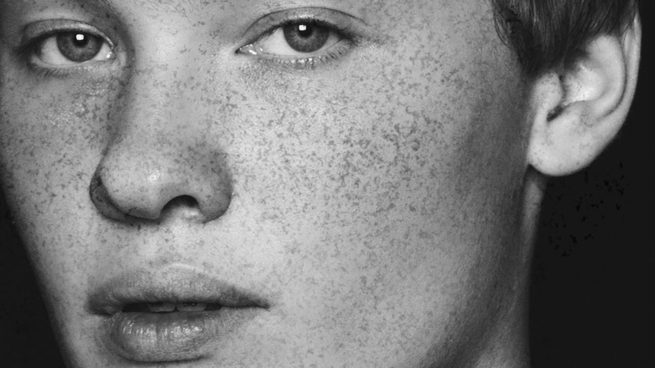
Retouching skin is one of those things that separates the Photoshop hobbyists from the people who actually get paid to do it. And one of the fastest ways to blow your cover as someone who knows what they’re doing is to add skin details that look painted on. Freckles are one of those details. Done badly, they look like someone sneezed brown dots across a face in MS Paint. Done well, they make a portrait feel alive, warm, and real. I spent an embarrassing amount of time trying to fake freckles with stock brushes before I finally sat down and watched how Aaron Nace over at PHLEARN does it. Watch the full tutorial on YouTube and then come back here for the full breakdown.
The key insight in Aaron’s approach is that he doesn’t reach for a Photoshop preset or a downloaded brush pack. He builds the brush himself, starting from a photograph of granite. That sounds unhinged until you think about it for two seconds. Granite has naturally scattered, irregular specks with no repeating pattern. It’s basically nature’s freckle map. Stealing that texture and turning it into a brush is the kind of lateral thinking that makes you feel like you’ve been doing Photoshop wrong this whole time.
Here’s a full walkthrough of the technique so you can follow along without pausing the video every thirty seconds.
Step 1: Open Your Granite Reference Image
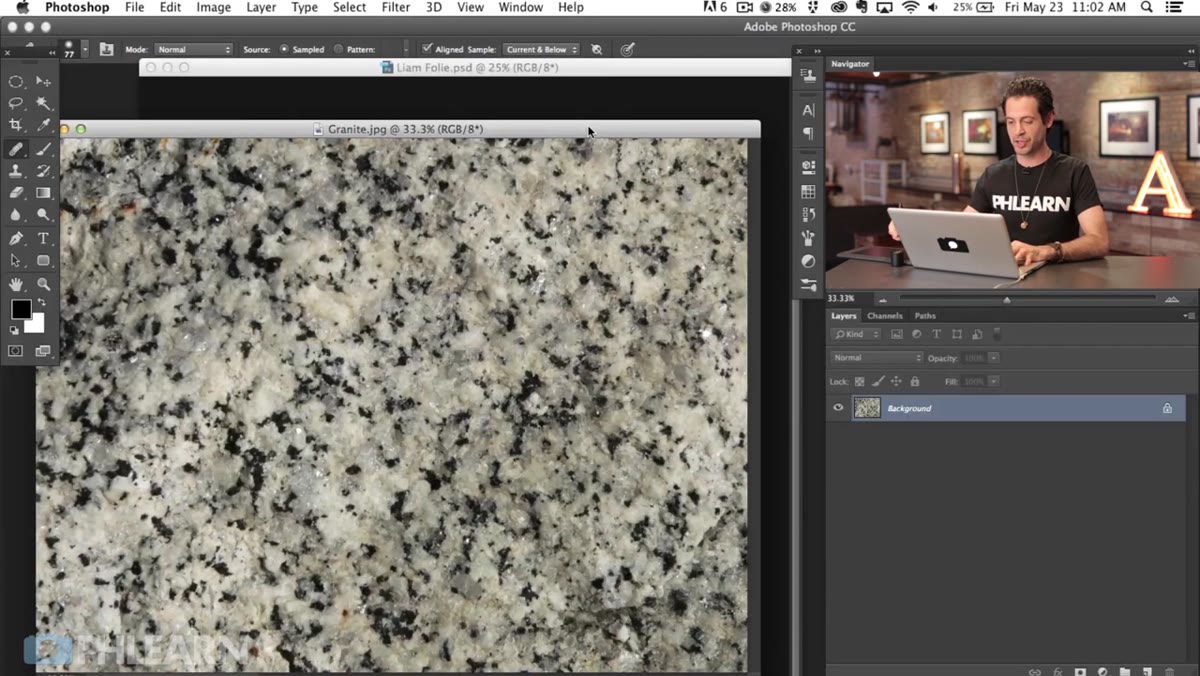 Granite image open in Photoshop as background layer
Start with a close-up photo of granite, the kind with clearly visible dark mineral flecks scattered across a lighter surface. The variation and randomness of those flecks is exactly what you’re after. Open it in Photoshop and keep it as your background layer. You’re not going to use this image as a texture overlay. You’re going to mine it for its dot pattern and turn that pattern into a brush tip.
Step 2: Select the Dark Flecks Using Color Range
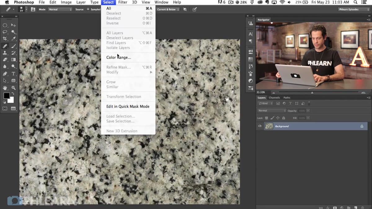 Color Range dialog open with dark speckles selected
Go to Select, then Color Range. This tool lets you target specific tones across the entire image at once, which is way faster than trying to paint a selection by hand. Click on one of the dark flecks in the granite to sample that tone. In the Color Range preview, anything showing as white is selected and anything showing as black is not. Use the plus eyedropper to add more dark tones to your selection and nudge the Fuzziness slider to expand or tighten the range. You want a good spread of dots selected without pulling in too much of the lighter background. Hit OK when it looks solid.
Step 3: Fill the Selection with Black on a New Layer
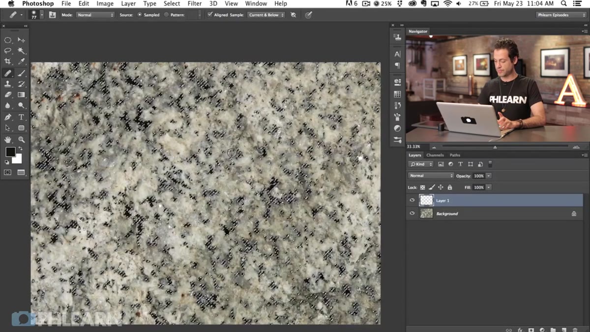 New layer above background filled with black using Edit Fill
Create a new layer above your granite background. With your selection still active, hit Shift + Delete (or Shift + Backspace on Windows) to open the Fill dialog. Set the contents to Black and hit OK. Your dots are now painted black on that new layer. Here’s the thing though: you won’t see much yet because your black dots are sitting on top of a dark background. That’s fine. The next step fixes it.
Step 4: Add a White Layer Beneath the Dot Layer
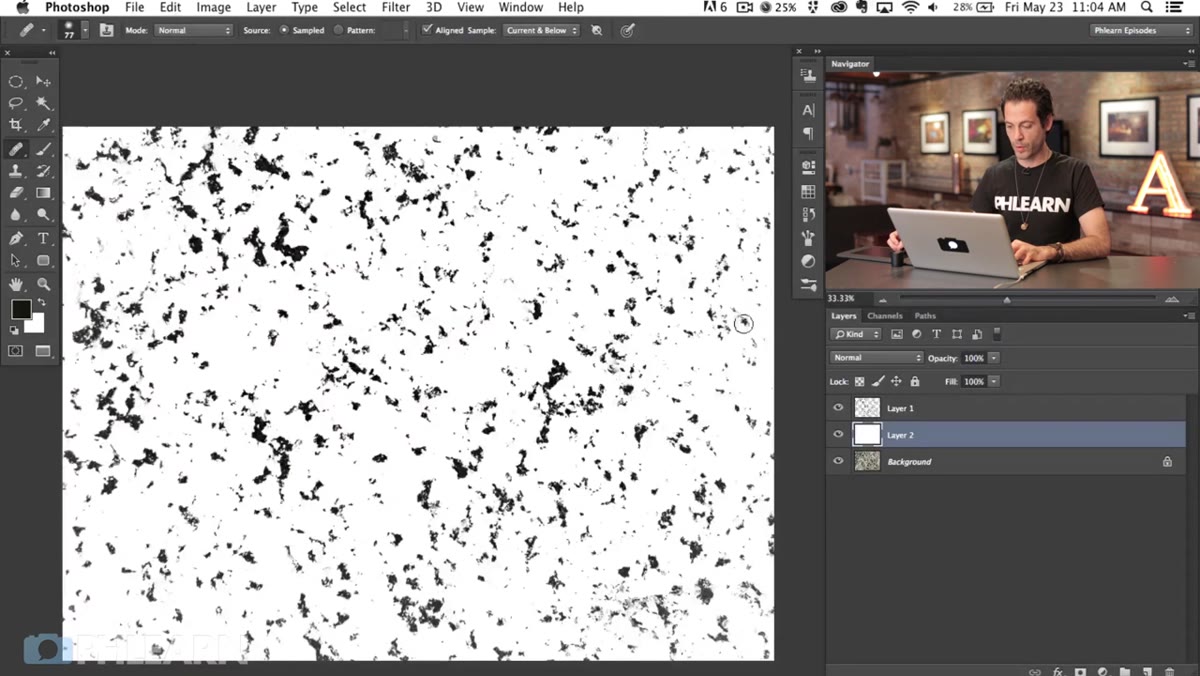 White fill layer added below dot layer, dots now visible
Create another new layer and drag it below your black dot layer. Fill this one with white using the same Shift + Delete method, choosing White as the contents. Now you’ve got a proper brush source: black dots on a white background. This is exactly what Photoshop needs to define a custom brush. Black areas become the part of the brush that paints, and white areas become transparent. Simple rule, important to remember.
Step 5: Clean Up the Edges for an Organic Shape
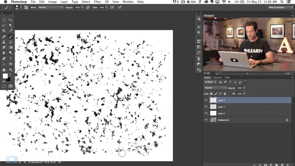
 White hard-edge brush painting around dot layer edges
This is the step most tutorials skip and it’s the one that makes or breaks the result. If your dot layer has a hard, rectangular edge, every stroke of your finished brush will show that same hard cutoff. It immediately reads as digital. To fix it, grab a hard-edged white brush and paint around the outer edges of your dot layer, feathering the boundary into an irregular, natural shape. You’re essentially knocking back the corners and giving the brush tip an organic silhouette. Think of it like tearing the edges of a piece of paper rather than cutting them with scissors. The goal is that no single brushstroke looks like it came from a stamp.
Step 6: Define the Brush Preset
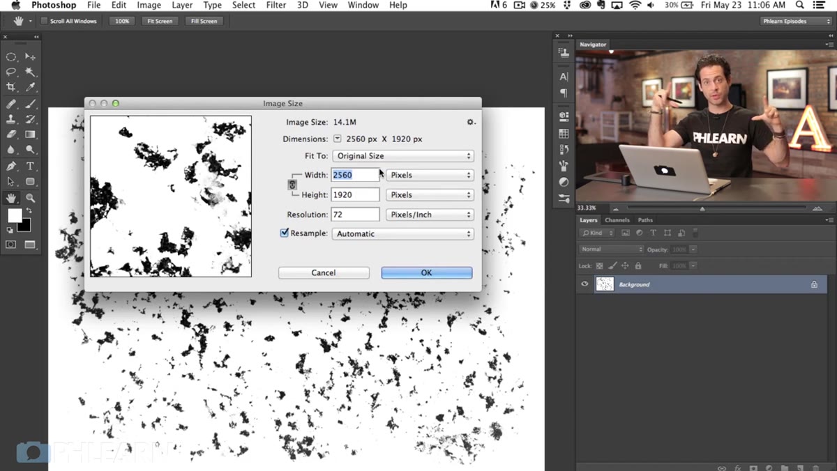
 Edit menu open with Define Brush Preset selected
Once you’re happy with the shape and dot distribution, flatten the relevant layers or merge your dot and edge-cleanup layers. Then go to Edit and choose Define Brush Preset. Give it a name you’ll actually remember, something like “Freckles - Granite” rather than “Brush 47.” Photoshop registers the entire visible black-on-white area as your new brush tip. From this point, you’re done with the granite image entirely.
Step 7: Configure the Brush Settings and Paint
 Brush Settings panel open showing scatter and spacing options
Open the Brush Settings panel (F5) and dial in the behavior. Increase Spacing so individual dots don’t clump together into a muddy streak. Turn on Scattering and push that value up so your strokes spread the freckles across an area rather than laying them down in a single line. Size Jitter and Opacity Jitter will give you variation in the dots so they don’t all look identical. Sample your subject’s skin tone for reference, then paint on a new layer set to Multiply or normal at a low opacity, building up freckles gradually in areas where they’d naturally occur: across the nose, cheekbones, and shoulders. Work light and keep your brush opacity low. You can always add more. You can’t easily pull back if you go heavy-handed.
My Extra Step: Use a Gradient Mask to Control Density
One thing I do that Aaron doesn’t cover here is adding a layer mask to my freckle layer and running a gradient across it. Freckles on real people tend to cluster more densely in certain spots and fade toward the edges of the face. A mask with a gradient built into it mimics that falloff without you having to manually vary your brush pressure the whole time. It takes about twenty seconds to set up and it’s the difference between freckles that look scattered naturally and freckles that look evenly applied like a stencil.
The single biggest takeaway from this whole technique is that organic-looking results in Photoshop often come from organic source material. Granite is random in a way that no algorithm perfectly replicates. Using a real-world texture to drive your brush means you’re working with nature’s randomness instead of fighting against Photoshop’s tendency toward symmetry and pattern. That mindset, letting real textures do the heavy lifting, applies way beyond freckles.
Watch the full tutorial on YouTube to see Aaron walk through the whole thing in real time. His delivery is clear and the before-and-after results are genuinely impressive.
Comments
Leave a Comment