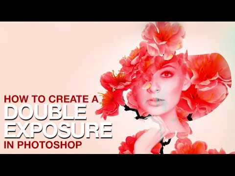
Client work has a funny way of pushing you toward techniques you’ve been lazily avoiding. For me, double exposures were exactly that. I’d seen them everywhere, assumed they were either done in-camera or required some wizardly process I hadn’t earned the right to know yet, and kept putting off learning them properly. Then a branding client asked for a portrait-meets-nature composite for a wellness campaign, and suddenly my procrastination had a deadline. That’s when I found myself deep in Aaron Nace’s PHLEARN tutorial on creating double exposures in Photoshop, and honestly, it rearranged how I think about blending images together in general.
What makes this technique worth learning isn’t just the aesthetic, which yes, looks great on everything from album covers to editorial spreads. It’s that double exposures force you to actually understand blending modes and layer opacity in a way that clicking through presets never does. You start to see why certain modes interact with light and dark values the way they do. Watch the full tutorial on YouTube if you want to follow along with Aaron directly, but here’s the full breakdown so you can work through it step by step.
Step 1: Get Both Images Into the Same Document
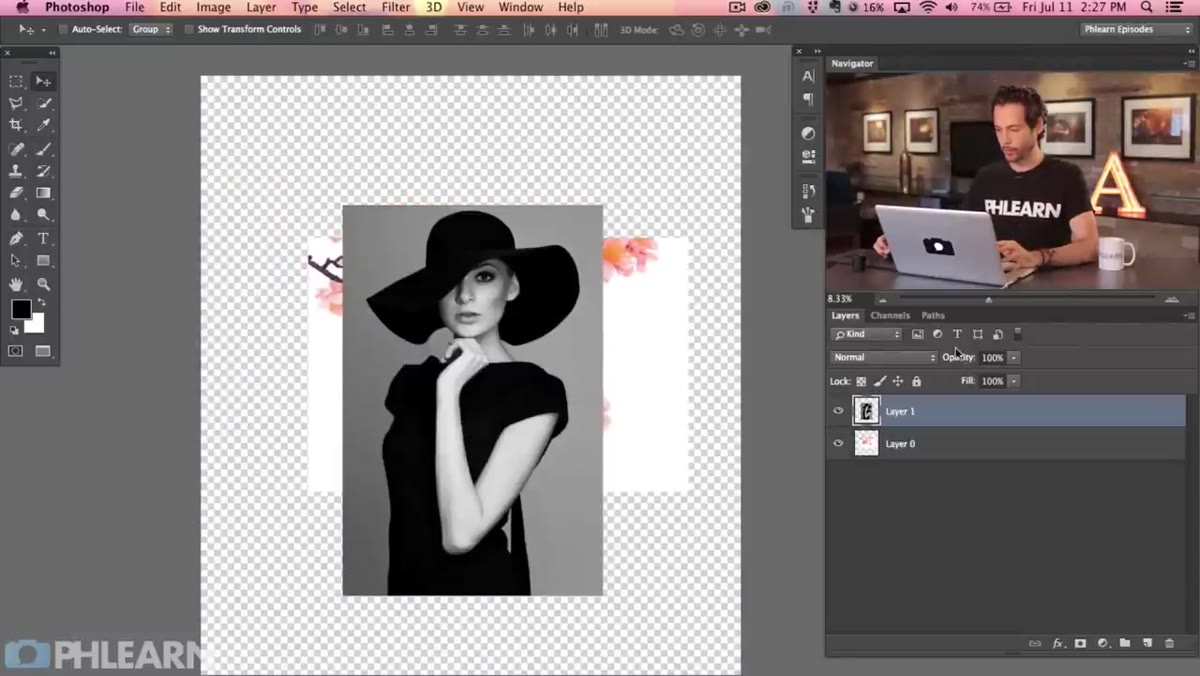
 Moving flower image onto portrait canvas with Move tool
Start with your two source images open as separate documents. Grab the Move tool (V), then hold Shift and drag from one image window onto the other. Holding Shift as you drop it centers the incoming layer on the canvas, which saves you an annoying manual centering step later. You should now have a two-layer document with your portrait on the bottom and your texture or secondary image on top.
Moving flower image onto portrait canvas with Move tool
Start with your two source images open as separate documents. Grab the Move tool (V), then hold Shift and drag from one image window onto the other. Holding Shift as you drop it centers the incoming layer on the canvas, which saves you an annoying manual centering step later. You should now have a two-layer document with your portrait on the bottom and your texture or secondary image on top.
Aaron uses a portrait and a flower photograph here, and the pairing matters more than people think. You want one image with strong light and dark contrast (the portrait) and one with interesting organic texture (the flowers). That contrast in tonal values is what makes the blend feel rich rather than muddy.
Step 2: Give Yourself Room to Work by Expanding the Canvas
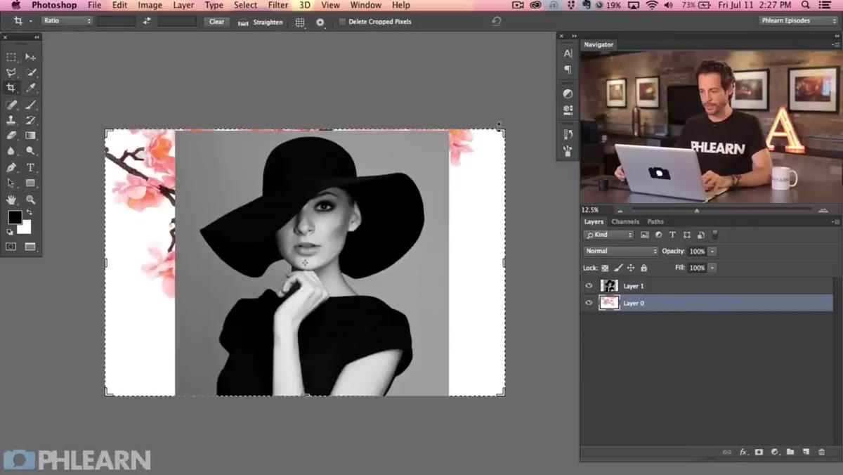 Crop tool dragged outward to expand canvas size
Before you touch a single blending mode, expand your canvas. Hit C for the Crop tool, then drag the crop boundary outward past the edges of your image. This gives you breathing room to reposition and scale layers without feeling hemmed in by the original document size. Make sure “Delete Cropped Pixels” is unchecked in the options bar. That checkbox being on is the kind of small thing that causes large amounts of grief later when you want to recover parts of a layer you thought were gone.
Crop tool dragged outward to expand canvas size
Before you touch a single blending mode, expand your canvas. Hit C for the Crop tool, then drag the crop boundary outward past the edges of your image. This gives you breathing room to reposition and scale layers without feeling hemmed in by the original document size. Make sure “Delete Cropped Pixels” is unchecked in the options bar. That checkbox being on is the kind of small thing that causes large amounts of grief later when you want to recover parts of a layer you thought were gone.
This extra canvas space is genuinely useful. Double exposures rely on specific placement relationships between your two images, and trying to nail that placement on a tight canvas is like trying to parallel park in a space that’s exactly your car’s length. Technically possible, practically miserable.
Step 3: Lower Opacity to Plan Your Composition
 Portrait layer with lowered opacity showing both images simultaneously
With both layers in place, click on your top layer and temporarily lower its opacity to around 50 percent. This isn’t your final blend, it’s just a compositional preview so you can see how the two images are spatially relating to each other. The goal is to find a placement where the key elements of both images create a conversation rather than a collision.
Portrait layer with lowered opacity showing both images simultaneously
With both layers in place, click on your top layer and temporarily lower its opacity to around 50 percent. This isn’t your final blend, it’s just a compositional preview so you can see how the two images are spatially relating to each other. The goal is to find a placement where the key elements of both images create a conversation rather than a collision.
Aaron’s concept here is the portrait subject “peeking through” the flowers, which means positioning the flower layer so that the blooms fall across the face and upper body in an interesting way. Before committing to any transforms, this low-opacity preview tells you whether your instinct is working or whether you need to rethink the crop or scale.
Step 4: Scale and Position Your Secondary Image
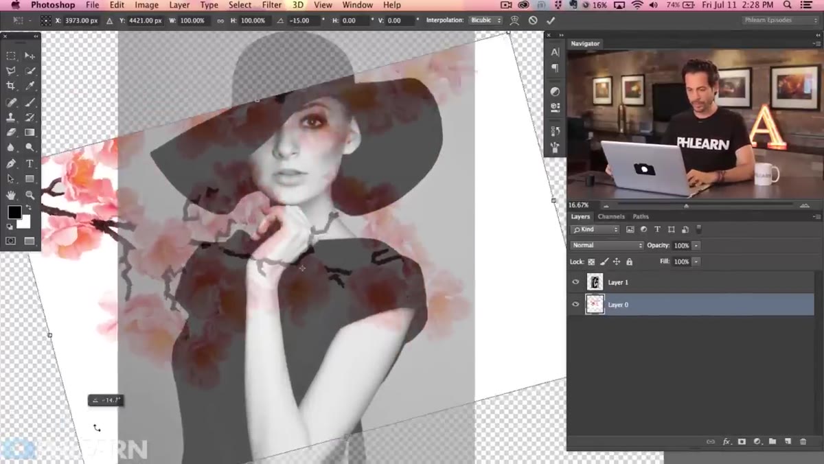 Flower layer being scaled with Free Transform
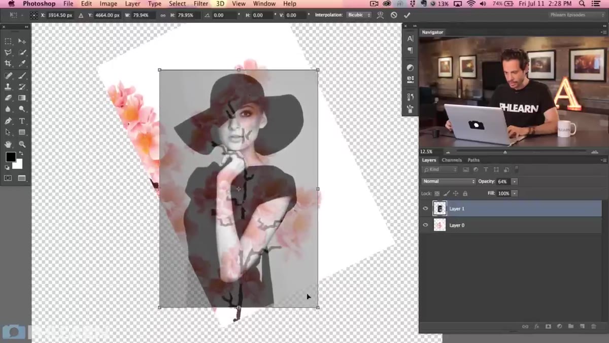
Hit Command+T (Ctrl+T on Windows) to bring up Free Transform on your flower layer. Scale and reposition until the secondary image sits where you want it compositionally. Aaron brings his flowers up from the bottom of the frame so they flow upward across the portrait, which creates a natural sense of movement.
Flower layer being scaled with Free Transform
Hit Command+T (Ctrl+T on Windows) to bring up Free Transform on your flower layer. Scale and reposition until the secondary image sits where you want it compositionally. Aaron brings his flowers up from the bottom of the frame so they flow upward across the portrait, which creates a natural sense of movement.
Don’t rush this step. The placement you lock in here is what makes the final image feel designed rather than accidental. Zoom out to see the full composition before confirming your transform. Once you commit, you want to feel good about the spatial relationship between the two images, because everything from here is about the blend.
Step 5: Apply a Blending Mode to Create the Exposure Effect
 Blending mode dropdown on flower layer
This is where the actual double exposure magic happens. With your flower layer selected, open the blending mode dropdown at the top of the Layers panel and work through the options. Screen and Multiply are your two heavy hitters for this effect. Screen drops out the dark pixels in the top layer and lets light values blend upward, which creates that classic luminous double exposure look. Multiply does the opposite, it drops out the lights and intensifies darks, which gives you a moodier, denser result.
Blending mode dropdown on flower layer
This is where the actual double exposure magic happens. With your flower layer selected, open the blending mode dropdown at the top of the Layers panel and work through the options. Screen and Multiply are your two heavy hitters for this effect. Screen drops out the dark pixels in the top layer and lets light values blend upward, which creates that classic luminous double exposure look. Multiply does the opposite, it drops out the lights and intensifies darks, which gives you a moodier, denser result.
Aaron leans into Screen mode for this particular combination, and with a light-toned portrait against organic flower shapes, it makes sense. The flowers begin to appear as if they’re glowing through the skin tones of the portrait. Spend a few minutes cycling through Overlay, Soft Light, and Lighten too. Every image pairing responds differently, and the “right” mode is the one that makes your specific images look intentional.
Step 6: Refine with Layer Masks
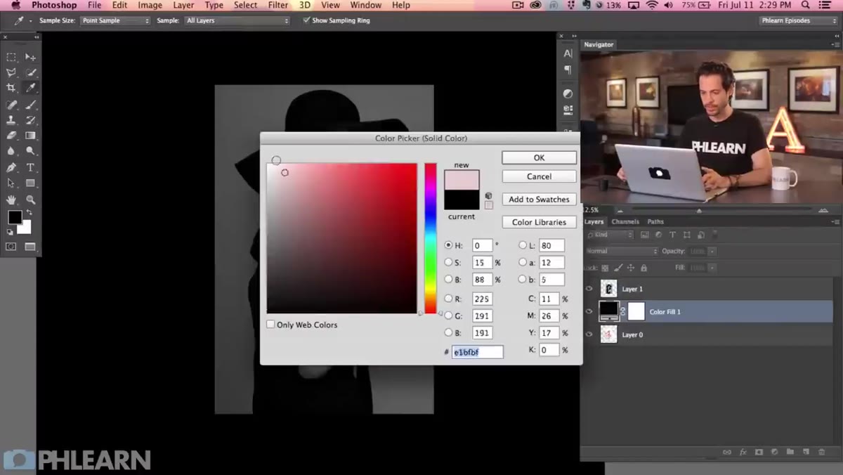 Layer mask being painted to control blend areas
Once your blending mode is set, add a layer mask to your flower layer by clicking the mask icon at the bottom of the Layers panel. Paint with a soft black brush at low opacity (around 20-30%) to pull back the flower layer in areas where you want the portrait to read more clearly, typically around the eyes and key facial features. Paint with white to bring it back in.
Layer mask being painted to control blend areas
Once your blending mode is set, add a layer mask to your flower layer by clicking the mask icon at the bottom of the Layers panel. Paint with a soft black brush at low opacity (around 20-30%) to pull back the flower layer in areas where you want the portrait to read more clearly, typically around the eyes and key facial features. Paint with white to bring it back in.
This is the step that separates a quick experiment from a finished piece. The mask gives you surgical control over where the blend is strong and where it recedes, and painting at low opacity means you’re building up the effect gradually rather than toggling between full visibility and nothing.
What I’d Add: Start With High-Contrast Source Images
When I ran through this technique for the first time, the composites that worked immediately all had one thing in common: strong tonal contrast in the portrait. Flat, evenly-lit headshots produced muddy results regardless of which blending mode I used, because Screen and Multiply need that light/dark range to have something to work with. The best source portraits have bright highlights and deep shadows, studio lighting or dramatic natural light. If your portrait looks great as a straight shot, it’ll probably look great as a double exposure too. If it’s flat before you start, fix that first with a Curves adjustment layer.
The single most important thing I took from Aaron’s approach is that composition planning before blending saves you hours of frustration after. It’s tempting to slam everything into Screen mode immediately and hope it looks cool. Sometimes it does. But the images that actually hold up are the ones where someone thought about where the flowers were going to land relative to the face before touching a single blend slider.
Watch the full tutorial on YouTube to see Aaron walk through every stage in real time. His pacing is good and he narrates his decision-making, not just his clicks, which is what makes PHLEARN worth bookmarking.
Comments (5)
I've watched a dozen tutorials on this and yours is the clearest by far.
This saved me so much time on my last edit. Wish I'd found this sooner.
Love this. I referenced a similar technique in one of my recent posts. Always good to see other perspectives.
This is exactly what I needed today. Been struggling with this for weeks.
The before and after really sells it. Incredible difference.
Leave a Comment