I’ve been building composites long enough to know that most of them fail in the same two places: the cutout looks fake, or the colors never quite agree. You end up with a subject that looks like they were Scotch-taped onto a background printed from a different printer. I hit this exact wall a few weeks ago on a project where I was dropping a portrait subject into a dramatic outdoor scene. The mask was technically clean but the whole thing read as “person floating in front of a photo.” Not great.
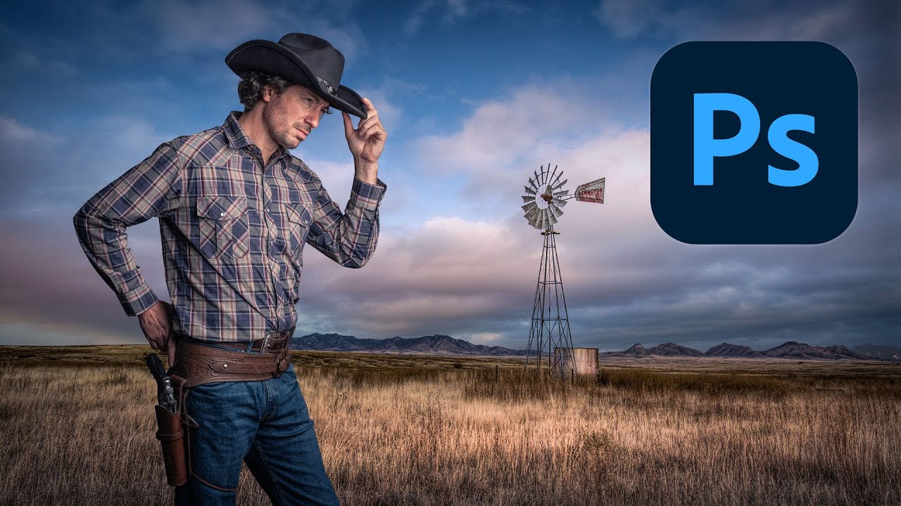
That’s what sent me down a rabbit hole and back to fundamentals. I found this Kelvin Designs tutorial on building a cowboy composite in Photoshop and it genuinely sharpened how I think about the whole pipeline, from extraction to final blend.
Getting the Extraction Right Before Anything Else
The tutorial leads with extraction, which is the correct call. There’s no color correction in the world that fixes a sloppy mask. Kelvin starts with Select and Mask, which you can access by going to Select > Select and Mask, or by making a rough selection first and hitting the Refine Edge Workflow button.
The key move here is using the Refine Edge Brush Tool specifically on the hair and any fine detail areas. You paint over the complex edges and let Photoshop do the heavy lifting on those semi-transparent pixels. The trick is to not overwork it. Paint over the hair once, let the algorithm analyze, and resist the urge to keep scrubbing back and forth. More passes don’t mean more accuracy.
For the output, set it to New Layer with Layer Mask rather than a flattened selection. You want that mask to stay editable. This is non-negotiable on any real project.
After the initial mask, he refines edges manually using a brush directly on the mask itself. Zoom in to 100% or higher, set a small hard brush, and paint black to hide or white to reveal. This is where you catch the fringe pixels that the algorithm missed around jacket edges or where the hair meets a lighter background.
Color Matching Without Guessing
Once the subject is on the new background, the composite looks wrong immediately, and that’s expected. The subject was shot under different light with a different color temperature than the background plate. Kelvin addresses this with a combination of Hue/Saturation and Color Balance adjustment layers, both clipped to the subject layer.
Clipping is essential here. Alt-click (Option-click on Mac) between the adjustment layer and the subject layer to clip it, so the adjustment only affects the subject and not the background below.
For Color Balance, he’s pushing the Midtones and Shadows toward the color temperature of the background. If the background is warm and golden, you’re adding yellow and red into the shadows. If it’s cool, you’re going the other way. He also adjusts Highlights separately, which is a step a lot of tutorials skip. Highlights need to match too, or skin tones start looking like they belong in a different movie.
He uses Curves as well, not just for luminosity but to tint specific channels. Pulling the blue channel down slightly and pushing red up in the midtones is a fast way to push warmth into a subject sitting in a golden-hour background.
The Creative Adjustments That Actually Sell It
Color matching gets you technically correct. What makes a composite feel real is the creative pass on top of that, and this is where the tutorial gets interesting.
Kelvin adds a gradient map as an overlay to unify the whole image. The gradient goes from a warm shadow tone to a lighter highlight tone, blended at a low opacity, maybe 15 to 25 percent. This single layer ties the darkest darks and lightest lights across both the subject and background into one consistent color range. It’s subtle but it’s doing a lot of work.
He also adds a vignette using a curves adjustment layer with an inverted radial gradient as the mask. This darkens the edges and pushes the eye toward the subject. The blend mode matters here. He keeps it on Normal rather than Multiply so he can control the exact darkness without the layer affecting colors underneath too aggressively.
On top of that, he adds subtle lens blur or depth-of-field considerations to the background to make the subject read as the focal point. Even a small blur on the background layer makes a dramatic difference to how grounded the subject looks.
Where I’d Push This Further
Everything Kelvin demonstrates works, and I use a similar pipeline. Where I’d diverge is on the color matching step when the lighting direction doesn’t match between subject and background. If the background light is coming from the left and the subject was lit on the right, no amount of Color Balance fixes that mismatch. You need to either paint in light and shadow using a soft light layer with a low opacity brush, or rethink your background choice entirely.
I learned this slowly and painfully on a project where I spent three days on a composite that a friend looked at and said “the light’s going the wrong way” in about four seconds. A global color grade can unify temperature and tone, but it can’t redirect the physics of light. Always check your light source direction before you commit to a background.
That said, for subject and background plates that were shot or sourced with compatible lighting, this workflow is clean, fast, and produces results that hold up to scrutiny.
The One Thing You Should Take Away
If the extraction and color matching are two separate problems solved in sequence, everything else is just refinement. Nail those two steps before you touch any creative grading and the composite almost builds itself.
Watch the full tutorial on the Kelvin Designs YouTube channel to see every step executed visually, which makes the selection refinement and color grading moves significantly easier to follow than any written description can capture.
Comments
Leave a Comment