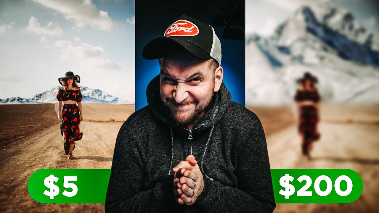
There’s a special kind of humbling that comes from looking at your own Photoshop work and realizing it’s just… not good. I know that feeling well. I spent three days on a composite once - mountain, moody sky, the whole thing - only to have a friend casually recreate something better in twenty minutes using a blending technique I’d never even heard of. So when Peter McKinnon put his own work on the chopping block and paid strangers to improve it, I was immediately invested. This isn’t just good YouTube drama. It’s actually one of the most instructive things you can do as an editor: watch someone else solve the same problem you already solved, and see where your instincts diverged.
In this Peter McKinnon tutorial, he revisits a composite he made earlier on his channel - a mountain dropped into a desert scene featuring a human subject. His original edit had some real problems (his words, not just mine), and rather than redo it himself, he hired multiple Fiverr editors at different price points, from five dollars all the way up to two hundred ten, and had them each take a crack at the same image. What comes back is a masterclass in what separates a convincing composite from a technically executed but visually wrong one. Watch the full tutorial on YouTube and then come back here for the breakdown.
Step 1: Identify What’s Actually Wrong With the Original Composite
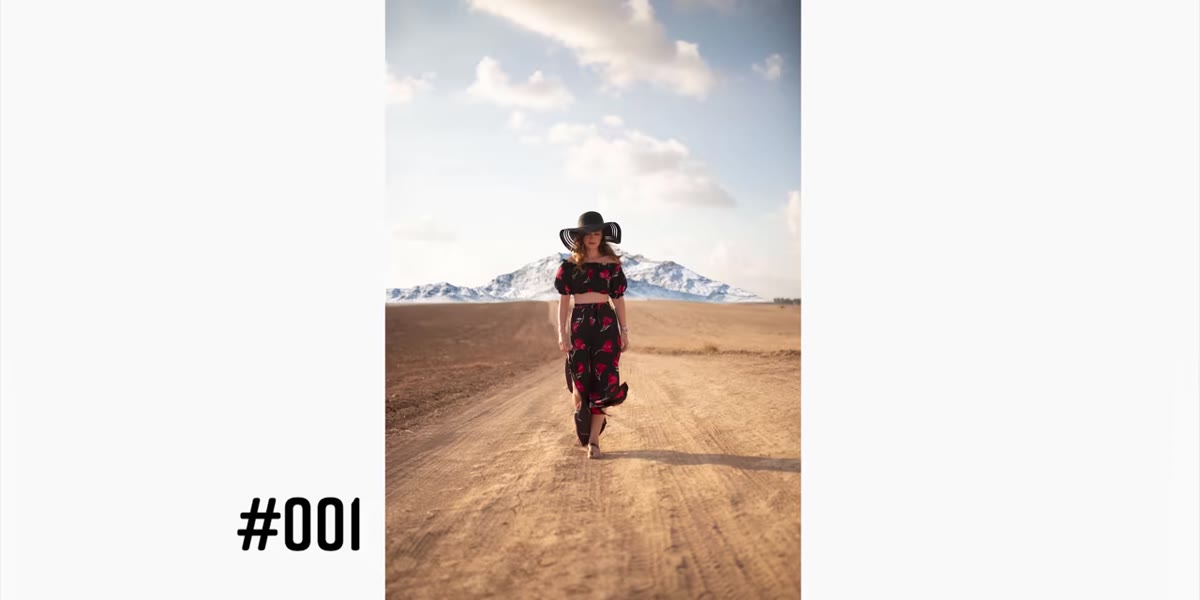
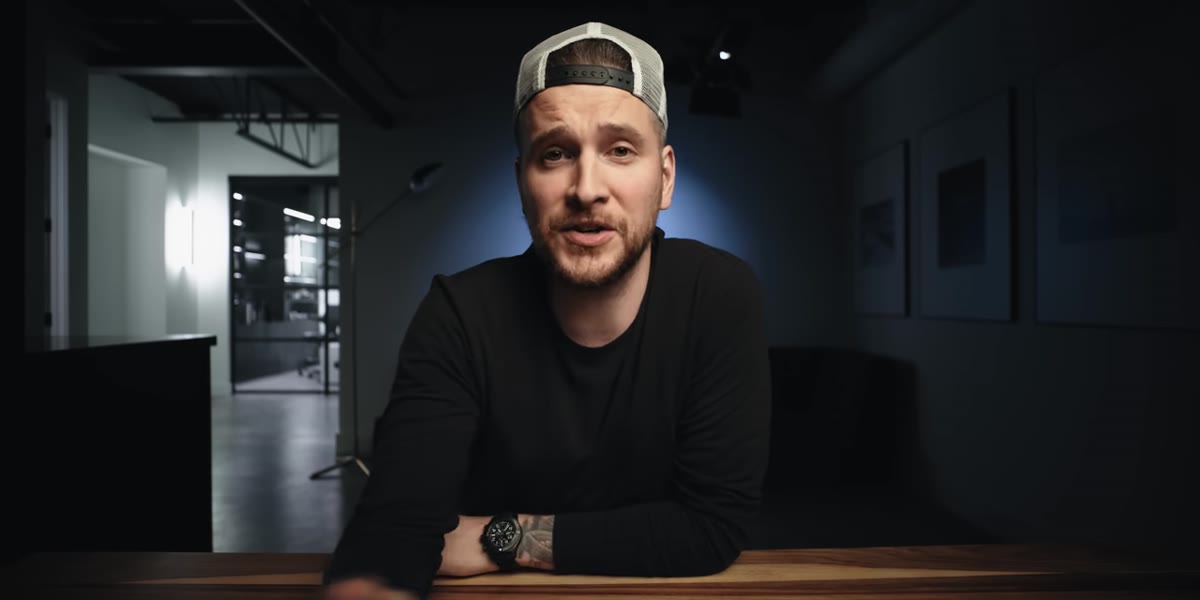 McKinnon’s original desert and mountain composite on screen
Before you can fix a bad composite, you have to diagnose it honestly. McKinnon flags two specific problems with his own edit: the shadows are going the wrong direction, and the mountain is scaled too large and placed too close to the subject. These aren’t stylistic quibbles - they’re physical errors. A mountain that appears massive right behind a person violates how perspective actually works. If you’ve ever driven through a desert and watched distant peaks hover on the horizon, you know they look small and faint, not looming and crisp.
McKinnon’s original desert and mountain composite on screen
Before you can fix a bad composite, you have to diagnose it honestly. McKinnon flags two specific problems with his own edit: the shadows are going the wrong direction, and the mountain is scaled too large and placed too close to the subject. These aren’t stylistic quibbles - they’re physical errors. A mountain that appears massive right behind a person violates how perspective actually works. If you’ve ever driven through a desert and watched distant peaks hover on the horizon, you know they look small and faint, not looming and crisp.
When you’re building any composite, pause before you merge anything and ask two questions: where is my light source, and how far away is this object supposed to be? Get those wrong and no amount of color grading will save you. Your viewer might not consciously spot the error, but they’ll feel that something is off, and that’s worse in some ways.
Step 2: Choose Editors Across a Range of Price Points
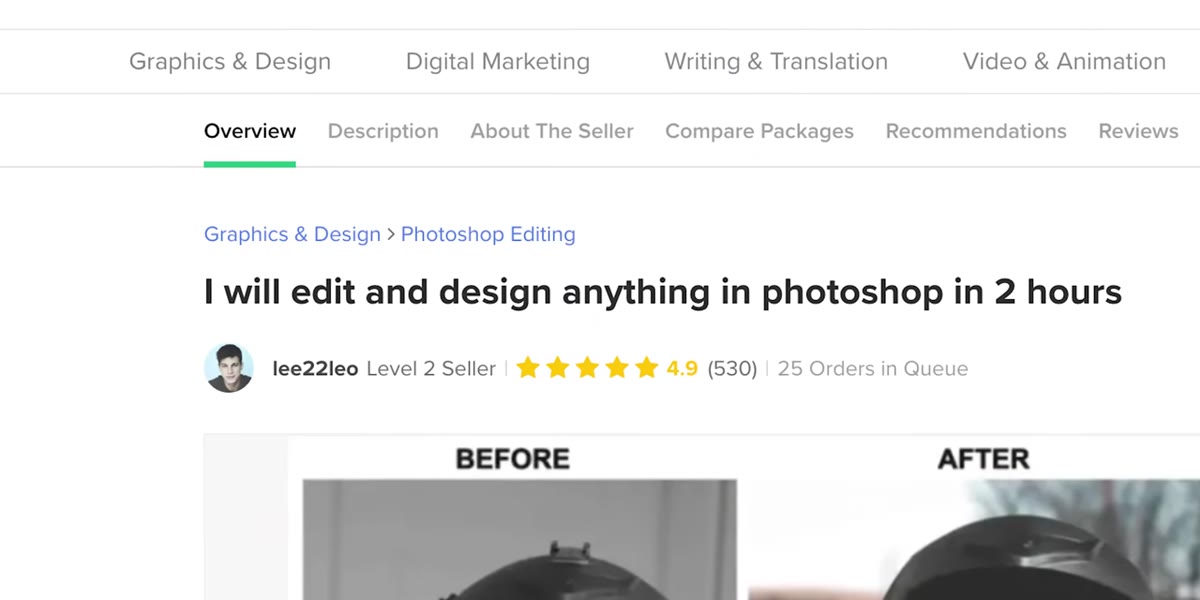 Fiverr search results showing multiple editor profiles and prices
McKinnon deliberately selects editors at wildly different price tiers - five dollars, twenty-five, fifty, eighty, a hundred, and two hundred ten. This isn’t just content structure. It’s a real-world test of a question every freelancer and client wrestles with: does price correlate with quality in Photoshop work? Spoiler - the answer is complicated, and that’s the useful part.
Fiverr search results showing multiple editor profiles and prices
McKinnon deliberately selects editors at wildly different price tiers - five dollars, twenty-five, fifty, eighty, a hundred, and two hundred ten. This isn’t just content structure. It’s a real-world test of a question every freelancer and client wrestles with: does price correlate with quality in Photoshop work? Spoiler - the answer is complicated, and that’s the useful part.
If you’re ever hiring out editing work, or positioning your own services, this kind of tiered comparison tells you more than any rate sheet. Look at portfolios carefully. A five-dollar gig from someone with strong samples can beat a hundred-dollar gig from someone whose portfolio doesn’t match your project type. Price anchors expectations but doesn’t guarantee results.
Step 3: Brief Your Editor With Specific Visual Context
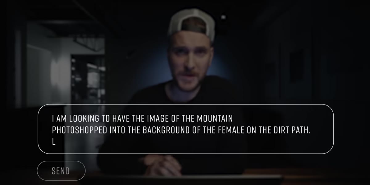 McKinnon preparing the image brief and notes for editors
McKinnon mentions putting together a blurb for each editor so they understand what they’re receiving and what they’re supposed to do with it. This is genuinely important and something a lot of people skip. Sending someone an image file with no context and expecting them to read your mind is how you end up with results that miss the point entirely.
McKinnon preparing the image brief and notes for editors
McKinnon mentions putting together a blurb for each editor so they understand what they’re receiving and what they’re supposed to do with it. This is genuinely important and something a lot of people skip. Sending someone an image file with no context and expecting them to read your mind is how you end up with results that miss the point entirely.
A good brief for a composite job should include: the original files, a reference image or description of the intended mood, any specific elements you want preserved or avoided, and the deadline. The more visual your reference, the better. Words like “realistic” or “natural” mean different things to different people. A screenshot of the vibe you’re after is worth five paragraphs of description.
Step 4: Evaluate Shadow Direction First - Everything Else Is Secondary
 Five-dollar result showing corrected mountain shadow direction
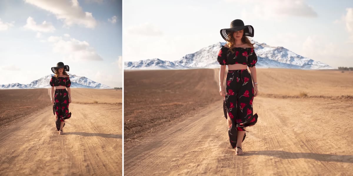
When the five-dollar result comes back, McKinnon’s first observation is that the shadows are going the right way. He calls this out as an immediate improvement over his own version. That’s telling. Shadow direction is the single most common thing that breaks a composite’s believability, and it’s also one of the easiest things to check before you ever start cutting and pasting.
Five-dollar result showing corrected mountain shadow direction
When the five-dollar result comes back, McKinnon’s first observation is that the shadows are going the right way. He calls this out as an immediate improvement over his own version. That’s telling. Shadow direction is the single most common thing that breaks a composite’s believability, and it’s also one of the easiest things to check before you ever start cutting and pasting.
Before placing any element into a scene, look at the existing shadows in the photo. Note the angle and the softness. Then match your imported element to that same light logic. If your scene has hard shadows pointing left at a forty-five degree angle and your mountain is lit from the right, no blending mode or color grade is going to fix that disconnect. Get the light right first.
Step 5: Scale and Perspective Are What Separate Good Composites From Great Ones
 Comparison showing mountain scaled smaller and placed at distance
The five-dollar editor also did something McKinnon’s original didn’t: they shrunk the mountain down so it reads as a distant landmark rather than a feature hovering directly behind the subject. McKinnon acknowledges that his version placed it too big and too close, which makes the whole thing feel like a cutout slapped onto a photo rather than a world the subject actually exists in.
Comparison showing mountain scaled smaller and placed at distance
The five-dollar editor also did something McKinnon’s original didn’t: they shrunk the mountain down so it reads as a distant landmark rather than a feature hovering directly behind the subject. McKinnon acknowledges that his version placed it too big and too close, which makes the whole thing feel like a cutout slapped onto a photo rather than a world the subject actually exists in.
When you’re placing objects into a scene, scale them down more than feels natural. Distance shrinks things, and our brains are calibrated to that. A mountain that feels “too small” when you’re manipulating it in Photoshop is often exactly the right size once you step back and look at the full image. Also consider atmospheric haze - distant objects are cooler, lower contrast, and slightly desaturated. Adding a soft blue-gray overlay at low opacity to your mountain layer can push it back in space convincingly.
Step 6: Color Match to the Environment, Not Just to “Look Good”
 McKinnon discussing color tone of the mountain against desert landscape
McKinnon notes that the five-dollar edit could have pushed further on color matching - the snowy mountain PNG doesn’t quite fit a warm desert environment. He suggests something more like the dusty, tan-colored peaks you’d see on a desert highway drive. This is a texture and color problem, and it’s fixable with a few targeted adjustments.
McKinnon discussing color tone of the mountain against desert landscape
McKinnon notes that the five-dollar edit could have pushed further on color matching - the snowy mountain PNG doesn’t quite fit a warm desert environment. He suggests something more like the dusty, tan-colored peaks you’d see on a desert highway drive. This is a texture and color problem, and it’s fixable with a few targeted adjustments.
Use a Hue/Saturation adjustment layer clipped to your mountain layer to shift the overall tone toward the warm, sandy range of your scene. Then add a Color Balance or Photo Filter layer on top, also clipped, and pull toward the yellows and oranges that dominate desert light. Keep the opacity conservative - around twenty to thirty percent - so the adjustment reads as environmental influence rather than a tint.
What I’d Do Differently After Watching This
The price-versus-quality experiment is interesting on its own, but the deeper lesson is about critique. McKinnon is publicly honest that his original edit was wrong in specific, technical ways. That kind of clear-eyed self-assessment is genuinely hard, especially when you’ve invested time in something. I’ve been guilty of defending a composite I knew wasn’t working just because I’d spent too many hours on it to walk away.
The move is to build in a forced break before you call anything finished. Export it, step away for at least a few hours, come back and look at it fresh. Better yet, drop it in a Discord or send it to a colleague with one question: “What’s the first thing that looks wrong?” You’ll get your answer fast, and it’s almost always about light or scale.
The single most important takeaway from this video: a technically clean cut means nothing if the physics of your scene are broken. Fix the light direction and the scale before you do anything else - color grading a compositionally wrong image is just polishing something that doesn’t work.
Watch the full tutorial on YouTube to see all the editor results side by side - the range between price points is genuinely surprising, and the two-hundred-ten dollar result alone is worth watching for.
Comments (1)
Been doing this wrong for years apparently. Thanks for the wake-up call.
Leave a Comment