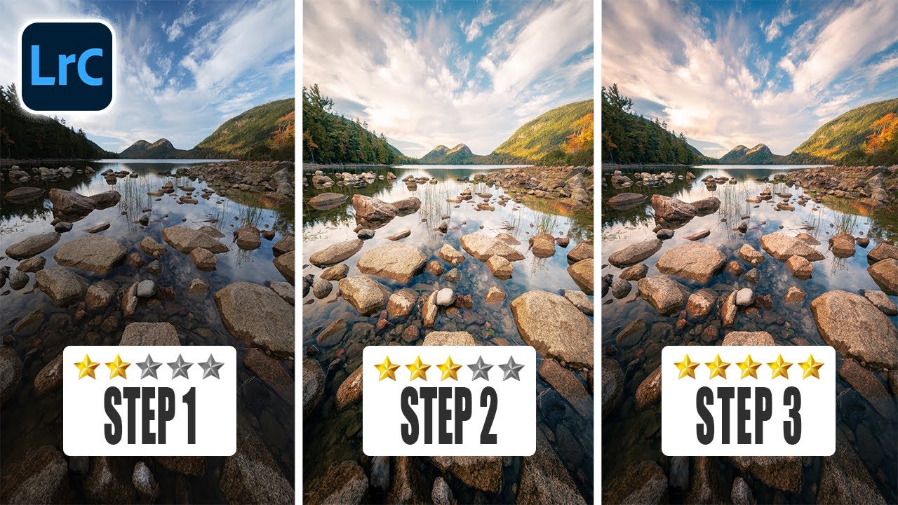
Vignettes in Lightroom: Why You're Probably Using the Wrong Tool for the Job

Vignettes in Lightroom: Why You're Probably Using the Wrong Tool for the Job

I’ve spent an embarrassing amount of time applying vignettes in Lightroom the lazy way — drag the Post Crop Vignette slider left, call it a day, move on. And honestly, for a long time it worked fine. Until it didn’t. The problem crept up on me during a client edit where the sky in the upper-left corner was blowing out, the lower-right foreground was already deep in shadow, and slapping a uniform darkening across all four corners made the whole thing look like I’d developed the photo inside a cave.

Two-Layer Vignettes in Photoshop: The Technique That Makes Your Subject Pop

Two-Layer Vignettes in Photoshop: The Technique That Makes Your Subject Pop

I used to add vignettes the lazy way. Throw a black-to-transparent radial gradient on top, drop the opacity to taste, call it a day. It worked well enough for meme graphics back when I was just making stuff for friends’ band pages, but the moment I started doing actual client work, that flat gradient approach looked exactly like what it was: a shortcut. The edges felt pasted on. Photographers noticed. Art directors noticed.