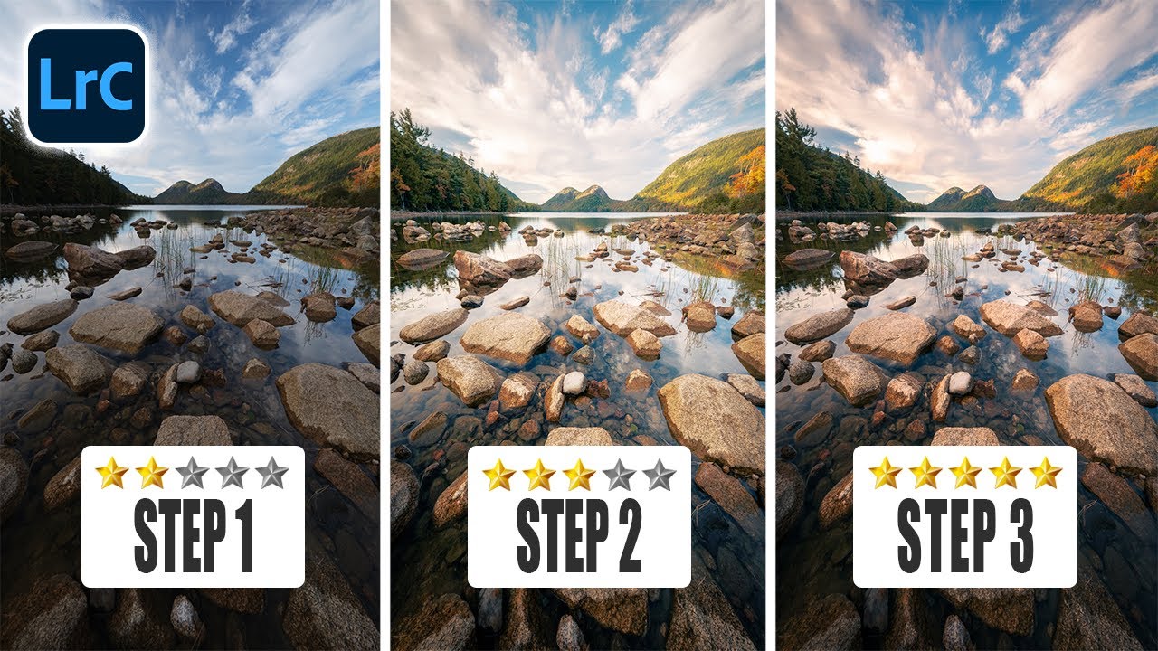
I’ve spent an embarrassing amount of time applying vignettes in Lightroom the lazy way — drag the Post Crop Vignette slider left, call it a day, move on. And honestly, for a long time it worked fine. Until it didn’t. The problem crept up on me during a client edit where the sky in the upper-left corner was blowing out, the lower-right foreground was already deep in shadow, and slapping a uniform darkening across all four corners made the whole thing look like I’d developed the photo inside a cave. I needed control. I didn’t have it.
That’s exactly the problem Mark Denney tackles in this tutorial on what he calls Lightroom’s most confusing but powerful tools. He specifically zeroes in on the vignette versus radial gradient comparison, and honestly, even if you think you already know the difference, the way he walks through it side by side makes the tradeoffs click in a way that a written explanation rarely does. Watch the full tutorial on YouTube if you want the visual alongside this breakdown.
Here’s the step-by-step of what he demonstrates, plus some thoughts from someone who has now applied this workflow to actual paying work.
Step 1: Apply a Standard Post Crop Vignette and See Its Limits
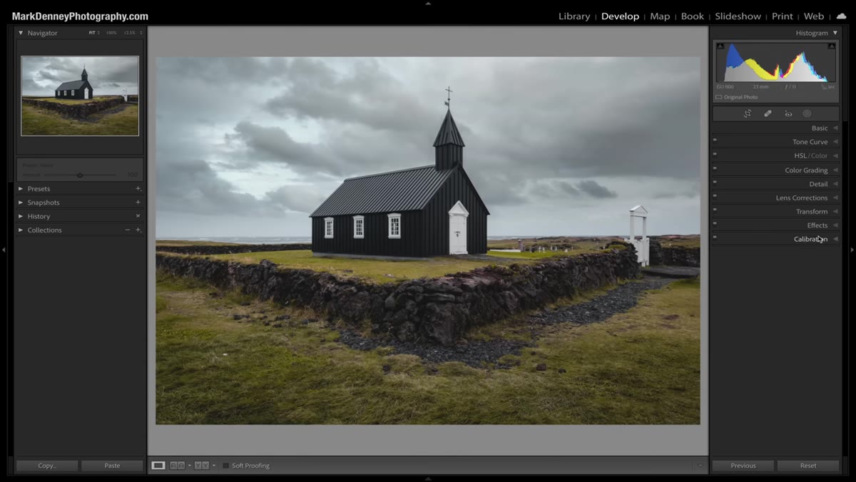 Post Crop Vignette slider in the Effects panel
Open your image in Lightroom’s Develop module and scroll down to the Effects panel. Find the Post Crop Vignette section and drag the Amount slider to the left. Mark typically lands around negative 15 to negative 20 for real work, but he pushes it to around negative 25 here so the effect is obvious on screen. Toggle the panel on and off to see before and after. The corners darken, the center stays bright, and it looks clean at first glance.
Post Crop Vignette slider in the Effects panel
Open your image in Lightroom’s Develop module and scroll down to the Effects panel. Find the Post Crop Vignette section and drag the Amount slider to the left. Mark typically lands around negative 15 to negative 20 for real work, but he pushes it to around negative 25 here so the effect is obvious on screen. Toggle the panel on and off to see before and after. The corners darken, the center stays bright, and it looks clean at first glance.
The issue surfaces the moment you actually study what’s happening in each corner individually. The slider applies the same intensity of darkening across all four corners simultaneously. You cannot tell it “darken the top-left more than the bottom-right.” If one corner is already in shadow and another is overexposed, a uniform vignette is going to make at least one of them look wrong.
Step 2: Reset the Vignette Slider and Set Up Your Workspace
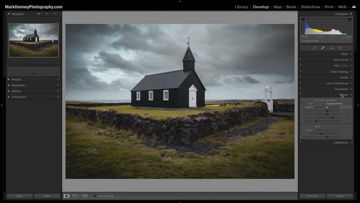 Effects panel reset, image resized on screen
Before building the better version, reset the Post Crop Vignette Amount back to zero. Then make your image slightly smaller on screen so you have room to work with the filter overlay without it feeling cramped. This is a minor workflow habit, but it genuinely helps when you’re drawing and adjusting a radial gradient because you can see the full image and the handles at the same time.
Effects panel reset, image resized on screen
Before building the better version, reset the Post Crop Vignette Amount back to zero. Then make your image slightly smaller on screen so you have room to work with the filter overlay without it feeling cramped. This is a minor workflow habit, but it genuinely helps when you’re drawing and adjusting a radial gradient because you can see the full image and the handles at the same time.
Step 3: Add a Radial Gradient Filter
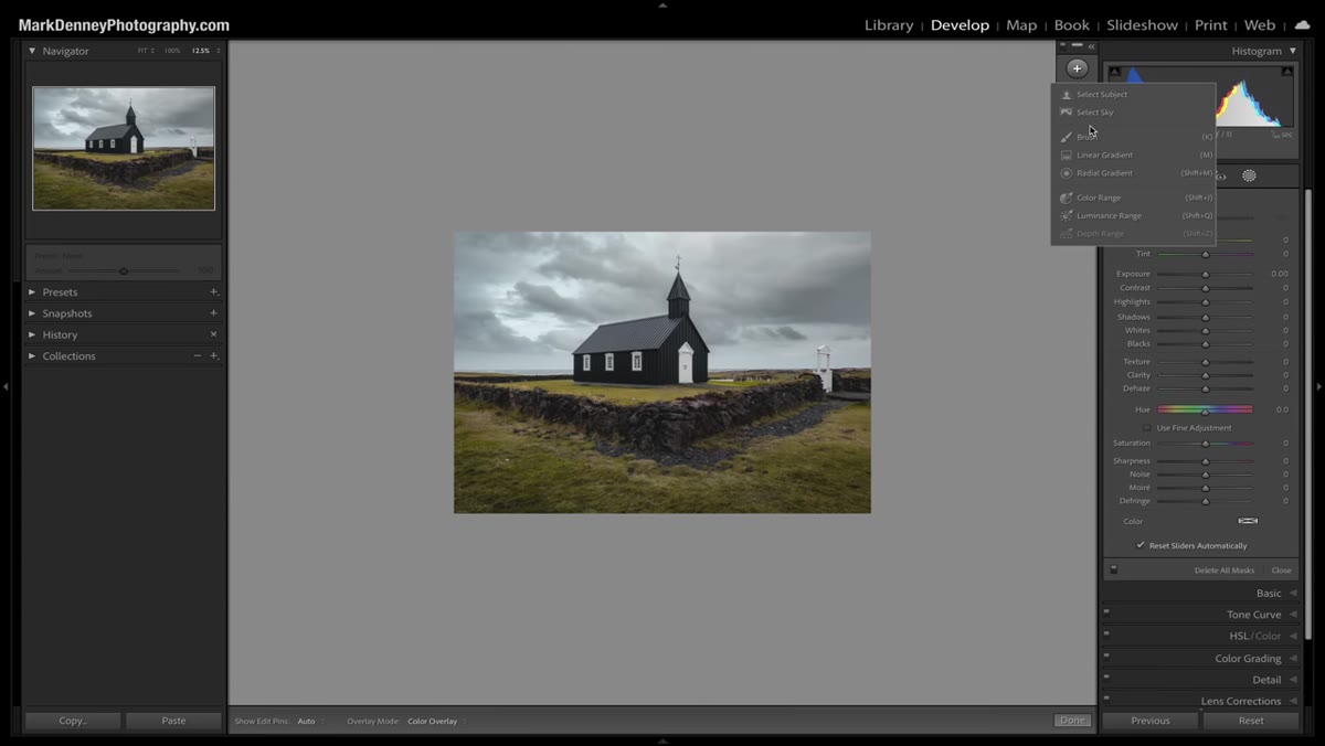 Filters tab open, Radial Gradient option selected
Navigate to the Filters tab at the top of the right panel (the icon that looks like a circle with a gradient). Click the plus icon and choose Radial Gradient from the menu. Click and drag across your image to draw the gradient. For a landscape-oriented photo, aim for a wide oval shape rather than a circle. You want the oval to cover most of the frame, leaving the corners exposed outside its boundary.
Filters tab open, Radial Gradient option selected
Navigate to the Filters tab at the top of the right panel (the icon that looks like a circle with a gradient). Click the plus icon and choose Radial Gradient from the menu. Click and drag across your image to draw the gradient. For a landscape-oriented photo, aim for a wide oval shape rather than a circle. You want the oval to cover most of the frame, leaving the corners exposed outside its boundary.
The size and shape here depend entirely on your image. A vertical portrait might want a taller, narrower oval. A wide panoramic landscape wants something stretched and low. Don’t just slap a circle on there and call it good.
Step 4: Invert the Mask So It Affects the Outside
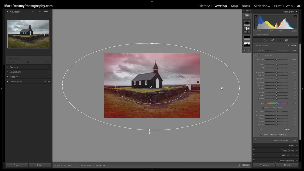
 Invert toggle active, red overlay showing corners affected
By default, a radial gradient affects everything inside the oval. That’s not what you want for a vignette. Click the Invert option (you’ll see it in the radial gradient settings panel). Once inverted, the mask flips so that Lightroom will apply your adjustments to everything outside the oval instead. The red overlay that appears when you hover over the mask will now show up in the corners and edges rather than the center.
Invert toggle active, red overlay showing corners affected
By default, a radial gradient affects everything inside the oval. That’s not what you want for a vignette. Click the Invert option (you’ll see it in the radial gradient settings panel). Once inverted, the mask flips so that Lightroom will apply your adjustments to everything outside the oval instead. The red overlay that appears when you hover over the mask will now show up in the corners and edges rather than the center.
This is the move that most people miss when they first try to build a manual vignette with a radial gradient. Without invert, you’d be darkening your subject instead of the corners.
Step 5: Adjust the Gradient Shape to Fit Your Scene
 Radial gradient handles being repositioned on image
With the mask inverted, drag the handles to reshape and reposition the oval. Pull the top edge down if the sky is getting too much darkening. Bring the sides in or push them out depending on how much edge falloff you want. This is the step where the radial gradient approach starts to earn its keep because you are making decisions based on what each specific area of your image actually needs, not applying a one-size-fits-all slider.
Radial gradient handles being repositioned on image
With the mask inverted, drag the handles to reshape and reposition the oval. Pull the top edge down if the sky is getting too much darkening. Bring the sides in or push them out depending on how much edge falloff you want. This is the step where the radial gradient approach starts to earn its keep because you are making decisions based on what each specific area of your image actually needs, not applying a one-size-fits-all slider.
Mark notes that he definitely overdoes the darkening during the demo so it reads clearly on camera. In practice, you’d be much more subtle.
Step 6: Pull Down Exposure to Create the Vignette Effect
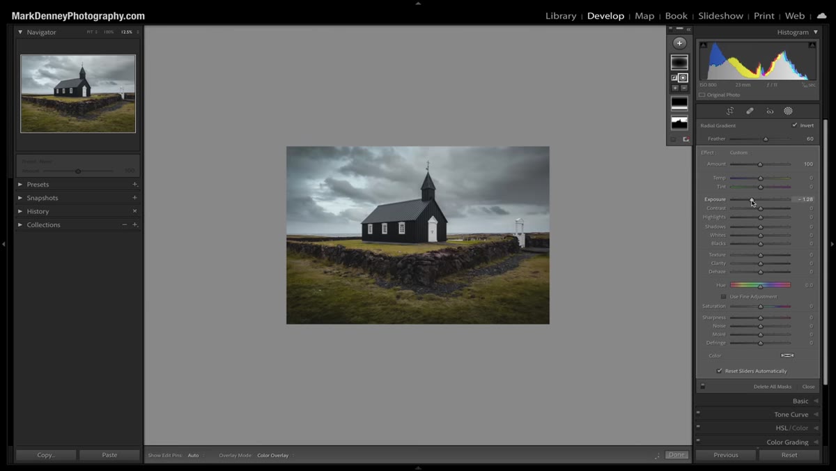 Exposure slider being reduced in radial gradient settings
With the mask shaped correctly, bring the Exposure slider down in the radial gradient’s adjustment panel. This is what actually creates the darkening. Start conservative, around negative 0.3 to negative 0.5, and work up from there. Because the mask is already shaped to your scene, the darkening happens exactly where you placed it, not uniformly across all corners.
Exposure slider being reduced in radial gradient settings
With the mask shaped correctly, bring the Exposure slider down in the radial gradient’s adjustment panel. This is what actually creates the darkening. Start conservative, around negative 0.3 to negative 0.5, and work up from there. Because the mask is already shaped to your scene, the darkening happens exactly where you placed it, not uniformly across all corners.
You can also add contrast, reduce highlights, or tweak other sliders within this same radial gradient. The vignette effect doesn’t have to be just an exposure drop.
One Thing I’d Add From My Own Experience
The real power move that Mark’s tutorial unlocked for me isn’t just using one radial gradient as a vignette. It’s using multiple radial gradients, one per corner, each with its own exposure value. I had a landscape where the top-right corner had a bright overcast sky and the bottom-left had a dark shadow in the foreground. One radial gradient set to invert could only split the difference. Two separate masked gradients, each dialed in independently, let me treat those corners as completely different problems. The top-right got a stronger exposure reduction. The bottom-left got almost nothing. The result looked natural because it actually matched the light in the scene.
It takes maybe two extra minutes. The difference in the final edit is not subtle.
The single most important thing to take away from Mark’s breakdown: similar tools in Lightroom are not interchangeable, and the one with fewer options is almost never the better choice once you understand what you’re giving up. The Post Crop Vignette slider isn’t bad. It’s just blunt. The radial gradient is a scalpel, and once you’ve used a scalpel, the blunt instrument stays in the drawer.
Watch the full tutorial on YouTube to see Mark walk through this and the other confusingly similar Lightroom tool pairs he covers. Worth your time.
Comments (1)
Great breakdown. The step-by-step approach really helps.
Leave a Comment