Curves, Fire, and the Finishing Touches That Actually Make a Composite Look Real

Curves, Fire, and the Finishing Touches That Actually Make a Composite Look Real

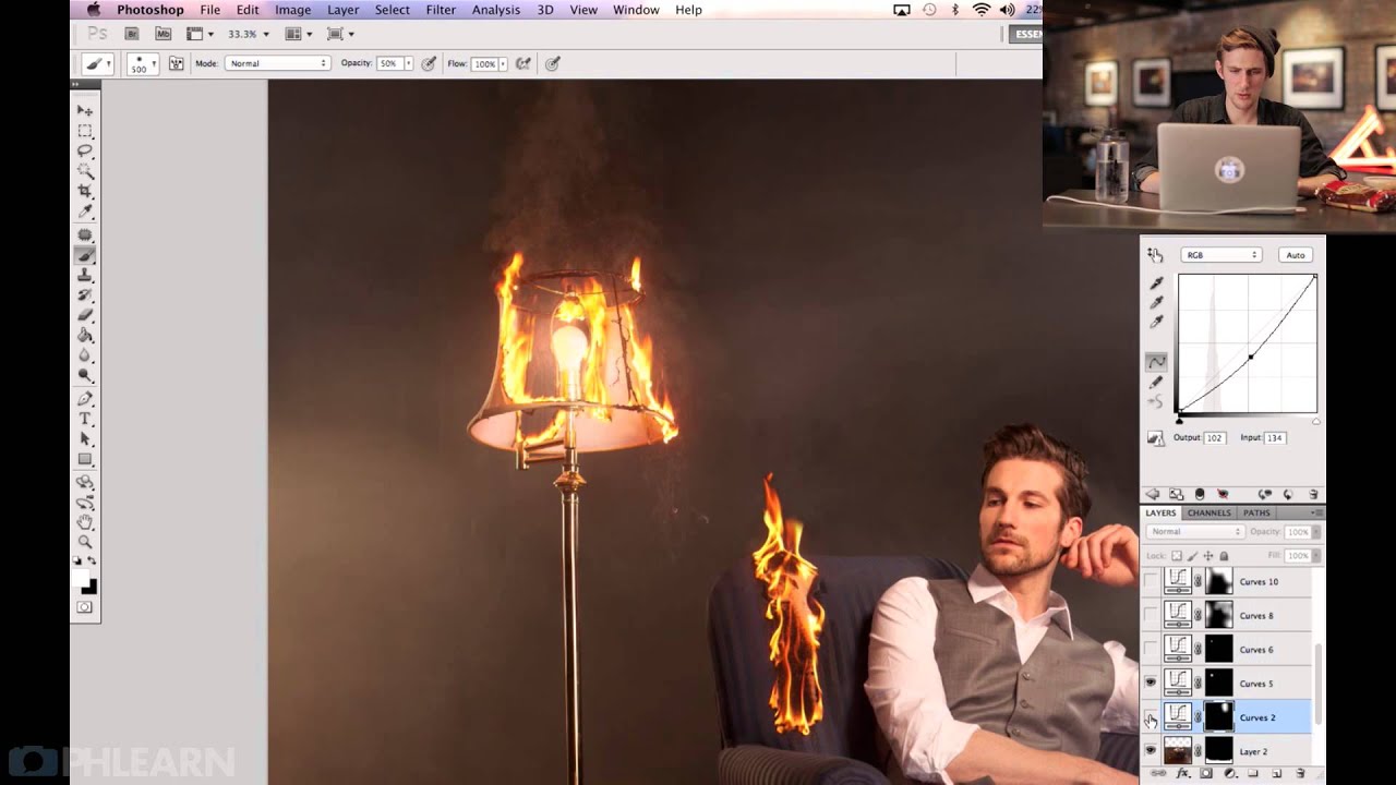
Compositing is one of those skills where you can do 90% of the work — great masking, solid lighting logic, believable color matching — and still have the image look… off. Like something’s not quite sitting in the scene. I’ve been there more times than I’d like to admit, usually staring at a layered PSD at 1am in whatever coffee shop hasn’t kicked me out yet, wondering why my composite looks like a collage and not a photograph.
How to Use Curves to Paint Swirling Color Gradients Across a Photo

How to Use Curves to Paint Swirling Color Gradients Across a Photo

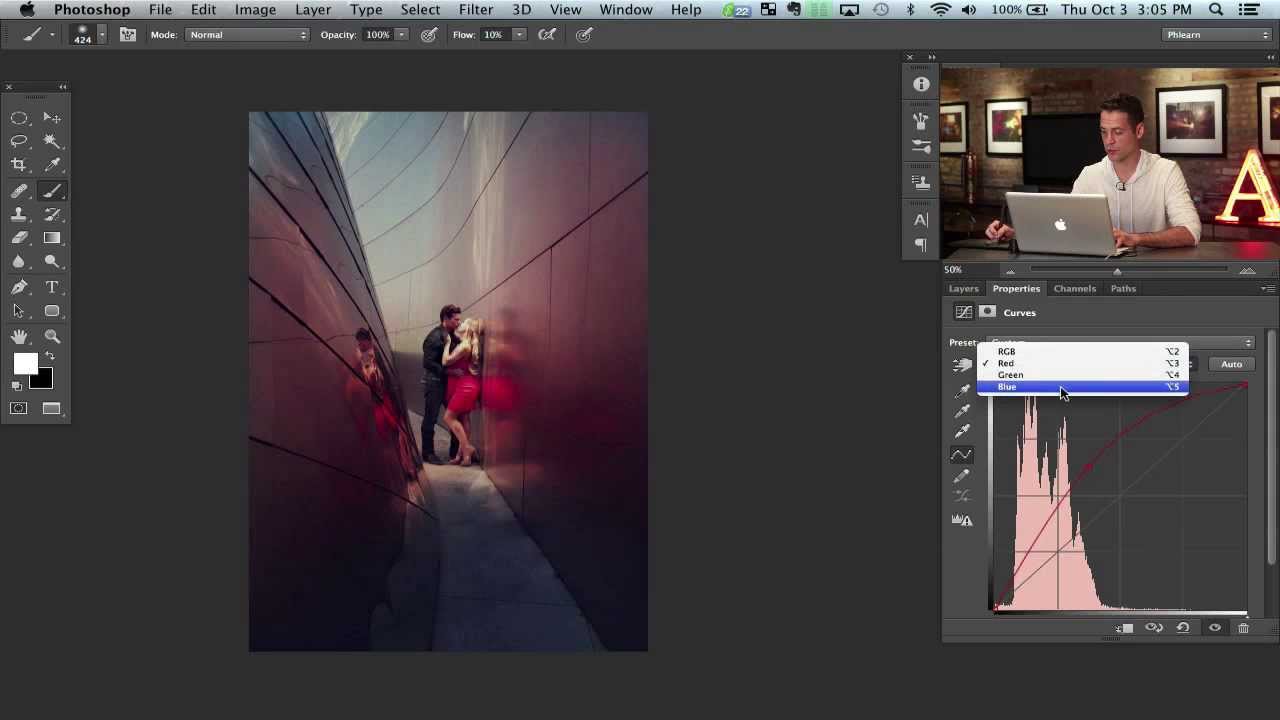
There’s a specific type of image that stops you mid-scroll. Not because of the subject, not even because of the composition, but because of the color. Something warm bleeding into something cool, colors that feel like they’re swirling around the focal point rather than just sitting on top of it. I spent an embarrassingly long time trying to fake that look with gradient maps and blending modes before I found a cleaner approach.