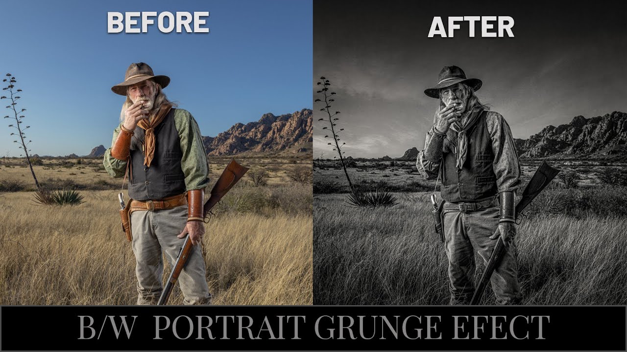
Joel Grimes' Dramatic Black & White Portrait Technique (And Why I Wish I'd Known This Sooner)

Joel Grimes' Dramatic Black & White Portrait Technique (And Why I Wish I'd Known This Sooner)

There’s a specific kind of frustration that comes from knowing your black and white portrait should look cinematic and instead looks like a desaturated snapshot from a 2009 Facebook album. I’ve been there more times than I’d like to admit. The problem usually isn’t the photo itself. It’s the conversion process. Most people hit Image > Desaturate, squint at the result, and then wonder why it looks flat. The answer is that dramatic B&W isn’t a one-step thing.
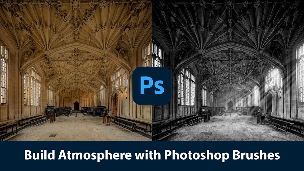
Painting With Light and Fog: How Joel Grimes Uses Photoshop Brushes to Make Images Feel Cinematic

Painting With Light and Fog: How Joel Grimes Uses Photoshop Brushes to Make Images Feel Cinematic

There’s a specific problem I kept running into early in my freelance work: I’d build out a composite, get the subject placed and lit, and then stare at the background feeling like something was missing. The image looked assembled. Competent, maybe, but flat. Like a person standing in front of a green screen even when they weren’t. What I didn’t understand then was that real drama in a photograph isn’t just about contrast or color grading.