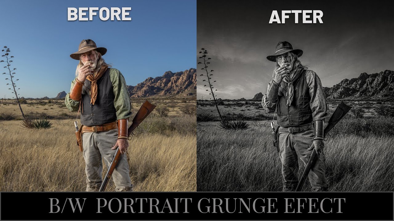
There’s a specific kind of frustration that comes from knowing your black and white portrait should look cinematic and instead looks like a desaturated snapshot from a 2009 Facebook album. I’ve been there more times than I’d like to admit. The problem usually isn’t the photo itself. It’s the conversion process. Most people hit Image > Desaturate, squint at the result, and then wonder why it looks flat. The answer is that dramatic B&W isn’t a one-step thing. It’s a workflow.
Watch the full tutorial on YouTube
In this Joel Grimes tutorial, the veteran commercial photographer (nearly 40 years in the industry, which makes me feel extremely young and under-qualified) walks through his complete process for building what he calls a “grungy” black and white portrait. The image he’s working with is a strobe-lit outdoor portrait with a gorgeous subject named Otis. The technique involves sky replacement, tonal layering, and a conversion approach that gives the final image that heavy, textured look you’d actually want to hang on a wall. I’ve pulled the whole thing apart below so you can follow along without pausing and rewinding every 30 seconds.
One thing worth noting before we dig in: Joel shoots and processes at a professional level, which means some of his starting materials (a panoramic stitch, a custom sky library) are things you may need to adapt to your own setup. But the core technique? Totally accessible. Here’s how it breaks down.
Step 1: Duplicate Your Base Layer Before You Touch Anything
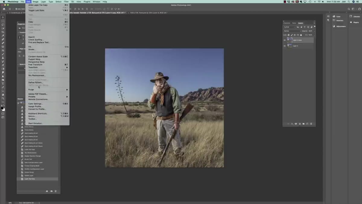
 Color portrait of Otis open in Photoshop before any edits
Before any editing happens, duplicate the base layer with Command + J (Ctrl + J on Windows). This gives you a working copy above the original, which stays untouched at the bottom as your safety net. It sounds obvious, but I cannot count the number of times I skipped this step in my early freelance days and deeply regretted it. Joel does this immediately and it’s worth treating it as a non-negotiable habit before you do anything else in a composite or retouch workflow.
Color portrait of Otis open in Photoshop before any edits
Before any editing happens, duplicate the base layer with Command + J (Ctrl + J on Windows). This gives you a working copy above the original, which stays untouched at the bottom as your safety net. It sounds obvious, but I cannot count the number of times I skipped this step in my early freelance days and deeply regretted it. Joel does this immediately and it’s worth treating it as a non-negotiable habit before you do anything else in a composite or retouch workflow.
Step 2: Replace the Sky Using Photoshop’s Built-In Sky Replacement Tool
 Sky Replacement dialog open with cloud image loaded
Go to Edit > Sky Replacement. Photoshop’s AI-powered sky tool does a surprisingly solid job of masking around complex edges like hair and hats, which used to require serious manual work. Joel loads in a custom sky JPEG he shot himself (he’s the kind of person who pulls over on the road to photograph good clouds, which honestly is a mood), but you can use Photoshop’s included sky presets if you don’t have your own library yet.
Sky Replacement dialog open with cloud image loaded
Go to Edit > Sky Replacement. Photoshop’s AI-powered sky tool does a surprisingly solid job of masking around complex edges like hair and hats, which used to require serious manual work. Joel loads in a custom sky JPEG he shot himself (he’s the kind of person who pulls over on the road to photograph good clouds, which honestly is a mood), but you can use Photoshop’s included sky presets if you don’t have your own library yet.
The key setting here is the Edge Shift slider. Joel drags this carefully to avoid the replacement sky bleeding onto the subject’s face and hat. Watch your edges closely, especially around any hard lines on your subject. He also flips the sky horizontally so the light direction matches the strobe placement in the original shot. That detail matters more than most people think. A sky that’s lit from the opposite direction of your subject immediately reads as fake, even if viewers can’t articulate why.
Step 3: Manage the Imported Sky Layers
 Layers panel showing multiple sky replacement layers grouped together
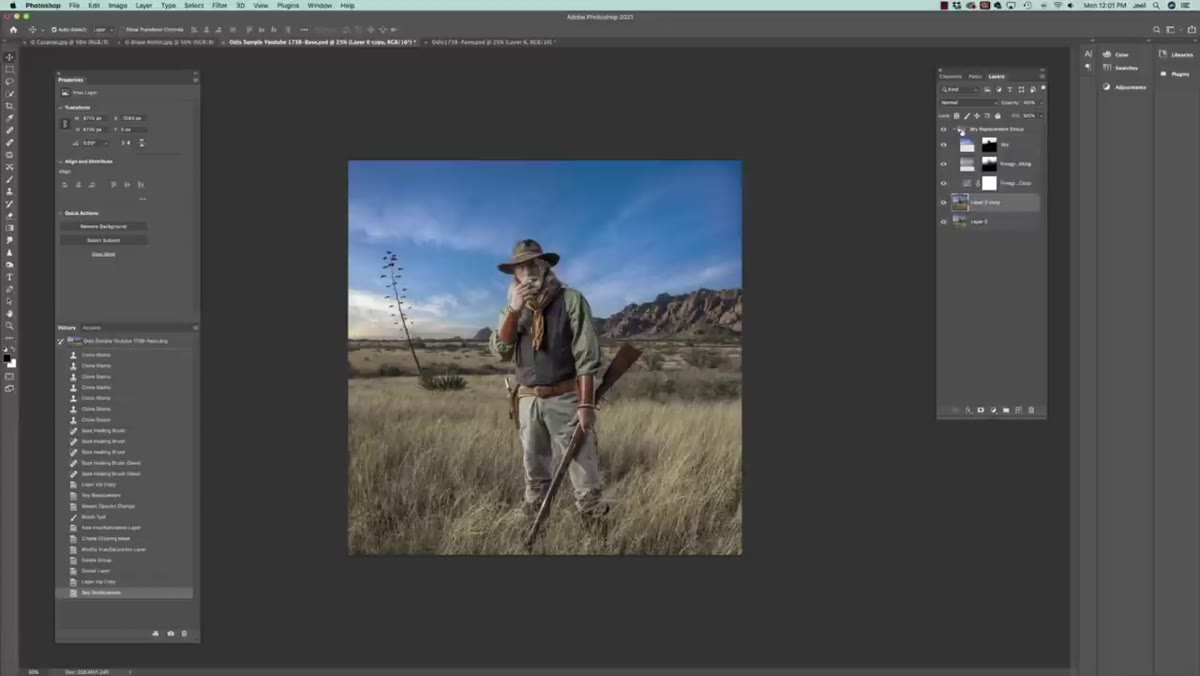
When Photoshop completes the sky replacement, it dumps a whole stack of layers into your panel. There’s a sky layer, a foreground adjustment layer, and a group mask. Rather than panicking or flattening everything immediately, take a moment to understand what each one is doing. The layer opacity on the sky itself is something Joel adjusts here. Pulling it back slightly can help the sky feel integrated rather than pasted, which is the difference between a composite that reads as real and one that looks like a collage project from a design class.
Layers panel showing multiple sky replacement layers grouped together
When Photoshop completes the sky replacement, it dumps a whole stack of layers into your panel. There’s a sky layer, a foreground adjustment layer, and a group mask. Rather than panicking or flattening everything immediately, take a moment to understand what each one is doing. The layer opacity on the sky itself is something Joel adjusts here. Pulling it back slightly can help the sky feel integrated rather than pasted, which is the difference between a composite that reads as real and one that looks like a collage project from a design class.
Don’t flatten this yet. You want to keep these layers live while you move into the tonal work.
Step 4: Convert to Black and White Using a Targeted Adjustment Layer
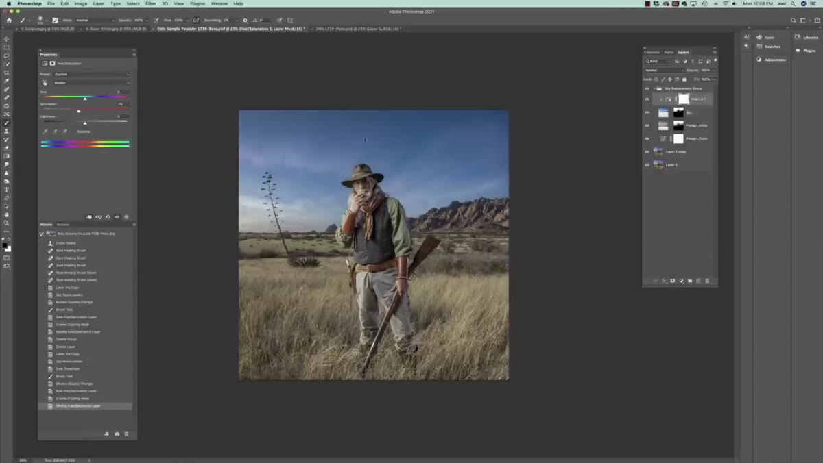 Black and White adjustment layer panel with color sliders visible
Add a Black and White adjustment layer from the Adjustments panel. Do not use Desaturate. The adjustment layer gives you individual channel sliders for reds, yellows, greens, cyans, blues, and magentas. This is where the actual drama gets built. Skin tones live mostly in the reds and yellows. Pulling those down darkens the skin and adds depth and edge. Pulling the blues affects the sky. Joel pushes these sliders in a way that creates strong tonal contrast between the subject and the background, which is what separates a “moody portrait” from a flat gray image.
Black and White adjustment layer panel with color sliders visible
Add a Black and White adjustment layer from the Adjustments panel. Do not use Desaturate. The adjustment layer gives you individual channel sliders for reds, yellows, greens, cyans, blues, and magentas. This is where the actual drama gets built. Skin tones live mostly in the reds and yellows. Pulling those down darkens the skin and adds depth and edge. Pulling the blues affects the sky. Joel pushes these sliders in a way that creates strong tonal contrast between the subject and the background, which is what separates a “moody portrait” from a flat gray image.
This is one of those steps where there’s no single right setting. Your job is to create separation between the tones so that the subject reads clearly and the background has texture and depth without competing.
Step 5: Add Contrast and Grungy Texture With Curves
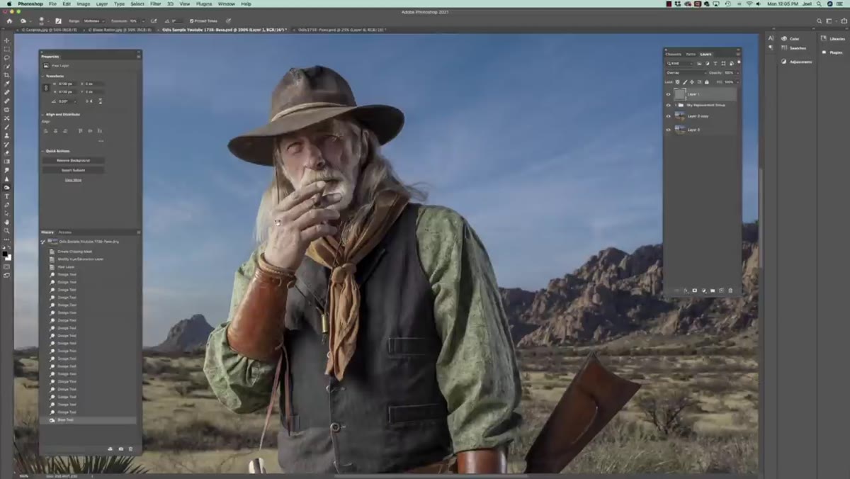 Curves adjustment layer showing an S-curve applied to the image
A Curves adjustment layer on top of everything gives you control over the overall contrast. Joel’s approach leans toward a heavier S-curve than you might expect. He’s not going for a clean editorial look. He’s going for something with weight and grit. Pulling the shadows down and the highlights up creates that punchy, high-contrast feel. If you want to push it further toward a “printed on rough paper” aesthetic, you can clip a curves layer to specific layers and apply different contrast treatments to the subject versus the background.
Curves adjustment layer showing an S-curve applied to the image
A Curves adjustment layer on top of everything gives you control over the overall contrast. Joel’s approach leans toward a heavier S-curve than you might expect. He’s not going for a clean editorial look. He’s going for something with weight and grit. Pulling the shadows down and the highlights up creates that punchy, high-contrast feel. If you want to push it further toward a “printed on rough paper” aesthetic, you can clip a curves layer to specific layers and apply different contrast treatments to the subject versus the background.
Step 6: Apply Local Dodging and Burning for Dimensionality
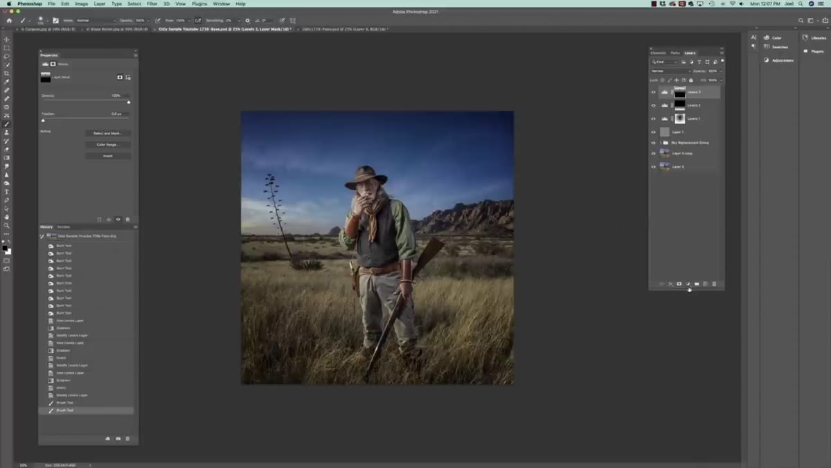 Dodge and Burn being applied to subject’s face on a gray overlay layer
The last major step in the retouch is localized dodging and burning. Create a new layer, fill it with 50% gray (Edit > Fill > 50% Gray), and set its blend mode to Overlay. Now paint with a low-opacity white brush to dodge (brighten) and a low-opacity black brush to burn (darken). Joel uses this to punch up the highlights on Otis’s face and deepen the shadows in a way that adds sculptural dimension. This is a non-destructive approach to dodging and burning that every portrait retoucher should have in their toolkit, full stop.
Dodge and Burn being applied to subject’s face on a gray overlay layer
The last major step in the retouch is localized dodging and burning. Create a new layer, fill it with 50% gray (Edit > Fill > 50% Gray), and set its blend mode to Overlay. Now paint with a low-opacity white brush to dodge (brighten) and a low-opacity black brush to burn (darken). Joel uses this to punch up the highlights on Otis’s face and deepen the shadows in a way that adds sculptural dimension. This is a non-destructive approach to dodging and burning that every portrait retoucher should have in their toolkit, full stop.
A Note on the Square Format Choice
Joel crops this image square, and I think it’s worth pausing on that decision. He mentions coming from a film era where medium format cameras produced square frames, and he genuinely loves that compositional constraint. For a portrait like this one, the square format centers the subject and creates a kind of graphic weight that a 3:2 rectangle doesn’t always deliver. If you’re building portraits meant to be printed large or to carry visual authority, it’s worth experimenting with square crops even if your camera doesn’t shoot that way natively. I started doing this for a few client projects and the feedback was immediately different. People describe the images as feeling “bold” without knowing exactly why.
The single biggest lesson from Joel’s workflow is that a dramatic black and white isn’t a conversion. It’s a construction. You’re making decisions at every layer about where the light lives, where the shadows fall, and how the sky and the subject work together tonally. Desaturate gets you gray. This process gets you something that actually hits.
Watch the full tutorial on YouTube to see Joel walk through it live with his own image. Watching him use the sliders in real time is worth it, especially if you want to calibrate your eye for how far to push the contrast before it crosses into overdone territory.
Comments (3)
Great breakdown. The step-by-step approach really helps.
Quality content like this is rare. Keep it up.
Well explained. I think my audience would really benefit from this — mind if I link to it?
Leave a Comment