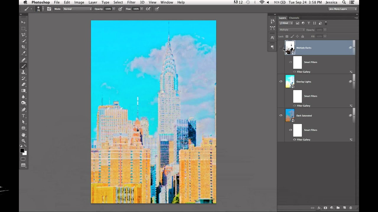
Client asks for something “painterly.” You stare at the Artistic submenu in the Filter Gallery, slap a Watercolor filter on a photo, and the result looks like a kindergarten project that got rained on. We’ve all been there. The problem isn’t the filter itself — it’s the approach. Dropping a single filter on a flat image is like seasoning food after it’s already on the plate. You need to build the effect into the image from the ground up.
In this KelbyOne tutorial featuring Pete Collins from Photoshop User TV, Pete walks through a genuinely clever workflow that uses HDR Toning — not to make something look like an HDR photo — but as a pre-processing tool to give a cityscape image the color depth and tonal drama that makes a watercolor effect actually convincing. Watch the full tutorial on YouTube — but if you want to follow along step by step, here’s the full breakdown.
The technique layers multiple versions of the same image, each processed differently through HDR Toning, then runs them through the Filter Gallery as Smart Filters. The result is something that looks hand-painted rather than filtered. That distinction matters a lot when a client can tell the difference.
Step 1: Apply HDR Toning to Create a Dark, Saturated Version
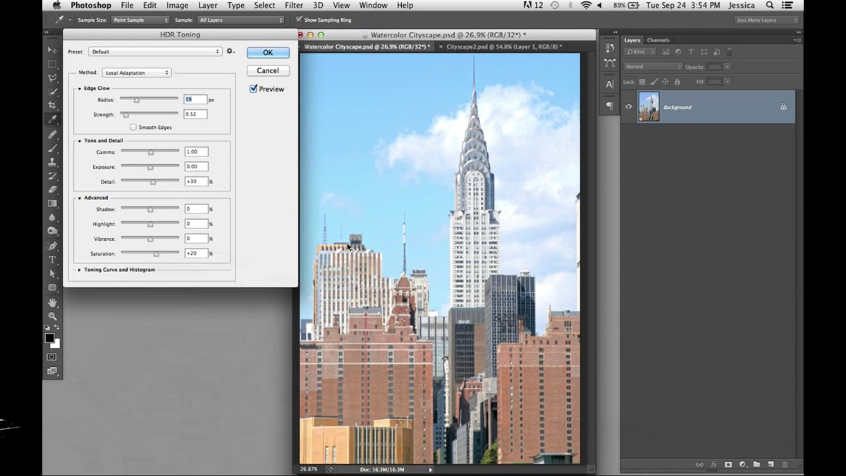 HDR Toning dialog open with saturated preset selected
Start with your base image — Pete uses a stock photo of Manhattan skyscrapers, and any urban cityscape with strong vertical lines and contrast will work well here. Go to Image > Adjustments > HDR Toning. Choose the Saturated preset as your starting point.
HDR Toning dialog open with saturated preset selected
Start with your base image — Pete uses a stock photo of Manhattan skyscrapers, and any urban cityscape with strong vertical lines and contrast will work well here. Go to Image > Adjustments > HDR Toning. Choose the Saturated preset as your starting point.
From there, pull the Shadows down, pull the Highlights down, and push Saturation and Vibrance all the way up. Increase the Radius for the glow effect, but keep the Strength low. Then adjust the Gamma to make this version noticeably dark and heavy. The goal is a moody, oversaturated, almost oppressive version of the image. Don’t worry that it looks weird — it’s a layer, not the final product. Save it as a separate file.
Step 2: Create a Second, Lighter HDR Version
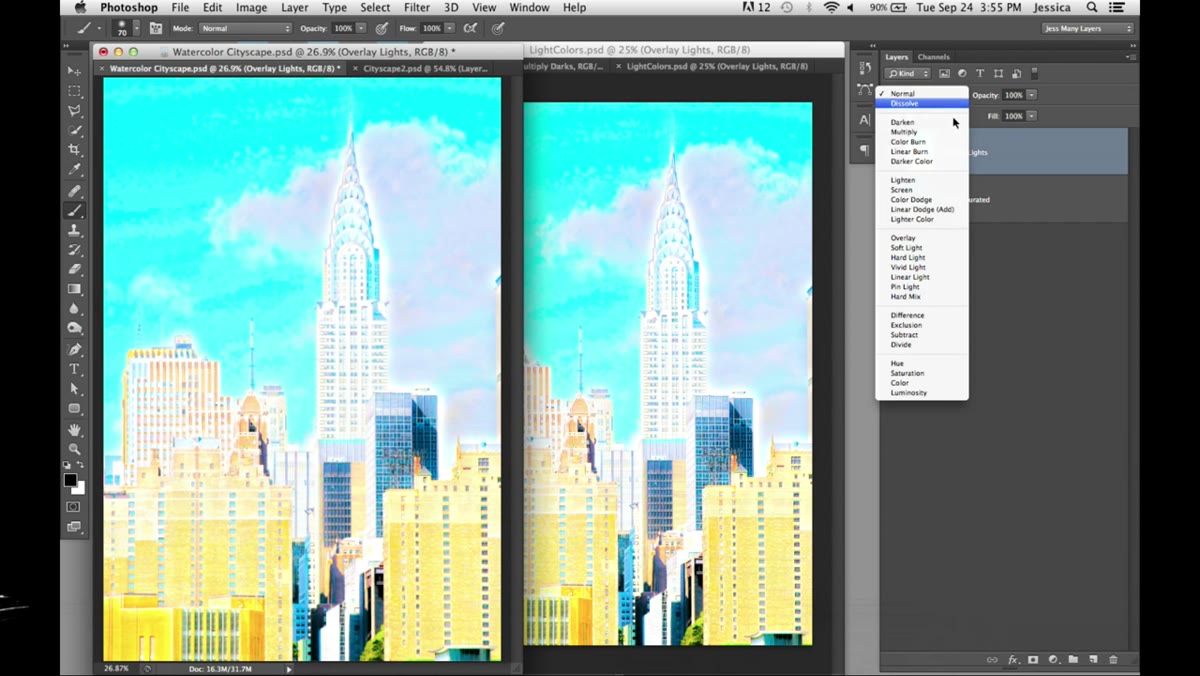 Second HDR-processed image opened, lighter tones visible
Go back to your original stock image and run Image > Adjustments > HDR Toning again, this time pulling the settings in the opposite direction — lighter, less crushed shadows, a brighter overall feel. Think of this as the highlight layer that will sit on top of your dark version and add air to the composition.
Second HDR-processed image opened, lighter tones visible
Go back to your original stock image and run Image > Adjustments > HDR Toning again, this time pulling the settings in the opposite direction — lighter, less crushed shadows, a brighter overall feel. Think of this as the highlight layer that will sit on top of your dark version and add air to the composition.
Save this as another separate file. You now have two distinct HDR-processed versions of the same photo: one dark and saturated, one light. This is the foundation of why the final effect has depth — you’re essentially building a tonal range across layers rather than trying to get it all from one image.
Step 3: Create a Third Version with Stark, High-Contrast Outlines
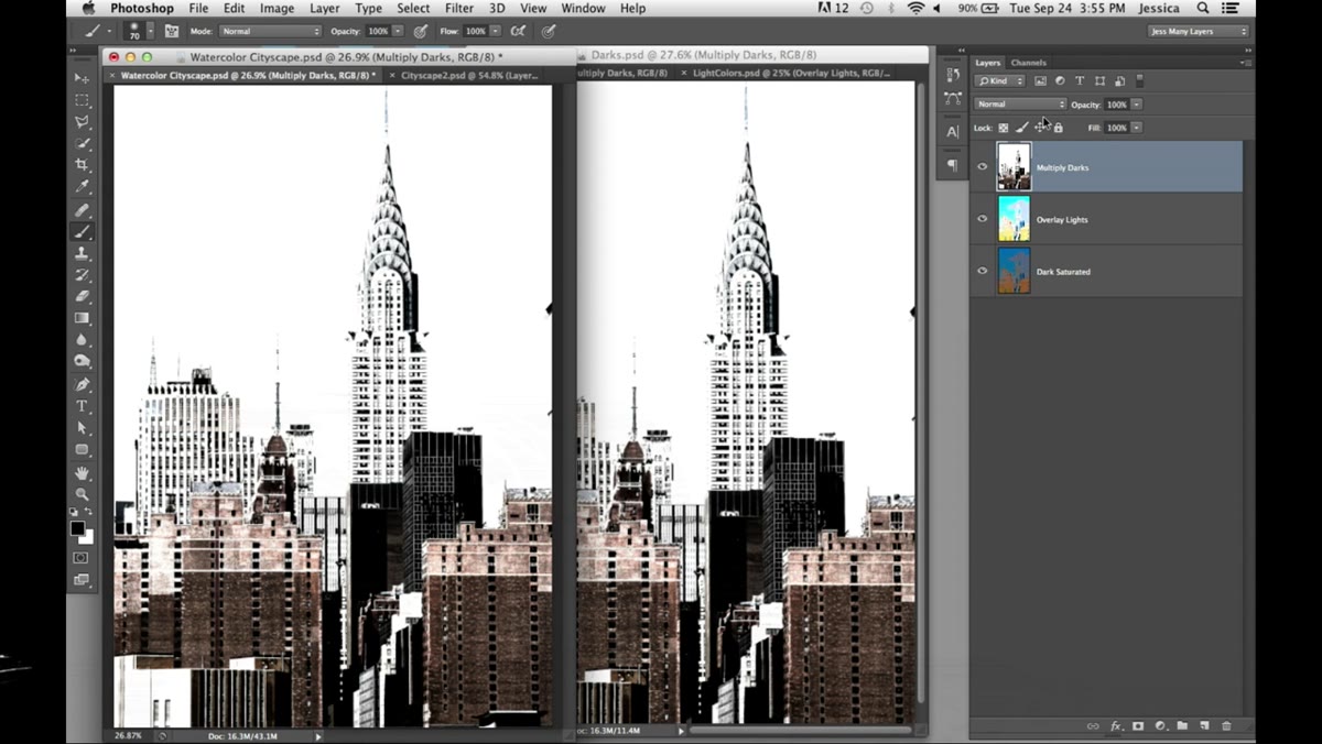 High-contrast HDR version with defined edges and structure
Run HDR Toning one more time on the original, but this time push for something stark and graphic — strong outlines, heavy contrast, less concern about color. This version is going to sit on a Multiply blend mode, so it’s mostly there to add edge definition and structure, the kind of thing that makes a watercolor look drawn rather than smudged.
High-contrast HDR version with defined edges and structure
Run HDR Toning one more time on the original, but this time push for something stark and graphic — strong outlines, heavy contrast, less concern about color. This version is going to sit on a Multiply blend mode, so it’s mostly there to add edge definition and structure, the kind of thing that makes a watercolor look drawn rather than smudged.
Save this as your third file. Now open all three in Photoshop and stack them as layers in one document: dark saturated version at the bottom, lighter version in the middle set to Overlay blend mode, stark outline version on top set to Multiply.
Step 4: Convert Every Layer to a Smart Object
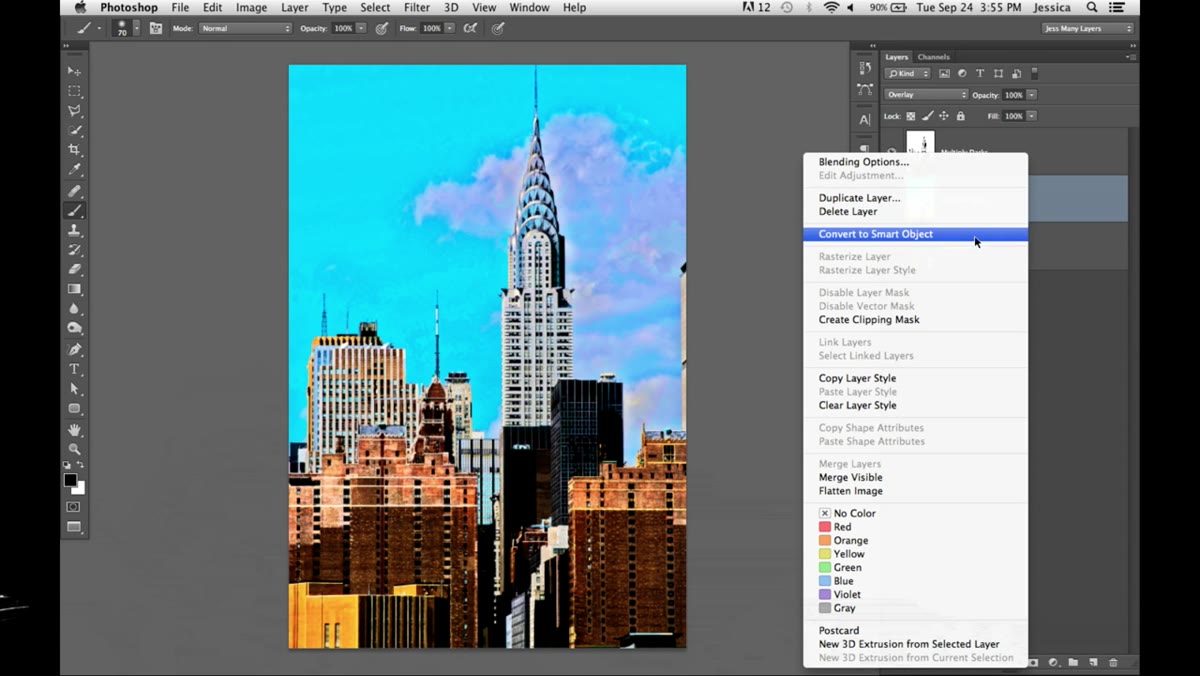 Right-click context menu showing Convert to Smart Object option
Here’s the move that makes everything else forgiving. Right-click on each layer and choose Convert to Smart Object. Do this for all three layers before you touch the Filter Gallery.
Right-click context menu showing Convert to Smart Object option
Here’s the move that makes everything else forgiving. Right-click on each layer and choose Convert to Smart Object. Do this for all three layers before you touch the Filter Gallery.
The reason is simple: any filter you apply to a Smart Object becomes a Smart Filter, which means it’s non-destructive and fully editable after the fact. I learned this the hard way early in my career when I flattened a file I thought was done, realized the effect wasn’t right, and had to rebuild everything from scratch. Smart Objects are the undo button that actually works across sessions.
Step 5: Apply the Filter Gallery to the Base Layer
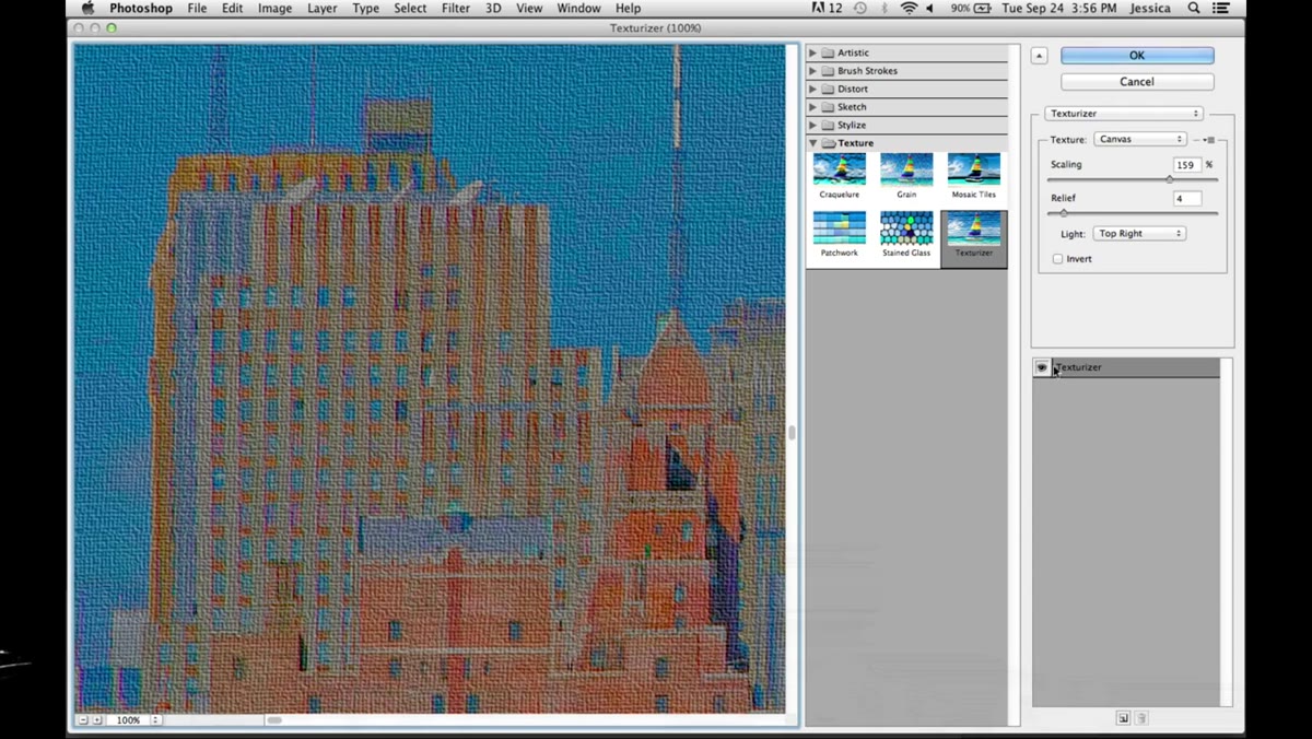 Filter Gallery open with Watercolor filter applied to base layer
Turn off the top two layers so you’re only looking at the dark saturated base. Go to Filter > Filter Gallery, navigate to the Artistic category, and choose Watercolor. Pull the Brush Detail down and reduce the Shadow Intensity so it doesn’t get muddy and blocked up.
Filter Gallery open with Watercolor filter applied to base layer
Turn off the top two layers so you’re only looking at the dark saturated base. Go to Filter > Filter Gallery, navigate to the Artistic category, and choose Watercolor. Pull the Brush Detail down and reduce the Shadow Intensity so it doesn’t get muddy and blocked up.
Here’s the part most people skip: inside the Filter Gallery, you can stack multiple effects on the same layer. Click the new effect layer icon at the bottom of the panel (it looks like a page icon) and add a second filter — Pete uses Rough Pastels from the Texture category on top of the Watercolor effect. This combination gives you the watercolor wash underneath with some rougher texture sitting on top, which is much more convincing than either filter alone.
Step 6: Copy the Filter Stack to the Other Layers
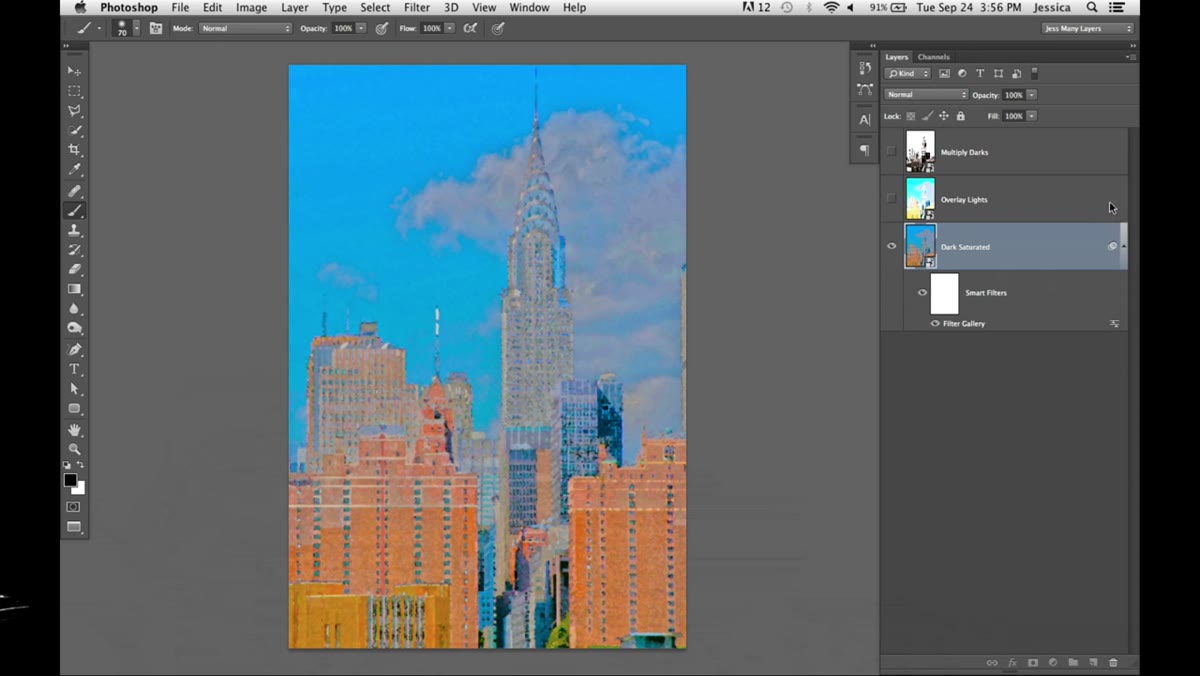 Alt-dragging Smart Filter stack from one layer to another
Once you’re happy with the Filter Gallery stack on your base layer, Option-drag (Alt on PC) the Smart Filters label from that layer onto each of your other Smart Object layers. This copies the entire filter stack — both effects, same settings — across all three layers instantly.
Alt-dragging Smart Filter stack from one layer to another
Once you’re happy with the Filter Gallery stack on your base layer, Option-drag (Alt on PC) the Smart Filters label from that layer onto each of your other Smart Object layers. This copies the entire filter stack — both effects, same settings — across all three layers instantly.
The layers will each interpret the same filters differently based on their own tonal content, which is exactly what you want. The Multiply outline layer will look different running through Watercolor and Rough Pastels than the light Overlay layer will, and that variation is what makes the composite feel organic rather than formulaic.
Step 7: Tweak Individual Layers as Needed
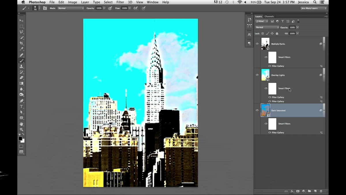 Filter Gallery reopened to adjust settings on individual layer
Because everything is a Smart Filter, you can click on the Filter Gallery entry under any layer and re-open the settings to adjust them independently. If the outline layer is too heavy or the light overlay layer looks washed out, just double-click and tune it.
Filter Gallery reopened to adjust settings on individual layer
Because everything is a Smart Filter, you can click on the Filter Gallery entry under any layer and re-open the settings to adjust them independently. If the outline layer is too heavy or the light overlay layer looks washed out, just double-click and tune it.
This is the part of the workflow I genuinely wish I’d known years ago. Non-destructive editing isn’t just a safety net — it actually changes how you work, because you stop second-guessing every decision and just keep moving.
My Take: Try This on Architectural Shots, Not Just Cityscapes
I’ve used a variation of this technique on single-building architectural shots for a client who wanted a “hand-rendered” look for a real estate development brochure. The HDR pre-processing works especially well on images with a lot of geometric detail because the Watercolor filter has something to interact with at the edges. On soft, organic subjects like portraits or nature shots, you get less definition and the result tends to feel more like a blur than a painting. Stick to subjects with structure and strong lines, at least while you’re learning the technique.
The single most important insight in Pete’s tutorial is this: filters work on what’s already in the image. If your image is flat and boring before you open the Filter Gallery, the filter output will be flat and boring too. The HDR pre-processing step is doing heavy lifting that the filter alone could never do. Build interesting source material, and the effects have something to amplify.
Watch the full tutorial on YouTube to see Pete walk through the settings in real time — some of the tonal judgment calls are easier to follow visually than in text.
Comments
Leave a Comment