Client sends you a photo. Good composition, decent light, and somehow it looks like it was taken through a dirty window. You know the colors should be vibrant, but everything is sitting flat on the canvas like it’s given up on life. I’ve been there more times than I want to count, usually at 11pm in whatever coffee shop hasn’t kicked me out yet.
That used to mean me throwing a Vibrance adjustment at the whole image, watching it look weird, undoing it, and repeating that cycle until I either fixed it or just accepted the mediocrity. Then I watched this tutorial from Kelvin Designs on making colors pop, and it genuinely tightened up how I approach these situations.
The core insight here is one that sounds obvious once someone says it out loud: global adjustments are almost always the wrong move. Cranking Vibrance or Saturation across the whole image lifts everything equally, including the stuff you don’t want lifted. Skin tones go weird. Backgrounds compete with subjects. You get loud instead of dramatic. What you actually want is selective, local control, and that’s exactly what this tutorial teaches.
Why Local Adjustments Beat Global Ones Every Time
The technique Kelvin walks through is built around isolating specific parts of the image and treating them independently. Rather than applying one adjustment layer and hoping for the best, you’re making targeted decisions about which areas need more saturation, which need more contrast, and which should stay relatively neutral to let the hero elements breathe.
This is how commercial work actually gets made. The reason product photos on e-commerce sites look so punchy is not because someone slapped a filter on them. It’s because someone spent time making the product itself vibrant while keeping the background controlled. Same logic applies here.
How to Select and Isolate Your Areas
The practical workflow starts with building a selection around the area you want to enhance. In the tutorial, Kelvin uses the selection tools to isolate specific regions, and the key move is feathering that selection so the adjustments blend naturally rather than creating a hard edge that screams “edited in Photoshop.”
Once you have your selection active, you add an adjustment layer (Hue/Saturation is the main player here) and it automatically masks itself to your selection. From there, you’re pushing Saturation up on the target area, somewhere in the range of 20 to 40 points depending on the starting image, while leaving the rest of the photo untouched.
The masking step is where most beginners bail, because it feels fiddly. But the mask is what separates a professional result from something that looks like a Instagram filter. Spend the extra 90 seconds on the feathering.
Contrast Is Doing More Work Than You Think
Here’s the part I almost skimmed past: Kelvin also applies localized contrast adjustments, not just saturation. He uses Curves to add a subtle S-curve to the same masked region. This is doing two things at once. It deepens the shadows slightly, which makes the colors feel richer without actually changing the hue. And it lifts the highlights just enough to create that sense of the image having internal light.
Saturation alone can make colors look garish. Contrast alone can make them look gritty. The combination, applied locally, is what makes them look alive. Think of it like seasoning food. Salt does a thing. Acid does a different thing. Together they make everything taste more like itself.
The S-curve doesn’t need to be aggressive. Small moves on Curves go a long way. If you’re dragging the curve to extreme positions, you’ve gone too far.
Where This Technique Has Limits
I’ll be honest about where I’ve run into trouble with this approach. It works beautifully on images with distinct subject-background separation, where you can build a clean selection without too much edge complexity. When I’ve tried to apply it to images with a lot of fine detail at the edges, like hair against a textured background, the selection work becomes time-intensive enough that you start questioning your choices.
In those cases, I’ll often combine this technique with a luminosity mask instead of a freehand selection. You’re still applying the same Hue/Saturation and Curves adjustments, but the mask is generated from the tonal values in the image itself, which gives you much cleaner transitions on complex edges. It’s a bit more setup but it pays off when the image has detail everywhere.
The other situation where I’d push back slightly: if the original photo has white balance problems, fix those first. Trying to pop colors on an image with a bad color cast is like trying to polish something that’s fundamentally the wrong shape. Sort the foundation before you get into the enhancement work.
The One Rule Worth Keeping
Make your adjustments locally, not globally, and always let the unaffected areas stay relatively neutral so your enhanced regions actually have somewhere to pop against. Contrast needs context. A color only looks vibrant if something around it is calmer.
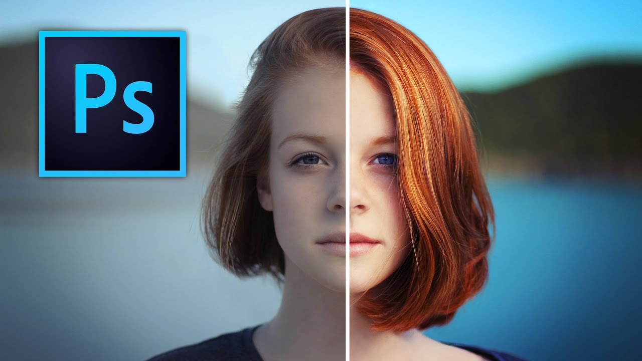
That’s the whole game. The rest is just knowing which tools to reach for, and Kelvin Designs explains the visual side of this far better than any written walkthrough can. Watch the full tutorial to see the actual before/after and get a feel for how much to push each adjustment.
Comments (7)
Finally someone explains this in a way that actually makes sense.
This is going in my reference folder. Incredibly useful.
Really solid breakdown. This pairs perfectly with the photography work I've been writing about.
Never thought of approaching it this way. Really creative.
Bookmarked. Coming back to this one for sure.
This is exactly what I needed today. Been struggling with this for weeks.
Love how you break down complex stuff into manageable steps.
Leave a Comment