There’s a specific kind of frustration that hits when you finish editing a photo and it just looks… fine. Technically correct. Boring. You added some contrast, maybe bumped the saturation, and the result is an image that could have come out of any free Lightroom preset pack. I spent an embarrassing amount of time in that zone early in my freelance career, convinced I was missing some secret tool. Turns out I wasn’t missing a tool. I was missing a plan.
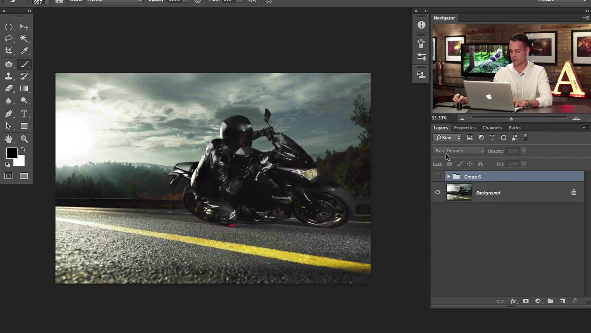
That’s the thing that hit me hardest watching this Aaron Nace tutorial from PHLEARN. Watch the full tutorial on YouTube — the source image is a motorcycle rider shot at high-speed sync with rim lighting cutting the subject out from a dark background. It’s already a solid photo. What Aaron does with it in the editing process is where the real education starts. This is Part 1 of a two-parter, and it covers color toning and luminosity-based blending, which honestly could each be their own full tutorial. Let me walk you through what’s happening and why it works.
Step 1: Start With a Plan Before You Touch a Single Slider
 Aaron annotating the image with edit goals before starting
Before Aaron opens a single panel, he spends a minute looking at the image and talking through what it needs. He identifies three things: a split tone color grade, better subject separation in the shadows, and atmospheric effects like rain and fog to sell the motion. That’s it. Three goals, written down mentally before a single adjustment is made.
Aaron annotating the image with edit goals before starting
Before Aaron opens a single panel, he spends a minute looking at the image and talking through what it needs. He identifies three things: a split tone color grade, better subject separation in the shadows, and atmospheric effects like rain and fog to sell the motion. That’s it. Three goals, written down mentally before a single adjustment is made.
I know, I know. You want to skip this part. I always want to skip this part. But the number of times I’ve gotten 45 minutes into an edit and completely lost the thread because I had no original direction… it’s a lot. Even a rough mental checklist changes how you edit. You stop chasing and start building.
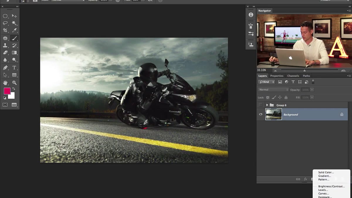
Step 2: Add a Solid Color Adjustment Layer for Your Shadow Tone
 Solid Color adjustment layer dialog open with blue-green selected
Go to the Adjustments panel and add a Solid Color layer. Aaron picks a blue-green, something in the teal family, as his shadow color. The exact hex isn’t the point here. What matters is the principle: you’re choosing a color that will live in the dark areas of the image. Think of films like Drive or any modern action movie. That teal-in-the-shadows, orange-in-the-highlights look has become a cinematic shorthand for “this is serious and cool.”
Solid Color adjustment layer dialog open with blue-green selected
Go to the Adjustments panel and add a Solid Color layer. Aaron picks a blue-green, something in the teal family, as his shadow color. The exact hex isn’t the point here. What matters is the principle: you’re choosing a color that will live in the dark areas of the image. Think of films like Drive or any modern action movie. That teal-in-the-shadows, orange-in-the-highlights look has become a cinematic shorthand for “this is serious and cool.”
Once you’ve picked your color and hit OK, change the blending mode of that solid color layer from Normal to Color. The whole image goes that hue immediately. Don’t panic. This is just the starting point.
Step 3: Use Blend If to Lock the Color Into the Shadows Only
 Layer Style dialog open showing Blend If sliders on Underlying Layer
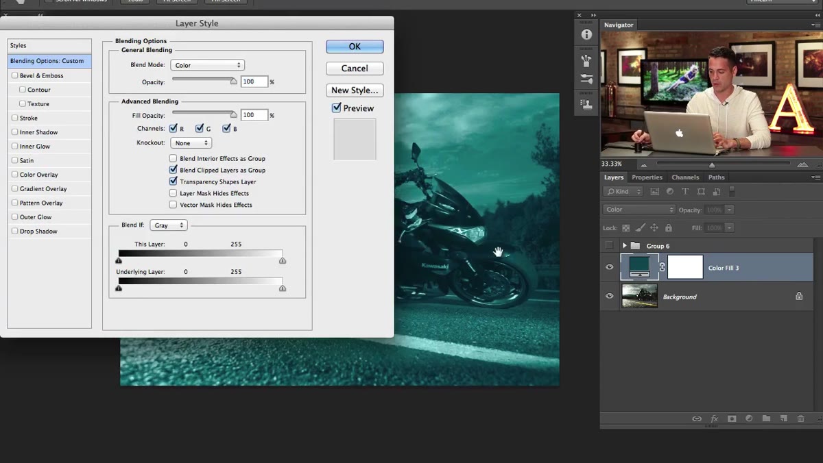
Here’s where it gets interesting. Double-click in the empty space next to the layer name (not on the thumbnail) to open Layer Style. Scroll down to the Blend If section. You’ll see two gradient bars: “This Layer” and “Underlying Layer.” You want the Underlying Layer bar.
Layer Style dialog open showing Blend If sliders on Underlying Layer
Here’s where it gets interesting. Double-click in the empty space next to the layer name (not on the thumbnail) to open Layer Style. Scroll down to the Blend If section. You’ll see two gradient bars: “This Layer” and “Underlying Layer.” You want the Underlying Layer bar.
The right-side white handle controls where the effect fades out in the highlights. Hold Alt (Option on Mac) and drag that white handle to the left. Holding Alt splits the handle in two, which creates a gradual transition instead of a hard cutoff. Drag until the teal color is only visible in the shadows and dark midtones of the image. The highlights should look mostly unaffected. This is luminosity-based blending, and it’s one of those techniques that once you actually understand it, you start seeing uses for it everywhere.
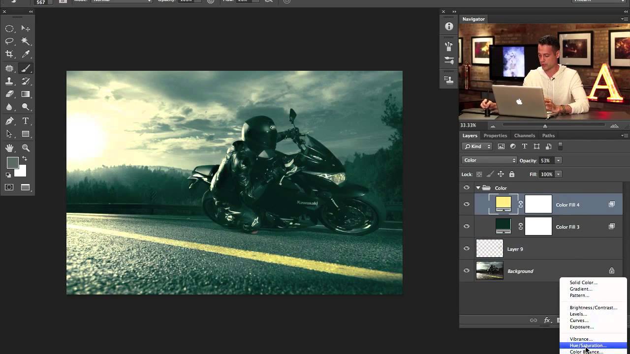
Step 4: Add a Second Solid Color Layer for the Highlights
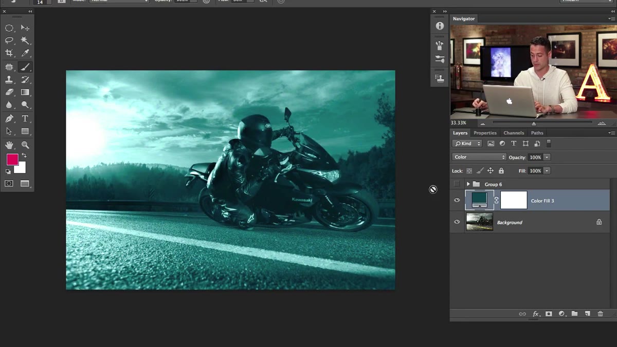 Two solid color layers visible in Layers panel, blend modes set to Color
Repeat the solid color process, but this time pick an orange or warm yellow. This is your highlight tone. Set it to Color blend mode again. Now go back into Layer Style and Blend If, but this time you’re working the left handle of the Underlying Layer bar. Hold Alt and drag it to the right so the warm color only appears in the brighter areas of the image.
Two solid color layers visible in Layers panel, blend modes set to Color
Repeat the solid color process, but this time pick an orange or warm yellow. This is your highlight tone. Set it to Color blend mode again. Now go back into Layer Style and Blend If, but this time you’re working the left handle of the Underlying Layer bar. Hold Alt and drag it to the right so the warm color only appears in the brighter areas of the image.
What you should have now is teal shadows and orange highlights living on separate layers, each constrained by luminosity to their respective tonal ranges. The image should start reading as cinematic rather than just “a photo.” If it looks overdone, lower the opacity on either layer until it feels like a color grade and not a Halloween filter.
Step 5: Evaluate Subject Separation Before Moving On
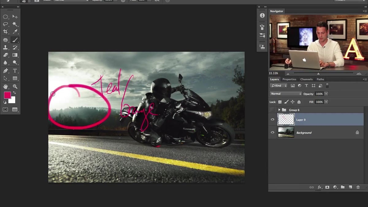 Original image showing lack of detail separation on front of motorcycle
Aaron pauses here to look at the front of the motorcycle and notice something specific: the shadow area on the front of the bike bleeds into the dark background. There’s no visual separation. The rim lighting on the back of the rider works great, but the front is muddy.
Original image showing lack of detail separation on front of motorcycle
Aaron pauses here to look at the front of the motorcycle and notice something specific: the shadow area on the front of the bike bleeds into the dark background. There’s no visual separation. The rim lighting on the back of the rider works great, but the front is muddy.
This is the kind of thing you only catch when you stop and look at the image with fresh eyes after a significant change like color grading. The new color tone makes the problem more visible. That’s actually one of the functional benefits of doing your color grade early rather than last, it surfaces problems you might not see in a neutral, flat image. Aaron flags this for Part 2, where atmosphere and lighting adjustments will address it. But naming the problem now means the solution is intentional rather than accidental.
My Take: The Color-First Workflow Is Underrated
I used to do color grading last. It was always my final step, like seasoning a dish after it was already plated. The problem is that every other decision I made during the edit, dodging, burning, sharpening, compositing, was made against a neutral tone that didn’t reflect the final image. Then I’d add the color grade at the end and suddenly everything looked wrong.
Flipping the order, doing a rough color grade early as a kind of creative anchor, changed how my edits held together. It’s not about getting the grade perfect on the first pass. It’s about making sure every subsequent decision is informed by the actual mood you’re going for. I learned this the hard way on a motorsports composite for a local racing client where the final grade completely killed the edge detail I’d spent hours on. If I’d graded first, I’d have dodged those edges differently from the start.
The biggest thing to take away from Part 1 is this: Blend If is not a scary advanced feature. It’s just luminosity masking with a friendlier interface, and the Alt-drag split handle trick is one of those ten-second moves that makes your work look ten times more controlled. Combined with a deliberate split tone built from Solid Color layers, you have a non-destructive, fully adjustable color grade that sits cleanly on top of your image without touching a single pixel.
Watch the full tutorial on YouTube to see Aaron work through the image in real time. Part 2 covers rain, fog, and atmosphere, which is where this edit goes from solid to genuinely impressive.
Comments
Leave a Comment