There’s a specific kind of project that lives in my head rent-free until I figure out how to pull it off. Pop art splatter portraits are one of them. You know the ones: bold colors, ink-splash edges, comic-book energy. I kept seeing them in branding work and concert posters and telling myself I’d reverse-engineer one eventually. “Eventually” kept getting pushed back because, honestly, I wasn’t sure where to even start.
Then I found this Aaron Nace tutorial from PHLEARN, and it clicked. Watch the full tutorial on YouTube — it’s Part 1 of a two-part series, and this first half is all groundwork: cutting the subject out cleanly and building a custom splatter brush you’ll use in Part 2. It sounds unglamorous, but the quality of everything that comes later lives or dies here. Garbage selection in, garbage composite out. I’ve learned that the expensive way.
What I like about Aaron’s approach is that he doesn’t skip the unsexy parts. He walks through the Pen Tool with the patience of someone who actually remembers not knowing how to use it, and he sets up the custom brush workflow in a way that makes Part 2 feel like payoff rather than confusion. Here’s how to follow along.
Step 1: Open Your Image and Head to the Pen Tool
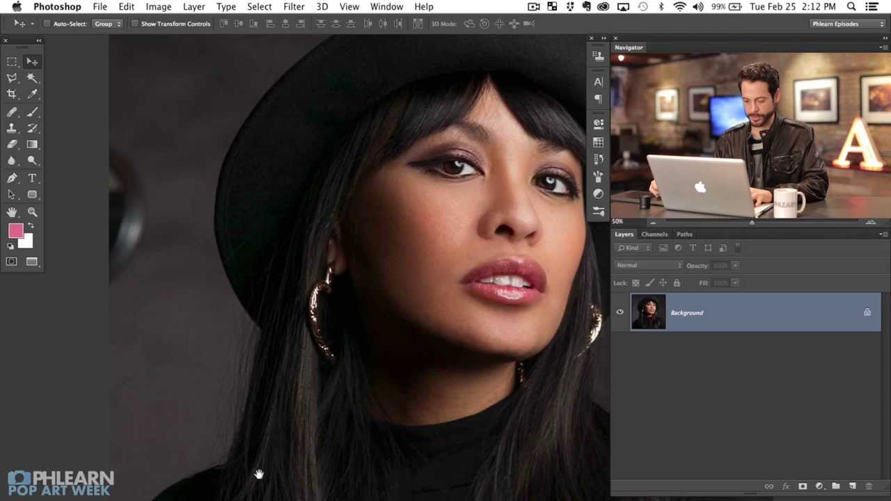
 Pressing P to activate Pen Tool on portrait
Hit P to grab the Pen Tool. Before you do anything else, look at your Layers panel and find the Paths tab sitting right next to it. This is important: the Pen Tool doesn’t create pixel selections directly. It creates paths, which live in that Paths tab. A lot of people miss this and then panic when nothing shows up in their layers. The paths are there, just in a different tab.
Aaron is working with a portrait of a woman named Cat, shot against a relatively simple background. The subject has some flyaway hair, which he openly decides not to stress about. That’s the right call for this style. The pop art aesthetic actually forgives a lot of edge roughness because the splatters and colors do the heavy lifting visually.
Step 2: Place Your First Anchor Point and Learn the Click-and-Drag
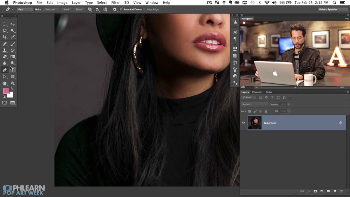
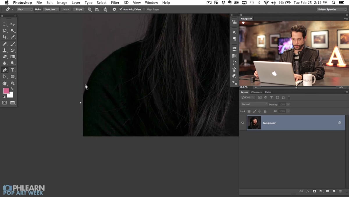 First pen tool anchor point placed on shoulder edge
Click once to place a straight anchor point. Then, at your next point, click and hold, then drag before releasing. That drag is everything. It pulls out two “handles” from the anchor point, which control the curve of the path segment leading into and out of that point. The further you drag, the more pronounced the curve. This is how you trace a shoulder, a jaw, the arc of a hat brim, without the path looking like a Connect Four board.
It takes about ten minutes to stop feeling weird and another ten to start feeling genuinely useful. The payoff is a level of precision you cannot get from the Lasso Tool or even Quick Select on a detailed subject. For anything with clean, defined edges – clothing, solid shapes, studio shots – the Pen Tool is worth every minute of the learning curve.
Step 3: Use Alt/Option to Break the Curve Handle
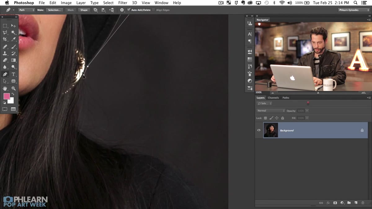 Alt-clicking anchor point to redirect path direction
Here’s where most beginners get stuck. When you place a curved point, both handles move together symmetrically. That works great on smooth, flowing shapes. But when you hit a corner – like the point of a collar or the edge of a hat brim – that symmetry fights you. The path curves in a direction you don’t want.
The fix: hold Alt (Windows) or Option (Mac) and click directly on the anchor point you just placed. This breaks the handles apart so you can redirect just one of them. Think of it as telling Photoshop: “okay, I was curving that way, but the next segment is going a completely different direction.” Aaron uses this constantly as he works around the subject’s hat. Once you know it exists, you’ll use it on almost every path you ever draw.
Step 4: Adjust Existing Points with the Command/Ctrl Key
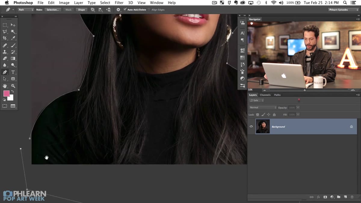 Command key held to reposition an existing anchor handle
You don’t have to get every point perfect on the first click. While you’re still in the middle of drawing a path, hold Command (Mac) or Ctrl (Windows) and you temporarily switch to the Direct Selection Tool. This lets you grab any existing anchor point or handle and move it without losing your place in the path.
This is a huge deal for workflow speed. Instead of finishing a path and then going back to fix it, you can correct as you go. Aaron does this naturally throughout the demo – places a point, sees it’s slightly off, holds Command, adjusts, keeps moving. It turns what feels like a rigid, commit-heavy process into something much more forgiving.
Step 5: Close the Path and Convert to a Selection
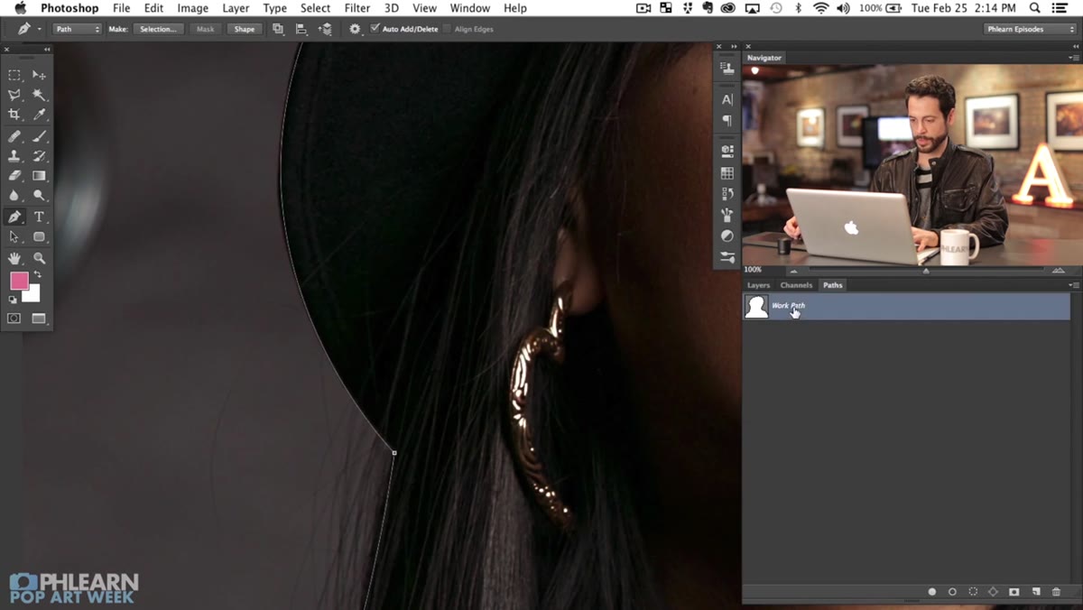 Closing path back to starting point on subject
Once you’ve traced all the way around your subject, close the path by clicking back on your original anchor point. A small circle appears near your cursor when you’re hovering over that first point – that’s Photoshop confirming it’ll close the shape. Click it.
Now go to your Paths panel, right-click your Work Path, and choose “Make Selection.” You can set the feathering to 0 for a crisp edge – which is what you want here since the pop art look doesn’t need soft, blended edges. This converts your careful path work into a selection you can use to mask or cut the subject from the background.
Step 6: Prep the Splatter Images for a Custom Brush
 Aaron referencing splatter assets to be used for brush creation
The back half of this tutorial shifts gears entirely. Aaron introduces actual ink splatter images – high-contrast, black on white – that he’s going to convert into a custom Photoshop brush. The principle is simple: Photoshop can turn any grayscale shape into a brush tip. Dark areas become the brush, white areas become transparent.
To do this yourself, open a splatter image, go to Edit > Define Brush Preset, name it, and it lives in your brush library from then on. The quality of the splatter source image matters a lot here. You want strong contrast, clean blacks, and interesting organic shapes. Aaron’s examples have that chaotic, ink-thrown-at-paper quality that gives the final portrait its energy.
One Thing I’d Add From My Own Experience
Custom brushes are fantastic until you have twelve of them that all look basically the same and you can’t tell them apart by the tiny thumbnail. Before you save any brush, rename it something descriptive – “splatter-large-asymmetric” beats “Brush 47” when you’re three projects deep and trying to remember what you made. I also keep a single PSD file with all my custom brush previews rendered out at a visible size so I can actually compare them. Fifteen minutes of organization saves a lot of squinting later.
The core lesson from this whole first part is that the Pen Tool rewards patience. It’s slower than a lasso drag, yes. But it gives you a path you can re-edit, a selection you can refine, and edges that hold up when you start layering pop art effects on top of them. Sloppy selections fall apart fast when you start adding bold, graphic elements – the roughness becomes obvious in a way it never would in a subtler composite.
Do yourself a favor and sit down with a practice image before you try this on a real project. Thirty minutes of deliberate Pen Tool practice will change how you work. Watch the full tutorial on YouTube and follow along with Aaron – he explains it better with live screen movement than any screenshot walkthrough can fully capture.
Comments (2)
Quality content like this is rare. Keep it up.
This is fantastic. I've been recommending this approach to my readers too.
Leave a Comment