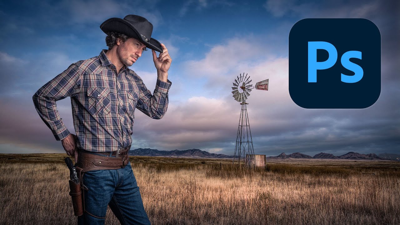
I’ve built composites that looked incredible at 50% zoom and completely fell apart the moment a client opened them on a decent monitor. The subject sitting on top of the background like a cardboard cutout someone forgot to integrate. Colors from two different universes. Edge fringing that screams “I copy-pasted this.” It’s a specific kind of embarrassment, and it never gets less annoying.
That’s exactly why I kept coming back to this tutorial. In this Kelvin Designs walkthrough, creator Kelvin works through a full cowboy composite from scratch, and the thing that makes it worth your time is the sequencing. It’s not just “here’s how to cut someone out.” It’s extraction, then color matching, then creative unification. Three phases, each one building on the last. That structure alone is worth stealing.
Getting a Clean Extraction Without Losing the Details That Matter
The first phase is subject extraction, and Kelvin doesn’t cut corners here. He uses Select Subject as a starting point, which is fine, but the real work happens in Select and Mask. This is where most people rush and most composites fail.
Inside Select and Mask, he works with the Refine Edge Brush to recover detail along the edges that matter most, specifically hair and any fine texture at the boundary of the subject. The key move is painting along those problem edges with the Refine Edge Brush rather than trying to manually paint a perfect mask. Photoshop does the heavy lifting of analyzing what’s hair and what’s background. You’re just pointing it at the right areas.
He outputs to a Layer Mask rather than a new layer, which keeps the original pixel data intact. Smart. If your mask needs fixing later, you still have something to work with.
One setting worth paying attention to: Decontaminate Colors inside Select and Mask. This removes the color spill from the original background that tends to bleed into the edges of your subject. On a cowboy shot with a bright sky background, this matters a lot. Without it, you get a subtle halo that your brain notices even when you can’t name it.
Matching Colors So the Subject Doesn’t Look Like a Stranger in the Scene
Once the extraction is solid, the composite still looks fake. That’s normal. The subject was shot under different lighting than the background, and the camera sensors didn’t match. Color matching is what closes that gap.
Kelvin uses a combination of adjustment layers clipped to the subject to bring the two images into alignment. The main tools here are Curves and Color Balance. With Curves, he’s not just adjusting brightness. He’s working the individual RGB channels to shift the color temperature of the subject toward the background’s tones. If the background skews warm and golden, the subject’s shadows need a little warmth pushed in. The highlights might need a slight desaturation to match.
Color Balance handles the midtones in a way that feels more intuitive for this kind of work. Pushing the midtones slightly toward the background’s dominant color is often the move that makes everything click. It doesn’t take much. A value of 5-10 on the relevant channel is usually enough to stop the eye from noticing the seam.
The clip-to-layer approach is important here. You want these adjustments affecting only the subject, not the whole canvas. Alt-click (Option-click on Mac) between the adjustment layer and the subject layer to clip it.
The Creative Pass: Making It Feel Like One Image
This is the phase most tutorials skip and the reason most composites still look like composites even after solid technical work. Kelvin calls it the creative adjustments phase, and it’s where global changes pull everything together.
He adds a Color Lookup adjustment layer over the whole image, not clipped to anything. This applies a single color grade to the entire scene, which forces the subject and background to share the same tonal palette. It’s the visual equivalent of putting two things under the same light source. Suddenly they belong together.
He also uses a Photo Filter layer to push a warming tone across the whole image, which reinforces the outdoor, golden-hour feel of the background. This is a subtle move but it earns its keep. When both the subject and the background are being shifted by the same filter, the eye stops looking for differences and starts reading the scene as a unified thing.
Vignetting comes in at the end, a soft darkening around the edges that draws attention to the center and adds a sense of atmosphere. This isn’t a heavy effect. It’s just enough to feel like the image has some depth.
Where I’d Push This Further
The technique as taught works well for hero shots with a clear subject and a relatively clean background. Where it gets complicated is when the background has strong directional lighting and the subject was shot in flat studio light. Color matching can close some of that gap, but it can’t fix physics.
In those situations, I’ll usually add a Multiply-blended layer with a painted shadow in roughly the direction of the background’s light source. Even a soft, low-opacity brush stroke can sell the illusion that the subject is actually standing in the scene rather than hovering above it. It’s not in this tutorial, but it’s the natural next step once you’ve got the color workflow down.
The One Thing to Take Away
If your composites look fake, it’s almost never the extraction. It’s the lack of a unifying color pass at the end. Get the global grade happening across the whole image, and half your problems disappear.
Watch the full Kelvin Designs tutorial for the visual walkthrough, especially the Select and Mask section, where seeing his brush strokes in real time is worth more than any written description.
Comments
Leave a Comment