I spend a lot of time in coffee shops convincing clients that yes, Photoshop’s AI tools are worth learning. And for the most part, I mean it. Generative Fill has genuinely saved me on deadline more than once. But I’ve also quietly regenerated the same selection twelve times, watched it hallucinate something completely unhinged, and pretended that was all part of the plan. So when I came across Watch the full tutorial on YouTube where Matt Kloskowski deliberately pushes Photoshop’s AI into the wall, I felt deeply, personally seen.
Matt is one of those instructors who doesn’t just show you the polished wins. In this tutorial, he methodically tests Generative Fill on the kinds of tasks photographers actually want to do, like dropping a dramatic night sky into a landscape shot or adding a rainbow to a moody mountain scene, and he documents exactly where it falls apart. This isn’t negativity for clicks. It’s genuinely useful because knowing the failure modes saves you from wasting an hour on a dead end. I’ve learned more from watching smart people fail on purpose than from watching perfect demos.
What follows is a breakdown of what Matt tested, what happened, and what you should actually take away from each experiment before you try it yourself.
Step 1: Set Your Expectations Before You Open Generative Fill
 Intro screen with Matt explaining the AI fails concept
Before you touch a selection tool, understand what Generative Fill is actually doing under the hood. It’s generating pixels based on a text prompt and the surrounding context in the image. That context sensitivity is what makes it brilliant for extending backgrounds or removing objects. It’s also what makes it unreliable for highly specific natural phenomena, because it’s interpolating, not simulating physics.
Intro screen with Matt explaining the AI fails concept
Before you touch a selection tool, understand what Generative Fill is actually doing under the hood. It’s generating pixels based on a text prompt and the surrounding context in the image. That context sensitivity is what makes it brilliant for extending backgrounds or removing objects. It’s also what makes it unreliable for highly specific natural phenomena, because it’s interpolating, not simulating physics.
Matt opens with this framing and it’s worth sitting with for a second. If you go in expecting Generative Fill to behave like a search engine for sky textures, you’ll be disappointed. If you think of it as a context-aware painting assistant that sometimes interprets your request like a confused intern, you’ll make smarter choices about when to use it.
Step 2: Test the “Realistic Stars” Prompt and Watch What Happens
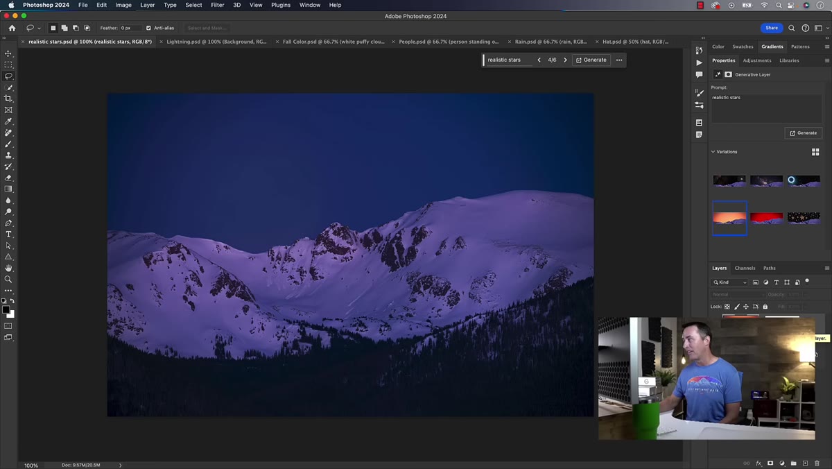 Generative Fill result panel showing three star variations
Matt selects the sky area of a landscape photo and types the prompt “realistic stars” into the Generative Fill bar. Simple, direct, reasonable. The three variations Photoshop returns are, to put it charitably, creative. One variation produces something that resembles a star field the way a tie-dye shirt resembles the night sky. Another is just perplexing.
Generative Fill result panel showing three star variations
Matt selects the sky area of a landscape photo and types the prompt “realistic stars” into the Generative Fill bar. Simple, direct, reasonable. The three variations Photoshop returns are, to put it charitably, creative. One variation produces something that resembles a star field the way a tie-dye shirt resembles the night sky. Another is just perplexing.
He then refines the prompt to “realistic night sky with stars” and gets slightly better results, though they still suffer from a problem that’s easy to miss until you zoom in: resolution. Generative Fill outputs at a relatively low pixel density, and on a high-resolution landscape image, those generated sky patches look noticeably soft and blurry compared to the sharp detail in the rest of the photo. Even when the content is passable, the quality mismatch is a giveaway.
Step 3: Notice the Pixel Resolution Problem on Large Files
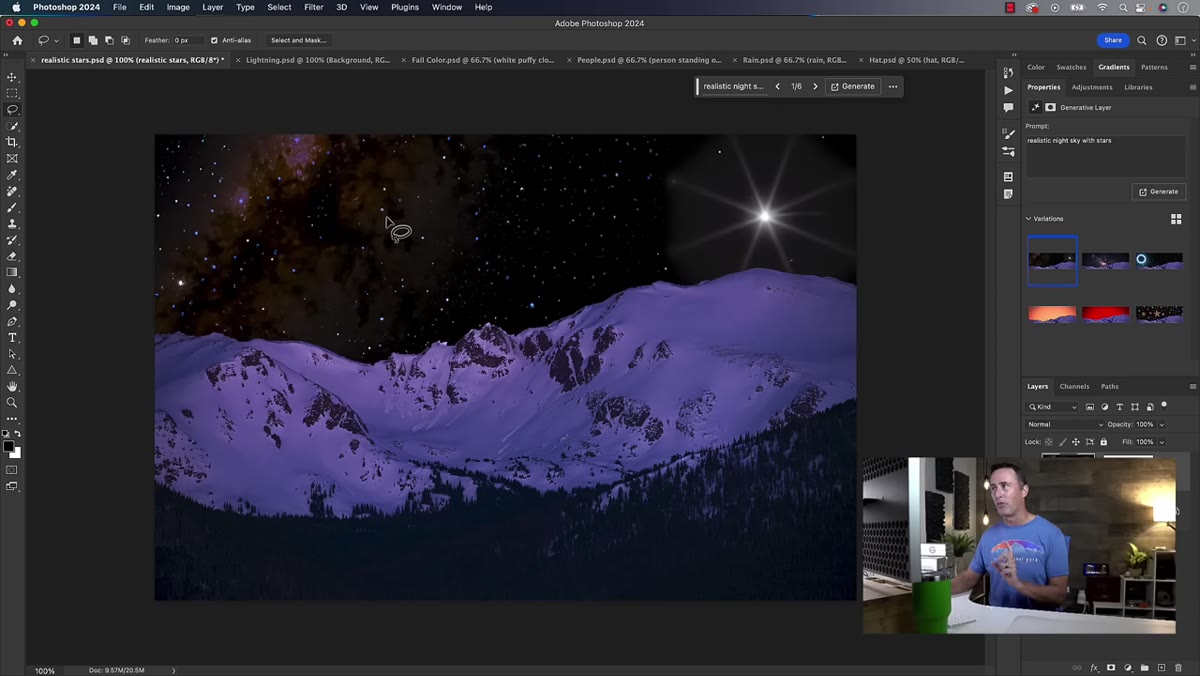 Zoomed-in view showing blurry AI-generated star texture
This is the part that doesn’t get talked about enough. The resolution ceiling on Generative Fill output means it can look fine at web sizes and fall apart at print resolution. Matt points this out specifically, that even the “not bad” variations in his star tests have a blurry, painterly softness that doesn’t match the crisp sensor data in the rest of the image.
Zoomed-in view showing blurry AI-generated star texture
This is the part that doesn’t get talked about enough. The resolution ceiling on Generative Fill output means it can look fine at web sizes and fall apart at print resolution. Matt points this out specifically, that even the “not bad” variations in his star tests have a blurry, painterly softness that doesn’t match the crisp sensor data in the rest of the image.
If you’re working on a file destined for a large print or a high-res delivery, run a quick zoom test before you commit to any generated content. Toggle the layer on and off at 100% and compare the edge quality. If the generated area looks like it was downscaled and upscaled again, that’s your answer. For web or social, you might get away with it. For anything else, this is a real limitation.
Step 4: Try Adding a Rainbow and Brace Yourself
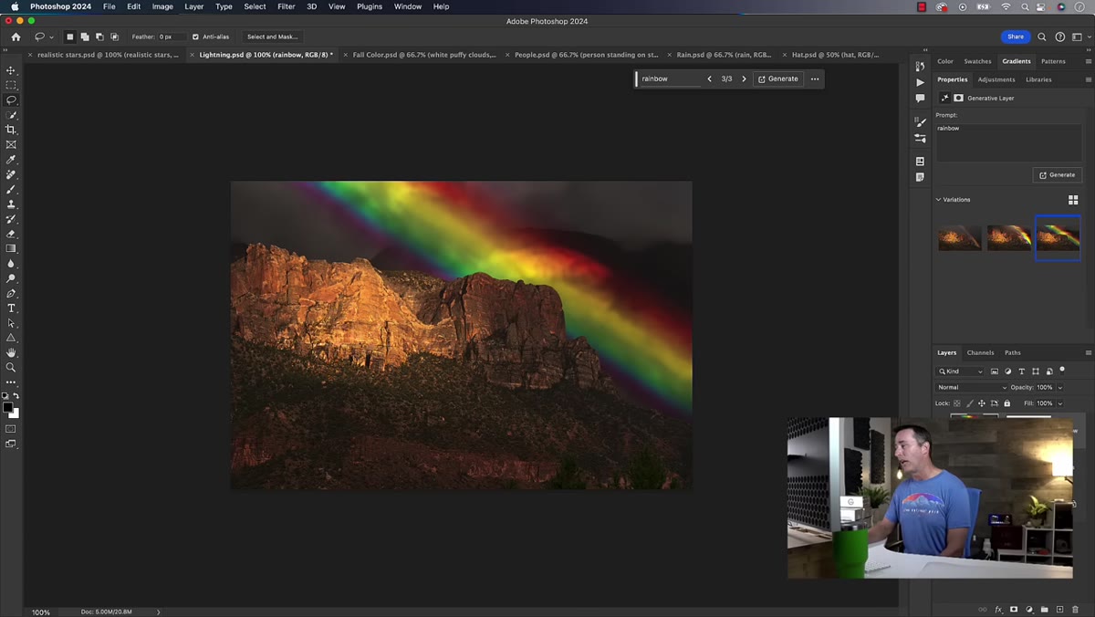
 Three rainbow variations, one replacing the mountain entirely
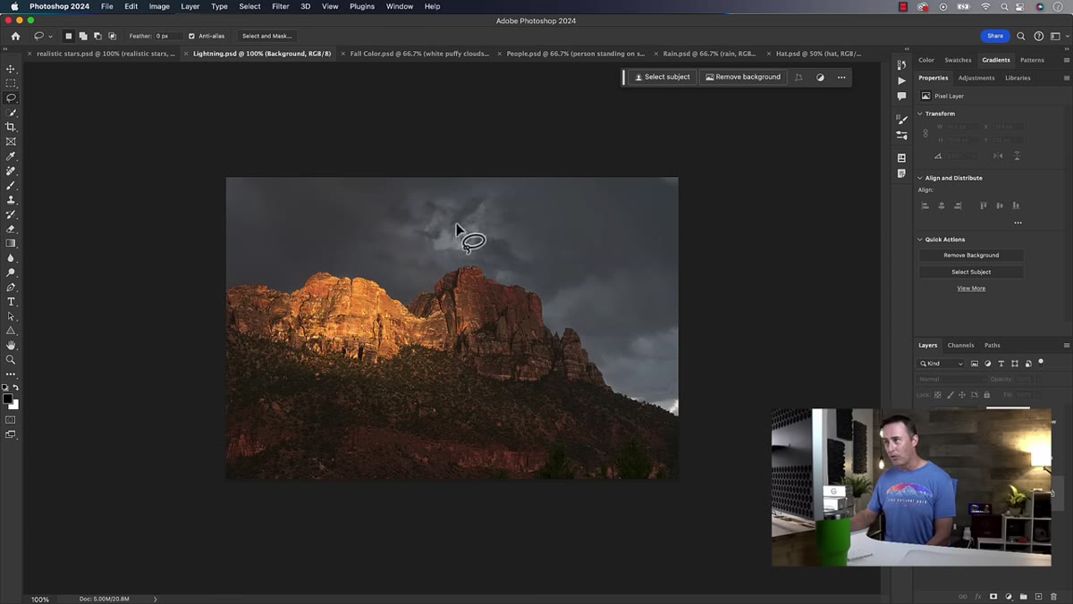
Matt moves to a mountain landscape that has a faint natural rainbow in it. He lassos the sky area only, being careful to exclude the mountains, and prompts Generative Fill to add or enhance the rainbow. The results are spectacular in the wrong direction. One variation produces a rainbow that does something no rainbow in nature has ever done. Another one ignores the selection boundary entirely and starts redrawing the mountains, which were never part of the selection.
Three rainbow variations, one replacing the mountain entirely
Matt moves to a mountain landscape that has a faint natural rainbow in it. He lassos the sky area only, being careful to exclude the mountains, and prompts Generative Fill to add or enhance the rainbow. The results are spectacular in the wrong direction. One variation produces a rainbow that does something no rainbow in nature has ever done. Another one ignores the selection boundary entirely and starts redrawing the mountains, which were never part of the selection.
That second part is worth flagging because it’s a behavior you need to know about. Generative Fill uses the surrounding context to blend its output, and sometimes that context bleed means it will alter pixels outside your selection, especially near the edges. It doesn’t always respect the implied instruction to “leave everything else alone.” If you have critical detail near your selection border, mask more conservatively than you think you need to.
Step 5: Accept That Some Things Are Just Off-Limits (For Now)
 Summary moment showing all failed rainbow and star variations
By the end of his tests, Matt’s conclusion is clear: don’t use Generative Fill for stars, Milky Way overlays, Aurora borealis, or rainbows. These are all phenomena that have very specific visual logic, gradients, atmospheric diffusion, light sourcing, that the current model doesn’t handle with enough precision to pass as real. The outputs can look decorative at a glance but won’t survive scrutiny.
Summary moment showing all failed rainbow and star variations
By the end of his tests, Matt’s conclusion is clear: don’t use Generative Fill for stars, Milky Way overlays, Aurora borealis, or rainbows. These are all phenomena that have very specific visual logic, gradients, atmospheric diffusion, light sourcing, that the current model doesn’t handle with enough precision to pass as real. The outputs can look decorative at a glance but won’t survive scrutiny.
This isn’t a permanent limitation on AI in general, just an honest assessment of where the tool sits right now. Knowing this saves you from going down the rabbit hole of “maybe if I tweak the prompt one more time.” You can redirect that energy toward using Generative Fill where it actually excels: cleaning up distractions, extending canvas, replacing skies with solid gradient backdrops, or filling in gaps on composites where the content is more generic.
What I’d Add From My Own Experience
Matt focuses on natural sky elements, which is the right place to stress-test this, but I’d add one more category to the “proceed with caution” list: anything with text, hands, or human faces as secondary elements. If you’re generating a background scene and there happen to be people in the distance, or signage, you will get some deeply weird artifacts. I’ve had generated crowd scenes where the background figures looked like they were melting into the pavement, and a storefront fill that produced letters that weren’t in any known alphabet.
The workaround that’s helped me most is keeping generated content to areas of the image that are low-detail or naturally soft, sky gradients, out-of-focus backgrounds, simple ground textures. The more your prompt asks for something specific and verifiable, the more likely it is to disappoint.
The single most important thing Matt demonstrates in this tutorial isn’t any one failure. It’s the habit of testing before trusting. Run a quick generation test on a throwaway copy of the file, zoom to 100%, and compare before you integrate anything into your actual composite. Generative Fill is a powerful tool with a specific and still-evolving range. Work with that range instead of against it and you’ll stop losing time to regeneration loops.
Watch the full tutorial on YouTube to see all of Matt’s examples in motion, including a few more that didn’t make this breakdown.
Comments
Leave a Comment