A client asked me for a “moody, cinematic composite” last month. I knew what they wanted. I had the subject, I had a background, I even had a rough idea of the mood. What I didn’t have was a clean, efficient way to tie everything together without it looking like a high school drama poster.
Overlays. That was the missing piece. Not the slap-a-texture-on-it-and-call-it-done approach I’d been guilty of before, but actually understanding how to layer, blend, and manipulate them into something that looks intentional. I went back to this tutorial from Kelvin Designs and worked through all four projects he builds. It’s one of the better structured overlay tutorials I’ve come across because it actually scales in complexity instead of just showing you one trick and leaving you to figure out the rest.
Set Up Your Workspace Before You Touch a Single Layer
Kelvin starts at the 2:30 mark with workspace setup, and I know, I know, everyone skips this part. Don’t. He sets up his panels deliberately, and more importantly, he shows how to use Photoshop Libraries to organize and access overlays without digging through folders every time. If you’re pulling from the free overlay pack he links in the description, you’ll want those assets inside a Library so they’re drag-and-drop ready. It takes three minutes and saves you ten every session.
The practical setup: create a dedicated Library for your overlays (Window > Libraries), then drag your overlay files in. From there, any project you’re working on can access them instantly without breaking your flow.
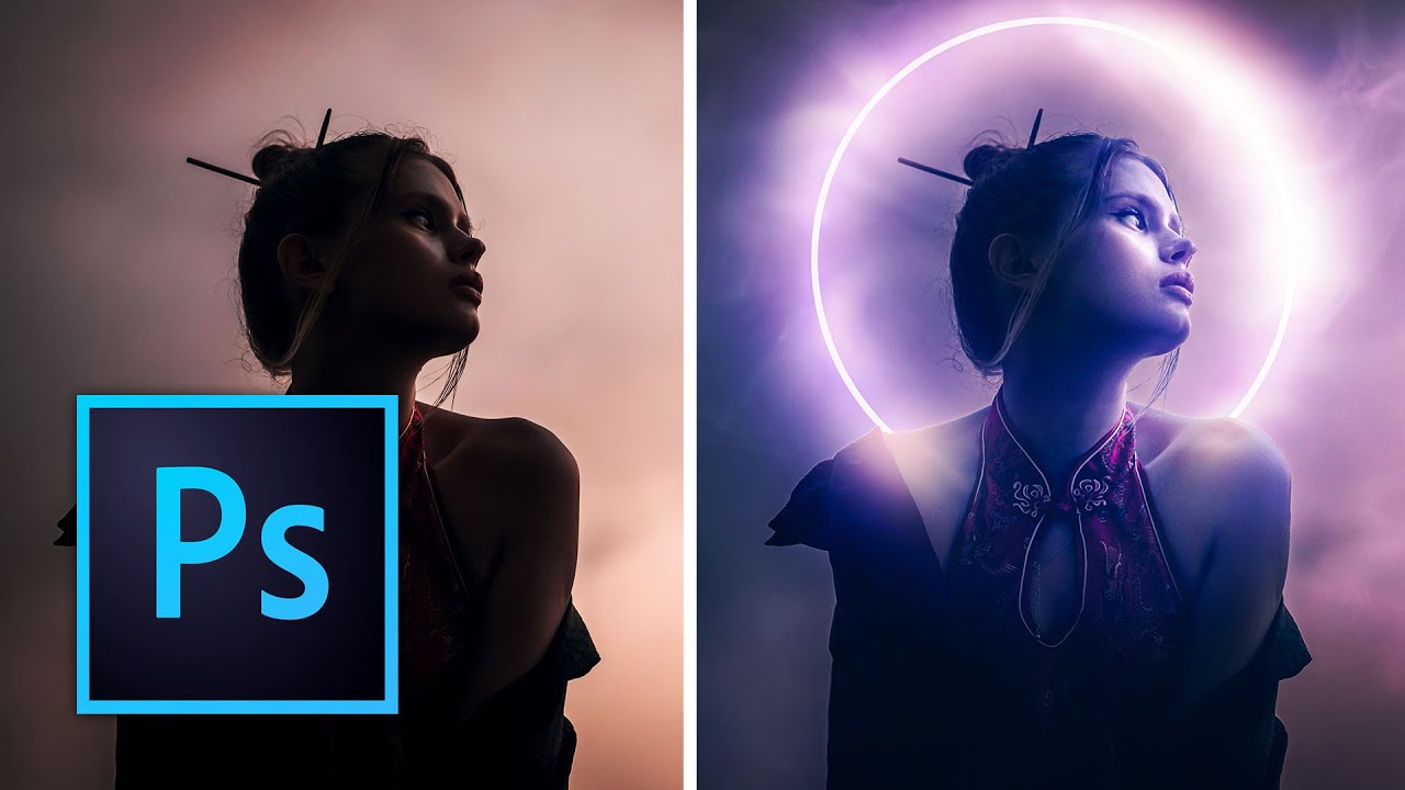
Project One: One Overlay, Done Properly
The first composite starts at 4:32 and it’s deliberately simple. One overlay, dropped onto a subject photo. The technique isn’t complicated but the execution details matter more than people think.
Once the overlay is placed, you’re changing the blend mode. Kelvin uses Screen for light-based overlays (smoke, light leaks, bokeh effects) because Screen ignores black pixels and lets the bright elements composite naturally onto your image. If your overlay has a black background, Screen is almost always your starting point. From there, use Free Transform (Ctrl/Cmd + T) to scale and position the overlay. At 7:46 he gets specific about using Free Transform not just for sizing but for rotation and repositioning to make the overlay feel like it belongs to the scene rather than sitting on top of it.
The mask work at 8:25 is where this goes from “added a texture” to “this was designed.” He adds a layer mask to the overlay and paints out areas where the effect shouldn’t exist, specifically over the subject’s face or anywhere the overlay competes with your focal point. Black conceals, white reveals. Soft brush, low opacity, build it gradually. This is the step most people skip and it’s the reason most overlays look cheap.
Stacking Multiple Overlays Without Making a Mess
At 7:09, the second project introduces layering multiple overlays, which is where things get interesting and where things can also go sideways fast.
The approach here is discipline. Each overlay gets its own layer, its own blend mode evaluated individually, and its own mask. You’re not piling effects on top of each other hoping for magic, you’re making deliberate decisions about what each layer contributes. A smoke overlay at low opacity on Screen might sit under a light leak overlay also on Screen but at a different opacity. The cumulative effect reads as atmosphere rather than chaos.
Opacity control is doing most of the heavy lifting in this section. Kelvin talks about pulling overlays back to 40-60% rather than leaving them at full strength. Full strength almost always looks like full strength. Subtle is the word that keeps coming up, and it’s the right word.
Shadows, Neural Filters, and Depth Maps (the Advanced Stuff)
The later projects step up considerably. Kelvin introduces his Glow Actions and, more interestingly, shadow overlays applied using Neural Filters and displacement with depth maps. This is the part I spent the most time on.
The short version: Photoshop’s Neural Filters can generate depth information from a photo, which you can then use to displace a shadow overlay so it wraps the contours of your subject instead of sitting flat on top. The result is a shadow that actually looks like it belongs in the scene because it’s responding to the geometry of the image, at least approximately.
The workflow is Neural Filters > Depth Blur (use the depth map output, not the blur itself), save that depth map, then use it as a displacement map on your shadow overlay layer via Filter > Distort > Displace. It’s a few extra steps but the difference between a flat shadow overlay and one that bends around a subject’s shoulder is the difference between a composite that reads as real and one that obviously isn’t.
Where I’d Push Back (Just a Little)
Here’s my honest caveat after working through this: overlays can become a crutch. I’ve seen work, including some of my own earlier stuff, where overlays are being used to add visual interest that should be coming from the composition itself. If your base image is flat and uninteresting, a smoke overlay at 50% Screen isn’t a fix, it’s decoration.
Use these techniques on images that are already working. The overlay should amplify something that’s already there, a mood, a light source, a sense of depth. When it’s doing the job the photograph should have done, it shows.
The single most important thing I took from this tutorial is that masking and opacity control aren’t finishing touches, they’re the actual technique. Every overlay skill Kelvin demonstrates lives or dies on those two things.
Watch the full tutorial from Kelvin Designs for the visual walkthrough, especially the depth map section, which is much easier to follow when you can see the actual displacement happening in real time.
Comments
Leave a Comment