There’s a specific kind of photo that lives in everyone’s Lightroom catalog: technically fine, compositionally okay, but somehow flat. The subject is there. The light is decent. But nothing jumps. I’ve wasted more hours than I’d like to admit trying to fix these images with global adjustments, nudging sliders until the whole thing looks like a fake HDR postcard. The real fix is usually more surgical than that – isolate what matters, then amplify it.
In this KelbyOne tutorial from PhotoshopUser TV Episode 309, host Corey walks through exactly that approach using a Times Square cab photo he shot at 2 a.m. (Yes, Times Square at 2 a.m. is still somehow packed. Wild.) The cab sits roughly centered in the frame and already draws the eye, but the goal is to push that further – to make the yellow so intentional it feels like the whole image was built around it. The technique takes maybe five minutes once you know the moves.
Watch the full tutorial on YouTube
Step 1: Open Your Image and Identify the Color Anchor
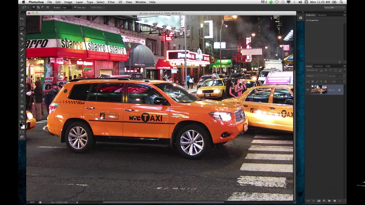
 Times Square cab photo open in Photoshop workspace
Before you touch a single tool, spend ten seconds actually looking at your image. What’s the one element with the strongest, most distinct color? In Corey’s case it’s the cab’s bold yellow – the kind of saturated, unmistakable tone that makes every other color in a busy night scene feel like background noise. That’s your anchor. Everything else in the technique is just telling Photoshop to treat that color like the main character it already is. If your photo has a red jacket in a grey alley, a green neon sign against brick, or a painted wall behind a portrait, this same logic applies.
Times Square cab photo open in Photoshop workspace
Before you touch a single tool, spend ten seconds actually looking at your image. What’s the one element with the strongest, most distinct color? In Corey’s case it’s the cab’s bold yellow – the kind of saturated, unmistakable tone that makes every other color in a busy night scene feel like background noise. That’s your anchor. Everything else in the technique is just telling Photoshop to treat that color like the main character it already is. If your photo has a red jacket in a grey alley, a green neon sign against brick, or a painted wall behind a portrait, this same logic applies.
Step 2: Grab the Quick Selection Tool
 Quick Selection tool active in the Photoshop toolbar
Go ahead and reach for the Quick Selection tool – keyboard shortcut W, though if you’re using an older setup you might need to cycle to it with Shift+W. Corey’s honest about this being a bit of a gamble with a complex urban photo, and I respect that. There’s a certain low-key bravery in choosing Quick Selection over the Lasso on a photo full of competing edges and similar tones. Set your brush to a reasonable size for the area you’re selecting – not so large that it bleeds into everything, not so small you’re there all day.
Quick Selection tool active in the Photoshop toolbar
Go ahead and reach for the Quick Selection tool – keyboard shortcut W, though if you’re using an older setup you might need to cycle to it with Shift+W. Corey’s honest about this being a bit of a gamble with a complex urban photo, and I respect that. There’s a certain low-key bravery in choosing Quick Selection over the Lasso on a photo full of competing edges and similar tones. Set your brush to a reasonable size for the area you’re selecting – not so large that it bleeds into everything, not so small you’re there all day.
Step 3: Paint Your Initial Selection Over the Subject
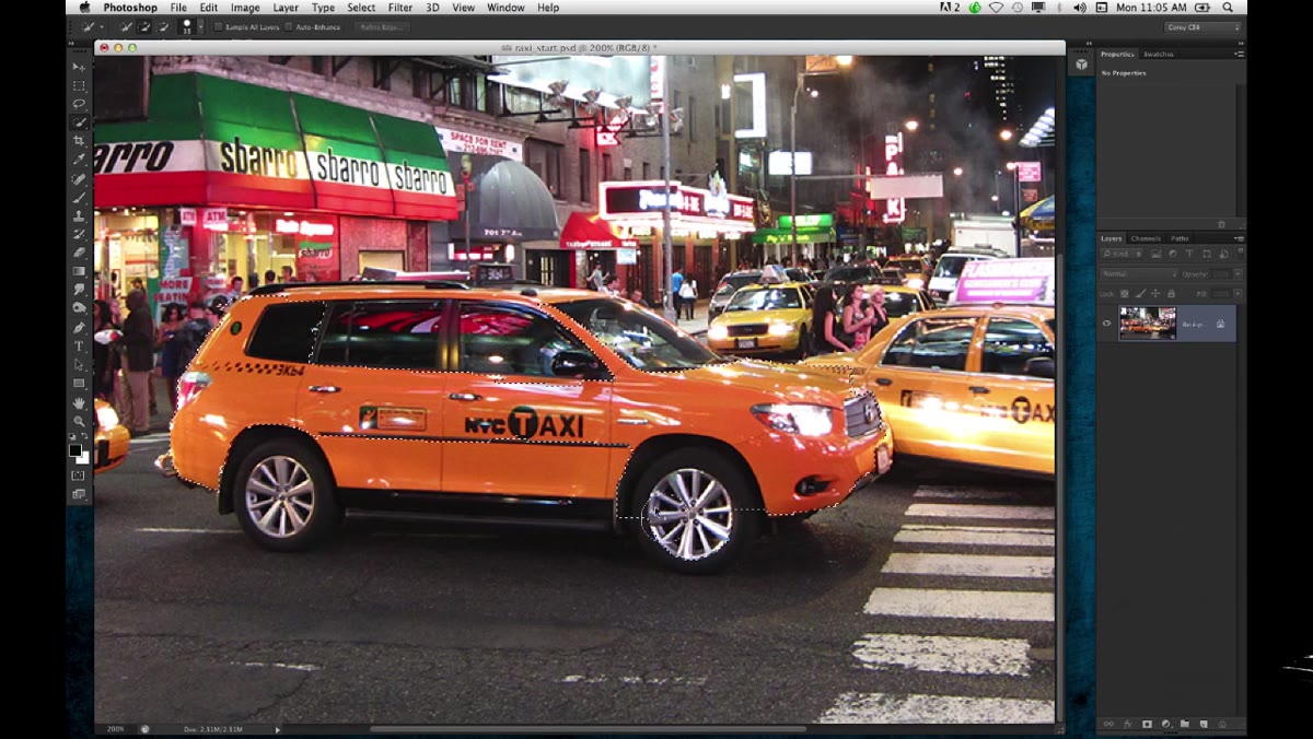 Quick Selection tool painting over the yellow cab
Click and drag across the color you want to isolate. You’re not trying to get a pixel-perfect selection here – you’re aiming for a broad, intentional grab of the dominant color region. For the cab, that means sweeping across the main body panels where the yellow is cleanest and most saturated. Quick Selection is going to try to read edges and contrast to figure out what you mean, and on something as visually bold as a yellow cab against a darker street scene, it actually does a pretty solid job. Don’t panic when it’s not perfect on the first pass. That’s what the next step is for.
Quick Selection tool painting over the yellow cab
Click and drag across the color you want to isolate. You’re not trying to get a pixel-perfect selection here – you’re aiming for a broad, intentional grab of the dominant color region. For the cab, that means sweeping across the main body panels where the yellow is cleanest and most saturated. Quick Selection is going to try to read edges and contrast to figure out what you mean, and on something as visually bold as a yellow cab against a darker street scene, it actually does a pretty solid job. Don’t panic when it’s not perfect on the first pass. That’s what the next step is for.
Step 4: Subtract the Parts You Don’t Need
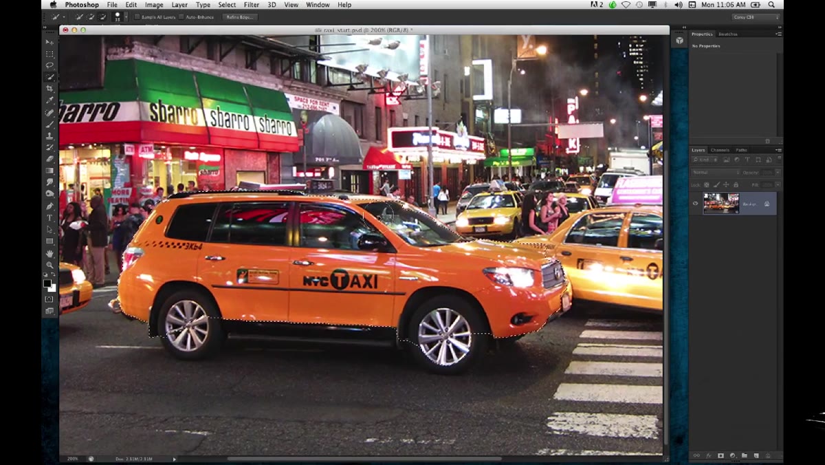 Alt-key subtraction removing unwanted selection areas
Here’s the move that a lot of people skip because they either don’t know it or they forget it mid-workflow: hold Alt (Option on Mac) while painting with the Quick Selection tool to switch it into subtract mode. Your cursor gets a little minus sign, and anything you drag across gets removed from the selection. Corey uses this to clean up a stray section of the cab that got picked up – a small piece he doesn’t need for the color effect to work. Shrink your brush size down with the left bracket key before you subtract, so you’re working precisely rather than wiping out chunks of the selection you actually want. A couple of targeted strokes is usually all it takes.
Alt-key subtraction removing unwanted selection areas
Here’s the move that a lot of people skip because they either don’t know it or they forget it mid-workflow: hold Alt (Option on Mac) while painting with the Quick Selection tool to switch it into subtract mode. Your cursor gets a little minus sign, and anything you drag across gets removed from the selection. Corey uses this to clean up a stray section of the cab that got picked up – a small piece he doesn’t need for the color effect to work. Shrink your brush size down with the left bracket key before you subtract, so you’re working precisely rather than wiping out chunks of the selection you actually want. A couple of targeted strokes is usually all it takes.
Step 5: Focus on the Color, Not the Cutout
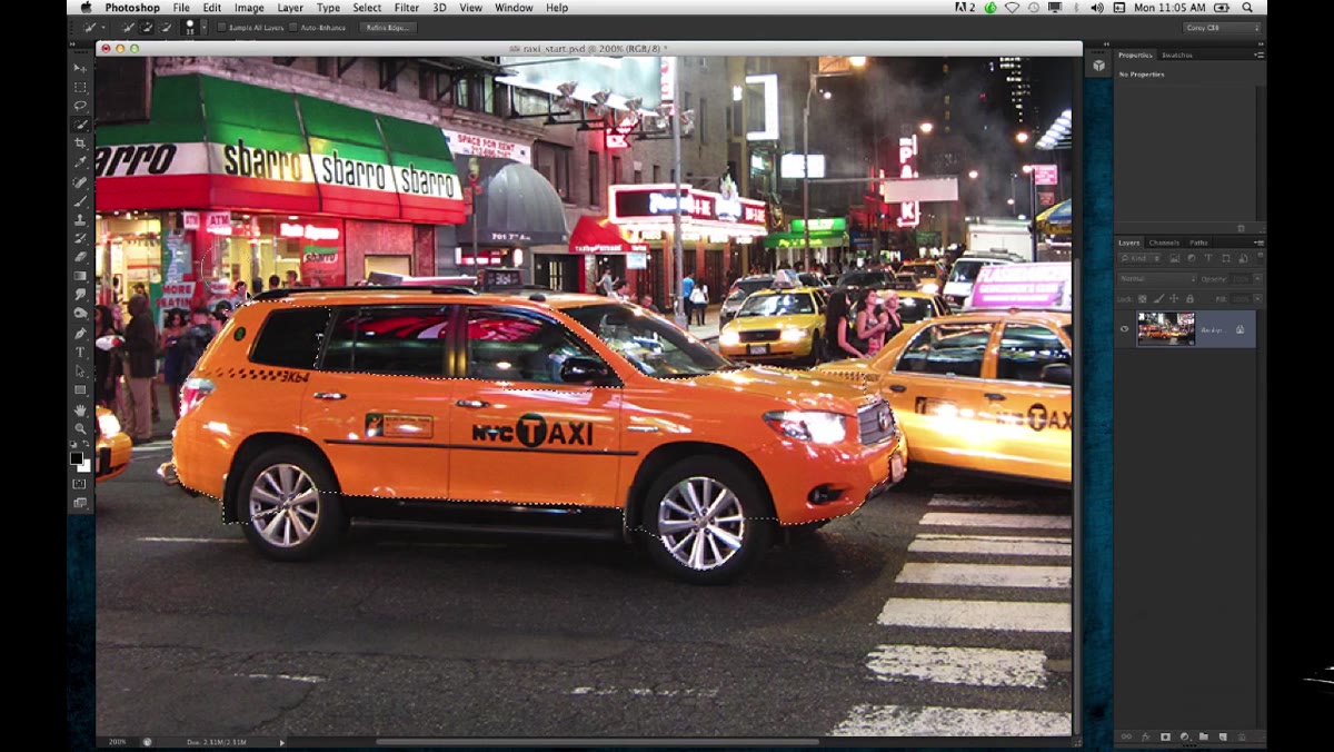 Selection active around the cab’s yellow body panels
This is probably the most useful mindset shift in the whole tutorial, and Corey drops it almost as a throwaway line: he’s not worried about selecting the entire car. He doesn’t need a perfect cutout of every door handle and wheel well. He just needs the bold yellow. That reframe changes how you approach the selection entirely. You’re not building a mask for a compositing job – you’re targeting a color region so you can push it further with adjustments. A slightly loose selection is fine. A selection that captures the spirit of the color is enough to do what comes next. Stop trying to be surgical when surgical isn’t the point.
Selection active around the cab’s yellow body panels
This is probably the most useful mindset shift in the whole tutorial, and Corey drops it almost as a throwaway line: he’s not worried about selecting the entire car. He doesn’t need a perfect cutout of every door handle and wheel well. He just needs the bold yellow. That reframe changes how you approach the selection entirely. You’re not building a mask for a compositing job – you’re targeting a color region so you can push it further with adjustments. A slightly loose selection is fine. A selection that captures the spirit of the color is enough to do what comes next. Stop trying to be surgical when surgical isn’t the point.
Step 6: Refine and Prepare for Adjustment
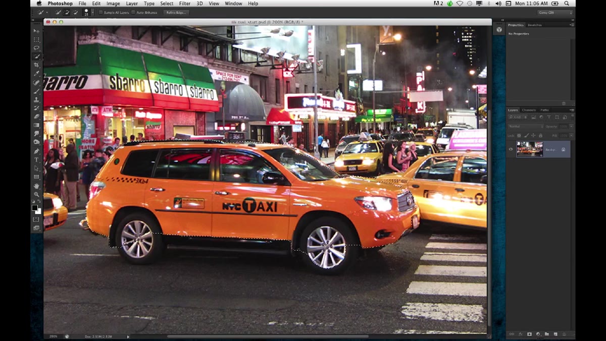 Cleaned-up selection around the cab ready for adjustment layer
Once your selection looks good enough – meaning the main color area is captured and the obvious mistakes are cleaned up – you’re ready to start doing something interesting with it. From here you’d typically add an adjustment layer (Hue/Saturation, Vibrance, or Curves are all solid choices depending on what effect you’re going for). Because the selection is active when you add the adjustment layer, Photoshop automatically turns it into a mask. Your edits stay contained to the selected area. Punch up the saturation, shift the hue slightly warmer, boost the contrast – any of those moves will now amplify the cab while leaving the surrounding scene relatively untouched.
Cleaned-up selection around the cab ready for adjustment layer
Once your selection looks good enough – meaning the main color area is captured and the obvious mistakes are cleaned up – you’re ready to start doing something interesting with it. From here you’d typically add an adjustment layer (Hue/Saturation, Vibrance, or Curves are all solid choices depending on what effect you’re going for). Because the selection is active when you add the adjustment layer, Photoshop automatically turns it into a mask. Your edits stay contained to the selected area. Punch up the saturation, shift the hue slightly warmer, boost the contrast – any of those moves will now amplify the cab while leaving the surrounding scene relatively untouched.
My Take: Pair This With a Desaturation Pass on Everything Else
I’ve used this exact approach on product shots and it works even better when you flip the logic and also desaturate the background slightly after boosting the subject. Select the cab, boost it, then invert the selection and drop a Hue/Saturation layer on the rest of the image at maybe -20 to -35 saturation. You’re not going full black and white – you’re just quietly telling the viewer’s eye where to go. The subject pops harder because the competition has been quietly knocked down a notch. It’s the visual equivalent of turning down the background music so people can hear the conversation. Takes an extra thirty seconds and the difference is pretty obvious once you’ve seen it.
Also worth noting: if this is a photo you might want to revisit later or share with a client, keep your adjustment layers non-destructive. Don’t flatten anything. Future you will be grateful.
The single biggest thing to take away here is that a “good enough” selection targeted at the right element beats a perfect selection of the wrong thing every time. Getting the whole car precisely masked is a different job for a different day. Getting the yellow – that confident, specific, story-telling color – is the actual work. Quick Selection with a clean subtract pass gets you there in under two minutes.
Watch the full tutorial on YouTube and see the full effect come together with Corey walking through it in real time.
Comments
Leave a Comment