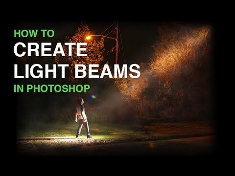
There’s a specific type of client request that used to make my eye twitch: “Can you make it look like the light is, like… dramatic?” No reference image. No clear direction. Just vibes. I’d end up digging through stock textures, lens flare packs, and half-remembered YouTube tutorials at 11pm in whatever coffee shop was still open. The result was usually fine. Sometimes it was terrible. Rarely was it controlled.
That changed when I worked through this Aaron Nace tutorial from PHLEARN on creating beams of light from scratch in Photoshop. Watch the full tutorial on YouTube. The image he works with is a guy standing outdoors who was apparently hoping to look like he’s getting abducted by aliens. Totally normal creative brief. And the technique Aaron uses to sell that effect is surprisingly low-tech in the best way possible. No plugins, no obscure filters. Just smart use of selections, fills, blending modes, and layer logic.
What I like about this approach is that it generalizes. Once you understand the bones of it, you can apply the same thinking to flashlight beams, car headlights, light streaming through a cracked door. The specific image doesn’t matter. The principles do.
Step 1: Clean Up the Frame First
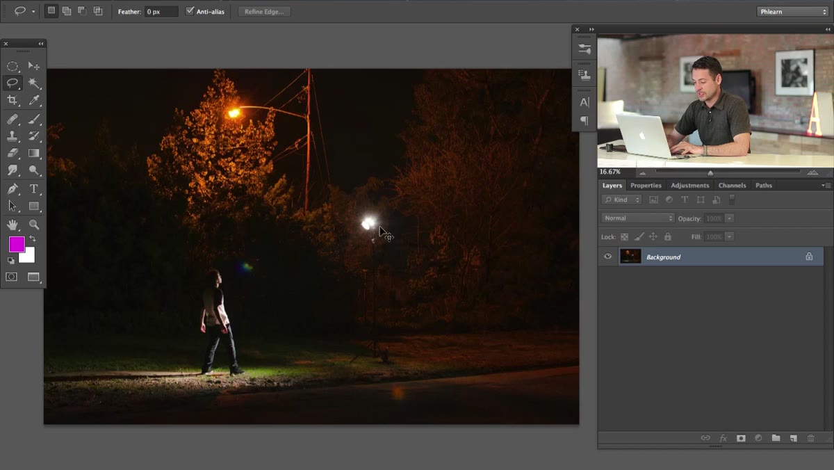 Clone Stamp removing a monoblock light from the background
Before you build anything, you need a clean canvas. In the tutorial image, there’s a physical studio light sitting in the frame that obviously needs to go. Aaron uses the Clone Stamp tool to remove it, which is the straightforward approach. He’s also upfront that there’s a smarter way: if you’re shooting with this technique in mind, take a second frame without the light in it. Then in post, you use a Layer Mask to blend the two shots together and you get real, clean background data instead of cloned guesswork.
If you’re working with a single shot like most of us realistically are, use the Clone Stamp (keyboard shortcut: S) and sample nearby areas to fill in what was behind the light. It doesn’t need to be perfect because you’re about to paint a beam of light directly over much of that area anyway. Don’t disappear down a retouching rabbit hole here. Get it close enough and move on.
Step 2: Create a New Layer and Sketch the Beam Shape
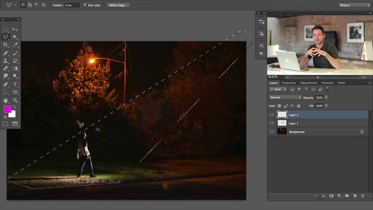
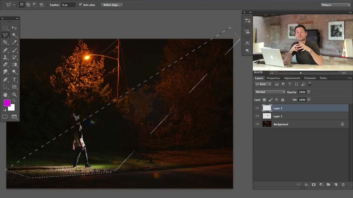
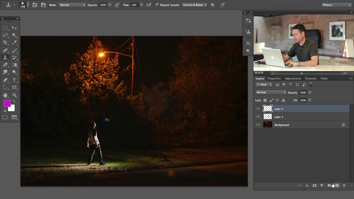 Polygonal Lasso tool drawing the outer shape of the light beam
Create a new blank layer above your background. This is where the outer shape of your beam lives. Grab the Polygonal Lasso tool (L) and draw the rough silhouette of where the light would fall. Think about this geometrically: light from above spreads out as it travels downward, so your shape should be narrow at the top (near the source) and wider at the bottom where it hits the ground.
Pay attention to where the light actually lands in the photo. In this case, you can see evidence of light on the ground, which gives you a target. Let the existing scene information guide the width at the base of your beam. Don’t make it too narrow or it reads as a laser. Don’t make it too wide or it stops reading as a beam and starts looking like a vignette gone wrong.
Step 3: Fill the Selection with White
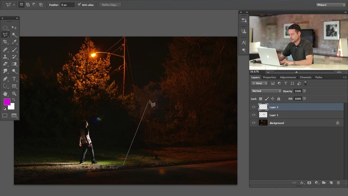 Polygonal Lasso selection filled with white on a new layer
Once you’ve closed your Polygonal Lasso selection, fill it with white. Go to Edit, Fill, and choose White, or use the shortcut Shift+F5. The goal right now is just to establish the shape. It’s going to look completely wrong and flat at this stage. That’s fine. You’re laying groundwork, not finishing the piece.
Lower the layer opacity to somewhere in the 20-40% range so you can see the image beneath while you work. This helps you judge proportions and whether the beam is actually pointing at the right things in the frame. If it’s not, delete and redraw. Polygonal selections are fast to redo and there’s no reason to commit to a bad shape.
Step 4: Apply a Gradient to Simulate Light Falloff
 Gaussian Blur or gradient applied to beam layer showing light falloff from source
Real light doesn’t look like a white wedge cut out of paper. It’s brighter at the source and fades as it travels. To fake that, you need to build falloff into the beam. The most controlled way to do this is to add a Layer Mask to your beam layer, then use the Gradient tool (G) set to a black-to-white linear gradient, dragging from the bottom of the beam upward. This makes the bottom edge fade out while keeping intensity near the source.
You can also apply a Gaussian Blur (Filter, Blur, Gaussian Blur) to soften the hard edges of the selection shape. Beams of light in real atmospheres are never razor-edged. A blur radius between 15 and 40 pixels depending on your image size will usually do it. Experiment. You want it to feel like light is scattering into the surrounding air, not like someone drew a triangle with the shape tool.
Step 5: Build Intensity with Multiple Layers
 Multiple beam layers stacked showing brighter center beam over softer outer glow
This is the single most important part of Aaron’s approach: don’t try to do everything on one layer. Real light has structure. It has a brighter core and a softer ambient glow around it. You need at least two layers to capture that, and probably three.
Start with your wide, very transparent outer glow layer. Then add a second, narrower beam shape on a new layer above it, and make that one a little more opaque to represent the concentrated core. If you want more intensity, add a third layer narrower still. Set each layer’s blending mode to Screen so that the white values add to the image below without muddying the darker tones. Screen mode is your best friend for any additive light effect in Photoshop. Stack, adjust opacity on each layer independently, and keep tweaking until the beam feels like it has dimension rather than just coverage.
What I’d Add: Color Temperature Changes Everything
Here’s something the tutorial doesn’t dig into but makes a huge difference in production work: beams of light almost never look white in final images. The ambient light in a scene has a color temperature, and your beam should interact with that. For a cool, overcast outdoor scene, push the beam toward a slight blue-white. For golden hour, warm it toward yellow. For the alien abduction brief, an ice-cold blue-white with slight cyan actually reads as way more otherworldly than pure white.
To do this, clip a Hue/Saturation adjustment layer to your beam layers using Alt+Click between the layers. Reduce saturation and nudge hue toward whatever feels contextually right. It’s a small move that separates “looks like a Photoshop layer” from “looks like it belongs in the shot.”
The core takeaway here is that you’re not finding a shortcut. You’re building the effect from the ground up using fundamental tools, which means you actually understand it well enough to fix it when something looks off. That’s worth more than any one-click filter in the long run.
Watch the full tutorial on YouTube to see Aaron walk through the whole thing in real time.
Comments (2)
Shared this with my photography group. Everyone loved it.
Really solid breakdown. This pairs perfectly with the compositing work I've been writing about.
Leave a Comment