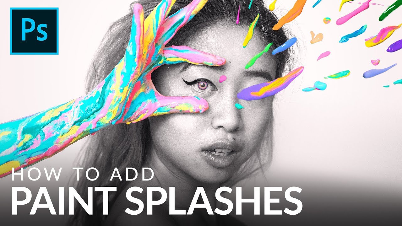
There’s a specific kind of composite work that looks wildly expensive and technically demanding but is actually just a few smart techniques stacked on top of each other. Paint splash effects are exactly that. I’ve scrolled past dozens of surrealist portraits where paint seems to explode off skin or cascade through a scene, and every time I assumed the photographer had some elaborate studio setup or a dedicated effects team. Turns out, a lot of those images come from someone with a wall, some borrowed lights, and a $4 can of paint. That’s the exact situation Natalia Seth (Instagram: @escapingyouth) describes in this collaboration with Aaron Nace over at PHLEARN. Watch the full tutorial on YouTube before or after reading this breakdown, your call.
What I find genuinely useful about this tutorial isn’t just the paint splash trick itself. It’s the underlying workflow: photograph your effects elements separately on a plain background, cut them out with a combination of selection tools and masks, refine the edges so they don’t look like they were scissored out by a kindergartner, then composite them into your base image with precision. That workflow applies to water splashes, smoke, fabric, hair, you name it. Once you understand the logic here, you’ve got a reusable system, not just a one-off effect.
Step 1: Open Your Paint Splash Photos Alongside Your Base Image
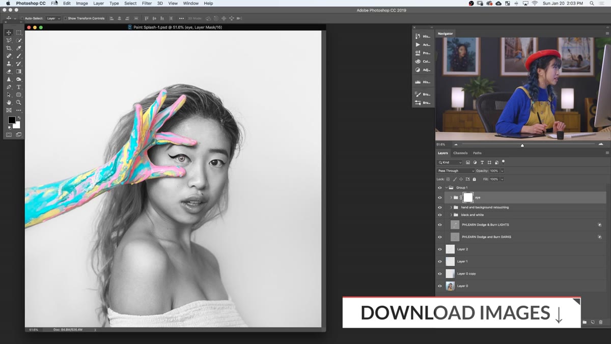 Three paint splash photos opened in Photoshop workspace
Start by opening your base portrait and all your paint splash source photos at the same time. Go to File, then Open, and select all your splash images at once. Photoshop will open each in its own tab. Zoom out on each one (Command/Ctrl + minus a few times) so you can see the full image. You want to get a sense of which splash shapes will work compositionally with your subject before you commit to anything.
Three paint splash photos opened in Photoshop workspace
Start by opening your base portrait and all your paint splash source photos at the same time. Go to File, then Open, and select all your splash images at once. Photoshop will open each in its own tab. Zoom out on each one (Command/Ctrl + minus a few times) so you can see the full image. You want to get a sense of which splash shapes will work compositionally with your subject before you commit to anything.
The goal at this point is just orientation. Look at your splash photos and think about placement: which ones are big enough to cover the areas you want, which shapes are interesting, and where the paint density is highest. Natalia photographed her splashes on plain white paper specifically so they’d be easy to isolate. If you’re shooting your own, white or very light neutral backgrounds are your best friend here.
Step 2: Drag a Paint Splash onto Your Base Image and Scale It
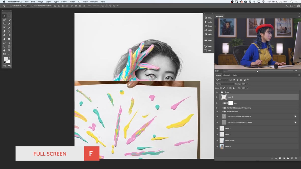 Paint splash layer dragged onto base portrait, transform handles visible
Pick the splash image you want to start with and drag its layer directly onto your base image. Once it’s there as a new layer, hit Command/Ctrl + T to bring up Free Transform. Hold Shift while dragging a corner handle if you’re on an older version of Photoshop, or just drag freely in newer versions since proportional scaling is now the default. Resize and reposition until the splash sits roughly where you want it in the final composition.
Paint splash layer dragged onto base portrait, transform handles visible
Pick the splash image you want to start with and drag its layer directly onto your base image. Once it’s there as a new layer, hit Command/Ctrl + T to bring up Free Transform. Hold Shift while dragging a corner handle if you’re on an older version of Photoshop, or just drag freely in newer versions since proportional scaling is now the default. Resize and reposition until the splash sits roughly where you want it in the final composition.
Don’t obsess over perfect placement yet. You’re going to be masking and adjusting anyway, so close enough is fine at this stage. What you’re really checking is whether the scale feels right and whether the shape is going to work. If it looks completely wrong, go back and try a different splash photo.
Step 3: Use the Magic Wand to Select the White Background
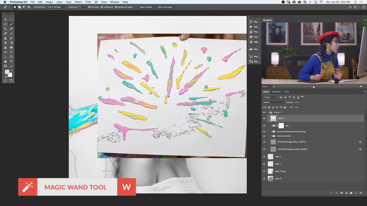 Magic Wand tool active, white background being selected on splash layer
With your paint splash layer selected, grab the Magic Wand tool (W on the keyboard). Set the Tolerance to around 17 in the options bar at the top. Click on the white background area of the splash. Then hold Shift and click any remaining white areas the tool missed, including edges and gaps between paint drops. You’re building up a selection of everything you want to remove, which is the background, not the paint itself.
Magic Wand tool active, white background being selected on splash layer
With your paint splash layer selected, grab the Magic Wand tool (W on the keyboard). Set the Tolerance to around 17 in the options bar at the top. Click on the white background area of the splash. Then hold Shift and click any remaining white areas the tool missed, including edges and gaps between paint drops. You’re building up a selection of everything you want to remove, which is the background, not the paint itself.
The Magic Wand works well here because the paint is colorful and the background is white, so the contrast gives the tool a lot to work with. Don’t stress if the selection isn’t perfect around every tendril of paint. You’ll clean that up in the next step with masking. The goal is to get the bulk of the background selected so you’re not doing it all by hand.
Step 4: Add a Layer Mask and Invert It
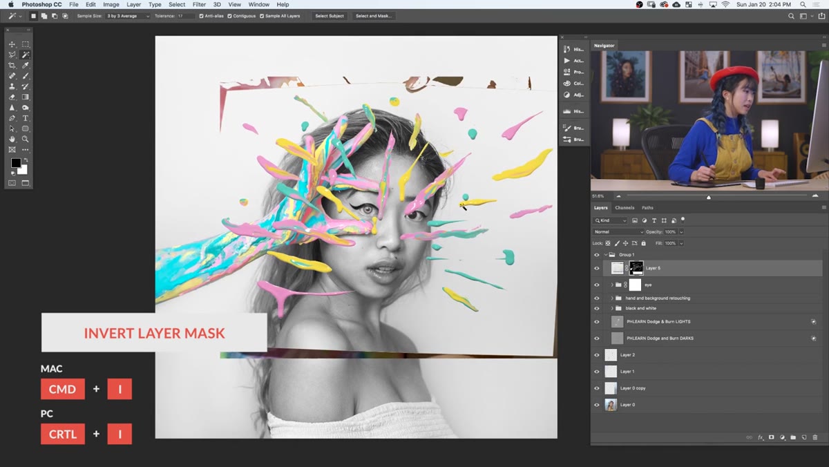 Layer mask added, Command I inverts selection to reveal paint splashes
With your background selection active, click the Add Layer Mask button at the bottom of the Layers panel. This will mask out the paint and reveal the background, which is the opposite of what you want. Immediately hit Command/Ctrl + I to invert the mask. Now the white background disappears and only your paint splashes remain visible.
Layer mask added, Command I inverts selection to reveal paint splashes
With your background selection active, click the Add Layer Mask button at the bottom of the Layers panel. This will mask out the paint and reveal the background, which is the opposite of what you want. Immediately hit Command/Ctrl + I to invert the mask. Now the white background disappears and only your paint splashes remain visible.
You’ll probably notice some rough edges and leftover bits of background paper showing around the paint. That’s normal and expected. The mask inversion trick is fast, but it’s not surgical. What you have now is a rough cut, and you’ll refine it in the next step.
Step 5: Refine the Mask Edges to Eliminate the White Halo
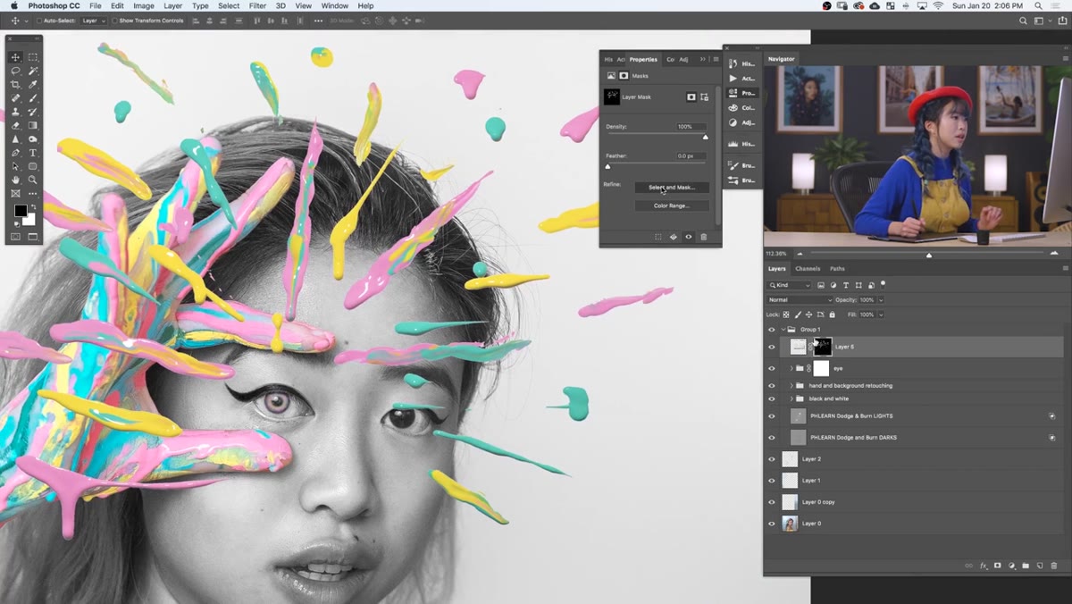 Mask Properties panel open, Shift Edge and Smooth sliders being adjusted
Double-click on the layer mask thumbnail in the Layers panel to open the mask properties. Look for the “Shift Edge” slider and drag it into negative territory, somewhere around -10 to -20, to contract the mask edge inward. This shaves off the thin white halo that often clings to extracted objects when the background and foreground share similar light values.
Mask Properties panel open, Shift Edge and Smooth sliders being adjusted
Double-click on the layer mask thumbnail in the Layers panel to open the mask properties. Look for the “Shift Edge” slider and drag it into negative territory, somewhere around -10 to -20, to contract the mask edge inward. This shaves off the thin white halo that often clings to extracted objects when the background and foreground share similar light values.
Then find the Smooth slider and bring it up gradually. Somewhere between 10 and 30 tends to work well for paint splashes, which have naturally organic, irregular edges. Too much smoothing and you’ll lose the spatter details that make the effect look real. Too little and the edges stay jagged in a way that reads as digital cutout. Find the balance that looks natural at your working zoom level, then zoom in to double-check before committing.
Step 6: Duplicate the Layer Before Applying the Mask
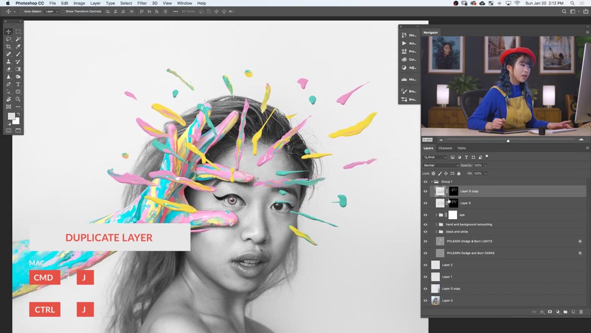 Layer duplicated in panel, Apply Layer Mask option shown in menu
Before you flatten or apply anything, duplicate your paint splash layer. Right-click the layer and choose Duplicate Layer. This duplicate acts as a backup in case you need to revisit the mask later. Once you have your safety copy, you can right-click the original and choose Apply Layer Mask to flatten the transparency into the actual pixel data.
Layer duplicated in panel, Apply Layer Mask option shown in menu
Before you flatten or apply anything, duplicate your paint splash layer. Right-click the layer and choose Duplicate Layer. This duplicate acts as a backup in case you need to revisit the mask later. Once you have your safety copy, you can right-click the original and choose Apply Layer Mask to flatten the transparency into the actual pixel data.
This is a habit worth building into every masking workflow, not just this one. Applied masks are more portable and sometimes behave more predictably when you’re moving layers around or exporting, but they’re also irreversible. The duplicate costs you nothing and has saved me more than once.
The Part the Tutorial Doesn’t Dwell On: Shooting Your Own Splash Assets
I want to flag something that’s easy to gloss over in a tutorial like this. The quality of your final composite depends almost entirely on the quality of your source splash photos. Natalia shot hers in a dorm room on plain white paper, which is genuinely accessible, but the lighting matters more than you’d think. Even, diffused light across the paper means the white background reads as consistent white, which makes the Magic Wand selection clean and fast. If your background has shadows or uneven exposure, you’ll spend significantly more time in the mask.
If you’re going to build a library of splash and texture elements (and you should, honestly, it’s one of the highest-value things you can do for composite work), shoot them in the same session, under the same lighting, on the same background color. Consistency in your source material cuts your masking time in half.
The single most transferable idea in this entire tutorial is this: isolate your effect elements on a plain background when you shoot them, and the compositing becomes a masking problem instead of a painting problem. Masking is faster, more forgiving, and easier to redo. If you want to see the full technique demonstrated with a real image and real decision-making in real time, go watch the original. Watch the full tutorial on YouTube and then go buy $4 worth of paint.
Comments
Leave a Comment