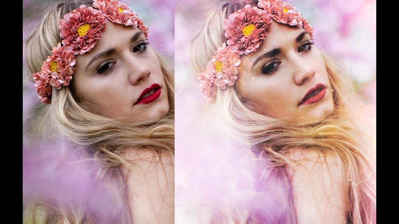
There’s a specific kind of edit that shows up constantly in editorial and portrait work - that soft, ethereal, almost-painted look that makes a photo feel like it exists somewhere between reality and a fever dream. I’ve tried to reverse-engineer it a hundred times from finished images, usually ending up with something that looks like I smeared Vaseline on my monitor. So when I came across Watch the full tutorial on YouTube from Jessica Kobeissi, I paid attention. Jessica is a photographer and retoucher who actually shoots her own source material, and her approach is refreshingly grounded - no 47-step processes, no plugin dependencies, just a texture and some adjustment layers used with real intention.
What I appreciate most about her workflow is the discipline behind it. The dreamy effect works precisely because she doesn’t let it run wild. Every step is calibrated. Low opacity brushes, careful cloning, textures blended with restraint. If you’ve ever wondered why your glowy fantasy edits look cheap while someone else’s look cinematic, the answer is almost always in the numbers - the opacity values, the blend modes, the willingness to stop before you’ve gone one step too far.
Here’s how the technique breaks down, step by step.
Step 1: Start with Frequency Separation Already Set Up
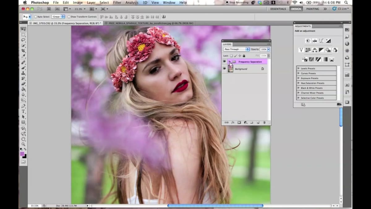 Layers panel showing a frequency separation setup
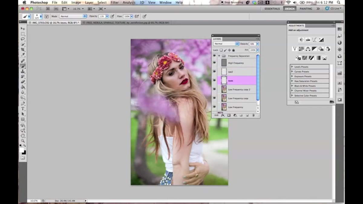
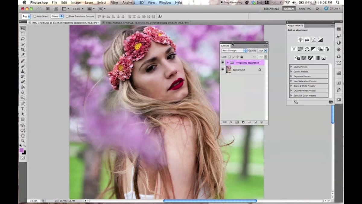
Jessica opens with a frequency separation setup already in place in her layers panel. She’s not going to walk through building it here - she points to a separate tutorial for that - but she’s clear that this is her foundation before any creative effect gets applied. If you’re not familiar with frequency separation, the short version is this: it splits your image into two layers, one holding texture (skin pores, fine detail) and one holding color and tone. This lets you retouch smoothly without destroying surface detail.
Before you chase the dreamy effect, get your technical retouching layer structure sorted. It’s the difference between a fantasy edit that looks intentional and one that looks like a mess with a texture slapped on top.
Step 2: Do a Light Skin Retouch with the Healing Brush
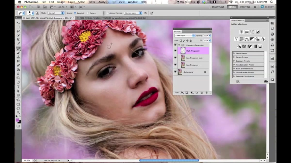 Healing brush being used over skin on portrait
With frequency separation in place, Jessica does a quick pass over the skin using the Healing Brush. The key word here is quick. She’s not after an airbrushed mannequin look - she’s cleaning up distracting spots while keeping the pores intact. This is a targeted cleanup, not a full skin smoothing pass.
Set your Healing Brush to a small, soft tip and work at a comfortable zoom level. Sample clean skin nearby, dab at blemishes, move on. The goal is to remove things that pull the eye away from the subject, not to erase evidence that a human being was photographed.
Step 3: Brighten the Eyes with a Low-Opacity White Brush
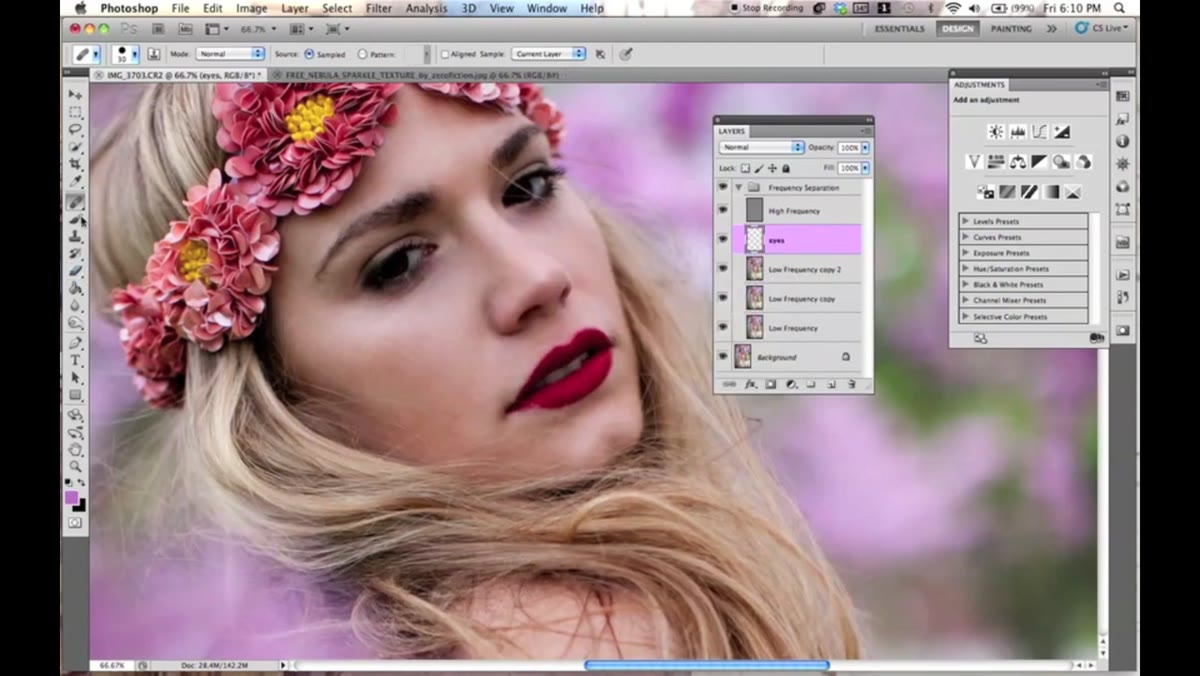 New layer above portrait, white brush at 11% opacity
Dark, flat eyes are a subtle mood-killer in portrait work, and Jessica fixes this with one of the simplest tricks in the book. She creates a new layer, grabs a soft round brush, sets the color to white, and drops the opacity to 11%. Then she paints lightly over the eye area - just enough to bring some life into them.
Eleven percent. That’s her number. It sounds almost too low to do anything, but build it up with a few passes and it lifts the eyes without making the subject look like they’ve had a supernatural encounter. The new layer gives you full control - lower the layer opacity afterward if it’s still too much, or erase areas that don’t need it. She also mentions using an Overlay blend mode for a second pass specifically over the center of the eye to add a bit of extra pop without going full X-Men.
Step 4: Fix the Background with the Clone Stamp Tool on a New Layer
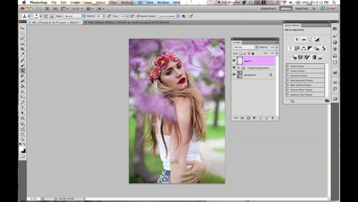 Clone stamp tool sampling background color on new layer
The original background in Jessica’s photo has some areas she’s not happy with. Rather than masking or replacing the whole thing, she cleans it up using the Clone Stamp Tool - but critically, on a new dedicated layer. She sets the brush hardness to around 35%, keeps the opacity at 88%, holds Alt to sample a clean area of the background, and paints over the problem sections.
The new layer point is not optional. Cloning directly onto your background or your retouching layers is a one-way street to regret. On a separate layer, you can lower opacity, mask sections, or throw the whole thing away and start over. Command+Shift+N on Mac gets you a new layer instantly - build the shortcut into your muscle memory and stop skipping this step.
Step 5: Add the Texture Layer and Blend It In
 Texture being placed over portrait in layers panel
This is where the actual “dreamy” part comes in. Jessica brings in a texture file - a subtle, soft one with the kind of grain and tonal variation that adds atmosphere without looking like a Instagram filter from 2012. She positions it above the image layers and experiments with blend modes to find what works with the underlying colors.
For this kind of effect, blend modes like Screen, Soft Light, or Overlay are your starting points. Screen will lighten and works well with darker textures. Soft Light adds contrast and color depth without blowing things out. Drop the texture layer’s opacity until the effect reads as something the camera might have almost done on its own, not something you clearly added in post.
Step 6: Refine the Effect with Adjustment Layers
 Adjustment layers stacked in layers panel over portrait
Adjustment layers are how the whole thing gets tied together. Jessica uses them to shift the overall color mood, boost or pull back luminosity, and make sure the texture and the portrait are reading as a single unified image rather than two separate things sitting on top of each other.
Curves, Color Balance, and Hue/Saturation are the workhorses here. A gentle S-curve adds contrast. Color Balance lets you push the shadows and highlights toward complementary tones. Use clipping masks to keep adjustments targeted to specific layers when you don’t want them affecting everything below.
One Thing I’d Add: Work Non-Destructively from the Jump
I learned the hard way - after accidentally nuking a client’s layered comp with no recovery path - that non-destructive editing isn’t a “best practice,” it’s self-preservation. Everything Jessica does here can be done while keeping your original pixels completely untouched. Convert your base image to a Smart Object before you start stacking layers on top of it. That way, if you need to go back and fix something at the retouching stage after you’ve built up six adjustment layers on top, you can do it without dismantling everything.
The other thing worth noting: the low opacity brushwork she uses throughout - the 11% white brush, the soft clone stamp passes - is the actual secret to why this effect works. Restraint is the technique.
The single biggest takeaway from this tutorial is that dreamy effects are built on subtlety, not saturation. Every tool Jessica uses is pushed well below its maximum, and the result is something that feels intentional rather than processed. Push any one of those steps too far and the whole thing collapses into something that screams “heavily edited” for all the wrong reasons.
Watch the full tutorial on YouTube and pay attention to when she slows down - that’s where the real information is.
Comments (3)
Finally someone explains this in a way that actually makes sense.
Been doing this wrong for years apparently. Thanks for the wake-up call.
Clear and practical. No fluff. Appreciate that.
Leave a Comment