There’s a specific kind of frustration that hits when you spend three days on a composite only to realize the light on your subject is pointing the wrong direction, the colors are from two different planets, and the whole thing looks like a bad movie poster from 2003. I’ve been there. More than once. And the honest problem isn’t talent or effort, it’s not having a repeatable process for blending subjects and backgrounds so they actually look like they belong together.
That’s exactly what Aaron Nace tackles in this PHLEARN Pro tutorial, “Photoshop Compositing in 2026.” Watch the full tutorial on YouTube before or after reading this breakdown. What makes it worth your time is the balance: Aaron covers Photoshop’s newer AI-powered features alongside manual techniques, so you’re not burning through generative credits every five minutes and you actually understand what’s happening under the hood. Four complete compositing projects, all sample images included. That’s a real curriculum, not a highlight reel.
Here’s how the tutorial breaks down, project by project, with the core techniques at each stage.
Step 1: Extend the Background and Match Your Subject to It
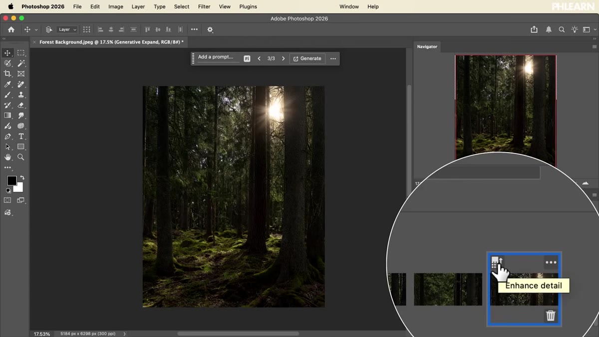 Extending a background with a subject placed on top
The first project is a fairy-themed composite, and it opens with one of the most practical skills in compositing: extending a background to fit your composition rather than cropping your vision to fit the photo. Aaron uses this as a chance to show how to evaluate whether a subject and background were realistically lit from the same direction and color temperature. The goal here isn’t just making things fit spatially, it’s making them look like they were photographed in the same universe.
Extending a background with a subject placed on top
The first project is a fairy-themed composite, and it opens with one of the most practical skills in compositing: extending a background to fit your composition rather than cropping your vision to fit the photo. Aaron uses this as a chance to show how to evaluate whether a subject and background were realistically lit from the same direction and color temperature. The goal here isn’t just making things fit spatially, it’s making them look like they were photographed in the same universe.
From there, the tutorial moves into adjusting light and color on both the subject and the background separately, dialing them toward each other until they harmonize. This is the step most tutorials skip or hand-wave. Aaron shows it explicitly, which means you’re building a process you can repeat on any composite.
Step 2: Build and Use a Custom Brush for Atmospheric Effects
 Custom brush creation panel with fairy light brush settings
Still in the first project, Aaron walks through creating a custom Photoshop brush from scratch, specifically designed to paint in fairy lights and atmospheric glow. The brush is included as a download with the tutorial, but more importantly, you learn how to build it, so you can create variations for any effect: bokeh, sparks, snow, dust, whatever your composite needs.
Custom brush creation panel with fairy light brush settings
Still in the first project, Aaron walks through creating a custom Photoshop brush from scratch, specifically designed to paint in fairy lights and atmospheric glow. The brush is included as a download with the tutorial, but more importantly, you learn how to build it, so you can create variations for any effect: bokeh, sparks, snow, dust, whatever your composite needs.
The technique for adding light is worth paying close attention to. Painting glow and luminosity convincingly requires the right blend mode (Screen or Add are your friends here), low opacity builds, and understanding where your light source actually lives in the frame. Aaron ties the brush work back to the light matching from Step 1, which is where the whole thing clicks into place.
Step 3: Prepare a Background by Removing Distractions and Extending the Crop
 Background cleanup with distractions removed, crop extended
Project two is a conceptual portrait involving wings and a dove. Before any of the fantastical elements get added, Aaron focuses on cleaning up the background: removing distractions, tightening the composition, and extending the crop to give the image room to breathe. This is unglamorous work, but it’s what separates a composite that looks intentional from one that looks like elements were just dropped in.
Background cleanup with distractions removed, crop extended
Project two is a conceptual portrait involving wings and a dove. Before any of the fantastical elements get added, Aaron focuses on cleaning up the background: removing distractions, tightening the composition, and extending the crop to give the image room to breathe. This is unglamorous work, but it’s what separates a composite that looks intentional from one that looks like elements were just dropped in.
The lesson here is that your background is the foundation. If it’s cluttered or compositionally weak, no amount of cool effects on top will fix it. Getting the background right first is the kind of discipline that speeds everything up downstream.
Step 4: Blend Separate Elements Using Light and Color Matching
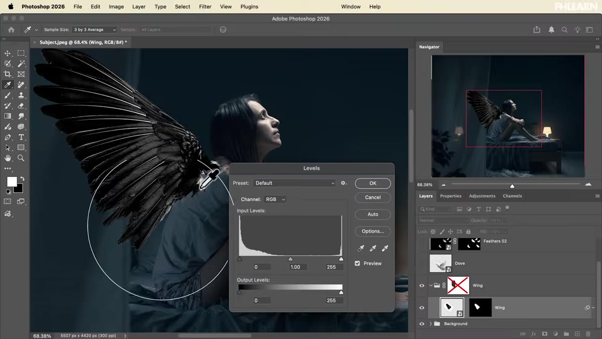 Wing element being blended onto subject with light matching
With a cleaned-up background in place, Aaron places the wing photograph onto the subject and works through the process of making two completely unrelated photos read as a single image. This is the core skill of compositing and it lives almost entirely in light and color. The wing has its own exposure, color temperature, and directional light. The subject has hers. Bridging that gap is what the tutorial is really teaching.
Wing element being blended onto subject with light matching
With a cleaned-up background in place, Aaron places the wing photograph onto the subject and works through the process of making two completely unrelated photos read as a single image. This is the core skill of compositing and it lives almost entirely in light and color. The wing has its own exposure, color temperature, and directional light. The subject has hers. Bridging that gap is what the tutorial is really teaching.
The dove element gets treated as an actual light source within the scene, which is a smart creative choice and a great technique to internalize. When you composite an element that’s glowing or luminous, you can sell the whole thing by having that element actually appear to cast light onto the surrounding scene, using adjustment layers clipped to your subject or painted light effects on a separate layer.
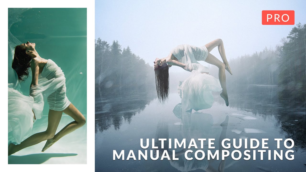
Step 5: Mask a Subject, Use Harmonize, and Add a Reflection
 Subject masked out with Harmonize color matching applied
Project three is a levitation effect over frozen water, and it’s where the tutorial gets into some of Photoshop’s newer AI tools. Specifically, Aaron covers the Harmonize feature, which analyzes your subject and background and adjusts the subject’s colors to match the scene. It’s genuinely impressive when it works.
Subject masked out with Harmonize color matching applied
Project three is a levitation effect over frozen water, and it’s where the tutorial gets into some of Photoshop’s newer AI tools. Specifically, Aaron covers the Harmonize feature, which analyzes your subject and background and adjusts the subject’s colors to match the scene. It’s genuinely impressive when it works.
But Aaron also shows you how to do the same thing manually, and that’s the part I’d bookmark. Harmonize won’t always nail it, and understanding how to manually recolor a subject using Hue/Saturation, Color Balance, and selective color adjustments gives you a fallback that works every time. The reflection technique is also covered here: flipping the subject, masking it into the water, and blending it with the original image so it reads as a real surface reflection rather than a copy-paste.
Step 6: Add Snow, Fog, and Finish in Adobe Camera Raw
 Fog and snow brush effects added over levitation composite
The levitation project finishes with atmospheric effects, fog and snow, both achievable with a downloadable brush included in the tutorial. The snow brush, like the fairy brush from project one, is something you can study and reverse-engineer. The technique is about placement and opacity variation, not just scattering particles everywhere.
Fog and snow brush effects added over levitation composite
The levitation project finishes with atmospheric effects, fog and snow, both achievable with a downloadable brush included in the tutorial. The snow brush, like the fairy brush from project one, is something you can study and reverse-engineer. The technique is about placement and opacity variation, not just scattering particles everywhere.
Both projects two and three close out in Adobe Camera Raw, and Aaron uses it for color grading, light adjustments, and final effects. ACR as a finishing step (running it as a Smart Filter on a flattened stamp layer) is worth adopting as a regular habit. It gives you one place to make global adjustments without permanently committing to anything.
Step 7: Place a Studio Subject into a Winter Environment
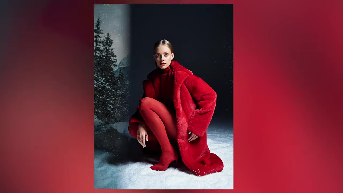 Studio subject placed into winter wonderland background
The fourth project takes a clean studio portrait and drops it into a winter wonderland, which is about as classic a compositing challenge as it gets. The process follows the same logic as the earlier projects: extend borders, cut out the subject carefully, blend the ground plane so the subject appears to actually be standing in the environment, then recolor and relight the background to match. A snow texture layer and a Camera Raw finishing pass bring it all together.
Studio subject placed into winter wonderland background
The fourth project takes a clean studio portrait and drops it into a winter wonderland, which is about as classic a compositing challenge as it gets. The process follows the same logic as the earlier projects: extend borders, cut out the subject carefully, blend the ground plane so the subject appears to actually be standing in the environment, then recolor and relight the background to match. A snow texture layer and a Camera Raw finishing pass bring it all together.
One Thing I’d Add From My Own Experience
The biggest compositing mistake I made early on was treating masking and color matching as two separate jobs done in sequence. Mask first, then color match. The problem is that color matching often reveals masking problems you missed, so you end up going back and forth forever. What I’d suggest is doing a rough mask, then doing a rough color match pass, then refining both together. It’s a tighter feedback loop and it saves a lot of rework.
The single most important thing this tutorial teaches isn’t any one tool or technique. It’s that every element in a composite needs to answer two questions: where is the light coming from, and does the color temperature match? Get those two things right and the rest is details. Get them wrong and no amount of snow brushes or Camera Raw magic will save you.
Watch the full tutorial on YouTube and grab the PHLEARN Pro version if you want the sample images and downloadable brushes. Worth it.
Comments
Leave a Comment