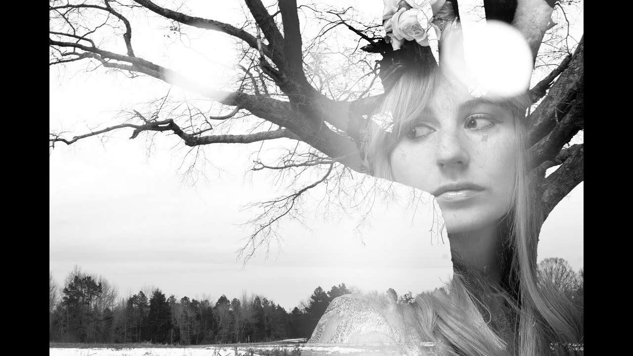
There’s a specific kind of client brief that used to make me freeze up: “Make it look artistic. You know, like a double exposure thing.” Vague enough to mean anything, specific enough that they definitely had a Pinterest reference they weren’t showing me. I’d cobble something together using Screen mode and hope for the best, and it would look… fine. Not great. The kind of result that gets approved but doesn’t end up in anyone’s portfolio.
That changed when I worked through this Aaron Nace (PHLEARN) tutorial on building a proper double exposure from scratch in Photoshop. Watch the full tutorial on YouTube. What I liked about Aaron’s approach is that it’s not just “slap two layers together and mess with opacity.” There’s actual logic behind which images to pair, how to prep them, and how to use selections to control exactly where each photo shows through. Once I understood that logic, the technique got a lot more repeatable.
The setup uses three images: a portrait, a tree photograph, and a blurry interior shot that reads like a window. You don’t need those exact photos, but the principle holds. You want a strong silhouette image (trees, buildings, a person from behind), a face or texture you want to reveal inside it, and optionally a soft background element to add depth. Here’s how it comes together.
Step 1: Gather Your Images and Stack Them in One Document
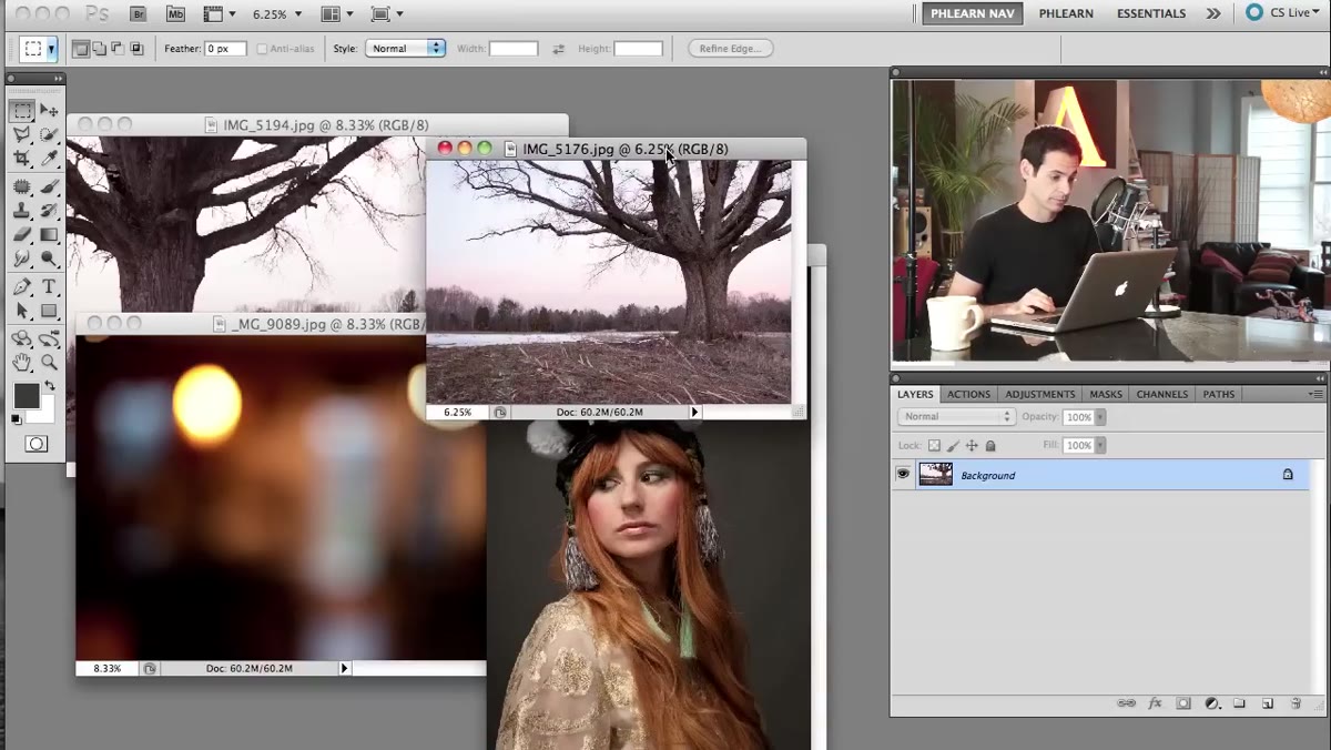 Three source images open side by side in Photoshop
Start by opening all three of your source images in Photoshop. Use the Move tool to drag each one into a single working document, so they sit on separate layers in the same file. Don’t worry about sizing or positioning yet. The goal here is just to get everything in one place so you can start making decisions. Aaron suggests keeping things loose at this stage because the whole process benefits from experimentation. There are genuinely no wrong moves yet.
Three source images open side by side in Photoshop
Start by opening all three of your source images in Photoshop. Use the Move tool to drag each one into a single working document, so they sit on separate layers in the same file. Don’t worry about sizing or positioning yet. The goal here is just to get everything in one place so you can start making decisions. Aaron suggests keeping things loose at this stage because the whole process benefits from experimentation. There are genuinely no wrong moves yet.
Once everything is stacked, close the original source files. You want to be working from a clean layer panel, not six open tabs.
Step 2: Duplicate and Reposition the Tree Layer
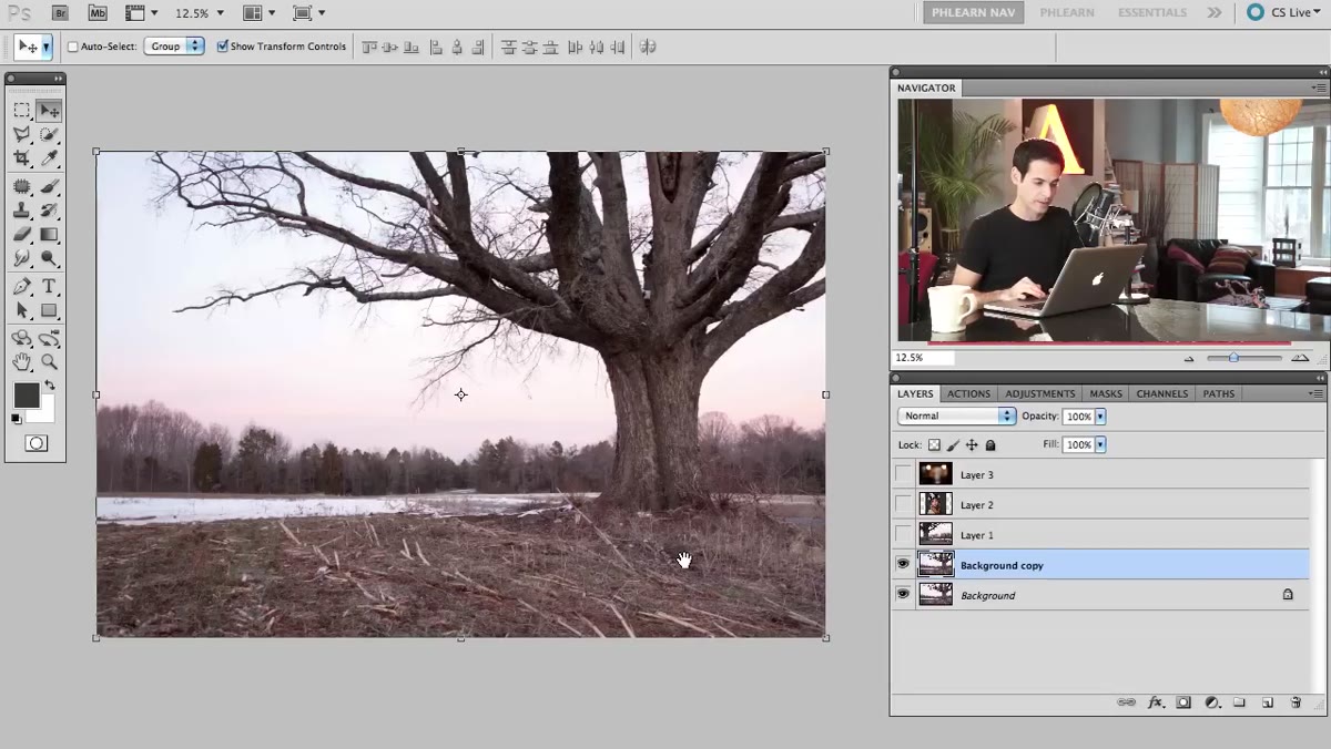 Duplicated tree layer being stretched and repositioned on canvas
The tree photo is going to be the structural backbone of the composite. To get more coverage across the canvas, duplicate the tree layer and stretch or reposition the duplicate so the branches fill more of the frame. Zoom out while you do this. Aaron makes a good point here: when you’re working on an abstract composite, you want to be able to see the whole canvas, not just one corner of it. Use Free Transform (Ctrl+T / Cmd+T) to scale and reposition until the tree feels balanced.
Duplicated tree layer being stretched and repositioned on canvas
The tree photo is going to be the structural backbone of the composite. To get more coverage across the canvas, duplicate the tree layer and stretch or reposition the duplicate so the branches fill more of the frame. Zoom out while you do this. Aaron makes a good point here: when you’re working on an abstract composite, you want to be able to see the whole canvas, not just one corner of it. Use Free Transform (Ctrl+T / Cmd+T) to scale and reposition until the tree feels balanced.
Don’t stress about perfect symmetry. Asymmetrical tree compositions almost always look more natural than centered ones.
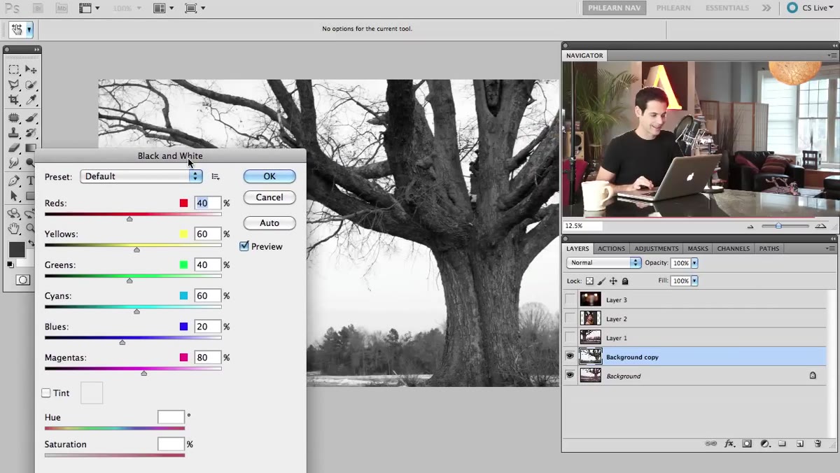
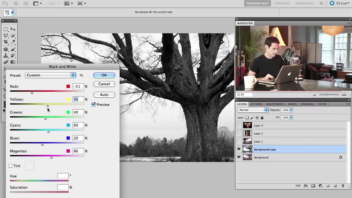
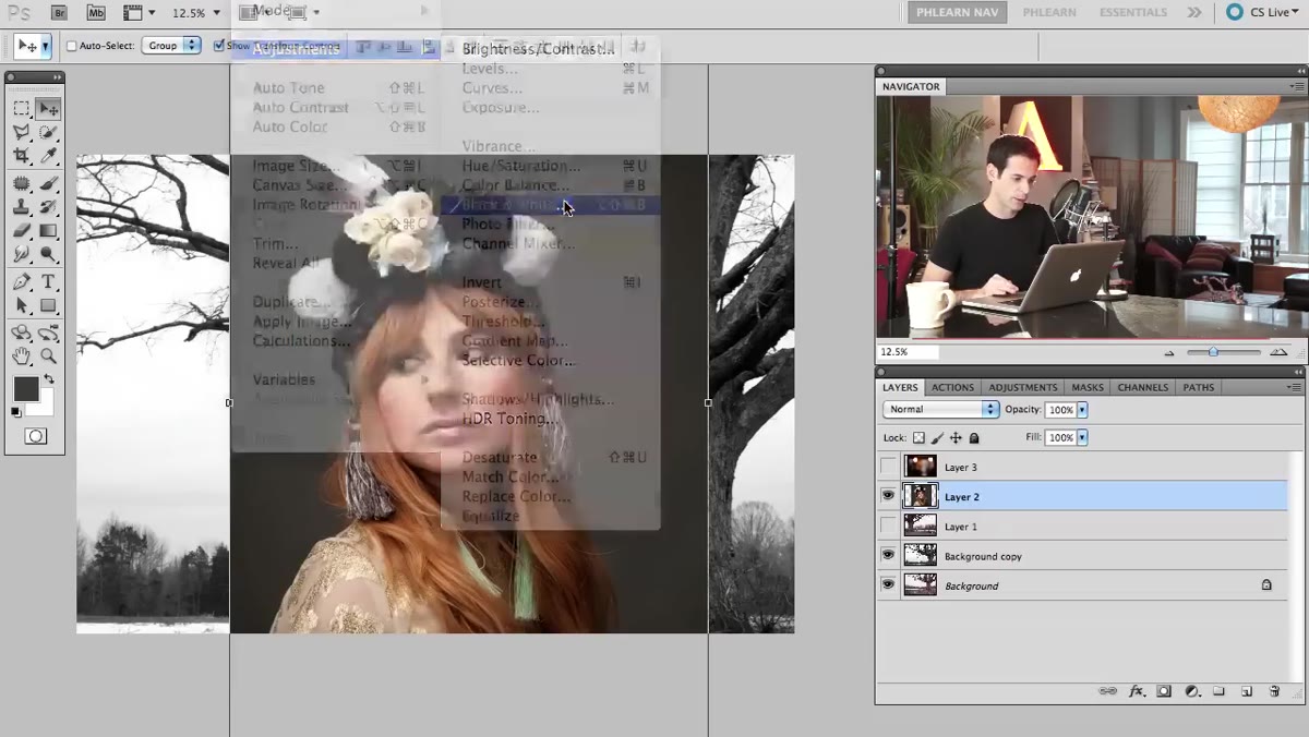
Step 3: Convert to Black and White Using Image Adjustments
 Black and White adjustment dialog open with color sliders visible
Here’s where a lot of people take a shortcut that costs them quality. The instinct is to go Image - Adjustments - Desaturate and call it a day. Aaron recommends going to Image - Adjustments - Black & White instead, and it’s genuinely a better call. The Black and White dialog gives you individual sliders for reds, yellows, greens, blues, cyans, and magentas. For a tree photo, that means you can pull the greens and yellows darker to make the foliage dramatic, or push them lighter to keep things airy.
Black and White adjustment dialog open with color sliders visible
Here’s where a lot of people take a shortcut that costs them quality. The instinct is to go Image - Adjustments - Desaturate and call it a day. Aaron recommends going to Image - Adjustments - Black & White instead, and it’s genuinely a better call. The Black and White dialog gives you individual sliders for reds, yellows, greens, blues, cyans, and magentas. For a tree photo, that means you can pull the greens and yellows darker to make the foliage dramatic, or push them lighter to keep things airy.
Aaron applies this directly to the layer rather than as an adjustment layer, which is fine for this workflow since you’re working non-destructively in other ways anyway. Dial in the contrast to taste. You want the tree to read as bold graphic shapes, not a muddy grey blob.
Step 4: Build a Selection From the Tree
 Tree layer selected with luminosity-based selection active in Photoshop
This is the core move that makes the whole effect work. The idea is to turn the tree itself into a selection, so that wherever the tree’s dark branches appear, you’ll eventually be revealing the portrait underneath. To do this cleanly, you can load a luminosity selection by going to Select - Color Range or by Ctrl-clicking (Cmd-clicking on Mac) the layer thumbnail in the Layers panel to load the layer’s pixels as a selection.
Tree layer selected with luminosity-based selection active in Photoshop
This is the core move that makes the whole effect work. The idea is to turn the tree itself into a selection, so that wherever the tree’s dark branches appear, you’ll eventually be revealing the portrait underneath. To do this cleanly, you can load a luminosity selection by going to Select - Color Range or by Ctrl-clicking (Cmd-clicking on Mac) the layer thumbnail in the Layers panel to load the layer’s pixels as a selection.
You may need to refine the selection depending on how your tree photo looks. The goal is a selection that captures the detail of the branches without being so tight that it ignores the softer edges. Aaron works with the tree selection loosely here, because the slight imperfection in the edges is part of what makes the final image feel organic rather than digitally sterile.
Step 5: Use the Selection to Mask the Portrait Layer
 Portrait layer with layer mask applied from tree selection
With your tree-based selection active, click on the portrait layer in the Layers panel and add a Layer Mask. Photoshop will use the selection to determine what’s visible. Where the tree branches were, you’ll now see the portrait. Where the sky or negative space was, the portrait is hidden.
Portrait layer with layer mask applied from tree selection
With your tree-based selection active, click on the portrait layer in the Layers panel and add a Layer Mask. Photoshop will use the selection to determine what’s visible. Where the tree branches were, you’ll now see the portrait. Where the sky or negative space was, the portrait is hidden.
If the result looks inverted (you’re seeing the face everywhere except the tree), just click the mask thumbnail and hit Ctrl+I / Cmd+I to invert it. This is one of those moments where the image either clicks immediately or needs a quick inversion to make sense. Either way, you’re one keystroke from the right result.
Step 6: Adjust Blend Modes and Layer Order to Unify the Composite
 Layers panel showing blend mode dropdown being changed on portrait layer
Once the mask is in place, the layers need to actually blend together visually, not just sit in a stack. Experiment with blend modes on the portrait layer. Screen and Multiply are the usual suspects for double exposure work, but Soft Light and Overlay can produce more painterly results depending on your photos. There’s no single right answer here. The blurry interior image works as a low-opacity background layer to add a sense of environment without competing with the main composition.
Layers panel showing blend mode dropdown being changed on portrait layer
Once the mask is in place, the layers need to actually blend together visually, not just sit in a stack. Experiment with blend modes on the portrait layer. Screen and Multiply are the usual suspects for double exposure work, but Soft Light and Overlay can produce more painterly results depending on your photos. There’s no single right answer here. The blurry interior image works as a low-opacity background layer to add a sense of environment without competing with the main composition.
Keep nudging layer order and opacity until the portrait feels like it’s living inside the tree, not just sitting on top of it.
What I’d Add After Doing This a Few Times
The one thing Aaron’s tutorial doesn’t get into, which I’d add based on my own use of this technique, is converting your key layers to Smart Objects before you start transforming them. I learned this the expensive way on a client job, resizing a portrait layer repeatedly until it turned into a soft mess, at which point it was too late to undo cleanly. If you right-click each layer and choose Convert to Smart Object before you start scaling or applying any filters, you preserve the original pixel data and can revisit transforms without degrading quality. Takes five seconds per layer and saves you a lot of grief.
The single most important thing this tutorial taught me is that a double exposure isn’t really a blending trick. It’s a selection problem. Once you understand that you’re using one image to define the shape of a window, and another image to be seen through that window, the whole technique becomes logical and repeatable rather than something you luck into. That shift in thinking is what makes it a real tool in your workflow instead of a happy accident.
Watch the full tutorial on YouTube to see Aaron walk through the full effect, including how the final image comes together with some additional tonal adjustments at the end.
Comments (1)
The tip about double exposure in photoshop h was the missing piece for me. Thank you.
Leave a Comment