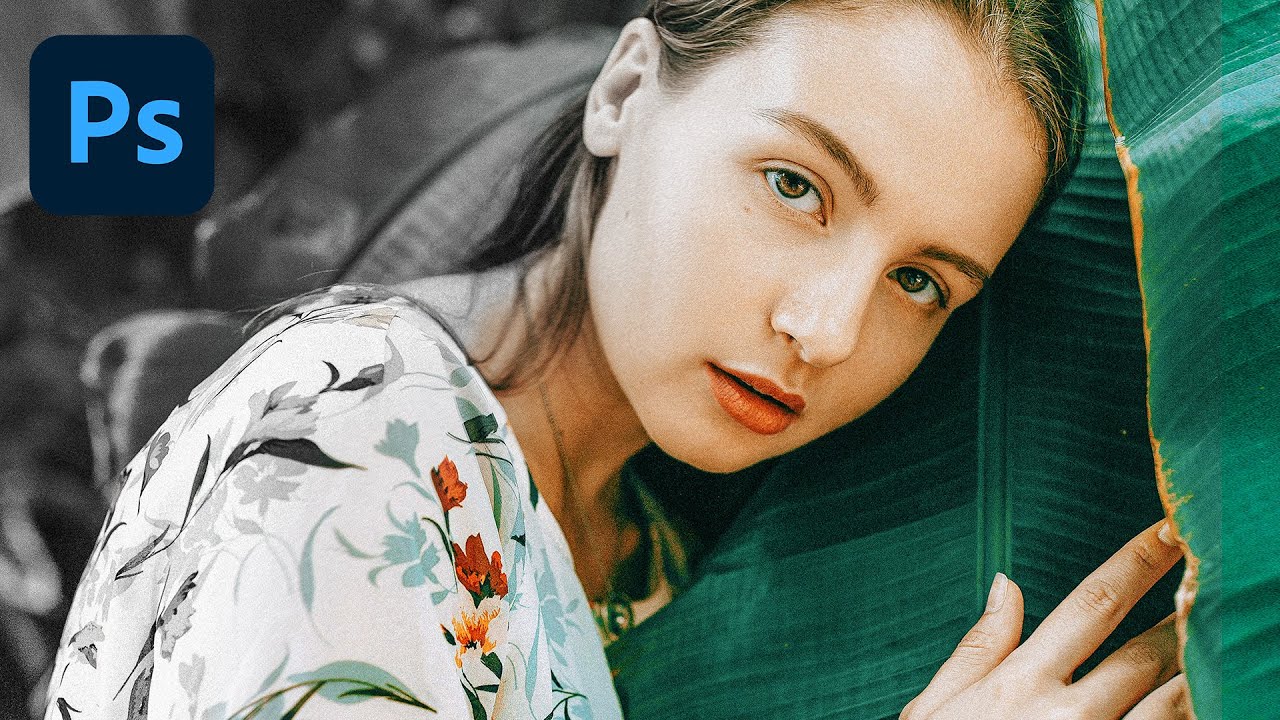
Stop Cranking Saturation on Portraits (Use This Instead)

Stop Cranking Saturation on Portraits (Use This Instead)

Every working designer has done it. You’ve got a portrait that feels a little flat, so you drag Saturation up and suddenly your subject looks like they’ve been marinaded in Hawaiian Punch. You dial it back, feel vaguely guilty, and move on. I did this for longer than I care to admit before I finally took the time to understand what Vibrance actually does differently, and why it’s almost always the better choice when people are in the frame.
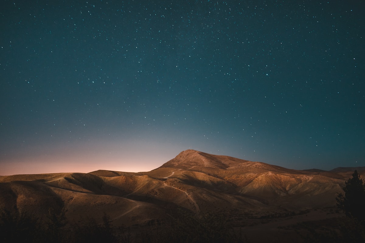
How to Make Colors Pop Without Oversaturating

How to Make Colors Pop Without Oversaturating

“Make the colors pop” is probably the most common editing request, and the most common way to fulfill it — cranking the saturation slider — is also the worst. Oversaturated images look amateurish, print terribly, and destroy skin tones. Here’s how to actually make colors more vivid and impactful. Why Saturation Alone Doesn’t Work The Saturation slider increases the intensity of every color equally. This means already-saturated colors become radioactive while subtle colors barely change.