
Every working designer has done it. You’ve got a portrait that feels a little flat, so you drag Saturation up and suddenly your subject looks like they’ve been marinaded in Hawaiian Punch. You dial it back, feel vaguely guilty, and move on. I did this for longer than I care to admit before I finally took the time to understand what Vibrance actually does differently, and why it’s almost always the better choice when people are in the frame.
In this Aaron Nace tutorial from PHLEARN, Watch the full tutorial on YouTube, the difference gets broken down cleanly using a real portrait with a green background, which is basically a perfect test case. You’ve got skin tones on one side and vivid environmental color on the other. Push Saturation too hard and the skin goes radioactive. Use Vibrance instead and the leaves pop while the face stays human. The contrast is pretty hard to argue with once you see it side by side.
The workflow he walks through is fast, but there’s a refinement at the end involving a color-based selection and layer masks that I think a lot of people skip over. Don’t skip it. It’s the part that actually makes this production-ready rather than just “good enough for now.”
Step 1: Add a Vibrance Adjustment Layer
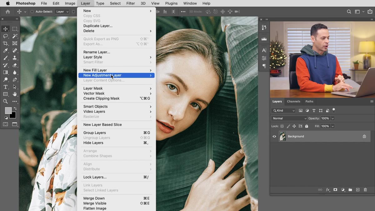 New Vibrance adjustment layer added in Layers panel
Go to Layer, then New Adjustment Layer, then Vibrance. This opens an adjustment layer that contains two sliders: Vibrance and Saturation. They live in the same panel, which I think is partly why people conflate them. Having both available is actually useful once you understand what each one does, but for now just notice they’re separate controls with very different behaviors.
New Vibrance adjustment layer added in Layers panel
Go to Layer, then New Adjustment Layer, then Vibrance. This opens an adjustment layer that contains two sliders: Vibrance and Saturation. They live in the same panel, which I think is partly why people conflate them. Having both available is actually useful once you understand what each one does, but for now just notice they’re separate controls with very different behaviors.
Step 2: Duplicate That Layer and Label It
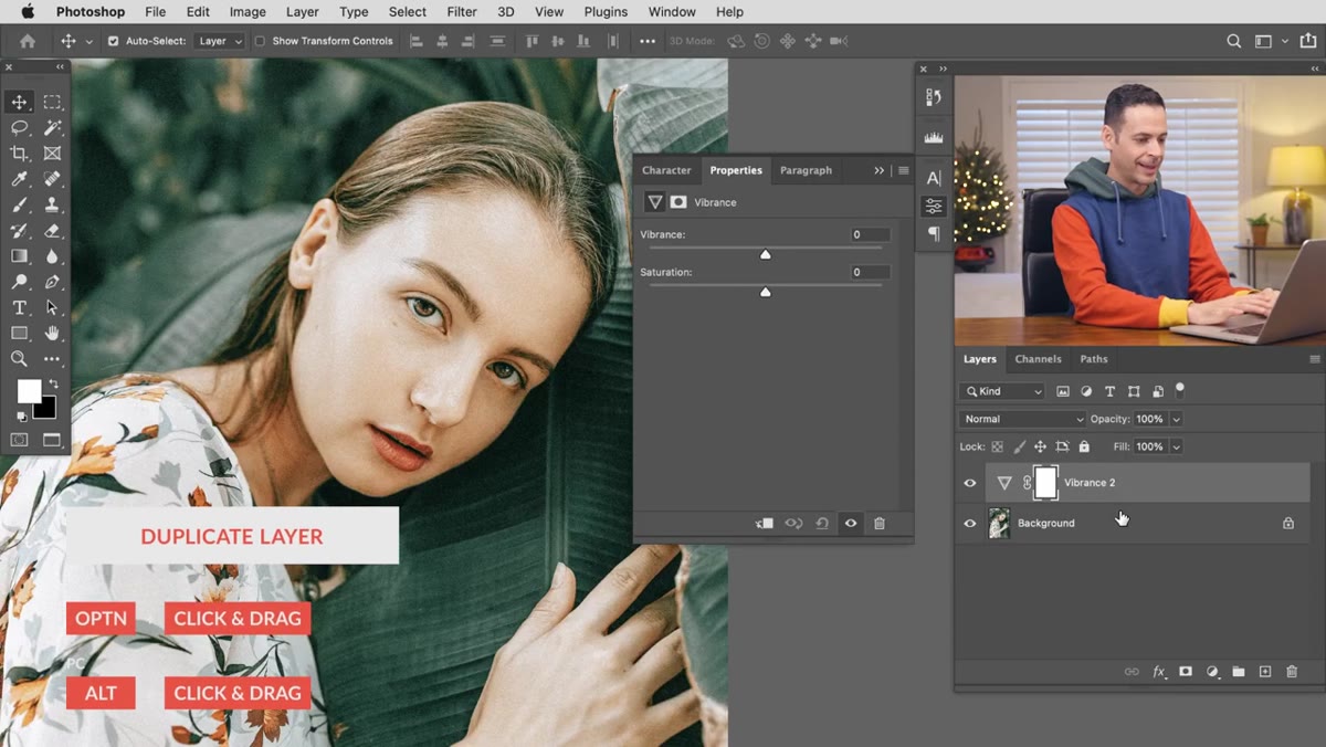 Duplicating the Vibrance adjustment layer in Layers panel
Hit Ctrl/Cmd + J to duplicate the Vibrance adjustment layer. Rename the duplicate “Saturation” so you have a clean A/B comparison ready to go. This isn’t just organizational housekeeping. You’re setting up an experiment right in your document, and being able to toggle each layer on and off independently is how you actually see the difference without having to rely on memory.
Duplicating the Vibrance adjustment layer in Layers panel
Hit Ctrl/Cmd + J to duplicate the Vibrance adjustment layer. Rename the duplicate “Saturation” so you have a clean A/B comparison ready to go. This isn’t just organizational housekeeping. You’re setting up an experiment right in your document, and being able to toggle each layer on and off independently is how you actually see the difference without having to rely on memory.
Step 3: Crank Vibrance on the First Layer
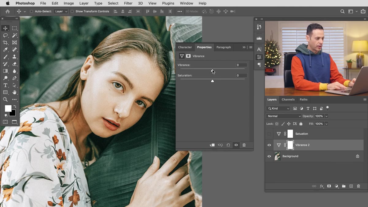 Vibrance slider pulled all the way up in Properties panel
On your original Vibrance layer, drag the Vibrance slider all the way to the right. Not halfway. All the way. The point of this exercise is to see the behavior at the extreme, not in some tasteful middle ground. What you’ll notice is that the environmental colors, greens, foliage, background tones, get a serious boost while the skin stays relatively intact. It’s not perfect at 100, and you wouldn’t leave it there on a real job, but it’s coherent. The face still reads as a face.
Vibrance slider pulled all the way up in Properties panel
On your original Vibrance layer, drag the Vibrance slider all the way to the right. Not halfway. All the way. The point of this exercise is to see the behavior at the extreme, not in some tasteful middle ground. What you’ll notice is that the environmental colors, greens, foliage, background tones, get a serious boost while the skin stays relatively intact. It’s not perfect at 100, and you wouldn’t leave it there on a real job, but it’s coherent. The face still reads as a face.
Step 4: Crank Saturation on the Duplicate Layer (for Comparison)
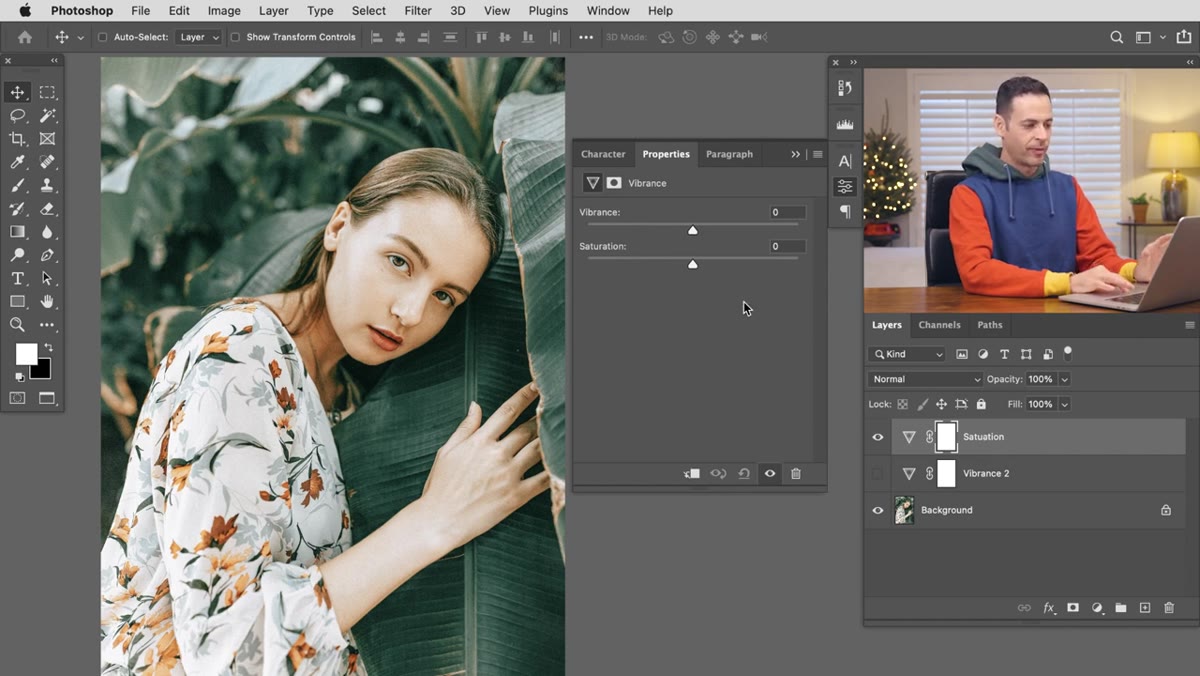 Saturation slider maxed out showing blown skin tones
On your duplicate layer (the one labeled “Saturation”), leave Vibrance at zero and push the Saturation slider all the way up instead. Then toggle the layer on and off and watch what happens to the skin. It’s the clearest possible demonstration of why Saturation is a blunt instrument. It treats every pixel equally, so the same boost that makes your greens sing also makes skin look synthetic. Vibrance, by contrast, is weighted. It reads that skin tones are already relatively saturated and eases off on them automatically.
Saturation slider maxed out showing blown skin tones
On your duplicate layer (the one labeled “Saturation”), leave Vibrance at zero and push the Saturation slider all the way up instead. Then toggle the layer on and off and watch what happens to the skin. It’s the clearest possible demonstration of why Saturation is a blunt instrument. It treats every pixel equally, so the same boost that makes your greens sing also makes skin look synthetic. Vibrance, by contrast, is weighted. It reads that skin tones are already relatively saturated and eases off on them automatically.
Step 5: Stack Vibrance Layers for a Stronger Effect
 Two stacked Vibrance adjustment layers visible in panel
Here’s something I genuinely hadn’t tried before watching this: if you want more punch than a single Vibrance layer gives you, duplicate it. Stack two identical Vibrance adjustment layers instead of reaching for the Saturation slider. The cumulative effect is noticeably more intense than a single layer, and the skin protection carries through both passes. It’s a smarter way to push color than just dragging a slider further right, and it keeps each adjustment layer at a reasonable value rather than pegged at the maximum.
Two stacked Vibrance adjustment layers visible in panel
Here’s something I genuinely hadn’t tried before watching this: if you want more punch than a single Vibrance layer gives you, duplicate it. Stack two identical Vibrance adjustment layers instead of reaching for the Saturation slider. The cumulative effect is noticeably more intense than a single layer, and the skin protection carries through both passes. It’s a smarter way to push color than just dragging a slider further right, and it keeps each adjustment layer at a reasonable value rather than pegged at the maximum.
Step 6: Select the Skin Using Color Range
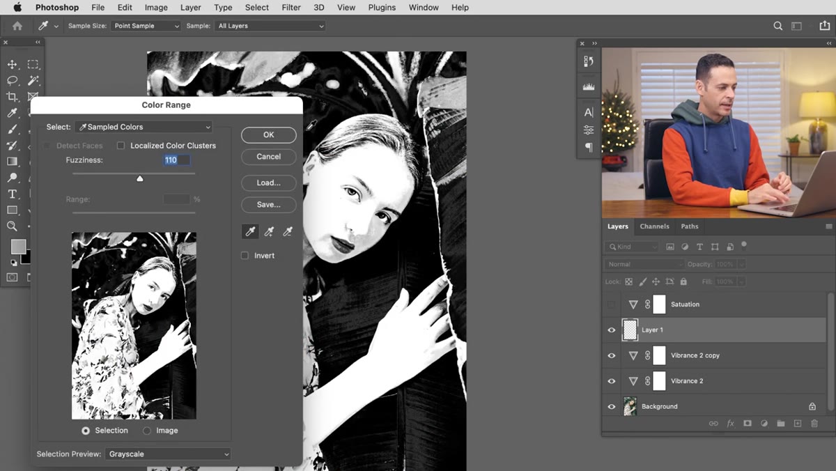 Color Range dialog with skin tones selected in preview
If you push the Vibrance layers and find the skin is still picking up more color than you want, here’s how to fix it non-destructively. Create a new blank layer, then go to Select and choose Color Range. Click your eyedropper on the skin in the image. The Color Range preview shows selected areas as white and unselected areas as black. Use the plus eyedropper to add a few more skin sample points until the face and hands are solidly selected. Hit OK and you’ll have a selection active based purely on color, which is exactly what you want here.
Color Range dialog with skin tones selected in preview
If you push the Vibrance layers and find the skin is still picking up more color than you want, here’s how to fix it non-destructively. Create a new blank layer, then go to Select and choose Color Range. Click your eyedropper on the skin in the image. The Color Range preview shows selected areas as white and unselected areas as black. Use the plus eyedropper to add a few more skin sample points until the face and hands are solidly selected. Hit OK and you’ll have a selection active based purely on color, which is exactly what you want here.
Step 7: Paint Black on the Vibrance Layer Mask
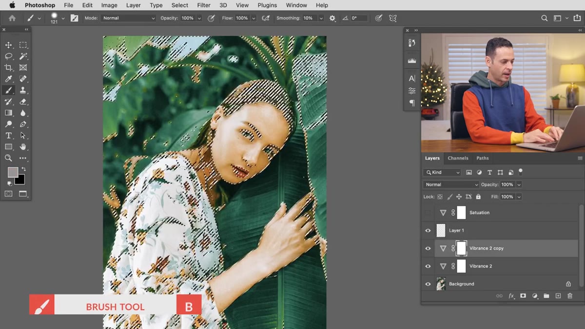 Black being painted onto Vibrance layer mask over skin area
Keep that selection active. Click on the layer mask thumbnail of one of your Vibrance adjustment layers, hit B for the Brush tool, set your foreground color to black, and paint over the skin areas. The selection constrains the brush so you’re only masking within the color range you defined. Painting black on a mask hides the effect in those areas. Do this on both stacked Vibrance layers if you’re using two, and the skin tones will quietly step back while the rest of the image stays boosted. Hit Ctrl/Cmd + H to hide the marching ants and check the result cleanly.
Black being painted onto Vibrance layer mask over skin area
Keep that selection active. Click on the layer mask thumbnail of one of your Vibrance adjustment layers, hit B for the Brush tool, set your foreground color to black, and paint over the skin areas. The selection constrains the brush so you’re only masking within the color range you defined. Painting black on a mask hides the effect in those areas. Do this on both stacked Vibrance layers if you’re using two, and the skin tones will quietly step back while the rest of the image stays boosted. Hit Ctrl/Cmd + H to hide the marching ants and check the result cleanly.
One Thing I’d Add: Watch Your Fuzziness Setting in Color Range
Color Range has a Fuzziness slider at the top of the dialog, and it controls how broadly the selection bleeds out from your sampled colors. On a portrait with warm skin tones, running Fuzziness too high will start pulling in things like golden hour backgrounds or warm-toned fabrics that you don’t actually want masked. I’ve made that mistake on a client edit where the model was wearing an orange jacket, and the mask ended up eating half her sleeve. Keep Fuzziness somewhere in the 40-60 range as a starting point and preview carefully before committing. The default value is often higher than it needs to be.
The single most important thing to take from this: Vibrance is not just “gentler Saturation.” It’s a contextually aware tool that prioritizes undersaturated areas and protects skin tones, which makes it categorically better for portrait work. Saturation has its uses, especially when you want even, uniform color shifts across an entire image, but it should not be your default knob to turn when a photo looks flat and there’s a person in it.
Watch the full tutorial on YouTube and see the side-by-side comparison in motion. Seeing the skin-tone difference in real time is more convincing than any description of it.
Comments
Leave a Comment