Displacement Maps in Photoshop: Make Text and Logos Look Like They Actually Belong There

Displacement Maps in Photoshop: Make Text and Logos Look Like They Actually Belong There

There’s a specific kind of bad composite that haunts me. You’ve seen it. A logo slapped onto a t-shirt or a hat, sitting perfectly flat and perfectly lit, glowing like a digital sticker that has absolutely no relationship with the fabric underneath it. I’ve made that mistake more times than I want to admit, usually under deadline pressure, usually when a client wanted something “quick.” The result always looked cheap, and I knew it.

Black & White in Photoshop: When to Use It, When to Ditch It, and How to Actually Do It Right

Black & White in Photoshop: When to Use It, When to Ditch It, and How to Actually Do It Right

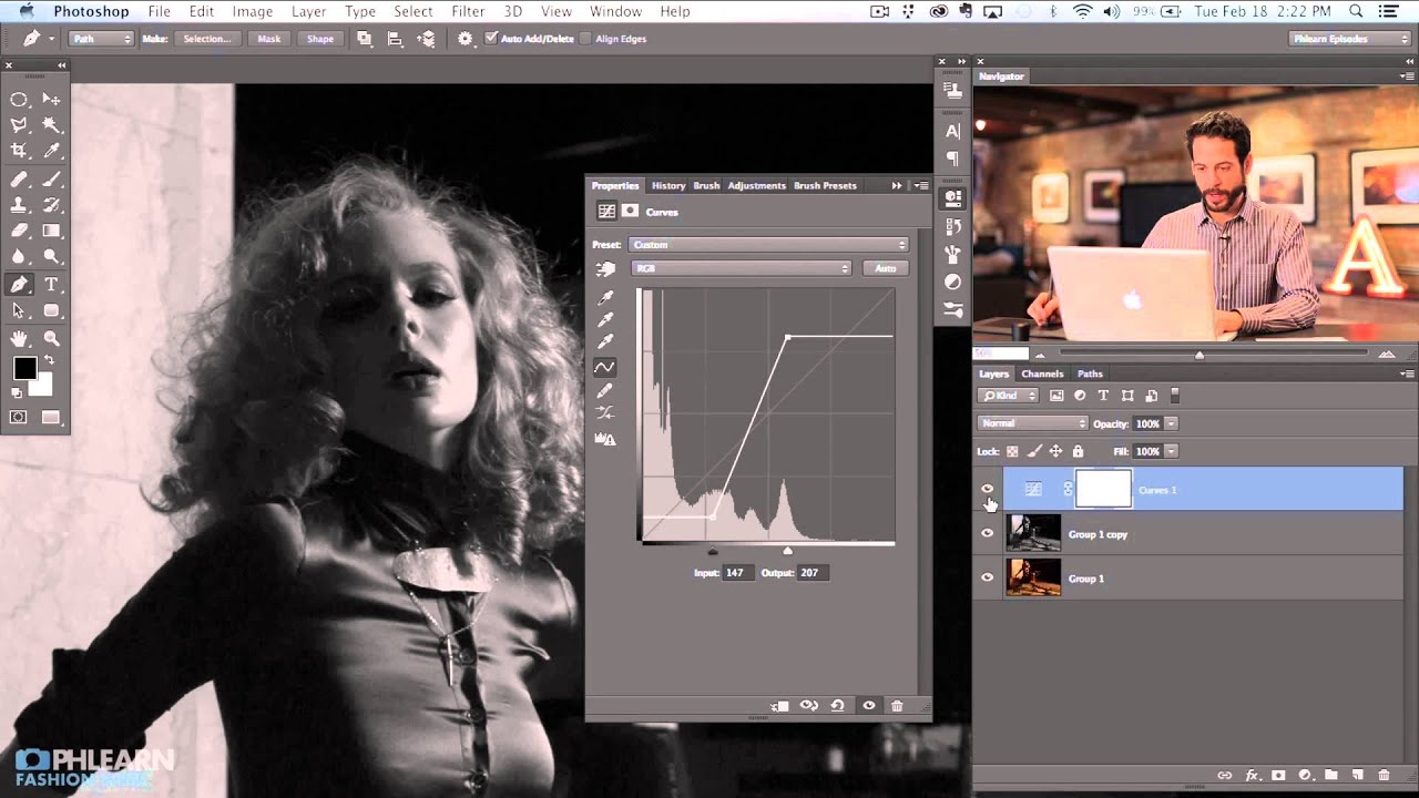
Client work has a funny way of forcing you to get good at things you’ve been half-assing for years. For me, black and white conversion was one of those things. I’d been hitting Shift+Command+U, calling it done, and moving on. Then I handed a moody portrait to a client who came back and said it looked “flat and kind of sad, but not in a good way.” Fair. I had no real control over the tonal relationships in the image.

Why Your Photo Composites Look Fake (And the Luminosity Trick That Fixes It)

Why Your Photo Composites Look Fake (And the Luminosity Trick That Fixes It)

I once spent three days on a composite. Three full days, multiple oat milk lattes, two different coffee shops, and one very dramatic Spotify playlist. I was proud of it. I sent it to a designer friend for feedback and he replied with a voice memo, which is never a good sign. Turns out he’d recreated something cleaner in about 20 minutes using a luminosity-based matching workflow I had never once considered.

Bringing the Dead Back to Life: How to Restore a Torn Photo in Photoshop

Bringing the Dead Back to Life: How to Restore a Torn Photo in Photoshop

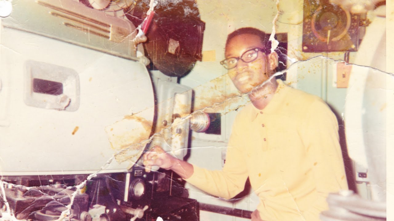
Old photos are brutal. Not emotionally (okay, sometimes emotionally) but technically. Torn edges, yellowed paper, creases running straight through someone’s face. If a client or a family member ever slides one of these across a table at you, the gut reaction is to smile and nod while internally spiraling. I’ve been there. The good news is that Photoshop has everything you need to bring these things back from the brink. The bad news is that the workflow isn’t obvious if you’ve never done it before.

Double Exposure in Photoshop: How to Blend a Portrait and a Landscape Into One Striking Image

Double Exposure in Photoshop: How to Blend a Portrait and a Landscape Into One Striking Image

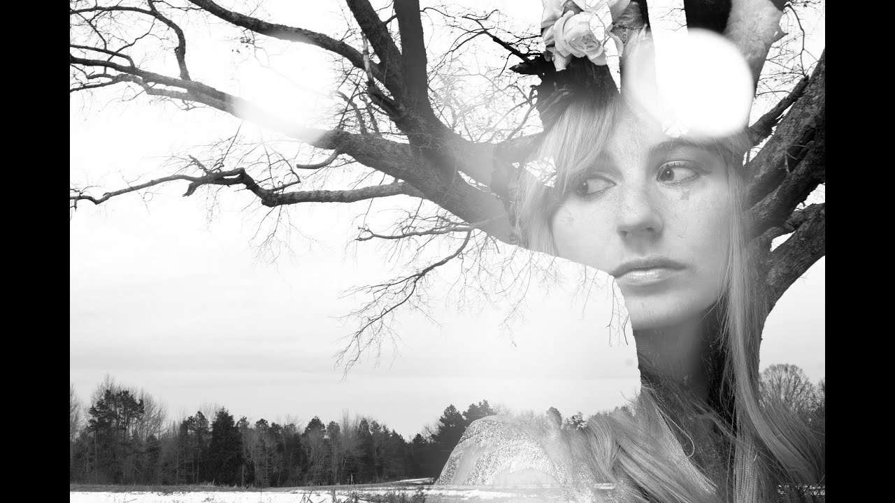
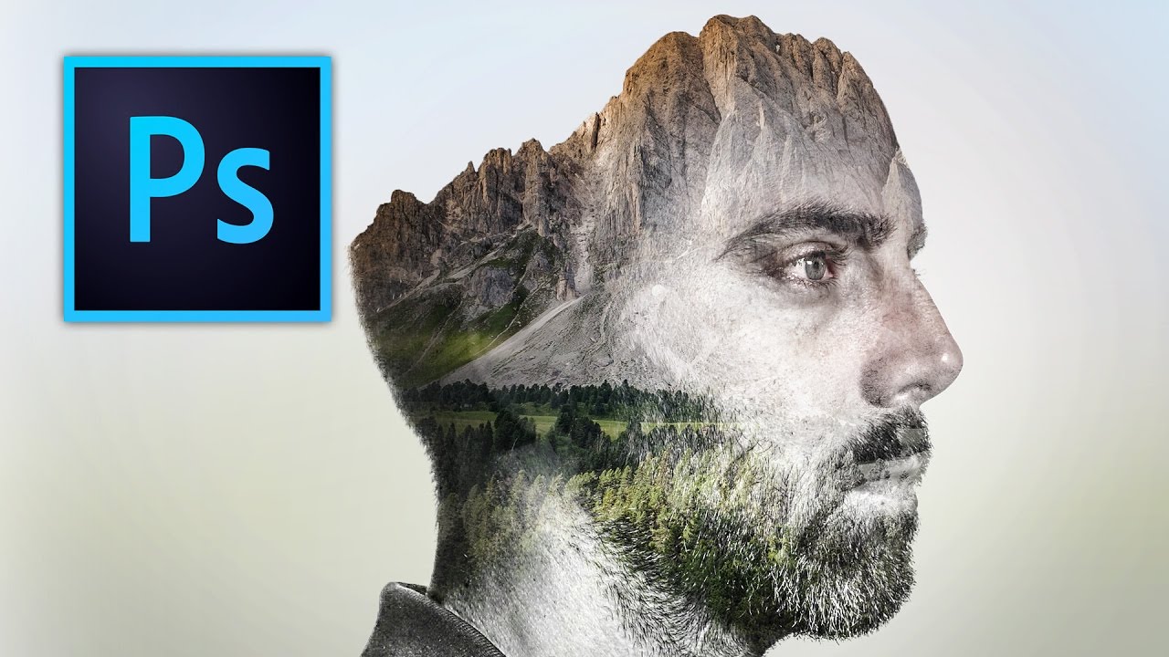
There’s a specific kind of client brief that used to make me freeze up: “Make it look artistic. You know, like a double exposure thing.” Vague enough to mean anything, specific enough that they definitely had a Pinterest reference they weren’t showing me. I’d cobble something together using Screen mode and hope for the best, and it would look… fine. Not great. The kind of result that gets approved but doesn’t end up in anyone’s portfolio.

Frequency Separation Filters: Stop Blurring Everything and Start Working Smarter

Frequency Separation Filters: Stop Blurring Everything and Start Working Smarter

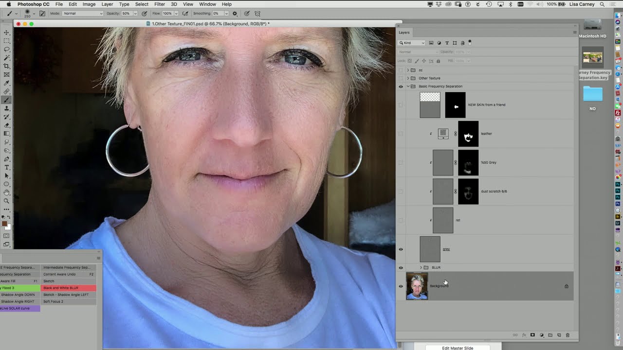
Frequency separation is one of those techniques that every retoucher learns, uses constantly, and then slowly starts doing wrong out of habit. The classic setup is fine. You’ve got your high-frequency texture layer, your low-frequency color layer, and you’re ready to go. But then you grab the Gaussian blur and just… nuke the whole low-frequency layer. Every dark blends into every light. You get that weird mushy modeling effect that looks fine at 50% zoom and terrible everywhere else.

Two-Layer Vignettes in Photoshop: The Technique That Makes Your Subject Pop

Two-Layer Vignettes in Photoshop: The Technique That Makes Your Subject Pop

I used to add vignettes the lazy way. Throw a black-to-transparent radial gradient on top, drop the opacity to taste, call it a day. It worked well enough for meme graphics back when I was just making stuff for friends’ band pages, but the moment I started doing actual client work, that flat gradient approach looked exactly like what it was: a shortcut. The edges felt pasted on. Photographers noticed. Art directors noticed.

How to Blend Two Photos into a Double Exposure Effect (Without It Looking Like a Mess)

How to Blend Two Photos into a Double Exposure Effect (Without It Looking Like a Mess)

There’s a specific kind of design request that used to make me sweat a little. Client sends over a headshot and a mood board full of those dreamy portrait-meets-landscape composites, and suddenly you’re either the person who knows how to do that, or you’re about to spend three hours on YouTube pretending you did all along. Double exposure is one of those effects that looks complicated and mysterious until someone actually walks you through it, and then you feel mildly embarrassed by how simple the core idea is.

Stop Sleeping on Camera Raw Filter: Your Secret Weapon for Stunning Photos

Stop Sleeping on Camera Raw Filter: Your Secret Weapon for Stunning Photos

The Tool You’ve Been Ignoring I’ll be honest—I spent years treating Photoshop’s Camera Raw filter like it was exclusively for photographers who shot in RAW format. Turns out, I was dead wrong, and I’m betting a lot of you have made the same mistake. Camera Raw Filter isn’t just a converter. It’s a full-featured editing powerhouse that most of us have been criminally underutilizing. While you’ve been hunched over your Curves and Hue/Saturation panels doing the same color work over and over, this beast has been sitting right there in your Filter menu, ready to transform your images in ways that’ll make you wonder why you didn’t start using it sooner.

The Art of Not Getting Caught: Photo Manipulation Done Right

The Art of Not Getting Caught: Photo Manipulation Done Right

The Art of Not Getting Caught: Photo Manipulation Done Right Look, I’m going to be straight with you: photo manipulation gets a bad rap. Everyone’s suddenly a purist who swears they “don’t edit their photos” while conveniently forgetting about that Instagram filter they applied. The truth? Good manipulation is invisible. Bad manipulation makes people look like plastic aliens. I’m here to help you be in the first camp. The Golden Rule: Subtlety is Your Best Friend The biggest mistake I see is people treating Photoshop like a sledgehammer when they should be using it like a scalpel.

Stop Nuking Eye Color: A Better Way to Change Eyes in Photoshop

Stop Nuking Eye Color: A Better Way to Change Eyes in Photoshop

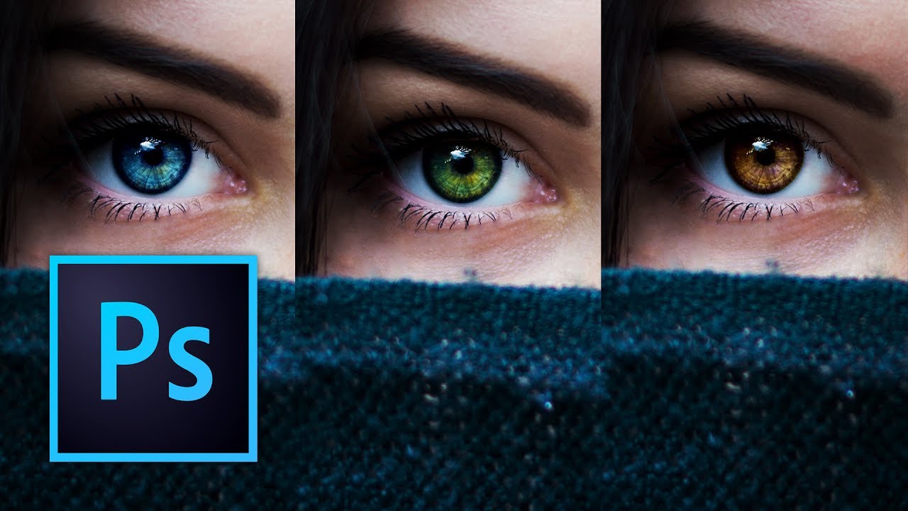
I used to change eye color in Photoshop the lazy way. Hue/Saturation adjustment layer, clip it, drag the slider, call it a day. It works, technically. It also looks like you swapped someone’s eyes with a cartoon character’s. Clients notice. You notice. And then you spend twenty minutes trying to dial it back until it looks passably human, which mostly defeats the purpose. The smarter approach involves a more deliberate mask and a color-mixing method that actually respects how eyes catch light.

Stop Fighting Your Edits: Why Luminosity Masks Are a Game-Changer

Stop Fighting Your Edits: Why Luminosity Masks Are a Game-Changer

Stop Fighting Your Edits: Why Luminosity Masks Are a Game-Changer I used to think luminosity masks were some sort of dark magic reserved for Photoshop wizards wearing black turtlenecks in dimly lit studios. Turns out, I was completely wrong—and I’m betting you might be too. The Brightness-Based Selection Revolution Here’s the thing about editing: the best adjustments feel invisible. You want your skies to pop without looking artificially manipulated. You want shadow detail without everything turning into a muddy mess.