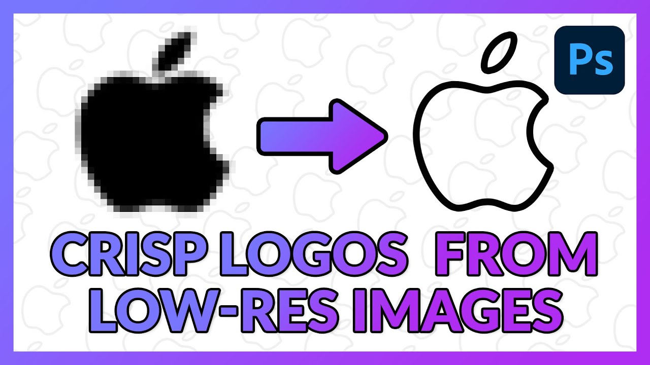
Stop Sending Pixelated Logos to Print — Here's How to Vectorize Them in Photoshop

Stop Sending Pixelated Logos to Print — Here's How to Vectorize Them in Photoshop

If you’ve done any kind of client work, you’ve been here before. Someone emails you a logo, you open it up, and it’s a 200x200 pixel JPEG that looks like it was exported from a website in 2009. They need it on a banner. Or a t-shirt. Or, my personal favorite, “just make it bigger.” And there you are, staring at a pixelated mess, trying to figure out how to not make it look terrible at three feet wide.

Displacement Maps in Photoshop: Make Text and Logos Look Like They Actually Belong There

Displacement Maps in Photoshop: Make Text and Logos Look Like They Actually Belong There

There’s a specific kind of bad composite that haunts me. You’ve seen it. A logo slapped onto a t-shirt or a hat, sitting perfectly flat and perfectly lit, glowing like a digital sticker that has absolutely no relationship with the fabric underneath it. I’ve made that mistake more times than I want to admit, usually under deadline pressure, usually when a client wanted something “quick.” The result always looked cheap, and I knew it.