If you’ve done any kind of client work, you’ve been here before. Someone emails you a logo, you open it up, and it’s a 200x200 pixel JPEG that looks like it was exported from a website in 2009. They need it on a banner. Or a t-shirt. Or, my personal favorite, “just make it bigger.” And there you are, staring at a pixelated mess, trying to figure out how to not make it look terrible at three feet wide. I’ve lost count of how many times I’ve had to have that awkward “your file is too small” conversation with a client, and honestly, I got tired of having it.
That’s why this tutorial hit close to home. In this Aaron Nace (PHLEARN) tutorial, Watch the full tutorial on YouTube, he walks through how to take low-resolution raster images and rebuild them as vectors entirely inside Photoshop. No Illustrator license required. Aaron’s upfront that Illustrator might handle this slightly better in some cases, but if you live in Photoshop like I do, this workflow gets the job done without switching apps.
The core idea is simple: raster images are made of pixels, so scaling them up just makes those pixels bigger and uglier. Vectors are defined mathematically, which means you can scale them to the size of a billboard and they stay sharp. By tracing your raster image with Photoshop’s shape tools, you convert it from a pixel blob into a clean, infinitely scalable graphic. Here’s how to do it.
Step 1: Start with the Highest Resolution Version You Have
 Low-res icon scaled up showing pixelated square edges
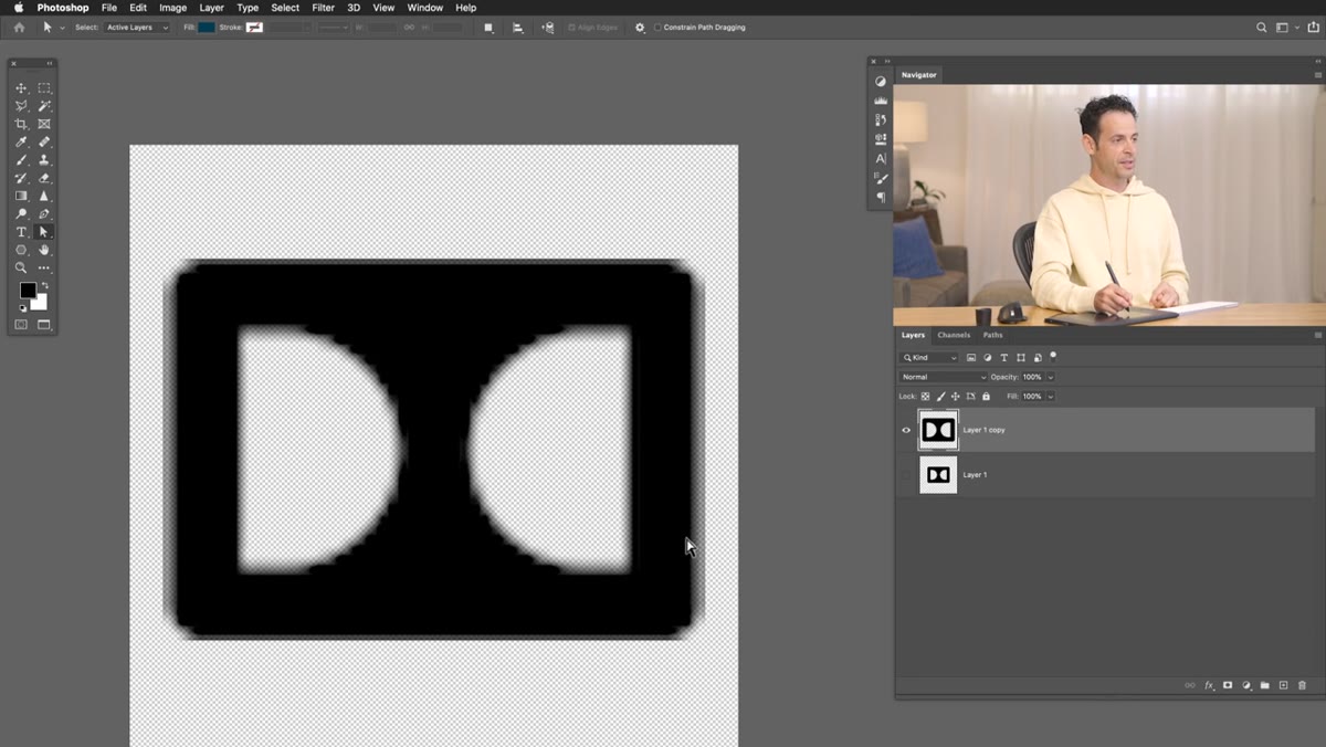
Before you start tracing anything, use the best version of the file you can get your hands on. Aaron demonstrates this by duplicating the layer, scaling it way up, and showing exactly what happens: the edges turn into chunky, blurred squares. It’s ugly, and it’s unavoidable with raster files. Even Photoshop’s smoothing algorithms can’t save you when pixels get stretched that far.
Low-res icon scaled up showing pixelated square edges
Before you start tracing anything, use the best version of the file you can get your hands on. Aaron demonstrates this by duplicating the layer, scaling it way up, and showing exactly what happens: the edges turn into chunky, blurred squares. It’s ugly, and it’s unavoidable with raster files. Even Photoshop’s smoothing algorithms can’t save you when pixels get stretched that far.
So pull the highest-res copy available, whether that’s from the original source, a client’s website, or somewhere like The Noun Project, which Aaron recommends for icons and graphics. Working from a larger source image gives you cleaner edges to trace, which means less cleanup work later.
Step 2: Choose the Right Shape Tool for the Job
 Shape tool options visible in toolbar, rounded rectangle selected
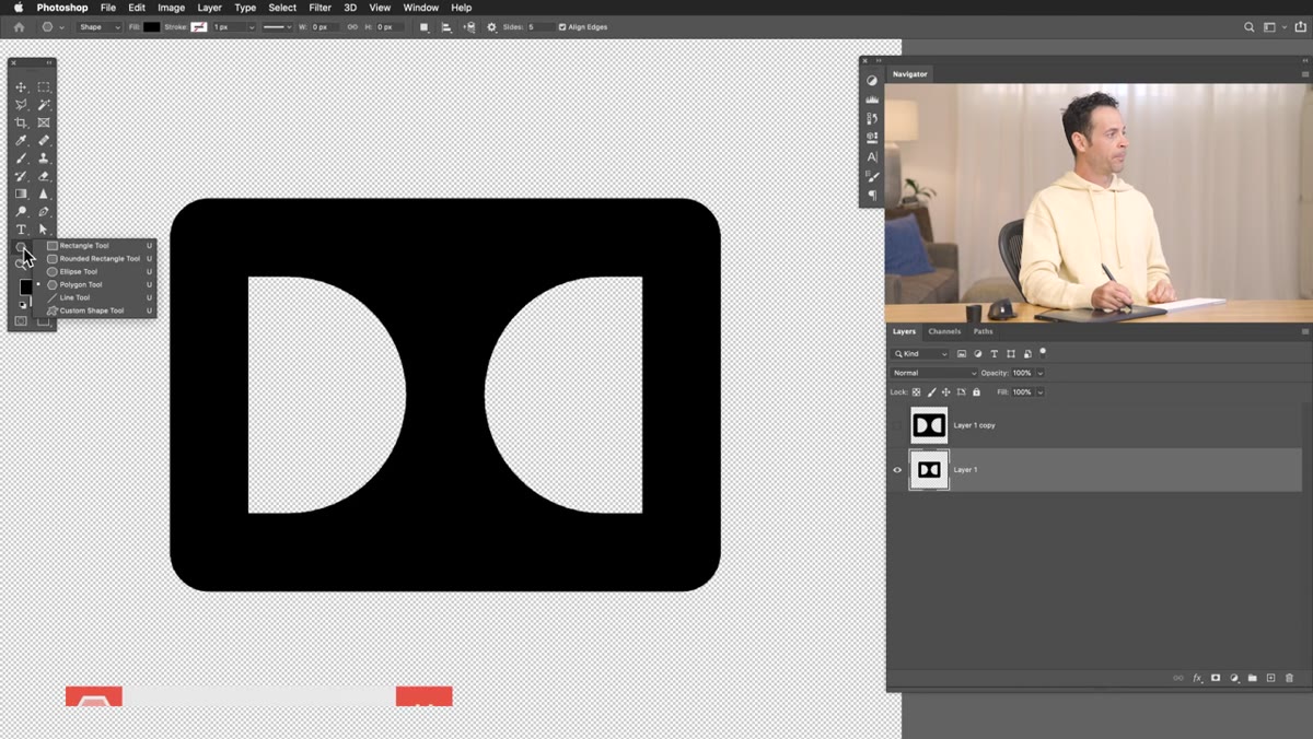
This is where the actual vectorization begins. Open your shape tools from the toolbar. You’ve got the Rectangle, Rounded Rectangle, Ellipse, Polygon, and Custom Shape tools. The goal is to match whatever tool fits the shapes in your image. For the Adobe Digital icon Aaron uses in the tutorial, he starts with the Rounded Rectangle because the logo has, predictably, rounded rectangle shapes in it.
Shape tool options visible in toolbar, rounded rectangle selected
This is where the actual vectorization begins. Open your shape tools from the toolbar. You’ve got the Rectangle, Rounded Rectangle, Ellipse, Polygon, and Custom Shape tools. The goal is to match whatever tool fits the shapes in your image. For the Adobe Digital icon Aaron uses in the tutorial, he starts with the Rounded Rectangle because the logo has, predictably, rounded rectangle shapes in it.
The choice of tool matters. If you reach for the Rounded Rectangle when the shape actually has sharp corners, you’ll spend forever fighting the corner radius settings. Take a second to look at your image and identify what basic geometric shapes make it up before you start clicking.
Step 3: Draw the Shape Over Your Image
 Rounded rectangle being drawn over icon with fill set to none
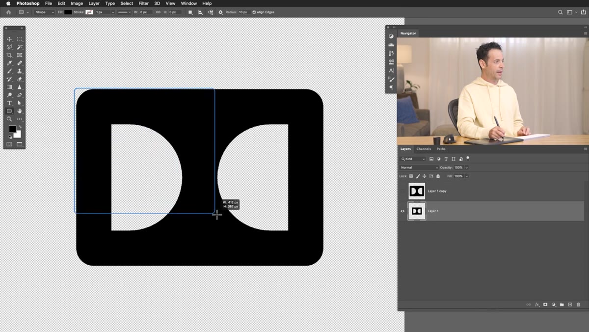
Click and drag to draw your shape directly over the corresponding part of the image. One useful trick Aaron mentions: hold the Spacebar while you’re still dragging and you can reposition the shape before you release the mouse. This is way better than drawing it, realizing it’s off-center, and starting over.
Rounded rectangle being drawn over icon with fill set to none
Click and drag to draw your shape directly over the corresponding part of the image. One useful trick Aaron mentions: hold the Spacebar while you’re still dragging and you can reposition the shape before you release the mouse. This is way better than drawing it, realizing it’s off-center, and starting over.
When you release, Photoshop will prompt you to set a fill and stroke for the shape. For the tracing phase, Aaron sets the fill to none. You’re essentially placing a transparent shape over your image so you can see what you’re tracing underneath. You can always fill it with color once your shape is in the right position.
Step 4: Adjust the Corner Radius to Match the Original
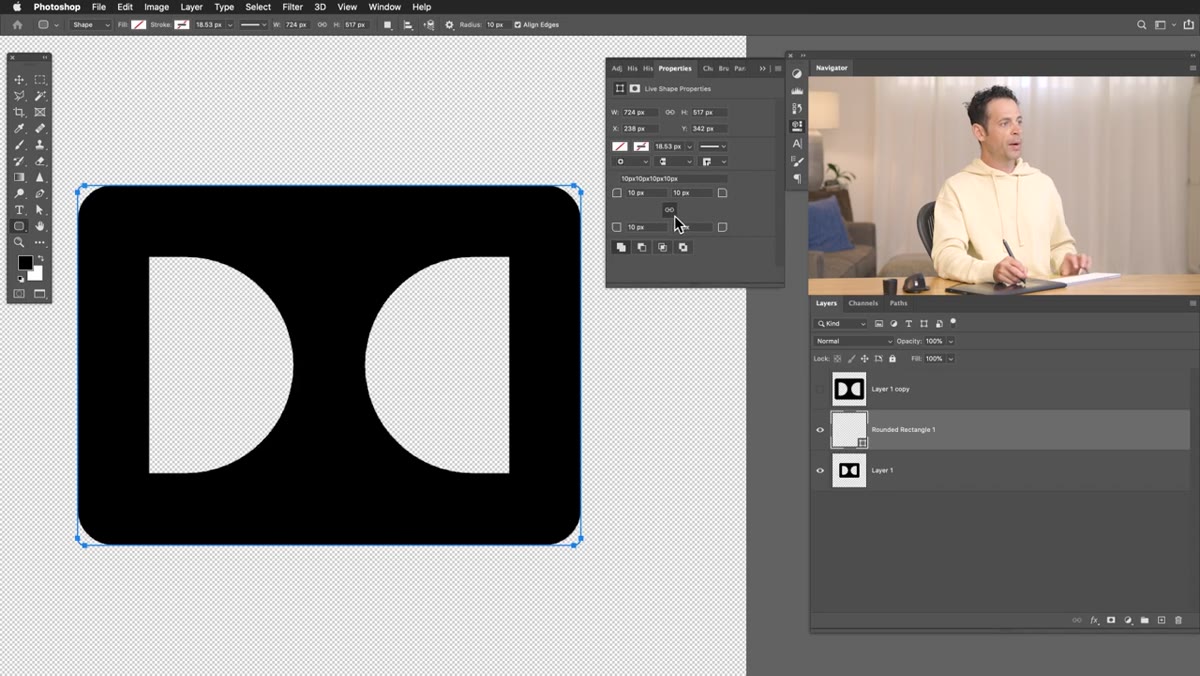 Corner radius fields visible in options bar for rounded rectangle
With the Rounded Rectangle tool selected, the options bar gives you control over the corner radius. By default, all four corners are linked together and adjust simultaneously. If your source image has corners that all curve the same amount, leave them linked and dial in the radius until it matches what you see underneath your shape.
Corner radius fields visible in options bar for rounded rectangle
With the Rounded Rectangle tool selected, the options bar gives you control over the corner radius. By default, all four corners are linked together and adjust simultaneously. If your source image has corners that all curve the same amount, leave them linked and dial in the radius until it matches what you see underneath your shape.
If the corners differ, you can unlink them and set each one independently. Getting this right matters more than it might seem. Sloppy corner radii are one of those things that look fine at small sizes and immediately fall apart when the graphic gets scaled up.
Step 5: Stack Shapes to Build the Full Logo
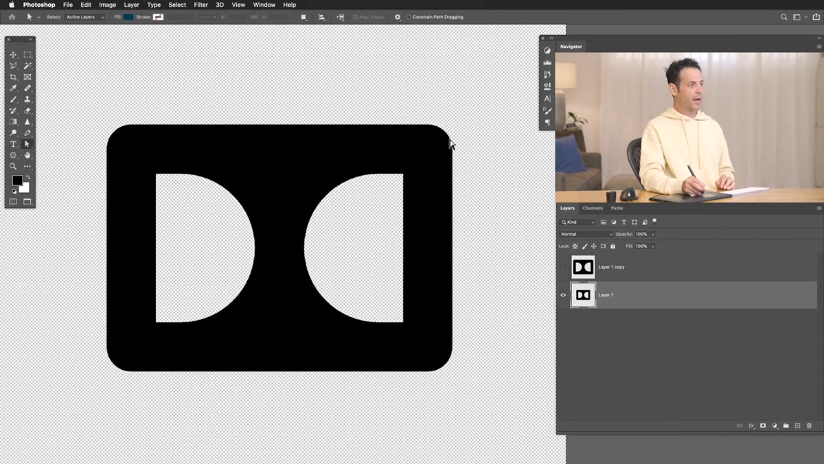 Multiple shape layers stacking to recreate icon structure
Most logos aren’t a single shape. They’re layers of shapes combined, subtracted, and overlapped. The approach here is additive: trace one shape, then trace the next, building up the full image piece by piece using separate shape layers.
Multiple shape layers stacking to recreate icon structure
Most logos aren’t a single shape. They’re layers of shapes combined, subtracted, and overlapped. The approach here is additive: trace one shape, then trace the next, building up the full image piece by piece using separate shape layers.
Photoshop’s shape layers are non-destructive by nature, which means you can go back and tweak any individual piece without wrecking the rest. Think of it like reassembling the logo from scratch using clean geometric parts instead of the original blurry pixels. Once you’ve covered all the major elements, you can group the shape layers and treat the whole thing as a single graphic.
Step 6: Fill with Color and Verify at Scale
 Finished vector shape scaled up, showing clean crisp edges
Once your shapes are traced and positioned, go back and add your fills. Use the original image for color reference, or match to brand guidelines if you have them. Then comes the satisfying part: hide or delete your original raster layer and scale your vector shapes up as large as you want.
Finished vector shape scaled up, showing clean crisp edges
Once your shapes are traced and positioned, go back and add your fills. Use the original image for color reference, or match to brand guidelines if you have them. Then comes the satisfying part: hide or delete your original raster layer and scale your vector shapes up as large as you want.
The edges stay clean. No pixelation. No blur. That’s the whole point, and it genuinely never gets old to see a formerly fuzzy icon snap into perfect sharpness at 10x the original size.
One Thing I’d Add From My Own Experience
Aaron doesn’t get into this in the tutorial, but once your vector shapes are built, save them as a Smart Object before you do anything else. I learned this lesson the hard way after losing an entire layered project to a crash. Smart Objects let you scale up and down without permanently resampling anything, and they protect your work if you need to make edits later. If you’re going to put the effort into rebuilding a logo from scratch using this method, make sure you’re not storing it in a format that punishes you for resizing it one too many times.
Also worth noting: this technique works best on logos and icons with clearly defined geometric shapes. If someone hands you a low-res photograph and asks you to “make it a vector,” that’s a different and significantly more painful conversation.
The single most important thing to take away here is that vectorizing in Photoshop is a manual tracing process, not an automatic conversion. It takes patience and the right tool selection, but the result is a file you can scale to any size without apology. If you work with client logos regularly, this is a skill that pays for itself the first time someone asks you to blow something up for print.
Watch the full tutorial on YouTube to see Aaron walk through two different logo types with two slightly different approaches, which is worth seeing even if you’re comfortable with the basics.
Comments
Leave a Comment