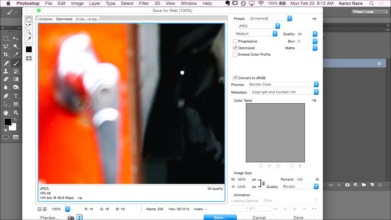
Stop Wrecking Your Colors When You Upload to the Web (A Save for Web Breakdown)

Stop Wrecking Your Colors When You Upload to the Web (A Save for Web Breakdown)

There’s a specific kind of frustration that hits when you’ve spent hours getting an image exactly right in Photoshop, colors dialed in, everything crisp and intentional, and then you upload it somewhere and it looks like a slightly sad version of itself. Washed out, weird, wrong. I ran into this constantly when I was starting out doing freelance work, mostly because I had no idea that the color space I was editing in and the color space browsers actually display are two completely different things.

JPEG vs PNG: Which Format Should You Actually Use in Photoshop?

JPEG vs PNG: Which Format Should You Actually Use in Photoshop?

The Great Format Debate Look, I get it. You’ve just spent three hours perfecting your image in Photoshop, and now you’re staring at the export dialog like it’s asking you to solve a Rubik’s cube. JPEG or PNG? The stakes feel impossibly high when you’re about to share your work with the world. Here’s the truth I’ve discovered after way too much time experimenting: there’s no one-size-fits-all answer, but understanding the difference makes all the difference.