Video Tutorials
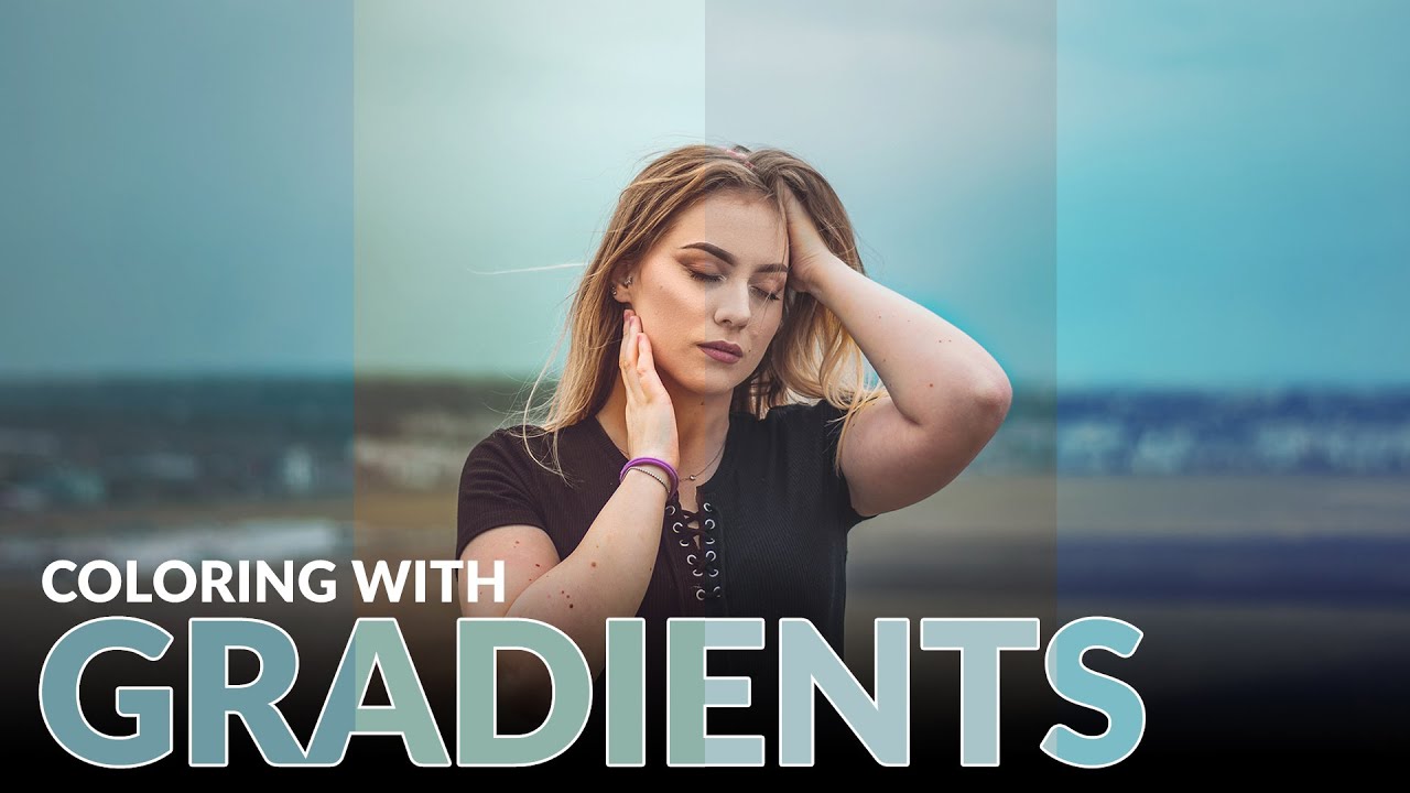
Stop Guessing at Color Grades: How Gradient Maps Give You Actual Control
Color grading used to be the part of my workflow where I’d just… vibe and hope for the best. I’d push a Curves layer around, add some Color Balance on top of that, and then wonder why everything looked like a bruised peach. It worked out maybe half the time, and the other half I’d just tell the client “it’s a stylistic choice” and pray they didn’t push back. The real problem was I had no meaningful control over shadows, midtones, and highlights independently, at least not in any way that felt intuitive.