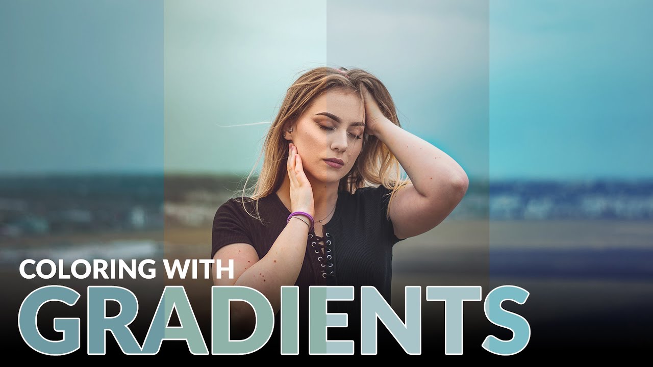
Color grading used to be the part of my workflow where I’d just… vibe and hope for the best. I’d push a Curves layer around, add some Color Balance on top of that, and then wonder why everything looked like a bruised peach. It worked out maybe half the time, and the other half I’d just tell the client “it’s a stylistic choice” and pray they didn’t push back. The real problem was I had no meaningful control over shadows, midtones, and highlights independently, at least not in any way that felt intuitive.
Gradient maps changed that for me. In this Aaron Nace (PHLEARN) tutorial, Watch the full tutorial on YouTube, Aaron walks through how gradient maps let you assign specific colors to specific tonal ranges in an image. It sounds technical, but once you see it in action it clicks fast. The bonus technique, protecting skin tones during a color grade, is genuinely one of those things I wish I’d known about three years ago.
What makes gradient maps worth learning over other color tools is that the relationship between the gradient and your image is direct and transparent. The left side of your gradient controls the darks. The right side controls the lights. Everything in between handles the midtones. There’s no mystery. You see exactly what’s happening and you can adjust it in real time.
Step 1: Add a Gradient Map Adjustment Layer
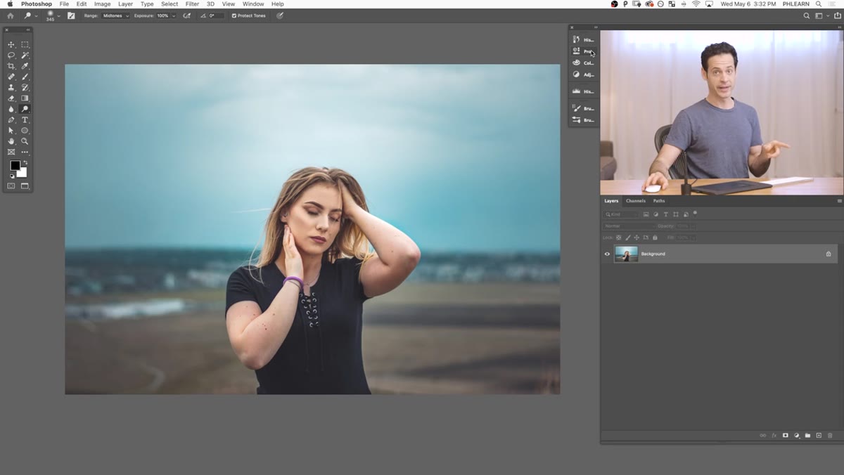 Adding a new gradient map adjustment layer in Photoshop
Head up to Layer, then New Adjustment Layer, then Gradient Map. You can also click the adjustment layer icon at the bottom of your Layers panel and find Gradient Map there. Either way gets you to the same place. By default, the gradient map will convert your image to black and white using your foreground and background colors, which is more useful than it sounds but definitely not the end goal here.
Adding a new gradient map adjustment layer in Photoshop
Head up to Layer, then New Adjustment Layer, then Gradient Map. You can also click the adjustment layer icon at the bottom of your Layers panel and find Gradient Map there. Either way gets you to the same place. By default, the gradient map will convert your image to black and white using your foreground and background colors, which is more useful than it sounds but definitely not the end goal here.
You’ll notice a “Reverse” checkbox in the Properties panel. If your image suddenly looks like a photographic negative, that’s why. Leave it unchecked for now.
Step 2: Open the Gradient Editor and Load a Starting Point
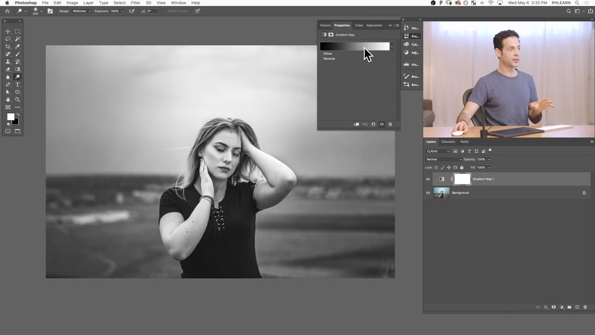 Gradient Editor open with gradient presets visible
Click directly on the gradient preview bar in the Properties panel to open the Gradient Editor. This is where all the real work happens. Photoshop ships with a bunch of preset gradients, including options like Cyanotype and Copper, and Aaron recommends clicking through a few just to see how they affect your specific image. Some of them are surprisingly usable right out of the box.
Gradient Editor open with gradient presets visible
Click directly on the gradient preview bar in the Properties panel to open the Gradient Editor. This is where all the real work happens. Photoshop ships with a bunch of preset gradients, including options like Cyanotype and Copper, and Aaron recommends clicking through a few just to see how they affect your specific image. Some of them are surprisingly usable right out of the box.
For the purposes of learning the system from scratch, choose “Foreground to Background” from the presets. This gives you a clean two-stop gradient to start manipulating manually.
Step 3: Fix the Gradient Orientation
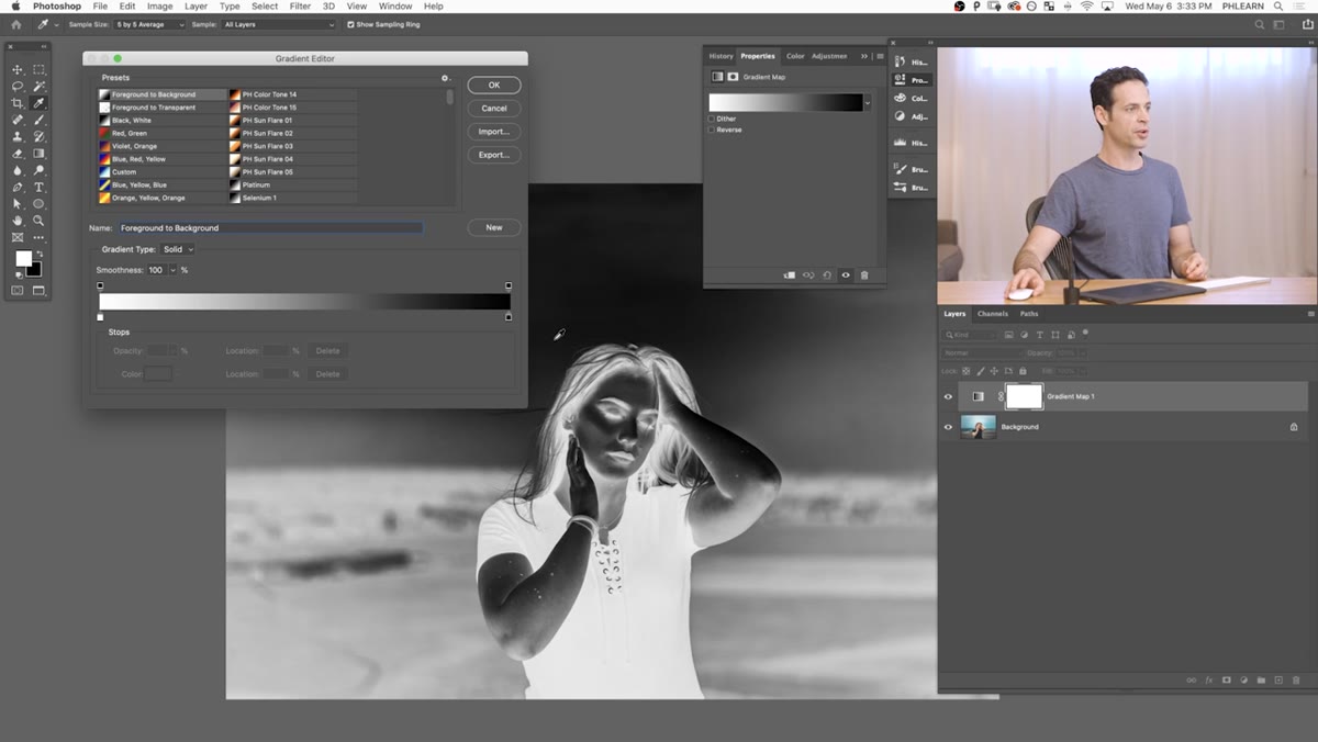 Swapping black and white gradient stops in the editor
With Foreground to Background selected, your image might look inverted. That’s because the left stop (your dark tones) is mapped to white, and the right stop (your light tones) is mapped to black. To fix it, click the white color stop on the left side of the gradient bar and drag it to the right, past the black stop. They’ll swap positions and your image will snap back to looking natural.
Swapping black and white gradient stops in the editor
With Foreground to Background selected, your image might look inverted. That’s because the left stop (your dark tones) is mapped to white, and the right stop (your light tones) is mapped to black. To fix it, click the white color stop on the left side of the gradient bar and drag it to the right, past the black stop. They’ll swap positions and your image will snap back to looking natural.
This step trips a lot of people up the first time. The gradient editor is just a visual map from dark to light, and you’re literally moving the colors to the tonal range where they belong.
Step 4: Add a Midtone Color Stop
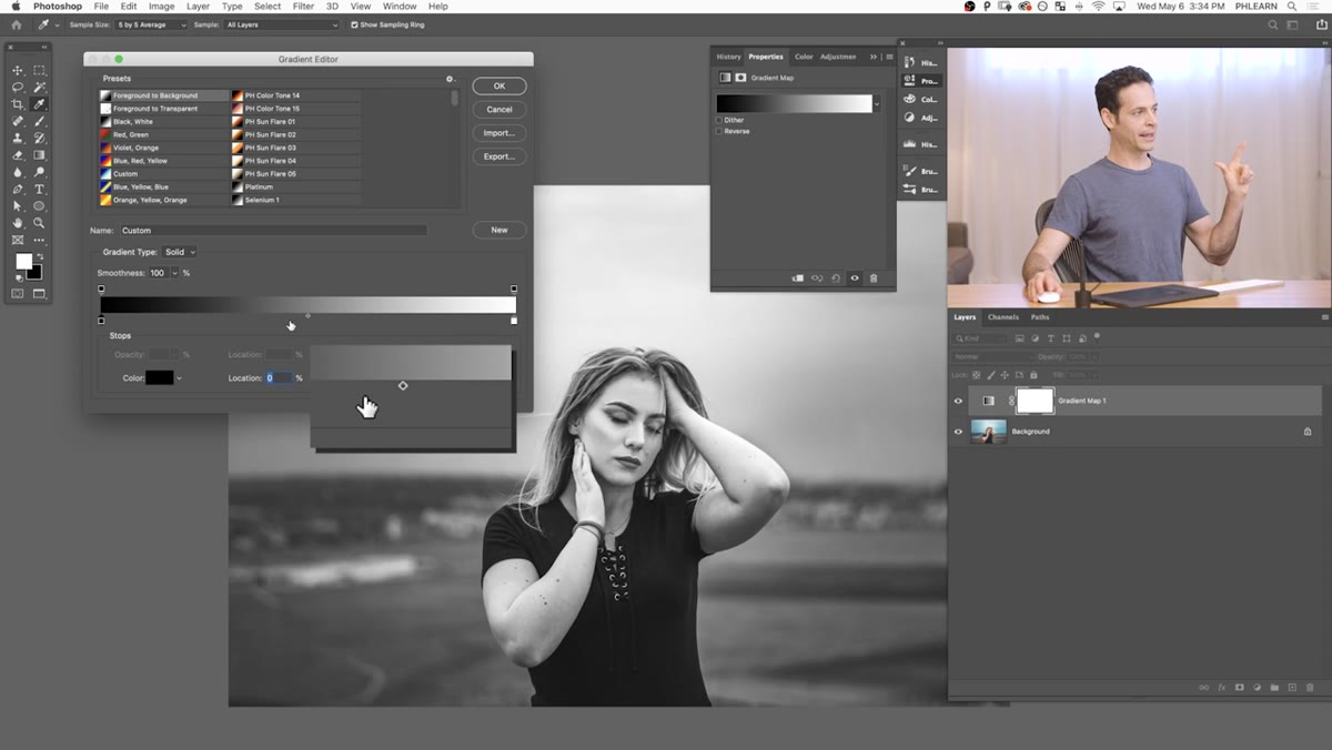 Clicking gradient bar to add a new color stop in the middle
Click somewhere in the middle of the gradient bar in the editor. A small house-shaped stop will appear below the bar. Click it to select it, then click the “Color” swatch that appears in the editor controls below. This opens the color picker.
Clicking gradient bar to add a new color stop in the middle
Click somewhere in the middle of the gradient bar in the editor. A small house-shaped stop will appear below the bar. Click it to select it, then click the “Color” swatch that appears in the editor controls below. This opens the color picker.
This new stop represents your midtones. Whatever color you choose here will blend between your shadow color on the left and your highlight color on the right. Aaron demonstrates this with a bright red to show clearly how the stop position affects which parts of the image pick up that color. Dragging the stop left pushes the color into the darker tones. Dragging it right pushes it into the brighter areas.
Step 5: Choose Colors That Actually Work Together
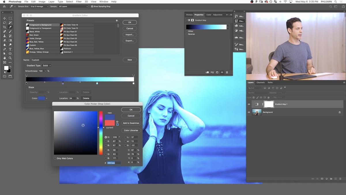 Color picker open with saturation being adjusted for a stop
Here’s where most people either nail it or fumble it. The temptation is to pick colors that look good in the color picker, but what actually matters is how they interact in the gradient blend. Aaron’s practical tip: pull your saturation back a bit. In the color picker, moving toward the left side of the spectrum box gives you a less saturated version of any hue. More subtle color stops usually read better in a finished image than fully saturated ones.
Color picker open with saturation being adjusted for a stop
Here’s where most people either nail it or fumble it. The temptation is to pick colors that look good in the color picker, but what actually matters is how they interact in the gradient blend. Aaron’s practical tip: pull your saturation back a bit. In the color picker, moving toward the left side of the spectrum box gives you a less saturated version of any hue. More subtle color stops usually read better in a finished image than fully saturated ones.
A common starting approach is cool shadows, neutral or slightly warm midtones, and cool or teal highlights. That’s the base of probably 80% of cinematic color grades you’ve seen. You can add multiple stops, one for shadows, one for midtones, one for upper midtones, one for highlights, and adjust each independently. If you add a stop and hate it, just click it and change the color. Nothing is permanent until you flatten, and you shouldn’t be flattening anyway.
Step 6: Use a Custom Gradient Preset
 Custom gradient presets listed in gradient editor panel
Aaron includes five downloadable custom gradient maps with this tutorial (link in the video description). Once you’ve downloaded them, you can load them into the Gradient Editor by clicking the gear icon in the presets panel and selecting Load Gradients. From there they appear in your presets list alongside Photoshop’s defaults.
Custom gradient presets listed in gradient editor panel
Aaron includes five downloadable custom gradient maps with this tutorial (link in the video description). Once you’ve downloaded them, you can load them into the Gradient Editor by clicking the gear icon in the presets panel and selecting Load Gradients. From there they appear in your presets list alongside Photoshop’s defaults.
Using a pre-built gradient is a great way to understand how professional color grades are constructed. Load one, look at where the stops are, what colors were chosen, and what tonal ranges they target. You’ll learn more from reverse-engineering a good preset than from reading about color theory for an hour.
My Honest Take After Using This in Real Projects
The skin tone issue Aaron mentions is not a small caveat. It’s a real problem. Gradient maps can make skin look genuinely strange, especially in photos with a lot of warm mid-tones in the face. My workaround has been to run the gradient map at a lower opacity first, then mask it off the skin using a rough selection. It’s not a surgical fix but it gets you 90% of the way there on most portraits. Aaron’s technique for preserving skin tones directly is worth watching the full video for because it goes further than what I’ve described here.
The other thing I’d add: gradient maps play beautifully with blend modes. Try setting your gradient map layer to Soft Light or Color instead of Normal. You get the tonal influence without blowing out the contrast or nuking your highlights. Some of my favorite grades have come from stacking two gradient maps, one on Normal at around 40% opacity and one on Color at 60%. It sounds like overkill until you see it.
Gradient maps are one of those tools that reward the time you put into actually understanding them. Once you stop thinking of them as a filter and start treating them as a mapping system, they become one of the most precise color tools in the whole application.
Watch the full tutorial on YouTube to see Aaron walk through the skin tone protection technique and grab the five free custom gradient presets from the video description.
Comments (2)
Been doing this wrong for years apparently. Thanks for the wake-up call.
Well explained. I think my audience would really benefit from this — mind if I link to it?
Leave a Comment