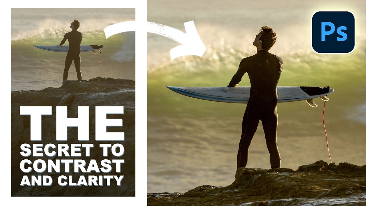
Stop Dragging the Contrast Slider Like Everyone Else — Do This Instead

Stop Dragging the Contrast Slider Like Everyone Else — Do This Instead

There’s a specific kind of frustration that comes from knowing a photo almost works. The composition is there, the light is interesting, but the whole thing looks flat — like someone draped a thin grey sheet over it. For years, my fix was to grab the Contrast slider in Camera Raw, drag it right, and call it a day. The result was always a little crunchy, a little over-cooked, and honestly kind of lazy.
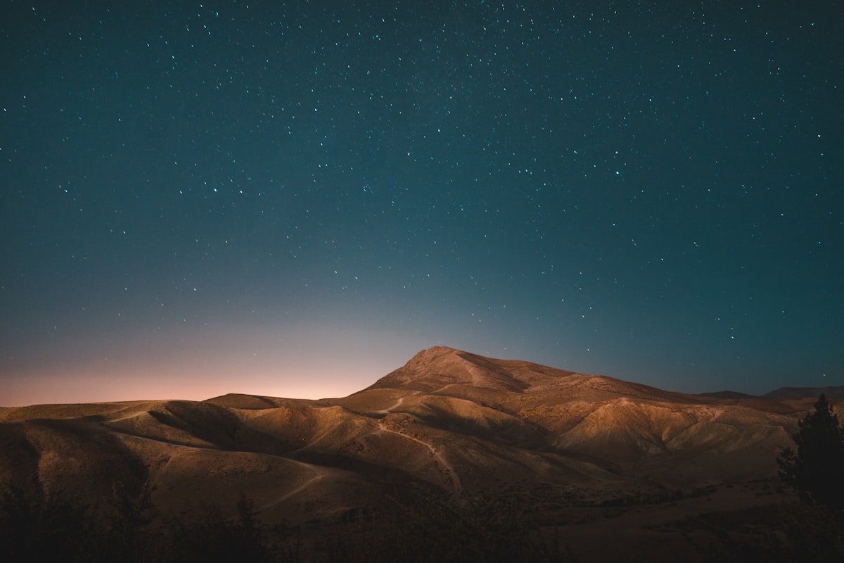
How to Make Colors Pop Without Oversaturating

How to Make Colors Pop Without Oversaturating

“Make the colors pop” is probably the most common editing request, and the most common way to fulfill it — cranking the saturation slider — is also the worst. Oversaturated images look amateurish, print terribly, and destroy skin tones. Here’s how to actually make colors more vivid and impactful. Why Saturation Alone Doesn’t Work The Saturation slider increases the intensity of every color equally. This means already-saturated colors become radioactive while subtle colors barely change.