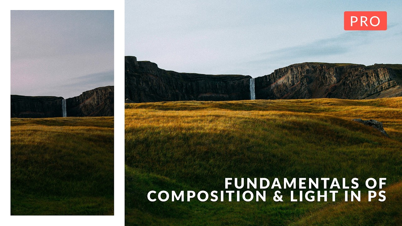
I’ve been doing design and photo editing long enough to know the difference between a technically correct image and one that actually works. For a while, I couldn’t articulate the gap. I’d open a landscape shot, push sliders around in Camera Raw until the histogram looked polite, and then sit back wondering why it still felt like a stock photo someone rejected. Turns out I was treating the symptoms instead of understanding the disease. Composition and light aren’t things you fix with a curve adjustment. They’re things you have to see before you can fix them.
That’s exactly the gap Aaron Nace’s PHLEARN course tackles head-on. In this Aaron Nace (PHLEARN) tutorial, he reframes Photoshop and Adobe Camera Raw not as correction tools but as sketch pads for learning how composition actually functions. Watch the full tutorial on YouTube - the trailer alone is worth ten minutes of your time even if you never buy the course. What follows is a breakdown of each of the nine sections so you can start applying these ideas today.
Step 1: Raw Processing and Focal Point Diagnosis
 Raw file open in Camera Raw with sky and foreground visible
Before any creative decisions happen, you need a usable image. Aaron starts with baseline raw processing in Adobe Camera Raw, pulling detail out of both the sky and the foreground. The goal here isn’t a pretty photo yet. It’s an honest one. Bring the highlights down enough to see cloud texture. Lift the shadows enough to see what’s actually happening in the foreground. You’re gathering information, not making art.
Raw file open in Camera Raw with sky and foreground visible
Before any creative decisions happen, you need a usable image. Aaron starts with baseline raw processing in Adobe Camera Raw, pulling detail out of both the sky and the foreground. The goal here isn’t a pretty photo yet. It’s an honest one. Bring the highlights down enough to see cloud texture. Lift the shadows enough to see what’s actually happening in the foreground. You’re gathering information, not making art.
The “focal point diagnosis” part is the piece most tutorials skip. Once you’ve recovered that tonal range, ask yourself: where does my eye actually go first? If the answer is “nowhere in particular” or “that blown-out patch in the upper right,” that’s your real problem. Every subsequent decision in the edit should serve that focal point.
Step 2: The Golden Ratio and Highlight Sculpting
 Photoshop crop overlay showing golden ratio spiral on landscape
Photoshop’s crop tool has overlay options most people cycle past with vague guilt. Aaron actually uses them. With the crop tool active, pressing O cycles through overlays including the Golden Ratio spiral. The idea is to align your primary subject with the tighter curl of the spiral, which naturally guides the eye through the frame rather than dumping it in the center.
Photoshop crop overlay showing golden ratio spiral on landscape
Photoshop’s crop tool has overlay options most people cycle past with vague guilt. Aaron actually uses them. With the crop tool active, pressing O cycles through overlays including the Golden Ratio spiral. The idea is to align your primary subject with the tighter curl of the spiral, which naturally guides the eye through the frame rather than dumping it in the center.
Paired with this is highlight sculpting - using targeted dodging and burning to draw attention toward your focal point. If your subject sits in a slightly darker zone than the surrounding area, a gentle dodge with a large, low-opacity brush pulls the viewer’s eye there without it ever feeling manipulated. Think of light as a pointing finger.
Step 3: Rule of Thirds and Dynamic Space
 Canvas expanded with Generative Expand showing off-center subject placement
Off-center placement creates tension, and tension keeps people looking. Aaron demonstrates this using Photoshop’s Generative Expand as a teaching tool - not to generate final content, but to artificially widen the canvas and test different crop positions. This is clever. You can see why a centered horizon feels static and why shifting the subject toward a third intersection wakes the image up.
Canvas expanded with Generative Expand showing off-center subject placement
Off-center placement creates tension, and tension keeps people looking. Aaron demonstrates this using Photoshop’s Generative Expand as a teaching tool - not to generate final content, but to artificially widen the canvas and test different crop positions. This is clever. You can see why a centered horizon feels static and why shifting the subject toward a third intersection wakes the image up.
The deeper lesson here is the one worth burning into your brain: practice this in post so you recognize the geometry in the field. Every time you expand a canvas and reposition a crop in Photoshop, you’re training your eye for the next time you’re standing in a field at 6am with a camera.
Step 4: Framing Interest and Breaking the Rules
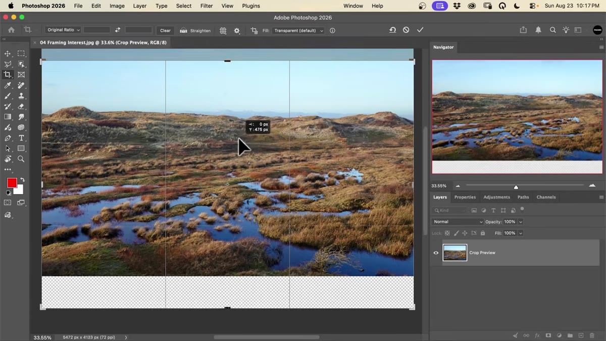 Crop positioned low with foreground dominating the frame
Rules are frameworks, not laws. When your foreground is genuinely extraordinary - texture, color, leading lines - a 50/50 horizon split or even a classic rule-of-thirds crop might actually weaken the image by under-serving what’s special about the scene. Aaron’s point is that breaking a rule should be a conscious choice, not an accident. If you’re blowing out the sky to give the foreground 70% of the frame, you’d better have a foreground worth that real estate.
Crop positioned low with foreground dominating the frame
Rules are frameworks, not laws. When your foreground is genuinely extraordinary - texture, color, leading lines - a 50/50 horizon split or even a classic rule-of-thirds crop might actually weaken the image by under-serving what’s special about the scene. Aaron’s point is that breaking a rule should be a conscious choice, not an accident. If you’re blowing out the sky to give the foreground 70% of the frame, you’d better have a foreground worth that real estate.
This section essentially teaches you to interrogate your scene before defaulting to “correct” composition. What is this photo actually about? Let the answer drive the crop, not the grid overlay.
Step 5: Balancing Zones and Luminance-Targeted Adjustments
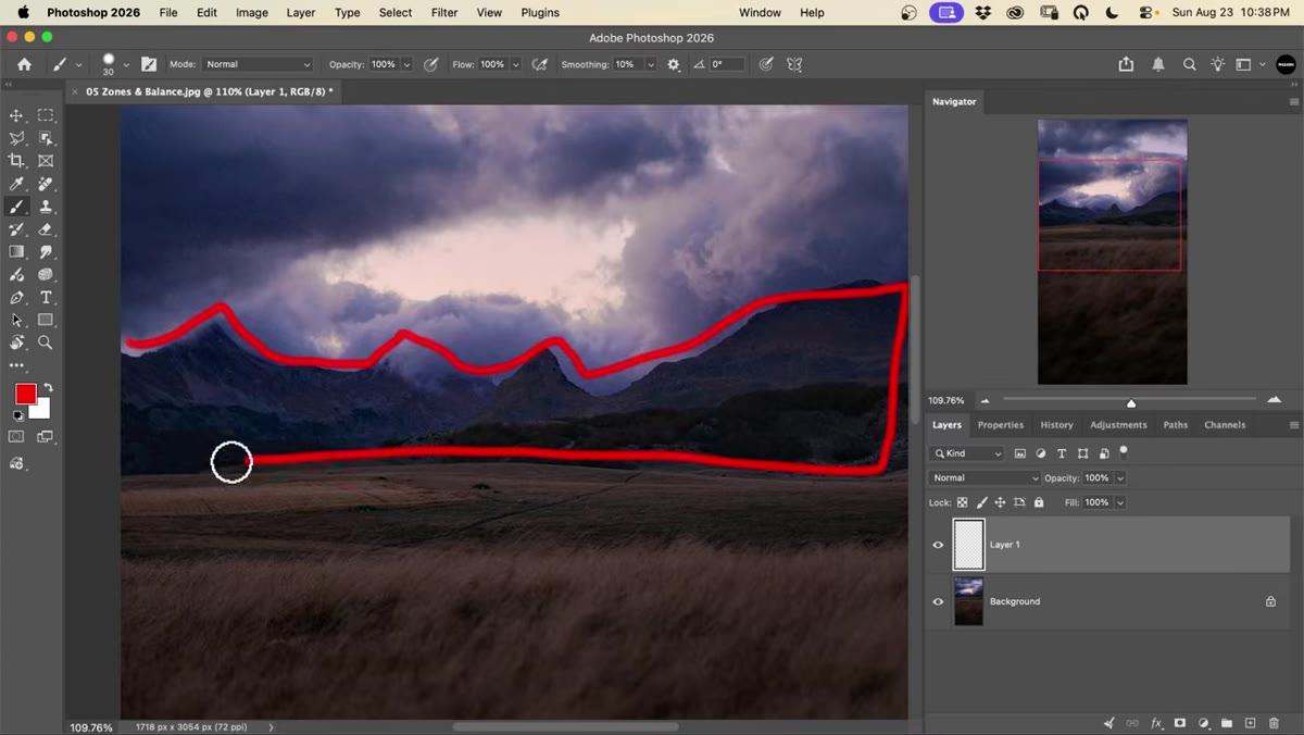 Landscape segmented into labeled zones: sky, mountains, foreground
Aaron segments landscapes into distinct zones - sky, midground, background, foreground - and treats each one as a compositional element that either earns its space or doesn’t. A muddy midground mountain range with no detail and no leading value is just visual noise. If it’s not contributing to the balance of the frame, it might need to be deemphasized.
Landscape segmented into labeled zones: sky, mountains, foreground
Aaron segments landscapes into distinct zones - sky, midground, background, foreground - and treats each one as a compositional element that either earns its space or doesn’t. A muddy midground mountain range with no detail and no leading value is just visual noise. If it’s not contributing to the balance of the frame, it might need to be deemphasized.
In section six, he takes dodging and burning further with luminance-targeted highlight and shadow work. The key technique is restricting your adjustments to only the highlights or only the shadows using a luminance mask, so you can add detail to a bright sky without blowing up the exposure in the foreground. This is where Camera Raw’s masking tools or Photoshop’s luminosity selections earn their keep.
Step 6: Diagonal Lines, Pre-Visualization, and Motion
 Sketch lines drawn over image showing diagonal leading lines
Before touching the crop tool, Aaron draws directly over the image - a literal sketch layer - to map out where the diagonal lines are already moving. Roads, shorelines, shadows, fence rows: these all create directional energy that either pulls the viewer into the frame or shoves them off the edge. If your diagonals point toward the corner instead of the subject, that’s a fixable problem once you can see it.
Sketch lines drawn over image showing diagonal leading lines
Before touching the crop tool, Aaron draws directly over the image - a literal sketch layer - to map out where the diagonal lines are already moving. Roads, shorelines, shadows, fence rows: these all create directional energy that either pulls the viewer into the frame or shoves them off the edge. If your diagonals point toward the corner instead of the subject, that’s a fixable problem once you can see it.
Section eight covers motion and lead space, which is a rule portrait and sports photographers know cold but landscape shooters sometimes forget: a moving subject needs open space in the direction of travel. A bird flying left with no room on the left side of the frame feels claustrophobic. Give motion somewhere to go.
Step 7: Structural Cohesion and Border Cleanup
 Tightly cropped final image with distracting edge elements removed
The final section is about unifying everything. Aaron tightens the crop to eliminate elements at the border that pull attention without adding meaning - a stray branch, a blown-out edge, a telephone pole that snuck into the lower left corner. These distractions are often invisible until you train yourself to scan the frame border before calling a shot finished.
Tightly cropped final image with distracting edge elements removed
The final section is about unifying everything. Aaron tightens the crop to eliminate elements at the border that pull attention without adding meaning - a stray branch, a blown-out edge, a telephone pole that snuck into the lower left corner. These distractions are often invisible until you train yourself to scan the frame border before calling a shot finished.
The phrase “structural cohesion” sounds like design-school jargon but it’s really just asking: does every element in this frame support the single story I’m trying to tell? Remove what doesn’t. Tighten what does. Then stop.
What I’d Add From My Own Experience
The generative expand trick for testing compositions is genuinely useful, but I’d add one more layer: do it before you spend an hour on a detailed edit. I can’t count how many times I’ve done careful sky replacement or complex masking work only to realize afterward that the crop I needed would have cropped out half of what I just spent time on. Use the canvas expansion trick early, while the commitment cost is still low, and you’ll save yourself exactly that kind of frustration.
The single most important takeaway from Aaron’s course is this: Photoshop is a thinking tool, not just a finishing tool. Use it to learn how to see, and your captures will improve before you ever open an editing panel.
Watch the full tutorial on YouTube and see all nine scenarios in action. The trailer runs just over three minutes and gives you enough to work with right now.
Comments
Leave a Comment