
There’s a specific kind of humbling that happens when you’ve been doing Photoshop work for years and you still catch yourself believing a magazine cover is real. I’ve been editing photos since I was making graphics in MS Paint for my middle school friends, and I know how much work goes into a polished image. I know it intellectually. And yet, those high-gloss editorial shots still land differently in the gut than they should. That’s exactly why this kind of breakdown video matters, not just for beginners, but for people who already know better and need the occasional reminder.
In this Jessica Kobeissi tutorial, the veteran photographer and retoucher walks through real celebrity before-and-afters, comparing behind-the-scenes set photos to the final published editorial images. Watch the full tutorial on YouTube before or after reading this breakdown. Jessica’s point isn’t to embarrass anyone – it’s to pull back the curtain on a professional retouching workflow so viewers understand the gap between “raw capture” and “magazine ready.” As someone who retouches my own client work, I can tell you: that gap is enormous, and it’s worth understanding every piece of it.
What makes this tutorial genuinely useful – beyond the celebrity hook – is that Jessica narrates like a working professional, not a critic. She calls out specific techniques, appreciates the craft where it’s good, and flags where editors pushed things too far. That balance is rare, and it’s where the real learning lives.
Step 1: Compare the Source Images Side by Side
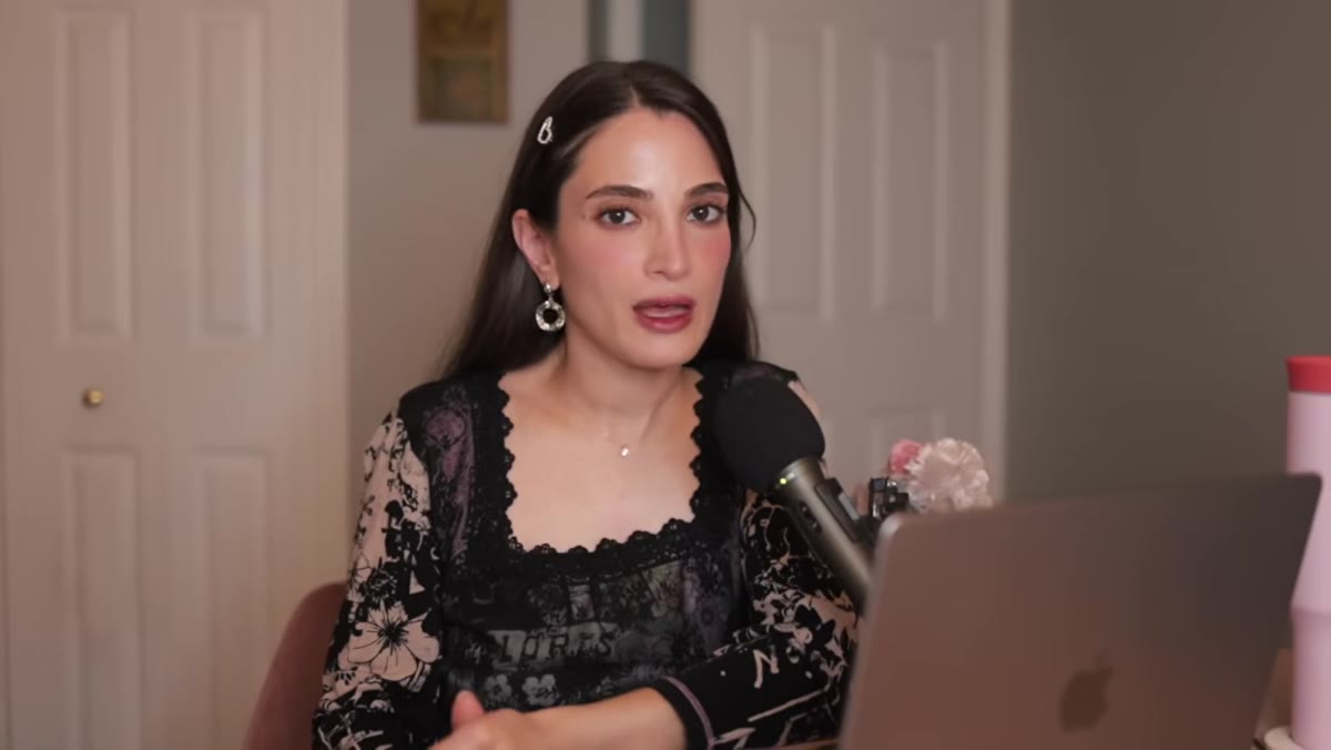 Side-by-side view of before and after celebrity images
Start any retouching analysis the way Jessica does here: put the raw capture (or behind-the-scenes photo) next to the final published image and just look. Don’t jump to tools yet. Before you touch a single slider, your eyes need to catalog what actually changed. Jessica identifies the backdrop color, the hair tone, the lighting contrast, and the skin texture all before zooming into any detail. In Photoshop, you can do this by opening both images and using Window > Arrange > 2-up Vertical. It takes four seconds and it forces you to slow down.
Side-by-side view of before and after celebrity images
Start any retouching analysis the way Jessica does here: put the raw capture (or behind-the-scenes photo) next to the final published image and just look. Don’t jump to tools yet. Before you touch a single slider, your eyes need to catalog what actually changed. Jessica identifies the backdrop color, the hair tone, the lighting contrast, and the skin texture all before zooming into any detail. In Photoshop, you can do this by opening both images and using Window > Arrange > 2-up Vertical. It takes four seconds and it forces you to slow down.
This comparison step sounds obvious but most people skip it, and then they end up chasing individual fixes without understanding the overall direction of the edit. The final image has a unified look – every adjustment serves a single visual intention. You can’t replicate that by randomly smoothing skin and calling it done.
Step 2: Identify the Color Grading Direction
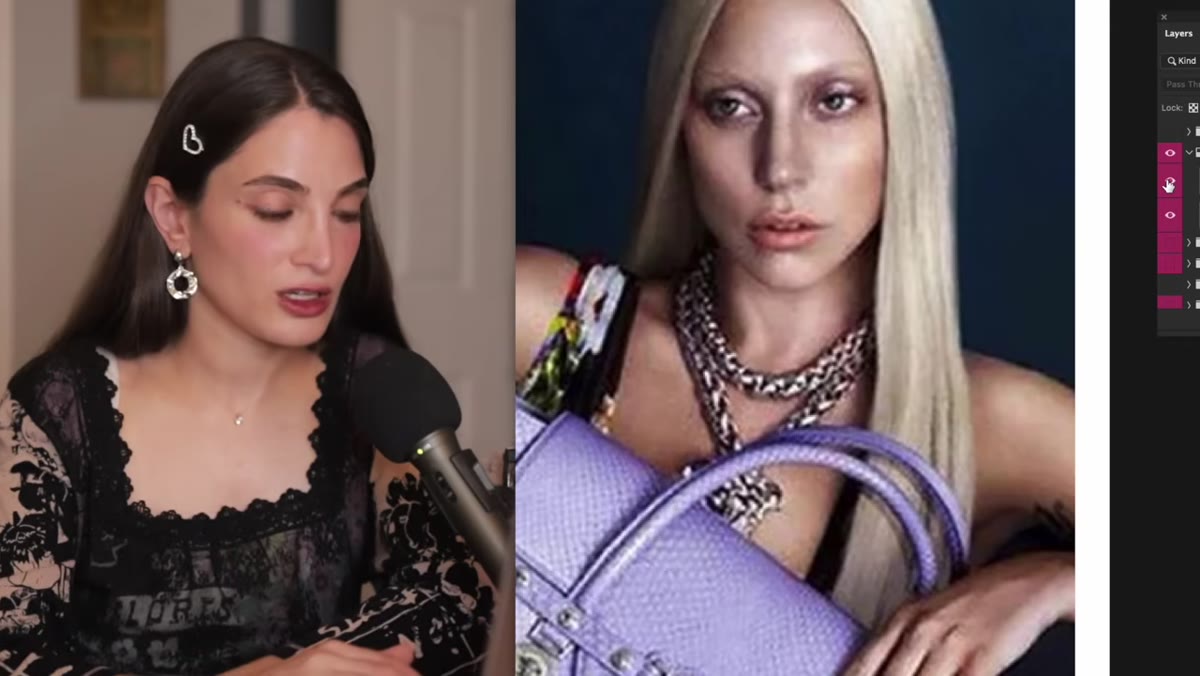 Before image showing natural hair color versus retouched silver tone
Jessica points out that the celebrity’s hair was shifted from a warm yellow-blonde to a cooler silver-white in the final image, which ties the whole shot together with the backdrop. This is a color grading decision, not just a skin retouching one, and it tells you everything about how professional editorial work functions. Nothing in the image is an accident.
Before image showing natural hair color versus retouched silver tone
Jessica points out that the celebrity’s hair was shifted from a warm yellow-blonde to a cooler silver-white in the final image, which ties the whole shot together with the backdrop. This is a color grading decision, not just a skin retouching one, and it tells you everything about how professional editorial work functions. Nothing in the image is an accident.
In Photoshop, you’d approach this with a Hue/Saturation adjustment layer targeted at the yellows, or via Camera Raw’s HSL panel if you’re working from a raw file. The goal is to desaturate and shift the warmth out of the hair channel specifically, without blowing out highlights. Layer masks let you contain the effect to just the hair. What you’re doing is making the image feel designed, not just captured.
Step 3: Enhance Backdrop Depth with Color Toning
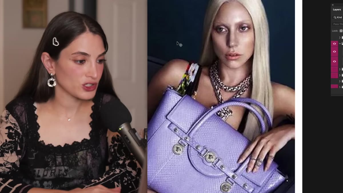 Final editorial image showing deepened blue backdrop versus flat original
The backdrop in the behind-the-scenes photo is flat and underdeveloped. In the final editorial, it’s a rich, saturated blue that actively complements the product being featured. Jessica specifically calls this out as an intentional compositional choice. The backdrop isn’t just cleaned up, it’s redesigned to serve the image.
Final editorial image showing deepened blue backdrop versus flat original
The backdrop in the behind-the-scenes photo is flat and underdeveloped. In the final editorial, it’s a rich, saturated blue that actively complements the product being featured. Jessica specifically calls this out as an intentional compositional choice. The backdrop isn’t just cleaned up, it’s redesigned to serve the image.
You can replicate this with a combination of a Selective Color adjustment layer (targeting the neutral or blue channel depending on your original backdrop color) and a soft Curves layer to deepen the shadows. The trick is keeping the adjustment from spilling onto the subject’s skin or clothing, which is where a clean layer mask – painted with a soft brush at reduced opacity – earns its keep. Editorial retouchers are essentially finishing the art direction in post.
Step 4: Retouch Skin Texture Without Destroying It
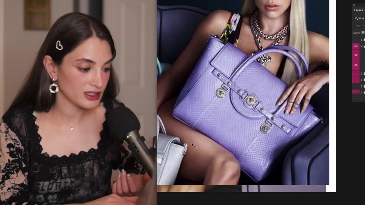 Close-up comparison showing knee texture removed in final image
This is the step that gets the most attention in Jessica’s video, and for good reason. The before image shows completely normal skin: texture, a few scuffs, the kind of knee that has actually been used by a human person. The after image removes all of it. Completely clean. Jessica acknowledges this is standard editorial practice without pretending it’s neutral, which is the right call.
Close-up comparison showing knee texture removed in final image
This is the step that gets the most attention in Jessica’s video, and for good reason. The before image shows completely normal skin: texture, a few scuffs, the kind of knee that has actually been used by a human person. The after image removes all of it. Completely clean. Jessica acknowledges this is standard editorial practice without pretending it’s neutral, which is the right call.
For your own work, the tool you want is Frequency Separation. Split your image into a high-frequency layer (texture) and a low-frequency layer (color and tone). Heal and clone on the low-frequency layer to even out tone and remove blemishes without touching the texture layer. This keeps skin looking like skin rather than porcelain. For editorial work at the level Jessica’s analyzing, retouchers often go further, but knowing where the line is – and making a deliberate choice to cross it or not – is the actual skill.
Step 5: Recognize When Retouching Goes Too Far
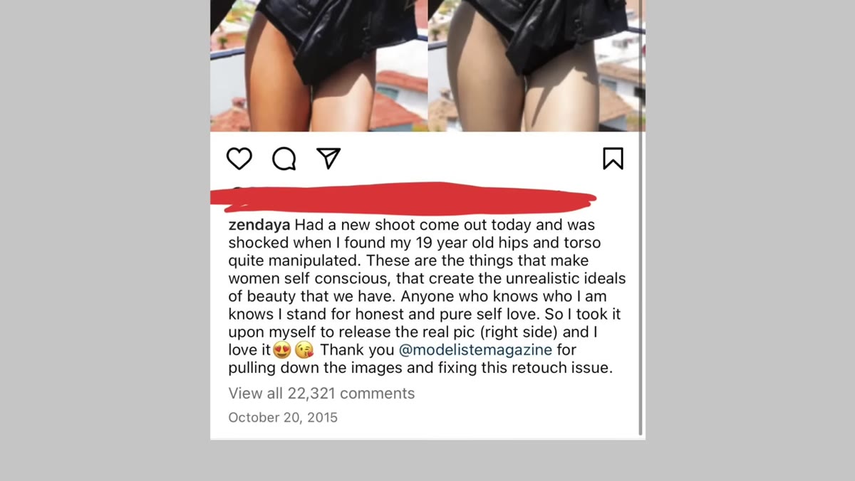 Magazine image where celebrity’s body was heavily distorted
Jessica closes her breakdown by showing a case where the retouching crossed a line the subject herself wasn’t comfortable with – enough that the celebrity publicly released the unretouched image to push back. This isn’t a minor adjustment or a color grade. Body reshaping tools like Liquify were pushed to the point where the final image no longer looked like the person who showed up on set.
Magazine image where celebrity’s body was heavily distorted
Jessica closes her breakdown by showing a case where the retouching crossed a line the subject herself wasn’t comfortable with – enough that the celebrity publicly released the unretouched image to push back. This isn’t a minor adjustment or a color grade. Body reshaping tools like Liquify were pushed to the point where the final image no longer looked like the person who showed up on set.
As a retoucher, this is genuinely useful to know, not just ethically, but technically. Over-use of Liquify creates warping in straight lines near the edge of the distortion, and proportions start to feel off even to untrained eyes. People may not be able to articulate why something looks wrong – they just know it does. The craft breaks when the edit stops serving the subject and starts replacing them.
My Take: Use These Breakdowns as a Calibration Tool
I keep a folder of before-and-after comparisons like the ones Jessica walks through – not for inspiration, exactly, but for calibration. When I’m three hours into a retouch and I’ve lost all sense of whether I’m improving things or just changing things, looking at professional editorial before-and-afters resets my eye. It shows me what “intentional” actually looks like versus what “I got carried away” looks like. There’s a version of every heavy retouch that’s craft, and a version that’s just noise. The difference is whether every single adjustment – the color grade, the backdrop, the skin work – is pulling in the same direction.
Jessica’s video is worth watching even if you’ve been doing this for years, because it’s one thing to know retouching happens, and another thing entirely to have a working pro narrate exactly what was done and why. The craft appreciation she brings to the good work, and the honest critique she brings to the overreach, is exactly the kind of perspective that sharpens your own editorial eye.
The single biggest takeaway: retouching is not a collection of individual fixes. It’s a unified creative decision made across the whole image. Learn to see it that way and your edits will immediately feel more coherent. Watch the full tutorial on YouTube to see Jessica’s full side-by-side breakdowns in motion – some of the details really do need to be seen to land properly.
Comments (3)
Never thought of approaching it this way. Really creative.
Really solid breakdown. This pairs perfectly with the landscape work I've been writing about.
Quality content like this is rare. Keep it up.
Leave a Comment