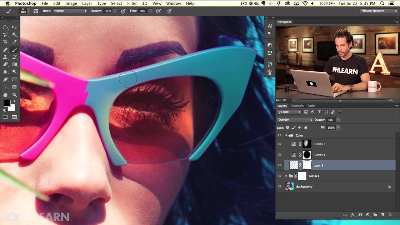
There’s a specific kind of pain that comes from finishing a retouch, flattening the file to export it, and then realizing you needed to go back and tweak something. I’ve been there more times than I’d like to admit, usually somewhere between my second coffee and a client email asking for “just one small change.” The good news is that most of those headaches come down to two things: not knowing enough non-destructive techniques, and not saving files correctly from the start. Watch the full tutorial on YouTube and follow along, because this one’s worth your time.
In this Aaron Nace (PHLEARN) tutorial, the third and final part of his Quick Start Guide to Photoshop series, Aaron wraps up by demonstrating two distinct approaches to brightening and coloring eyes, then moves into the stuff most beginners skip entirely: proper naming conventions, file structure, and saving for web in the correct color space. It sounds boring. It isn’t. Getting this wrong costs real time on real jobs, and getting it right is one of those things that quietly separates hobbyists from people who do this professionally.
What I like about Aaron’s approach here is that he shows you multiple paths to the same result, which is genuinely how Photoshop works. There’s almost never one right way. The techniques below are pulled directly from the tutorial and expanded with context so you can follow along without pausing the video every thirty seconds.
Step 1: Create a New Layer and Paint Over the Eyes with a Brush
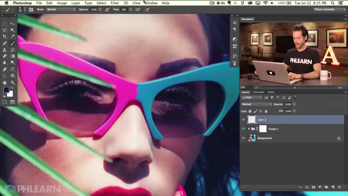 Empty new layer created above subject layer in Layers panel
Start by creating a new blank layer above your subject. Grab the Brush tool (B) and pick a bright, warm color, something in the orange or yellow range works well as a starting point. Use a soft-edged brush and paint directly over the irises of your subject’s eyes. Don’t stress about being pixel-perfect here. You want to stay inside the iris, but this doesn’t need to be a surgical selection. The effect you’re building relies on a blend mode, not masking precision, so a loose pass is completely fine.
The point of starting with a warm, saturated color is that it gives the blend mode something strong to work with. If you paint with a muted color, the effect will be too subtle to see. Go bright, almost garish, and let the next step pull it back into something that looks intentional.
Step 2: Change the Blend Mode to Soft Light or Overlay
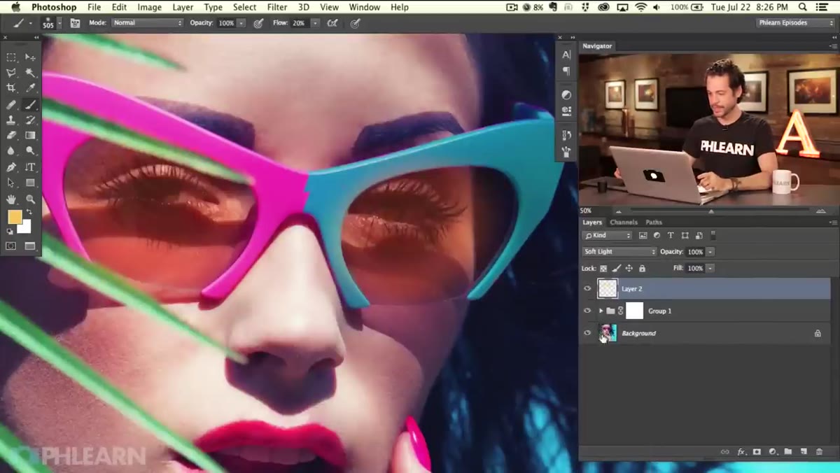 Blend mode dropdown set to Soft Light on painted eye layer
With your painted layer selected, go to the blend mode dropdown at the top of the Layers panel (it defaults to “Normal”) and switch it to Soft Light. The orange blob you painted will transform into a subtle color shift and brightening effect on the eyes. It works because Soft Light blends the color of your painted layer with the luminosity of whatever’s underneath, adding warmth and lift without blowing out the highlights.
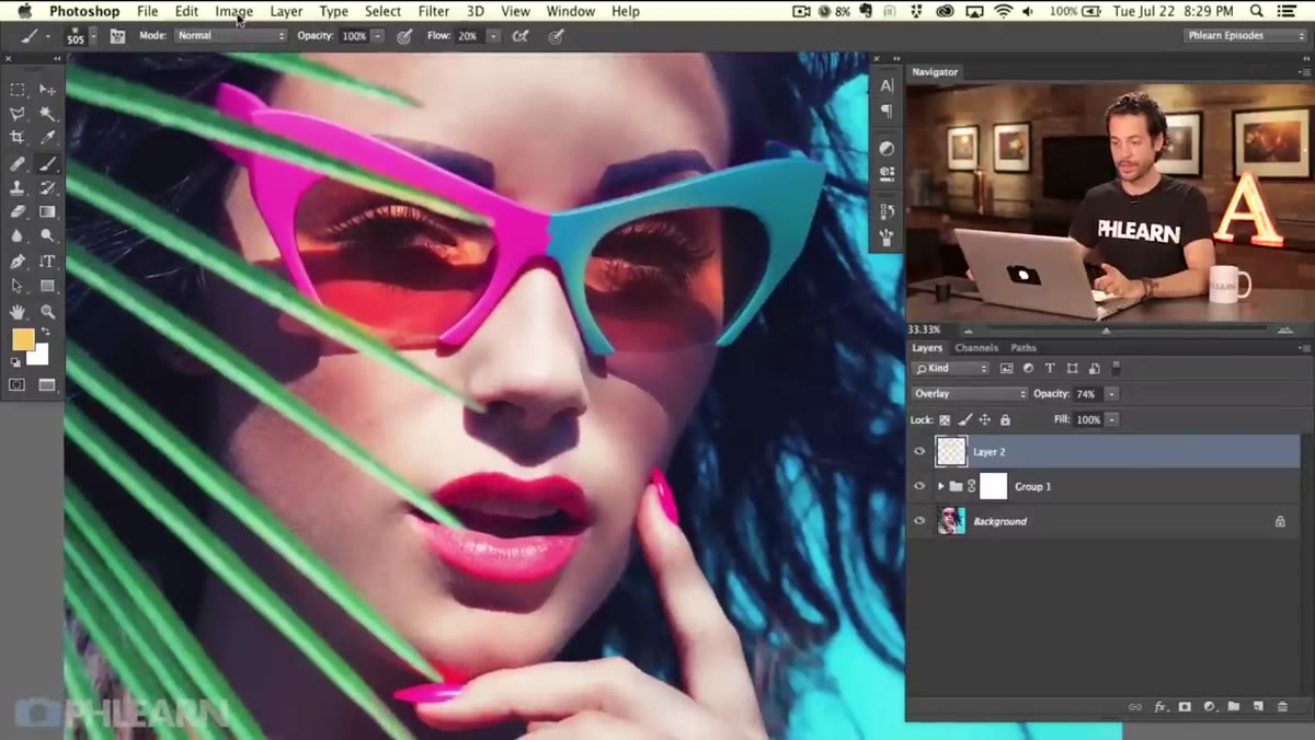
If Soft Light feels too gentle, try Overlay. It’s a harder version of the same idea and will produce more contrast and saturation. For something more extreme, Color Dodge pushes the brightness significantly, but you’ll almost certainly need to drop the layer Opacity down to somewhere between 20 and 40 percent to keep it from looking like your subject is part of a video game cutscene. Experiment with Opacity regardless of which blend mode you land on. Most of the best results come from backing off the intensity until it reads as intentional rather than obvious.
Step 3: Change the Hue After the Fact with Hue/Saturation
 Hue/Saturation dialog open with Hue slider being dragged
Here’s a move I genuinely use all the time: even after you’ve painted that color onto the layer, you’re not locked in. Select the painted layer, then hit Command+U (Mac) or Control+U (Windows) to open Hue/Saturation. Drag the Hue slider left or right and watch the color on the layer shift in real time. Started with orange and now you want teal? Drag left. Want a warm amber instead of yellow? Drag right. The blend mode updates live as you scrub.
This is a small thing but it represents a bigger principle worth internalizing. In Photoshop, decisions that feel permanent usually aren’t, as long as you’re working non-destructively. Painting on a separate layer instead of directly on your image is what makes this possible. The habit of always working on new layers is the difference between a flexible file and a file you’re afraid to touch.
Step 4: Use a Curves Adjustment Layer as an Alternative Approach
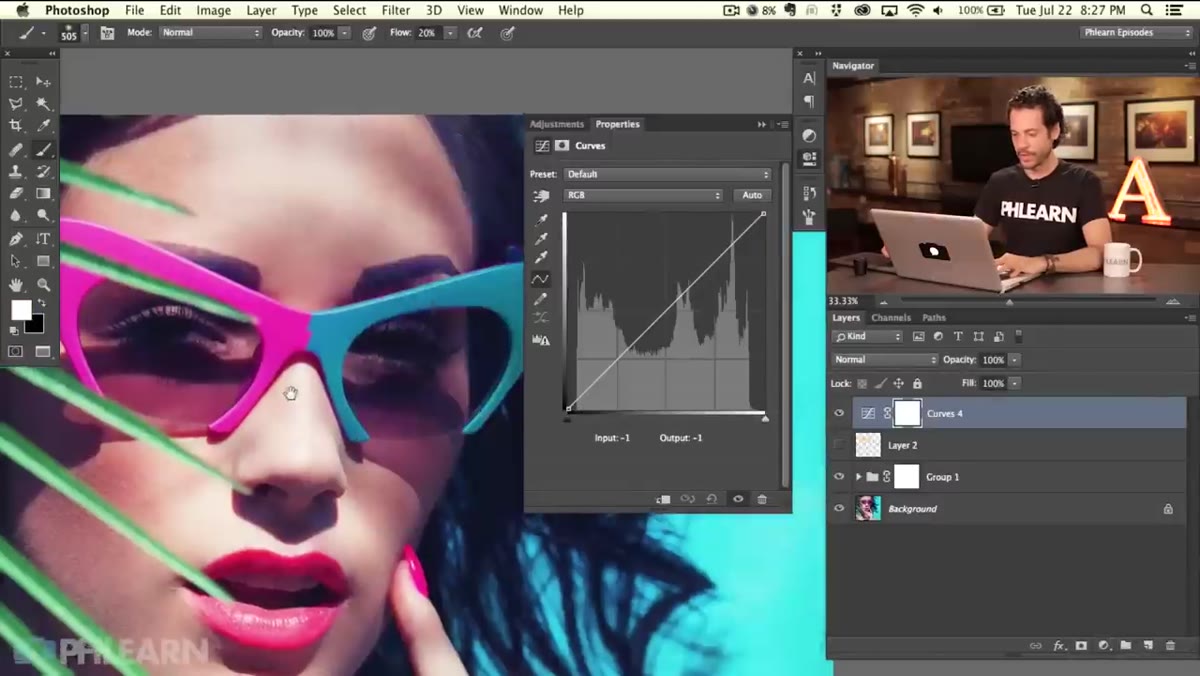 Curves adjustment layer panel open with RGB curve pulled upward
The second method Aaron demonstrates skips the brush entirely and uses a Curves adjustment layer instead. Add one via the Adjustments panel or through Layer > New Adjustment Layer > Curves. Pull the curve upward in the RGB channel to brighten the overall image, then switch to the Red channel within Curves and make a separate adjustment there to add warmth. Because you haven’t touched the layer mask yet, the adjustment hits the entire image at this stage, which is expected.
The layer mask on the Curves adjustment layer is where you control where the effect lands. Fill the mask with black to hide the effect completely, then paint white only over the eyes to reveal the brightening and color shift exactly where you want it. This approach gives you more control over specific tonal ranges than the brush method does, and it’s fully editable after the fact. Either method works. The brush approach is faster. The Curves approach is more precise. Pick based on what the job needs.
Step 5: Save Your Layered File and Export Correctly for Web
 Save dialog and file format options visible in Photoshop
Aaron closes the series by covering file saving, which is the step most tutorials gloss over. The short version: always save a layered PSD or PSB file as your master. This preserves every layer, mask, and adjustment you’ve made so you can return to it later. Never flatten your document and overwrite the original. That’s how you end up in a situation where a client asks for a revision and you’re starting from scratch.
For web exports, use File > Export > Export As (not Save for Web, which is legacy) and make sure you’re exporting as sRGB. Photoshop works in a wide color space by default, and images that look great on your screen can look washed out or oversaturated when viewed in a browser if you skip the color space conversion on export. sRGB is the standard for screens. Set it, save it, move on.
One Thing I’d Add: Label Your Layers Before You Forget What They Do
I learned this the expensive way. A few years back I handed off a PSD to a client for their in-house team to update, and I had layers named “Layer 14 copy 3” and “Layer 14 copy 3 (2)”. The client’s designer called me confused, I couldn’t explain it over the phone, and I ended up redoing work for free. Double-clicking a layer name and giving it something descriptive takes four seconds. “Eye color overlay” or “Eye brightness curves” is infinitely better than whatever Photoshop auto-names it. If you ever share files, collaborate, or return to old work, you’ll thank yourself for this.
The biggest idea from this whole series, and from this episode in particular, is that the tools are only as useful as the workflow you build around them. Knowing how to use a brush and a blend mode is straightforward. Building the habit of working on separate layers, saving masters, and labeling everything correctly is what actually makes you faster and more professional over time. The technique takes an afternoon to learn. The workflow takes deliberate practice.
Watch the full tutorial on YouTube and check out PHLEARN for the full Quick Start Guide series from Episode 1 if you’re just getting into Photoshop. Aaron’s one of the better teachers in this space, and the series is a genuinely efficient way to get grounded in the fundamentals.
Comments
Leave a Comment