There’s a specific kind of client panic I know well. You’ve got a photo that’s technically fine but creatively boring, a design layout that needs something, and a deadline that does not care about your feelings. I’ve been there more times than I’d like to admit, sitting in a coffee shop on my second Americano, staring at a stock photo wondering how to make it not look like a stock photo. That’s exactly the problem this technique solves, and it solves it fast.
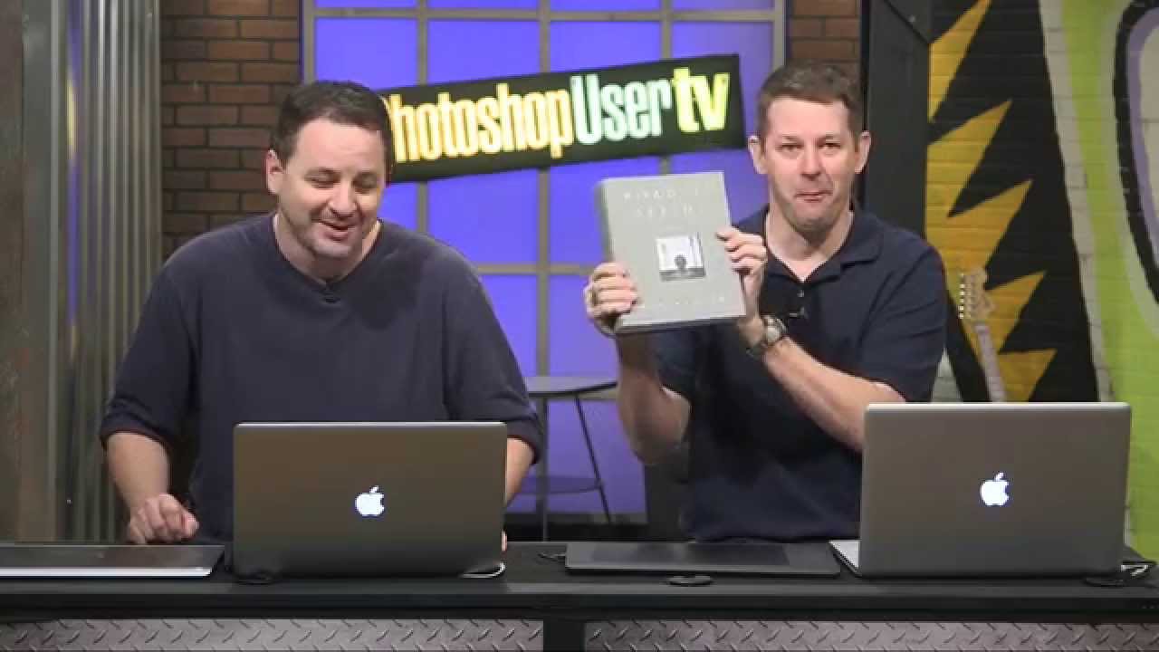
In this KelbyOne tutorial from Photoshop User TV, Pete Collins walks through a method for turning a regular model photograph into something that looks like it came out of an illustrated design or a high-end editorial layout. The technique comes from Corey Barker’s book “Down and Dirty Tricks for Designers, Volume 2,” which tells you right away that this isn’t some theoretical exercise. It’s a working designer’s shortcut. Watch the full tutorial on YouTube if you want to follow along visually, but everything you need to actually execute this is right here.
What I love about this approach is that it leans on a filter most people completely ignore. The Grain filter has a reputation as one of Photoshop’s dustier attic tools, but there’s one grain type buried in there that does something genuinely interesting. Once you know about it, you’ll start seeing it everywhere.
Step 1: Set Up Your Document with a Textured Background
 Simple textured background layer visible in Photoshop document
Start with a background that has some texture to it. This isn’t strictly required, but a flat color background will undercut the illustrated feel you’re going for. A subtle paper texture, a gradient, anything with a little visual noise helps the final composite read as intentional rather than lazy. The technique is ultimately about placing your treated photo on top of something, so give that something a reason to exist.
Simple textured background layer visible in Photoshop document
Start with a background that has some texture to it. This isn’t strictly required, but a flat color background will undercut the illustrated feel you’re going for. A subtle paper texture, a gradient, anything with a little visual noise helps the final composite read as intentional rather than lazy. The technique is ultimately about placing your treated photo on top of something, so give that something a reason to exist.
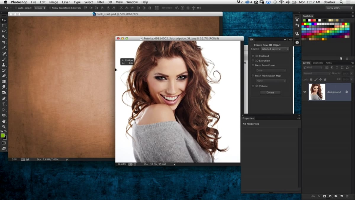
Step 2: Bring Your Photo In and Scale It with Free Transform
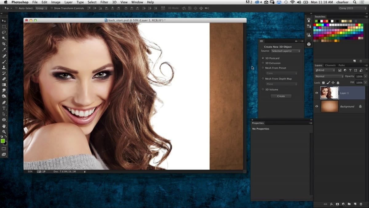
 Large model photo being scaled using Free Transform handles
Drag your photo onto the document. If you’re working with a high-resolution image (and you should be, for this effect to hold up), it’ll probably land at a comically large size. Hit Command+T (Ctrl+T on Windows) to enter Free Transform. Here’s a quick tip Pete mentions that I actually use constantly: press Command+0 (Ctrl+0) while in Free Transform to zoom the canvas out far enough to see all your transform handles. Without that shortcut, you’re fishing around for corner handles that are off-screen.
Large model photo being scaled using Free Transform handles
Drag your photo onto the document. If you’re working with a high-resolution image (and you should be, for this effect to hold up), it’ll probably land at a comically large size. Hit Command+T (Ctrl+T on Windows) to enter Free Transform. Here’s a quick tip Pete mentions that I actually use constantly: press Command+0 (Ctrl+0) while in Free Transform to zoom the canvas out far enough to see all your transform handles. Without that shortcut, you’re fishing around for corner handles that are off-screen.
Hold Shift+Option (Shift+Alt on Windows) while dragging a corner handle to scale the image proportionally from the center. Get it to the size you want, position it, and commit the transform.
Step 3: Enable All Filter Gallery Filters in Preferences
 Plugins preferences panel showing “Show all Filter Gallery groups” checkbox
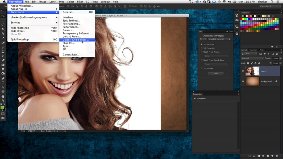
Before you go digging through the Filter menu, take 30 seconds to fix how it displays. By default, Photoshop hides a chunk of the artistic and texture filters unless you’ve enabled them through preferences. Go to Photoshop > Preferences > Plugins and check the box for “Show All Filter Gallery Groups and Names.” Restart Photoshop if you need to. Once it’s on, all those filters show up directly in the Filter menu categories instead of being buried inside the Filter Gallery panel. This is one of those settings that should honestly be on by default. It isn’t, but now you know.
Plugins preferences panel showing “Show all Filter Gallery groups” checkbox
Before you go digging through the Filter menu, take 30 seconds to fix how it displays. By default, Photoshop hides a chunk of the artistic and texture filters unless you’ve enabled them through preferences. Go to Photoshop > Preferences > Plugins and check the box for “Show All Filter Gallery Groups and Names.” Restart Photoshop if you need to. Once it’s on, all those filters show up directly in the Filter menu categories instead of being buried inside the Filter Gallery panel. This is one of those settings that should honestly be on by default. It isn’t, but now you know.
Step 4: Desaturate the Photo
 Desaturated grayscale model photo in the document
With your photo layer selected, hit Shift+Command+U (Shift+Ctrl+U on Windows). That’s the keyboard shortcut for Desaturate, and it strips the color out instantly. You’re not converting to grayscale mode, just removing the color information from that layer. The illustrated effect works in monochrome, so this step is non-negotiable. If you skip it, the grain filter in the next step will produce a much messier result with color noise you don’t want.
Desaturated grayscale model photo in the document
With your photo layer selected, hit Shift+Command+U (Shift+Ctrl+U on Windows). That’s the keyboard shortcut for Desaturate, and it strips the color out instantly. You’re not converting to grayscale mode, just removing the color information from that layer. The illustrated effect works in monochrome, so this step is non-negotiable. If you skip it, the grain filter in the next step will produce a much messier result with color noise you don’t want.
Step 5: Apply the Grain Filter on the Speckle Setting
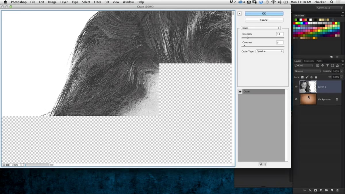 Grain filter dialog open with Speckle type selected, showing pen-ink effect
This is the heart of the technique. Go to Filter > Texture > Grain. Inside the Grain dialog, find the “Grain Type” dropdown. You’ll see a list of options and most of them are, honestly, not great. Pete’s word is “silly” and I won’t argue with that. The one you want is “Speckle.” Select it and watch the preview. It produces a stippled, pen-and-ink style texture that reads immediately as illustrated or hand-rendered.
Grain filter dialog open with Speckle type selected, showing pen-ink effect
This is the heart of the technique. Go to Filter > Texture > Grain. Inside the Grain dialog, find the “Grain Type” dropdown. You’ll see a list of options and most of them are, honestly, not great. Pete’s word is “silly” and I won’t argue with that. The one you want is “Speckle.” Select it and watch the preview. It produces a stippled, pen-and-ink style texture that reads immediately as illustrated or hand-rendered.
Once Speckle is selected, use the Intensity slider to control how heavy the effect is. A moderate boost works well here. The Contrast slider adjusts how pronounced the light and dark separation is. There’s no single correct value because it depends on your source image and how dramatic you want the effect. The preview updates in real time, so push the sliders until it looks like a deliberate artistic choice rather than a broken filter. Commit when you’re happy.
My Take: Where This Technique Actually Lives in Real Work
I want to be honest about something. The first time I saw a technique like this, my reaction was “okay but when would I actually use this?” And then a client asked me to design a music festival poster with a photo that was shot on a phone in bad lighting, and suddenly I understood. The illustrated treatment isn’t just a stylistic option, it’s also a way to rescue images that aren’t strong enough to carry a design on their own. When you strip color and apply the Speckle grain, you’re hiding a lot of photographic sins. Noise, weird color casts, soft focus, mediocre lighting. It all becomes part of the aesthetic instead of a problem you’re apologizing for.
One thing I’d add to what’s covered in the tutorial: before applying the Grain filter, duplicate your photo layer and run the effect on the duplicate. Keep the original below with a low opacity, somewhere between 10 and 25 percent. That ghost of the original photo under the illustrated version adds a subtle depth that makes the whole thing feel less flat. It’s not always necessary, but on portraits especially, it keeps a hint of the subject’s actual skin tone and facial structure showing through.
Also consider running this on a Smart Object so the Grain filter stays editable. I learned the hard way (via an entire deleted project and a very understanding client) that non-destructive workflows aren’t optional. They’re what separates working designers from people who redo everything twice.
The single most important thing this tutorial teaches isn’t really about the Grain filter at all. It’s that Photoshop has useful tools hiding in places most people never look, and the only way to find them is to spend time in the menus with actual curiosity rather than just reaching for the same five tools every time. The Speckle grain type has been sitting there quietly for years. Now you know it exists.
Watch the full tutorial on YouTube to see Pete walk through the complete workflow, including how the final composite comes together on that textured background.
Comments
Leave a Comment