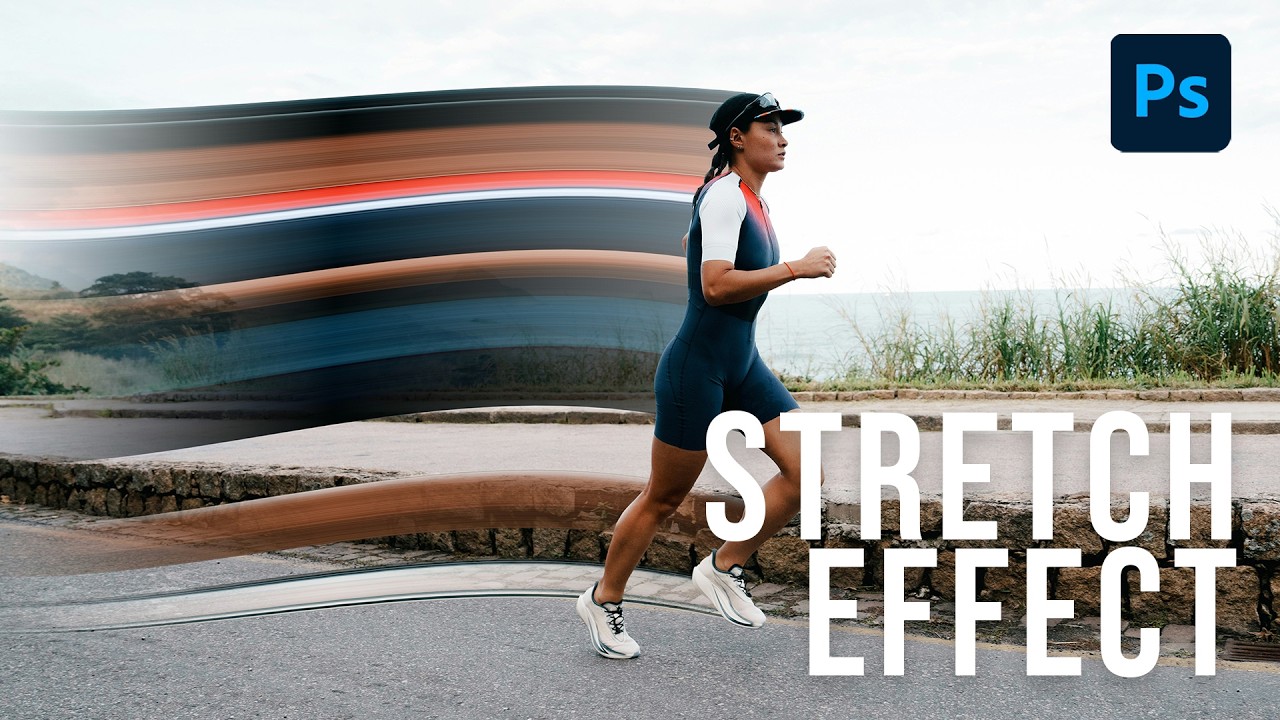
I’ve been making graphics professionally long enough that I should be embarrassed by how many Photoshop tools I’ve flat-out ignored. The single-column marquee tool was one of them. I knew it existed the way I know my gym membership exists – technically present, never used. Then I watched Aaron Nace’s pixel stretch tutorial over at PHLEARN and felt that specific flavor of frustration where a technique is so simple and so good that you’re annoyed you didn’t already know it.
Watch the full tutorial on YouTube
The pixel stretch effect is one of those things that looks expensive. You see it in music visuals, editorial photography, motion graphics. It reads as designed, like someone spent serious time on it. In reality, the core technique takes maybe five minutes. The version Aaron walks through adds some warp and masking magic that elevates it from “cool party trick” to something you could actually hand off to a client. Here’s how it works.
Step 1: Set Up Your Layers
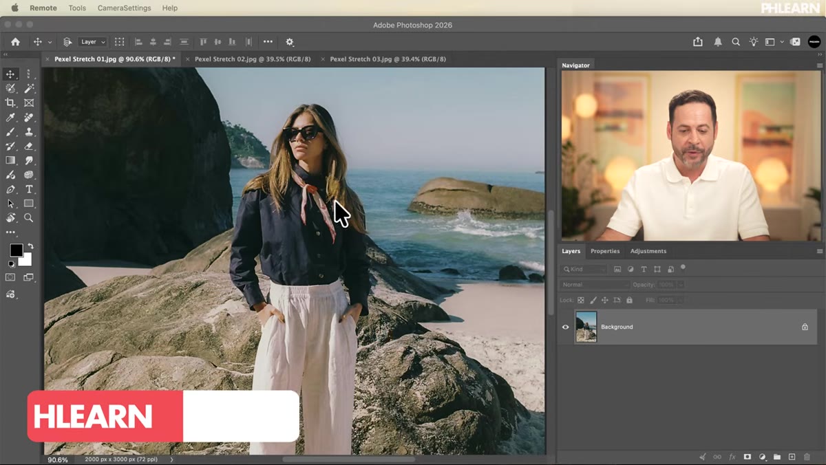 Background layer selected in Photoshop layers panel
Start with your image on the background layer. Select it, then use Select Subject in the contextual taskbar to isolate your subject automatically. Photoshop’s AI selection here is solid – you don’t need to fiddle with Quick Select or manually refine unless your subject has complex edges like hair against a busy background.
Background layer selected in Photoshop layers panel
Start with your image on the background layer. Select it, then use Select Subject in the contextual taskbar to isolate your subject automatically. Photoshop’s AI selection here is solid – you don’t need to fiddle with Quick Select or manually refine unless your subject has complex edges like hair against a busy background.
Once you have the selection, duplicate the subject layer twice using Ctrl/Cmd+J back to back. You’ll end up with three versions: the original background, and two copies sitting above it. Those two copies are doing different jobs, which will make sense in a moment. The key is to keep them organized – label them if that’s your habit, because staring at “Layer 1 copy 2” at midnight is its own kind of suffering.
Step 2: Select the Middle Layer and Grab the Single-Column Marquee Tool
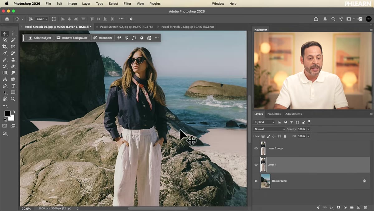 Middle layer selected, single-column marquee tool active in toolbar
This is where things get interesting. Click on the middle layer – not the top copy, the middle one. This distinction matters because the top layer will sit in front of your stretch, keeping your subject looking clean and intact, while the middle layer is where all the distortion happens.
Middle layer selected, single-column marquee tool active in toolbar
This is where things get interesting. Click on the middle layer – not the top copy, the middle one. This distinction matters because the top layer will sit in front of your stretch, keeping your subject looking clean and intact, while the middle layer is where all the distortion happens.
Now go find the Single Column Marquee tool. It lives nested under the Rectangular Marquee in the toolbar – right-click the marquee icon and you’ll see the dropdown. Select the single-column option. This tool selects exactly one pixel column running the full height of your canvas. Most people never touch it. Today it becomes your entire personality.
Step 3: Make Your Single-Column Selection
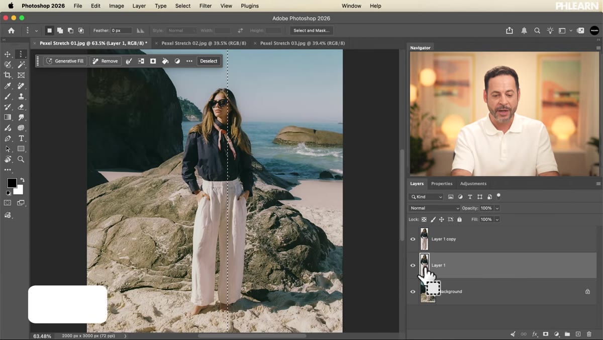
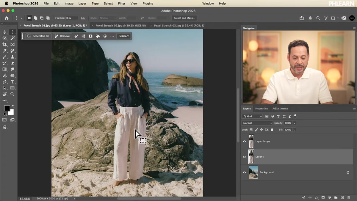 Single-column selection running vertically through the subject
Zoom out so you can see your full image, then click somewhere on your subject. The tool drops a one-pixel-wide vertical selection straight through whatever you click on. Because you’re on the middle layer, which already has your subject isolated, this selection only captures subject pixels – not background.
Single-column selection running vertically through the subject
Zoom out so you can see your full image, then click somewhere on your subject. The tool drops a one-pixel-wide vertical selection straight through whatever you click on. Because you’re on the middle layer, which already has your subject isolated, this selection only captures subject pixels – not background.
Click somewhere central to your subject, like the torso or the middle of the figure. You’ll see the marching ants running top to bottom. That one pixel column is your raw material for the stretch effect. It sounds minimal, but it contains all the color information Photoshop needs to extrapolate the whole thing outward.
Step 4: Transform and Stretch the Selection
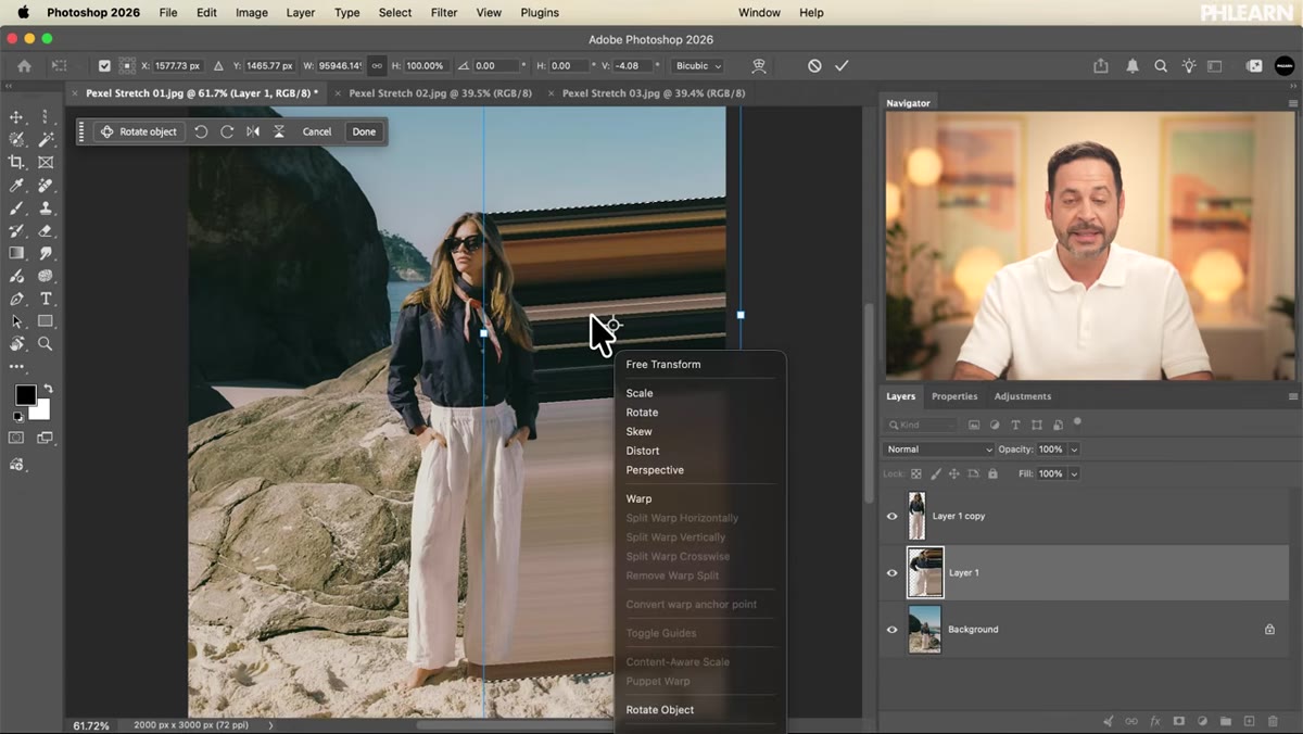
 Transform handles visible on single-column selection
With the selection active on your middle layer, hit Ctrl/Cmd+T to enter Free Transform. The transform handles will appear, but they’ll be nearly impossible to grab because the selection is one pixel wide. Don’t panic – this is where holding Ctrl/Cmd while dragging the side handles saves you.
Transform handles visible on single-column selection
With the selection active on your middle layer, hit Ctrl/Cmd+T to enter Free Transform. The transform handles will appear, but they’ll be nearly impossible to grab because the selection is one pixel wide. Don’t panic – this is where holding Ctrl/Cmd while dragging the side handles saves you.
Hold Ctrl/Cmd, click the left or right edge handle, and drag outward. You’re essentially pulling that single column of pixels across the canvas, smearing it horizontally. Drag it to the edge of the frame, or past it. Do the same on the other side. The result is a flat, hard pixel stretch running across your image – clean color bands radiating from the point you clicked. At this stage it looks intentional and sharp, which is fine, but we’re not done.
Step 5: Switch to Warp for Fluid Motion
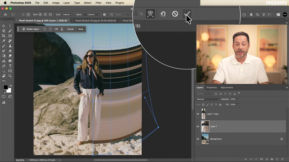
 Warp grid overlay active on the pixel stretch layer
While still inside the Transform operation, right-click on the canvas and select Warp from the context menu. This swaps the standard transform handles for a mesh grid with corner handles and interior control points. This is the step that turns a flat graphic trick into something that feels alive.
Warp grid overlay active on the pixel stretch layer
While still inside the Transform operation, right-click on the canvas and select Warp from the context menu. This swaps the standard transform handles for a mesh grid with corner handles and interior control points. This is the step that turns a flat graphic trick into something that feels alive.
Pull the corner points up or down to introduce curves into the stretch. You can also grab interior points and push them around to create flow. The goal is to make the pixel bands bend, wave, or taper – like the light is bending around your subject rather than cutting straight across. Even subtle warp adjustments make a significant visual difference. When you’re happy, confirm the transform by pressing Enter or clicking the checkmark.
Step 6: Add a Gradient Mask to Fade the Edges
 Layer mask with gradient applied, stretch fading at edges
The warp introduces natural transparency where the pixels thin out, which is already a nice effect. But you can push it further by adding a layer mask to the middle (stretch) layer and painting a gradient on the mask to fade the stretch out at the edges or toward your subject.
Layer mask with gradient applied, stretch fading at edges
The warp introduces natural transparency where the pixels thin out, which is already a nice effect. But you can push it further by adding a layer mask to the middle (stretch) layer and painting a gradient on the mask to fade the stretch out at the edges or toward your subject.
Select the middle layer, add a layer mask, grab the Gradient tool set to black-to-white, and drag across the mask. Black on the mask hides, white reveals – so pulling a gradient from the edge inward will dissolve the stretch cleanly rather than cutting it off. This is what makes the effect look composited rather than slapped on. If the fade is too aggressive, lower the layer’s overall opacity slightly to taste.
What I’d Do Differently
The tutorial focuses on a single stretch direction, which works beautifully. But when I played with this on a portrait I was working on at the coffee shop on Thursday, I found that duplicating the stretch layer and running a second column selection horizontally – using the Single Row Marquee instead – and applying a much more subtle warp created an intersecting effect that looked genuinely strange in a good way.
The other thing worth noting: this works dramatically better on subjects with bold, solid color regions. Busy patterns or highly textured areas produce muddy stretch bands that read as noise. Clean clothing, solid backgrounds behind the subject, strong silhouettes – those give you the crisp, graphic quality that makes the effect pop.
The single-column marquee tool has been sitting in that toolbar for years. One tutorial, five minutes, and now it’s in the regular rotation. That’s the Aaron Nace effect, and it’s why PHLEARN tutorials are worth bookmarking rather than just watching once and forgetting.
Watch the full tutorial on YouTube and grab the free sample images from the PHLEARN site while you’re there – practicing on the same assets makes it much easier to isolate what each step is actually doing before you take it to your own work.
Comments (2)
Never thought of approaching it this way. Really creative.
This is the kind of content that keeps me coming back.
Leave a Comment