
Over-editing is the silent killer of otherwise great photos. I know this personally because I spent years making graphics and memes where “more” was always better — crank the saturation, punch the contrast, slap a vignette on it and call it done. That habit followed me into photo editing and it took an embarrassingly long time to unlearn. The problem is you rarely notice you’ve gone too far until you’re looking at the image a week later wondering why the sky looks like a neon sign.
In this Mark Denney tutorial, he tackles that exact problem and introduces a workflow inside Lightroom that acts like a reality check for your edits. What makes it genuinely useful is that it’s not some third-party plugin or a workaround — it’s already sitting inside Lightroom waiting to be used. Watch the full tutorial on YouTube if you want to follow along with his actual footage, but I’ve broken down every step below so you can apply it to your own images right now.
The core idea Mark builds on is simple but smart: depth in a photograph mimics how the human eye perceives the real world. Foreground elements are sharper, more saturated, and more contrasty. Background elements are softer, flatter, and slightly hazy. When your entire image is edited at the same intensity from edge to edge, it reads as flat, even if every individual slider is technically “correct.” Here’s how he fixes that.
Step 1: Start With Your Base Edit in the Basics Panel
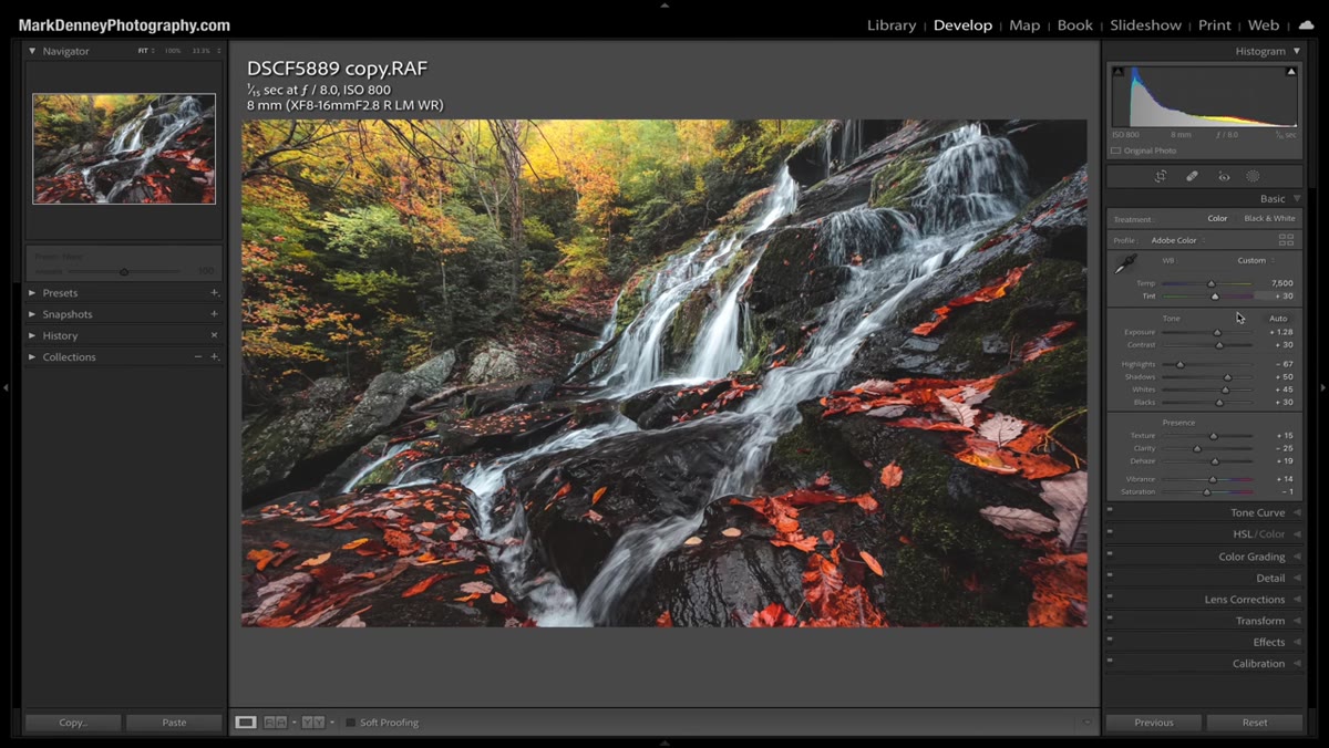 Lightroom Basics panel with completed adjustments visible
Before introducing the depth technique, get your standard global adjustments dialed in first. Mark runs through his Basics panel settings on a waterfall shot from the Blue Ridge Mountains, covering exposure, contrast, and tone. Don’t try to use this depth technique as a workaround for a bad base edit. Your exposure should be solid and your colors should feel close before you start layering masks on top.
Lightroom Basics panel with completed adjustments visible
Before introducing the depth technique, get your standard global adjustments dialed in first. Mark runs through his Basics panel settings on a waterfall shot from the Blue Ridge Mountains, covering exposure, contrast, and tone. Don’t try to use this depth technique as a workaround for a bad base edit. Your exposure should be solid and your colors should feel close before you start layering masks on top.
This step is mostly about restraint. Resist the urge to push saturation or clarity globally at this stage. You want those tools available for surgical use later, not burned into the whole image from the start.
Step 2: Use the Calibration Panel to Tint Your Shadows
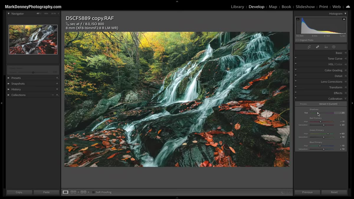 Calibration panel open with shadow tint slider adjusted
Mark adds a subtle magenta tint to the shadow areas using the Calibration panel, which lives at the very bottom of the right-hand panel strip in Lightroom. This is not a panel most people visit regularly, and honestly that’s a shame. The shadow tint slider here lets you shift the color of your darkest tones independently, which is a much cleaner way to add a color grade than hammering the HSL sliders.
Calibration panel open with shadow tint slider adjusted
Mark adds a subtle magenta tint to the shadow areas using the Calibration panel, which lives at the very bottom of the right-hand panel strip in Lightroom. This is not a panel most people visit regularly, and honestly that’s a shame. The shadow tint slider here lets you shift the color of your darkest tones independently, which is a much cleaner way to add a color grade than hammering the HSL sliders.
He keeps this adjustment gentle, just enough to add a hint of warmth and separation in the shadows. The goal here is not a dramatic color grade. If you can immediately name the color you’ve added, you’ve probably gone too far.
Step 3: Identify What’s Foreground and What’s Background
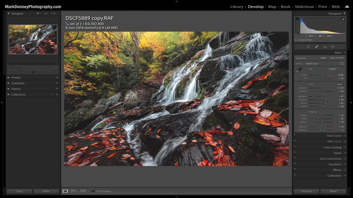 Full image visible, foreground waterfall vs background foliage contrast shown
This is the conceptual step that makes everything else click. Mark points out that in real life, objects closer to your eye naturally appear more saturated, sharper, and higher contrast. Objects farther away look softer and slightly desaturated, almost like a gentle haze sits between you and them. Your editing should reflect that same logic.
Full image visible, foreground waterfall vs background foliage contrast shown
This is the conceptual step that makes everything else click. Mark points out that in real life, objects closer to your eye naturally appear more saturated, sharper, and higher contrast. Objects farther away look softer and slightly desaturated, almost like a gentle haze sits between you and them. Your editing should reflect that same logic.
Look at your image and draw a mental line. What’s in the foreground? What’s pushing toward the back of the frame? In Mark’s shot, the waterfall and immediate rocks are the foreground. The tree canopy and foliage in the distance are the background. Each zone is going to get treated differently.
Step 4: Create a Linear Gradient Mask Over the Background
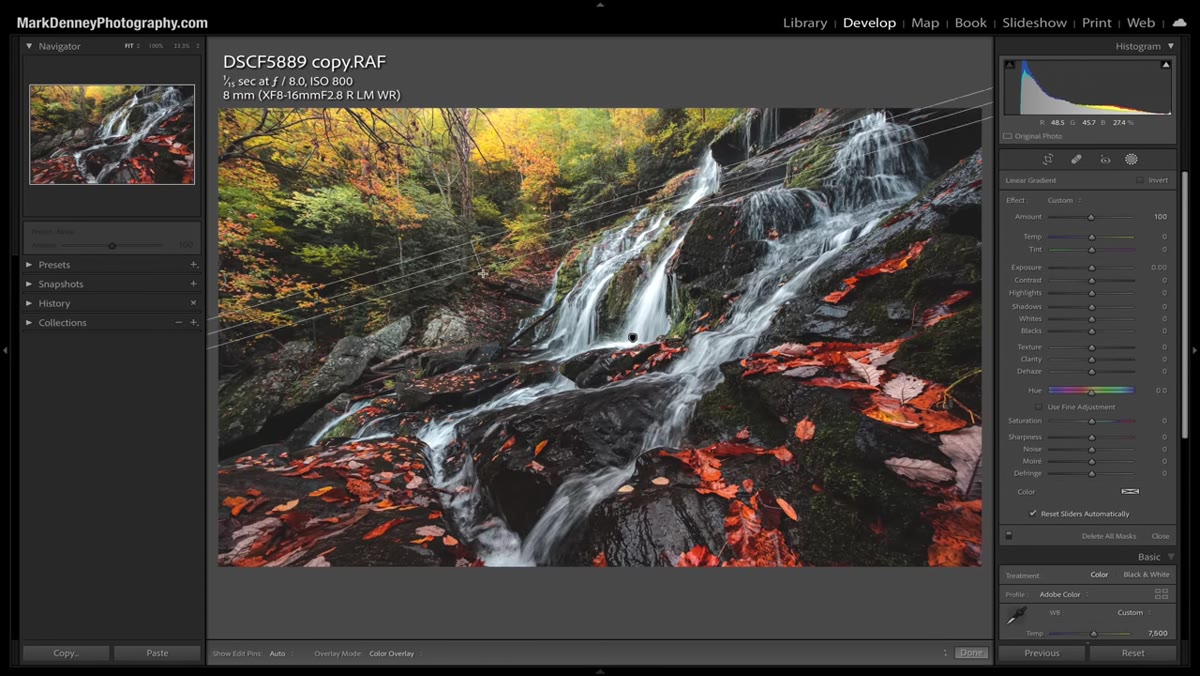 Linear gradient mask being dragged across the background area
Head to the Masks panel and create a new Linear Gradient. Drag it across the background portion of your image. Mark pulls his across the upper portion of the frame to cover the distant foliage, leaving the waterfall and foreground rocks untouched.
Linear gradient mask being dragged across the background area
Head to the Masks panel and create a new Linear Gradient. Drag it across the background portion of your image. Mark pulls his across the upper portion of the frame to cover the distant foliage, leaving the waterfall and foreground rocks untouched.
The direction and feathering of your gradient matters a lot here. You want a smooth transition, not a hard line through the middle of your image. Take your time placing it. You can always adjust the handles after you’ve dragged it out.
Step 5: Pull Down Contrast, Saturation, and Clarity in the Background Zone
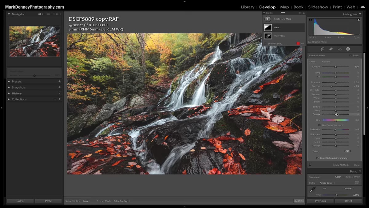 Mask adjustments panel showing contrast, saturation, and clarity reduced
With your gradient mask active, now dial back the contrast, saturation, and clarity in that background region. Mark doesn’t go dramatic with any of these. A modest contrast reduction, a small saturation dip, and a slight clarity pull-back are all you need. The combined effect is what creates the illusion of atmospheric depth.
Mask adjustments panel showing contrast, saturation, and clarity reduced
With your gradient mask active, now dial back the contrast, saturation, and clarity in that background region. Mark doesn’t go dramatic with any of these. A modest contrast reduction, a small saturation dip, and a slight clarity pull-back are all you need. The combined effect is what creates the illusion of atmospheric depth.
Clarity is especially worth paying attention to here. Reducing it softens micro-contrast, which mimics the way distant objects lose sharpness in real conditions. Toggle the mask on and off as you work so you’re always comparing against your starting point rather than editing blind.
Step 6: Toggle the Mask to Check Your Work
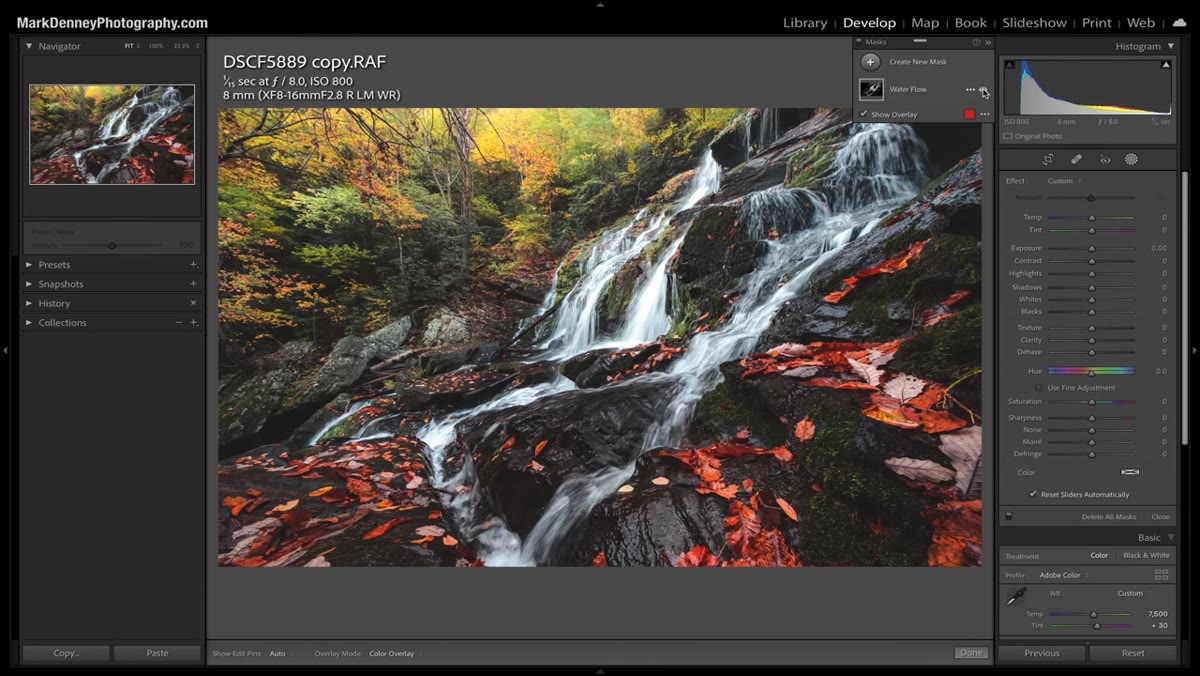 Mask overlay toggled on showing the gradient coverage across the background
Mark uses the toggle feature to flip the mask on and off and compare the before and after state of just that adjustment. This is your built-in sanity check, and it’s the closest thing Lightroom has to the “undercover tool” the video title teases.
Mask overlay toggled on showing the gradient coverage across the background
Mark uses the toggle feature to flip the mask on and off and compare the before and after state of just that adjustment. This is your built-in sanity check, and it’s the closest thing Lightroom has to the “undercover tool” the video title teases.
Seeing the isolated change rather than the full edit makes it much easier to catch when you’ve pushed something too far. If toggling the mask on and off makes no visible difference, you’ve been too subtle. If toggling it causes a jarring jump in how the image feels, you’ve overdone it. You’re aiming for a change that’s clearly present but doesn’t scream for attention.
What I’d Add From My Own Work
The toggling habit Mark demonstrates here is something I now apply well beyond Lightroom. In Photoshop, I do the same thing with layer visibility toggles, especially when I’m building composites. I’ll isolate a single adjustment layer and flip it on and off repeatedly before committing.
Where I’d extend Mark’s technique is with luminosity masking. His linear gradient is great for landscapes with a clear foreground-to-background divide, but if your scene has an irregular depth structure, a luminosity mask that targets specific tonal ranges gives you much more control over where the depth effect actually lands. It’s a bit more setup, but for complex images it’s worth the extra five minutes.
The biggest thing to take away here is that depth in a photograph is not just about composition. It’s something you actively construct in post, by mimicking the way human vision actually works. Foreground punchy. Background soft. Let each zone do its own job.
Watch the full tutorial on YouTube to see Mark walk through this on his actual image. Seeing the before-and-after on real footage makes the subtlety of the adjustments much easier to calibrate against your own work.
Comments
Leave a Comment