A few months ago I spent the better part of an afternoon trying to warm up a landscape shot using nothing but the Temperature slider. The result was technically warmer, sure, but it also looked like someone had smeared Velveeta across the sky. Everything shifted. The rocks, the shadows, the parts I didn’t even want touched. I ended up with a photo that looked like it was shot through a jaundiced window.
Turns out I was using the wrong tool for the job. In this Matt Kloskowski tutorial, he cracks open a color control that lives inside Lightroom’s local adjustment tools, specifically the Graduated Filter, Radial Filter, and Adjustment Brush. It’s a small color swatch with an X on it that most people (myself included, for an embarrassingly long time) have completely ignored. Once you understand what it actually does and how it differs from Temperature or HSL, it changes how you approach color grading entirely.
The technique works identically inside Camera Raw, which means if you’re living in Photoshop, you haven’t been left out. Watch the full tutorial on YouTube and follow along here for a step-by-step breakdown.
Step 1: Understand Why the Temperature Slider Isn’t Always the Answer
 Temperature slider being dragged right to warm entire image
The Temperature slider is a global control. Drag it right, the whole image gets warmer. Drag it left, everything goes blue. That’s fine when you want a full-image white balance correction, but it’s clumsy for anything creative or selective. Same deal with the Tint slider, which pushes things toward red or green. Matt’s point here is simple: these tools work on the whole photo, and sometimes you only want to push color into a specific area without touching everything else. That limitation is exactly what this hidden tool solves.
Temperature slider being dragged right to warm entire image
The Temperature slider is a global control. Drag it right, the whole image gets warmer. Drag it left, everything goes blue. That’s fine when you want a full-image white balance correction, but it’s clumsy for anything creative or selective. Same deal with the Tint slider, which pushes things toward red or green. Matt’s point here is simple: these tools work on the whole photo, and sometimes you only want to push color into a specific area without touching everything else. That limitation is exactly what this hidden tool solves.
Step 2: Locate the Color Swatch in the Local Adjustment Tools
 Graduated Filter panel open in Lightroom showing color swatch
Inside Lightroom, open either the Graduated Filter, the Radial Filter, or the Adjustment Brush. Scroll all the way to the bottom of the panel that opens. You’ll see a row labeled “Color” with a small square swatch that has an X through it. That X just means no color is currently selected. It’s easy to miss because it doesn’t look like much, but this is the thing. Click that swatch and a color picker opens where you can choose any color you want, plus dial in the saturation level.
Graduated Filter panel open in Lightroom showing color swatch
Inside Lightroom, open either the Graduated Filter, the Radial Filter, or the Adjustment Brush. Scroll all the way to the bottom of the panel that opens. You’ll see a row labeled “Color” with a small square swatch that has an X through it. That X just means no color is currently selected. It’s easy to miss because it doesn’t look like much, but this is the thing. Click that swatch and a color picker opens where you can choose any color you want, plus dial in the saturation level.
Step 3: Apply the Graduated Filter to the Entire Image
 Graduated filter being dragged from outside the canvas
Here’s a trick worth writing on a sticky note: if you click and drag a Graduated Filter starting from outside the canvas edge (not from within the image), Lightroom applies the effect to the entire photo as a flat, uniform layer rather than a gradient that fades across the frame. This is how you use a Graduated Filter without actually graduating it across anything. Click off the edge of the image and drag away from it. The whole photo gets the treatment evenly. This comes in handy any time you want to use a local adjustment tool’s settings globally, without the fade.
Graduated filter being dragged from outside the canvas
Here’s a trick worth writing on a sticky note: if you click and drag a Graduated Filter starting from outside the canvas edge (not from within the image), Lightroom applies the effect to the entire photo as a flat, uniform layer rather than a gradient that fades across the frame. This is how you use a Graduated Filter without actually graduating it across anything. Click off the edge of the image and drag away from it. The whole photo gets the treatment evenly. This comes in handy any time you want to use a local adjustment tool’s settings globally, without the fade.
Step 4: Pick Your Color and Set the Saturation
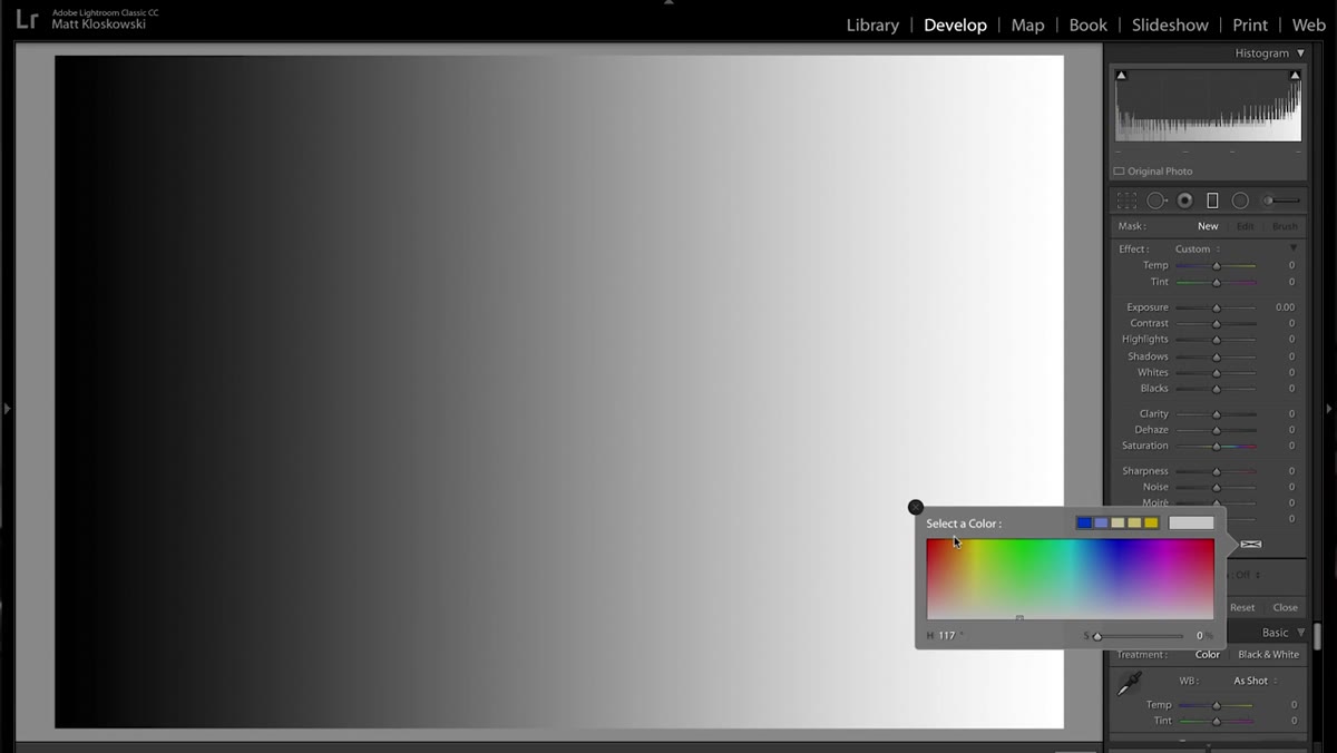 Color picker open with warm orange-yellow selected
Once the color picker is open, choose something that fits your intent. Matt uses a warm orange-yellow as the example, which is a reliable starting point for golden hour looks on landscapes. The saturation slider inside the color picker controls the intensity of the color overlay. Pull it down for subtlety, push it up for something more aggressive. You’re not locked into a preset value here, so experiment. Pulling the saturation back gives you a much more natural blend into the image rather than a painted-on look.
Color picker open with warm orange-yellow selected
Once the color picker is open, choose something that fits your intent. Matt uses a warm orange-yellow as the example, which is a reliable starting point for golden hour looks on landscapes. The saturation slider inside the color picker controls the intensity of the color overlay. Pull it down for subtlety, push it up for something more aggressive. You’re not locked into a preset value here, so experiment. Pulling the saturation back gives you a much more natural blend into the image rather than a painted-on look.
Step 5: Watch the Histogram to Understand What’s Actually Happening
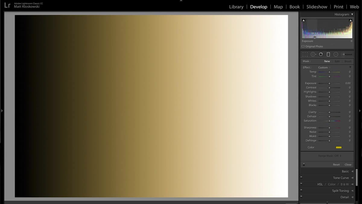 Histogram showing color spikes being toggled on and off
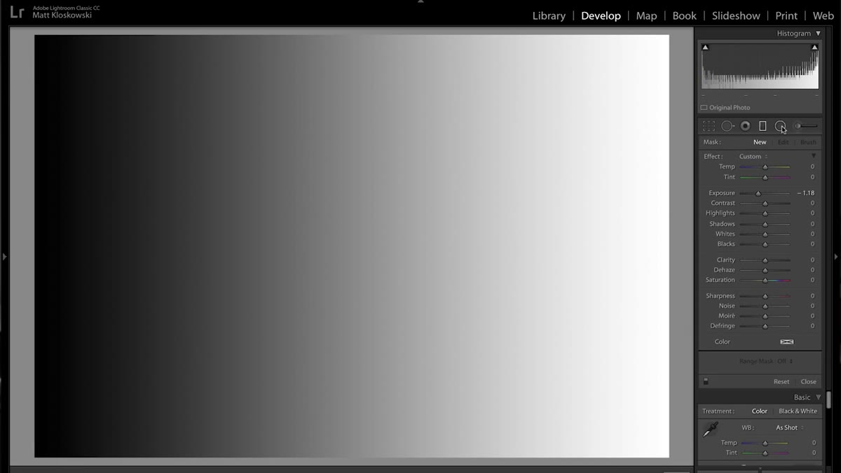
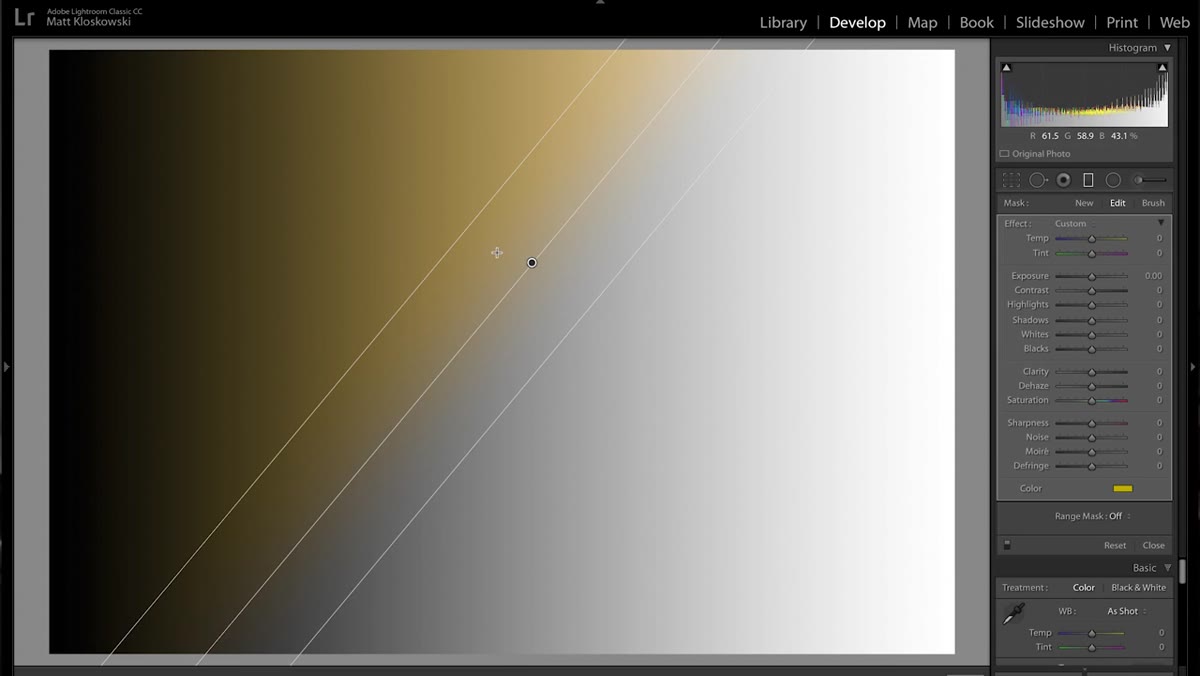
This is where it gets genuinely interesting, and it’s why Matt uses a simple white-to-gray gradient image as his demo. When you apply the color swatch tool and look at the histogram, you’ll see color channel spikes appear that weren’t there before. But here’s the key thing: the overall tonal structure of the image, the luminosity values, barely moves. Toggle the effect on and off and watch the histogram. The tones stay largely intact while the color shifts. That’s the behavior that makes this tool different from Temperature. Temperature bakes warmth into the tonal values. This tool layers color on top without blowing out or crushing your tones in the same way.
Histogram showing color spikes being toggled on and off
This is where it gets genuinely interesting, and it’s why Matt uses a simple white-to-gray gradient image as his demo. When you apply the color swatch tool and look at the histogram, you’ll see color channel spikes appear that weren’t there before. But here’s the key thing: the overall tonal structure of the image, the luminosity values, barely moves. Toggle the effect on and off and watch the histogram. The tones stay largely intact while the color shifts. That’s the behavior that makes this tool different from Temperature. Temperature bakes warmth into the tonal values. This tool layers color on top without blowing out or crushing your tones in the same way.
Step 6: Compare the Two Approaches Side by Side
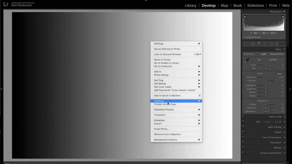 Virtual copy comparison between temperature-warmed and color-swatch versions
Matt creates a virtual copy of the original image (right-click the image in Lightroom and choose “Create Virtual Copy”) so he can compare the Temperature-warmed version against the color swatch version. Looking at both, the difference is visible but also instructive. The Temperature version shifts the entire image uniformly, including areas where the warmth feels forced. The color swatch version gives you that same warm feeling with more control over where it lives, because it’s attached to a local adjustment tool. If you use a Radial Filter or Adjustment Brush instead of the Graduated Filter, you can paint that color into specific regions only.
Virtual copy comparison between temperature-warmed and color-swatch versions
Matt creates a virtual copy of the original image (right-click the image in Lightroom and choose “Create Virtual Copy”) so he can compare the Temperature-warmed version against the color swatch version. Looking at both, the difference is visible but also instructive. The Temperature version shifts the entire image uniformly, including areas where the warmth feels forced. The color swatch version gives you that same warm feeling with more control over where it lives, because it’s attached to a local adjustment tool. If you use a Radial Filter or Adjustment Brush instead of the Graduated Filter, you can paint that color into specific regions only.
How I Actually Use This in Client Work
The version of this technique I reach for most often isn’t the full-image gradient application. It’s the Radial Filter version. I’ll drop a large, soft radial filter over a subject’s face or the center of a landscape composition, set the color swatch to a warm amber, pull the saturation back to maybe 30-40%, and feather the edges heavily. The result is a subtle directional warmth that draws the eye without screaming “I color graded this in 10 minutes.”
The other place this earns its keep is product photography. If I’m shooting something that’s supposed to have a warm, premium feel, like leather goods or coffee packaging, painting a warm overlay selectively with the Adjustment Brush lets me warm specific surfaces without contaminating the neutral background. Temperature would ruin that instantly.
One caveat worth flagging: this tool works on raw files in Lightroom and Camera Raw. If you’re working on a JPEG or a flattened file, your mileage will vary because the color math is different. Use it as early in your workflow as possible, before you’ve flattened anything, and you’ll get the cleanest results.
The single most important thing to take away from this is that the Color swatch tool in Lightroom’s local adjustments is not redundant with Temperature or HSL. It does something those tools can’t: it applies a chosen color selectively to a region of the image while leaving the tonal structure relatively undisturbed. That’s a meaningfully different kind of control.
Go watch Matt’s full breakdown for the visual demonstration, especially the histogram comparison, which makes the difference click immediately.
Watch the full tutorial on YouTube
Comments (2)
Shared this with my photography group. Everyone loved it.
I've watched a dozen tutorials on this and yours is the clearest by far.
Leave a Comment