Client wants the red car blue. The logo needs to be teal instead of orange. The product shot has to match six colorways before Friday. If you’ve done any kind of commercial or product work, you know this scenario. You also know the sinking feeling of doing it badly — painting over things manually, losing texture, making something that looks like a toddler got hold of a bucket of digital paint.
I ran into this exact problem on a product shoot mockup last year and wasted an embarrassing amount of time doing it the wrong way. Then I watched Ben Willmore break it down in a CreativeLive Quick Tips tutorial and felt that specific frustration of realizing there was a smarter path the whole time. Watch the full tutorial on YouTube — it’s short, dense with useful info, and Ben explains it without wasting your time.
The core technique is a Hue/Saturation adjustment layer with a targeted color selection. It’s non-destructive, it’s editable, and when you need to roll back or tweak, you’re not starting from scratch. Here’s exactly how to do it.
Step 1: Add a Hue/Saturation Adjustment Layer
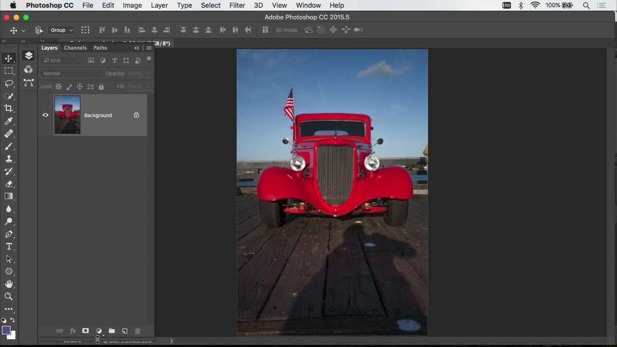 Clicking the adjustment layer icon in the Layers panel
If your Layers panel isn’t visible, go to Window and click Layers. At the bottom of that panel, there’s an icon that looks like a circle split half black and half white. That’s your adjustment layer button. Click it and choose Hue/Saturation from the list. This keeps your original image completely untouched underneath, which matters a lot once you start needing to revise things or explain your choices to a client at 9pm.
Step 2: Turn On the Hand Tool (On-Image Targeting)
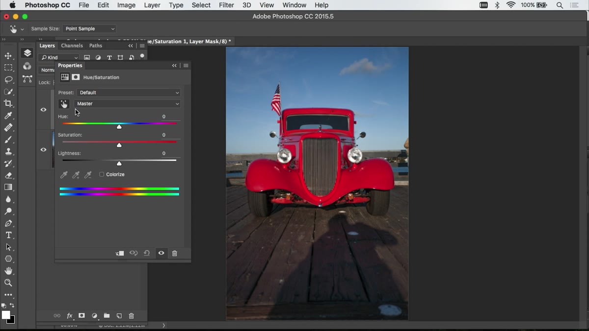 Hand icon highlighted in the Hue/Saturation properties panel
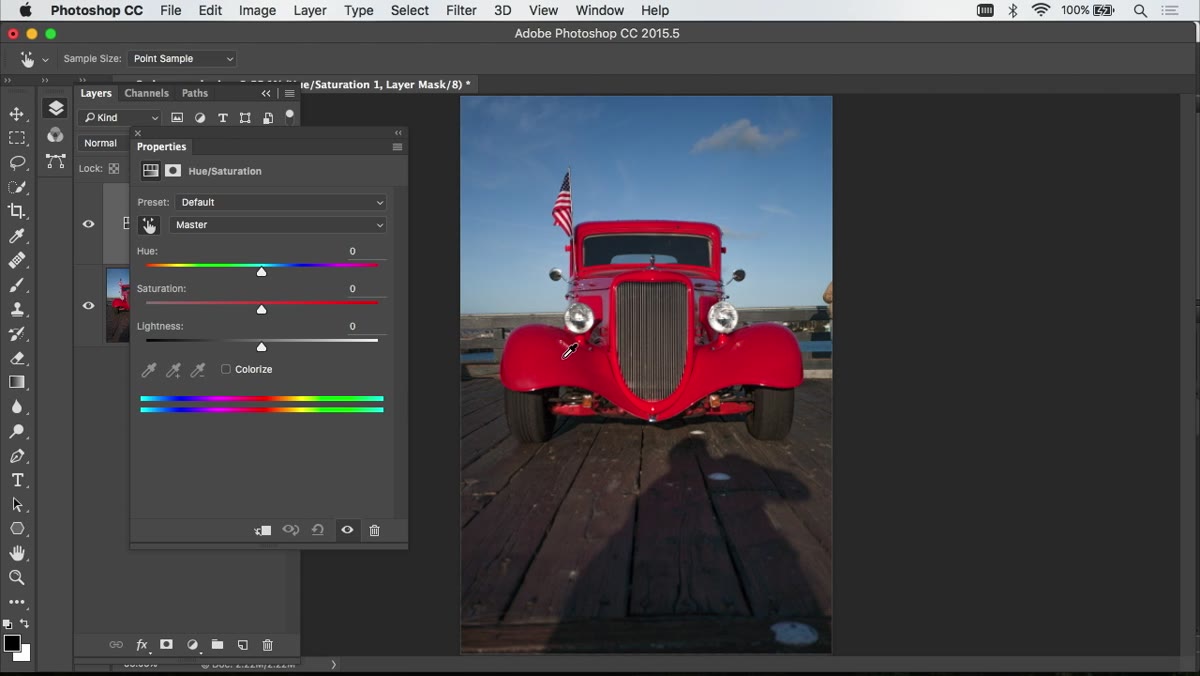
Inside the Hue/Saturation properties panel, look for a small hand icon on the left side. Click it so it’s active. This tells Photoshop that when you click on the image, you want to sample a color and work on that specific range, rather than shifting every color in the entire photo. If you want this to be your default behavior every time you open Hue/Saturation, go to the panel’s upper-right menu and enable Auto Select. Future you will thank present you for that one.
Step 3: Click the Color You Want to Replace
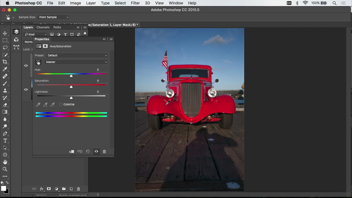 Clicking the red car in the image to sample its color
With the hand tool active, move your cursor over the image and click directly on the color you want to change. In the tutorial, Ben clicks on the red car. When you do this, two things happen: the dropdown menu inside the panel switches from “Master” to the specific color channel Photoshop detected (something like “Reds”), and some range markers appear along the color bar at the bottom of the panel. Photoshop is now focused on a targeted slice of the color spectrum rather than the whole thing.
Step 4: Adjust Hue, Saturation, and Lightness
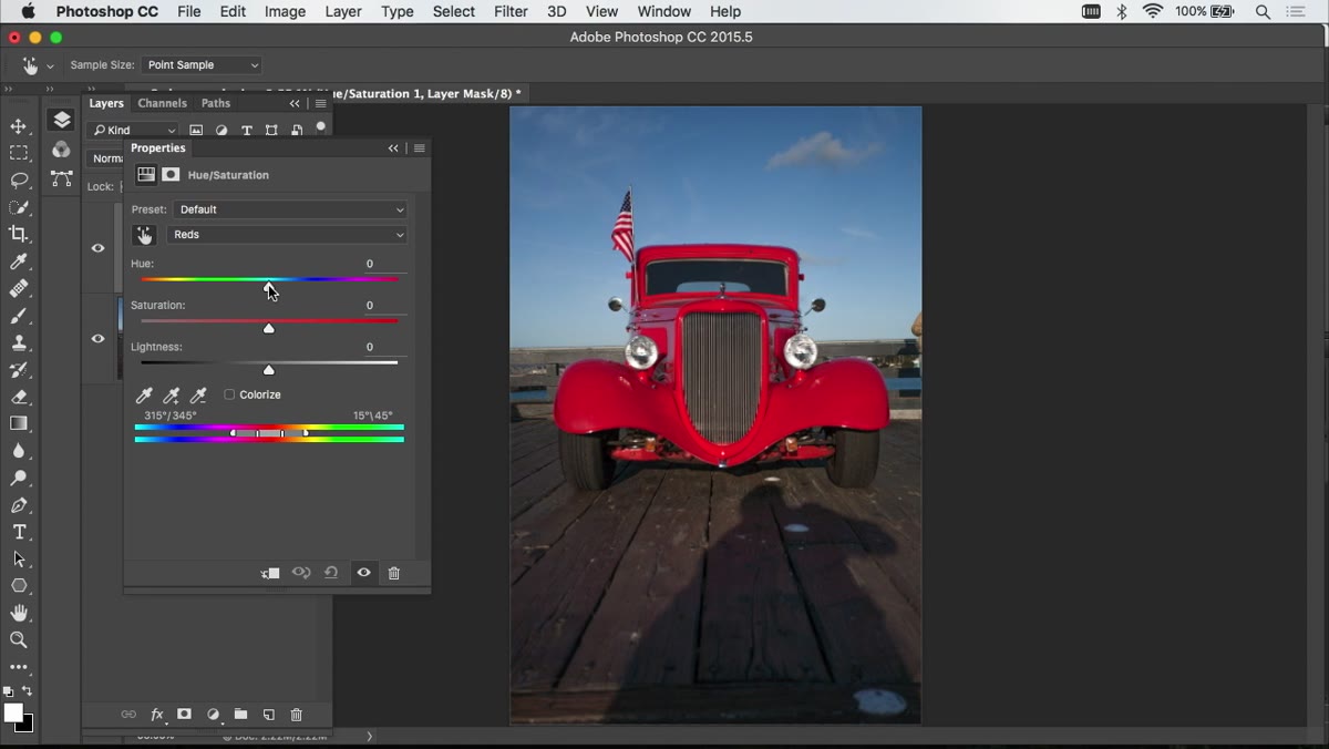 Hue slider being dragged to change car color from red to blue
Now you’ve got three sliders to work with. Hue shifts the actual color — drag it left or right and you’ll cycle through the whole spectrum. Saturation controls how vivid or washed-out the result looks. Lightness handles how bright or dark the color appears. Ben’s advice here is good: get your hue where you want it first, then fine-tune saturation. Lightness usually needs only a small nudge, if anything. Push it too far and your object starts looking fake in a way that’s hard to put your finger on but everyone notices.
Step 5: Paint Out Any Areas That Changed That Shouldn’t Have
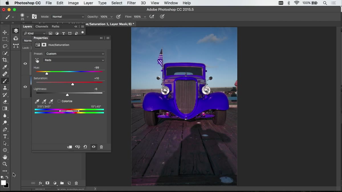 Brush tool painting black on the adjustment layer mask
Adjustment layers come with a built-in mask, which is one of the main reasons to use them. If your color shift accidentally hit something it shouldn’t have, like a flag in the background with the same red hue, grab your Brush tool, make sure your foreground color is set to black, and paint over the areas you want to protect. Black hides the adjustment, white reveals it. This is way less stressful than trying to make a perfect selection upfront.
Step 6: Use the Precise Method When the Simple One Isn’t Enough
 Color range sliders at the bottom of the Hue/Saturation panel
Sometimes reflections, shadows, or subtle color variation in your subject means parts of it don’t get picked up by the basic click-and-shift approach. Ben covers a more precise version for exactly this situation. Delete the first adjustment layer and create a fresh one. Click on the color again to sample it, but this time look at the color range indicators at the bottom of the properties panel. You’ll see a light gray bar flanked by two darker bars. The light section is the core range getting the full effect. The darker outer bars are where the adjustment fades out.
Grab those bars and slide them so the range is as narrow as possible, all pushed together. From there, you expand and reposition the range deliberately to capture only the colors that actually need to change. It takes a little more patience, but it gives you far more control over tricky areas like metallic surfaces or color gradients within a single object.
What I’d Add: Sample Multiple Points on Complex Subjects
The one thing the tutorial doesn’t get into, probably because of time, is that a single click sometimes isn’t enough to capture the full color range of something like a car with reflections or a fabric with varying tones. What I do is hold Shift and click additional spots on the object after my initial sample. Each Shift-click expands the targeted color range to include that new sample. Combined with Ben’s precise method of manually adjusting the range sliders, this usually catches the stubborn patches that stay the wrong color after the first pass.
It’s also worth noting that this whole approach works really well for product photography where you’re doing color variants for e-commerce. I’ve used it to generate six colorway options from a single image in under ten minutes, which used to take me most of an afternoon.
The single most useful thing to take away from this technique is the combination of non-destructive adjustment layers with targeted color sampling. Neither one alone is as powerful as using them together. The mask gives you an easy cleanup path. The targeted range gives you precision without complicated selections. That’s the whole move.
Watch the full tutorial on YouTube and pay attention to how Ben handles the color range sliders in the second method. That part goes fast but it’s the most valuable sixty seconds in the whole video.
Comments (3)
Printing this out and pinning it next to my monitor. That good.
This is the kind of content that keeps me coming back.
Finally someone explains this in a way that actually makes sense.
Leave a Comment