
I used to email myself PSDs. Not proud of it. We’re talking dragging files into Gmail like some kind of digital cave person, because I had no reliable system for moving assets between machines or sharing them with collaborators. Fonts would go missing, logo files would live in seventeen different folders named “final,” “final_v2,” and “ACTUAL_FINAL,” and every new project started with a twenty-minute archaeological dig through my desktop. Turns out, Photoshop had been quietly solving this problem for years and I just wasn’t paying attention.
In this Aaron Nace (PHLEARN) tutorial on Photoshop Libraries, Aaron breaks down a feature that genuinely changes how you manage assets across projects, whether you’re a solo freelancer or handing work off to a team. Watch the full tutorial on YouTube - but read this first so you know exactly what you’re looking at when you open the panel.
The core idea is simple: Libraries let you store design assets - colors, graphics, logos, character styles, images - in the cloud, tied to your Creative Cloud account. Switch computers, hand off to a collaborator, come back to a project six months later. Everything is right there. Aaron runs through all of this by building a wine label from scratch, which is a genuinely clever way to show how the pieces fit together.
Step 1: Open a New Document and Pull Up the Libraries Panel
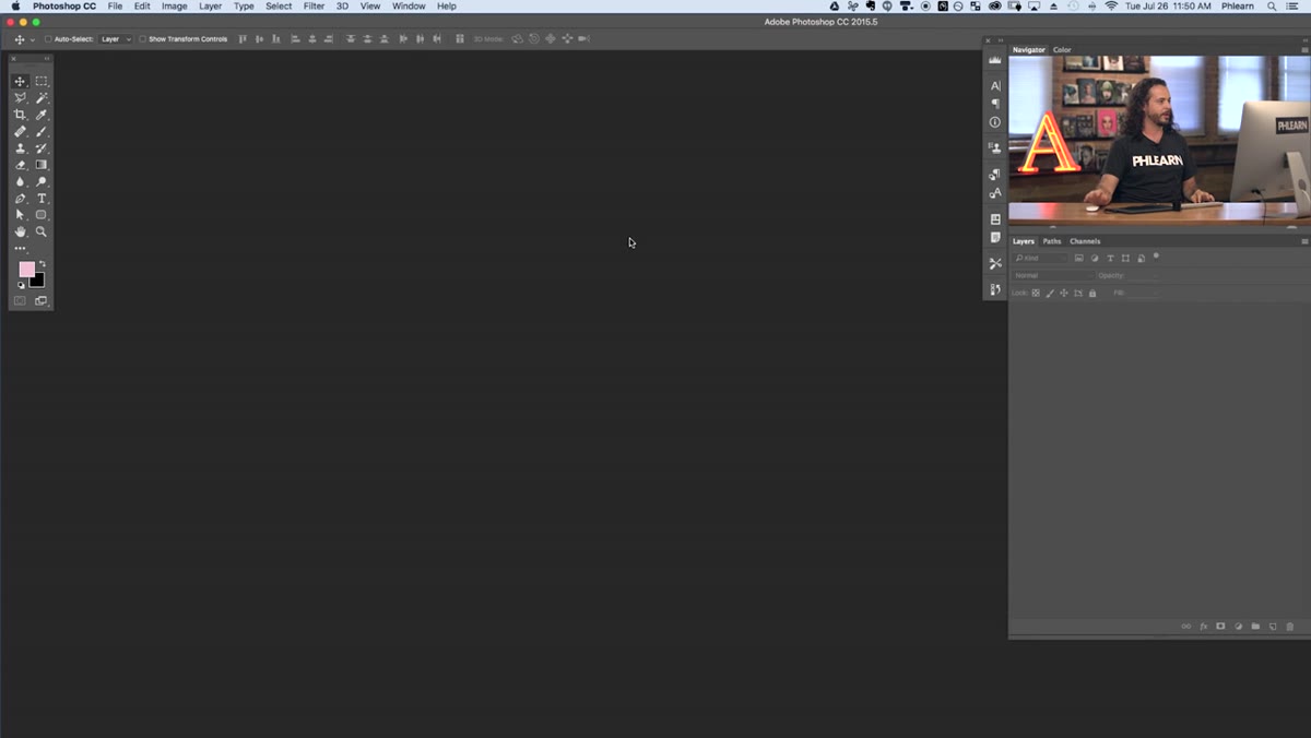 Blank new document open in Photoshop workspace
Start with a new document. Aaron creates a 1500 x 1500 pixel square canvas with a white background - clean and simple, nothing fancy. Once that’s open, head to Window > Libraries to bring up the Libraries panel. If you’ve never opened it before, it’ll dock into your panel area and probably look emptier than you’d expect. That’s fine. You’re about to fix that.
Blank new document open in Photoshop workspace
Start with a new document. Aaron creates a 1500 x 1500 pixel square canvas with a white background - clean and simple, nothing fancy. Once that’s open, head to Window > Libraries to bring up the Libraries panel. If you’ve never opened it before, it’ll dock into your panel area and probably look emptier than you’d expect. That’s fine. You’re about to fix that.
While you’re getting oriented, hit F to toggle full screen mode. Aaron does this immediately and honestly it’s one of those habits worth stealing. More canvas, fewer distractions, and you can right-click the background area to set it to a neutral gray so your colors read more accurately as you work.
Step 2: Understand the Library Panel Layout
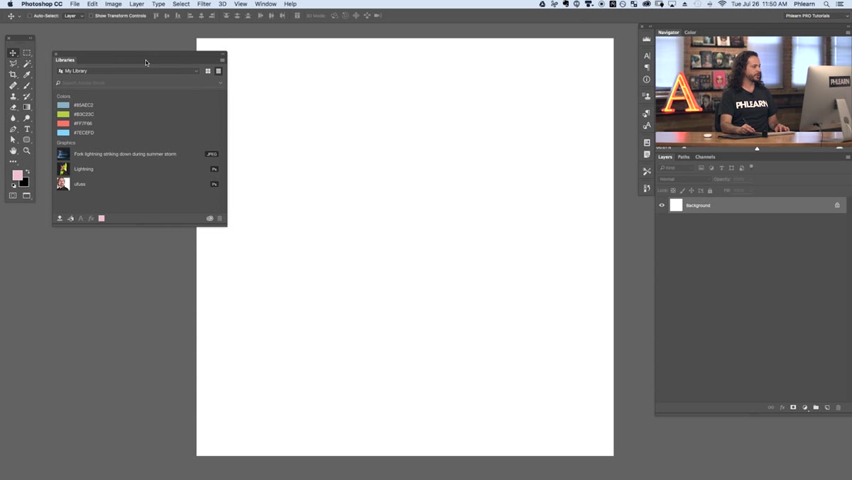 Libraries panel open showing default My Library and dropdown menu
Before you start adding anything, take thirty seconds to learn the panel. At the top you’ll see a dropdown that defaults to “My Library.” Click it and you’ll see any other libraries you’ve already created or had shared with you. Aaron has a “Patterns” library in his from a previous project, plus some assets he’d pulled from Adobe’s own content.
Libraries panel open showing default My Library and dropdown menu
Before you start adding anything, take thirty seconds to learn the panel. At the top you’ll see a dropdown that defaults to “My Library.” Click it and you’ll see any other libraries you’ve already created or had shared with you. Aaron has a “Patterns” library in his from a previous project, plus some assets he’d pulled from Adobe’s own content.
Think of each library as a project container - or better yet, a brand container. If you do recurring work for the same client, one library can hold their approved logo files, hex colors, fonts, and background textures. Anyone you share it with gets the whole kit. No more “can you send me the logo again” messages at 11pm.
Step 3: Create a New Library for Your Project
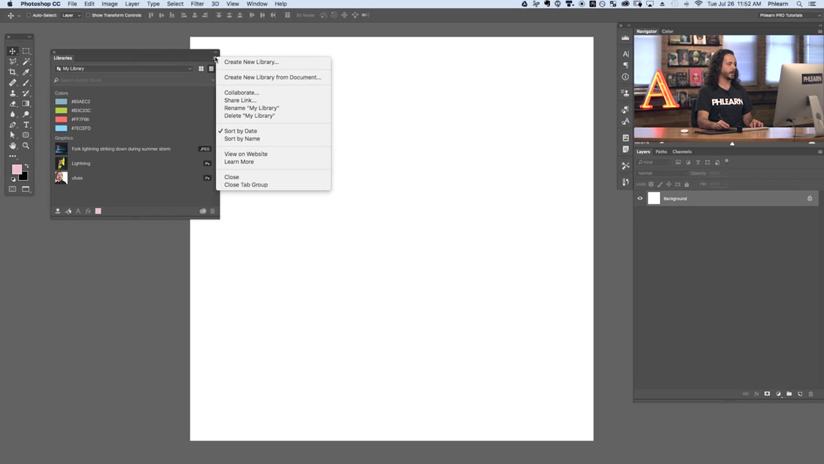 New library creation dialog with name field visible
Click the menu icon in the Libraries panel (the three-line hamburger menu or the small icon depending on your version) and select “Create New Library.” Give it a name that actually means something - Aaron names his after the specific project he’s working on, which is the move. A name like “Wine Label - Chateau Whatever” beats “Library 3” every single time.
New library creation dialog with name field visible
Click the menu icon in the Libraries panel (the three-line hamburger menu or the small icon depending on your version) and select “Create New Library.” Give it a name that actually means something - Aaron names his after the specific project he’s working on, which is the move. A name like “Wine Label - Chateau Whatever” beats “Library 3” every single time.
Once created, your new library becomes the active one and it’s ready to start accepting assets. Everything you add from this point will sync to the cloud automatically. That part requires no extra steps on your end, which is genuinely the best kind of feature.
Step 4: Add Colors to Your Library
 Foreground color swatch being dragged into Libraries panel
Here’s where things get immediately useful. Pick a color using the color picker - foreground or background, doesn’t matter - then drag the color swatch directly into the Libraries panel. It saves as a color asset with the exact hex value. Do this for every color in your palette and you’ve got a locked-in, shareable color system.
Foreground color swatch being dragged into Libraries panel
Here’s where things get immediately useful. Pick a color using the color picker - foreground or background, doesn’t matter - then drag the color swatch directly into the Libraries panel. It saves as a color asset with the exact hex value. Do this for every color in your palette and you’ve got a locked-in, shareable color system.
Why does this matter? Because “just eyedrop it from the old file” is not a color workflow. It’s a mistake factory. Saving colors to a library means everyone working on the project - including future you - is pulling from the same source. No more “this blue looks slightly different on the printed version” conversations.
Step 5: Save Graphics and Logo Assets to the Library
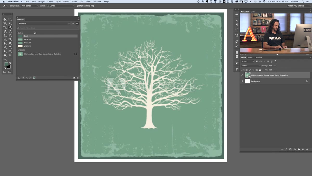 Graphic element being added to library from canvas
To add a graphic element - say a logo, an illustration, or any layer-based artwork - select the layer or layer group in your Layers panel, then use the Libraries panel menu to add it as a graphic. You can also drag directly from the canvas into the panel in some versions of Photoshop.
Graphic element being added to library from canvas
To add a graphic element - say a logo, an illustration, or any layer-based artwork - select the layer or layer group in your Layers panel, then use the Libraries panel menu to add it as a graphic. You can also drag directly from the canvas into the panel in some versions of Photoshop.
Once it’s saved as a library graphic, you can drag it back onto any canvas at any time. Here’s the important part: library graphics behave like linked smart objects. If you update the asset in the library, it updates everywhere it’s been placed. That’s not a small thing. That’s the difference between updating a logo in one place versus hunting it down across forty files.
Step 6: Add Character Styles for Typography Consistency
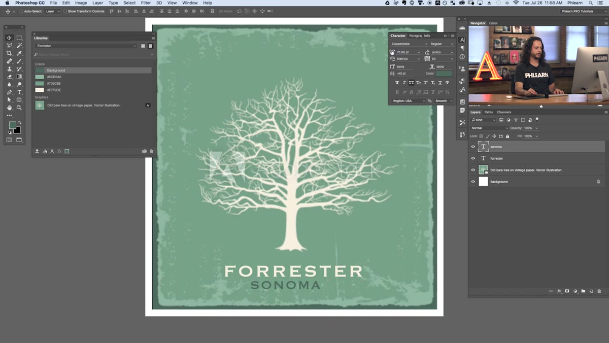 Text layer selected with character style being saved to library
Create a text layer, style it exactly how you want it - font, size, tracking, leading, color - then save it as a character style directly to your library. This captures the full typographic treatment, not just the font name.
Text layer selected with character style being saved to library
Create a text layer, style it exactly how you want it - font, size, tracking, leading, color - then save it as a character style directly to your library. This captures the full typographic treatment, not just the font name.
For branding work especially, this is the feature that quietly saves you hours. Instead of manually matching type settings every time you start a new deliverable for a client, you open the library, click the style, and it’s applied. Aaron emphasizes this in the context of sharing libraries with collaborators, and he’s right - a shared character style is worth more than a two-page style guide document that nobody reads.
What I’d Add From My Own Experience
The sharing side of Libraries is where I see most people leave value on the table. Aaron mentions it but I want to push on it: you can share a library with a collaborator and they can add to it, not just pull from it. That means if you’ve got a client who also has Creative Cloud, or a second designer helping on a project, you can build out a living asset library together in real time.
I started doing this with a copywriter I collaborate with occasionally. She doesn’t use Photoshop, but she can access shared library colors through other Adobe apps. We stopped having the “which shade of teal is the teal” conversation entirely. Worth it.
The single most important thing Libraries does is kill the version confusion problem. Assets live in one place, sync automatically, and update wherever they’re used. That’s the whole pitch, and it delivers. If you’re on Creative Cloud and not using Libraries, you’re doing extra work for no reason.
Watch the full tutorial on YouTube to see Aaron walk through the wine label project and catch the details on a few panel interactions that are easier to see than describe.
Comments
Leave a Comment