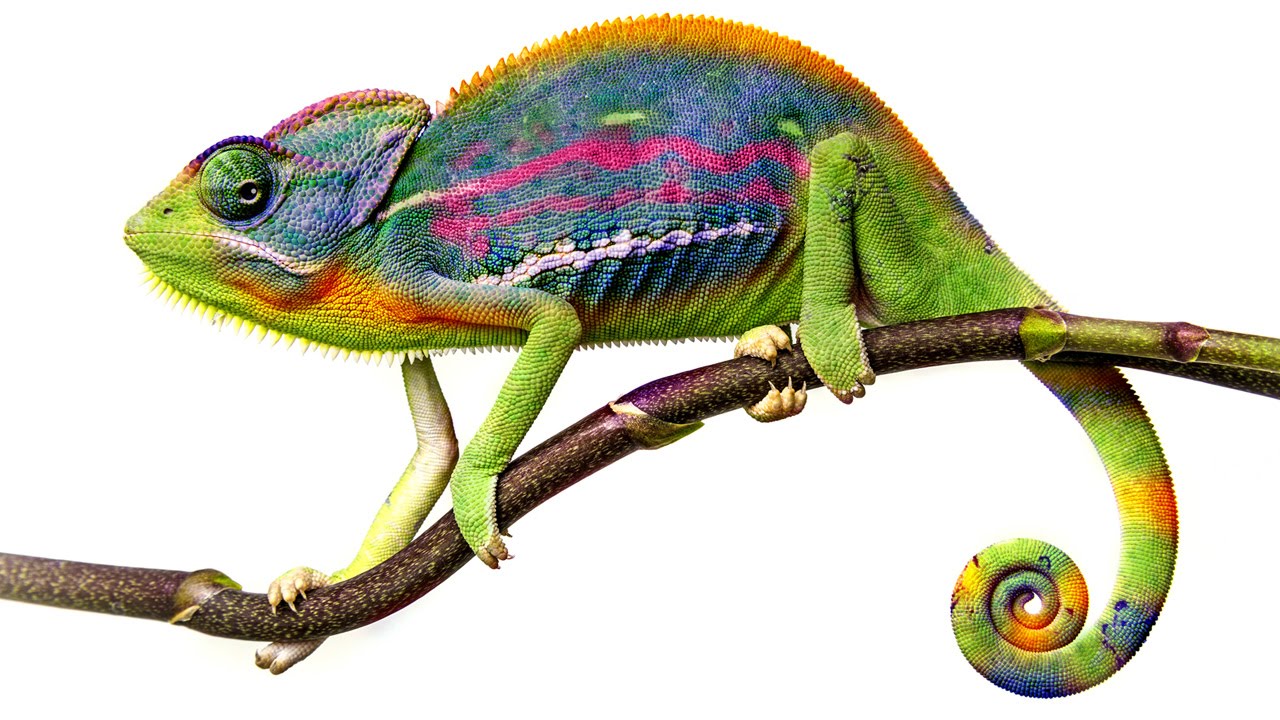
Color adjustments are where most beginners torch their files and don’t realize it until three saves later. I know because I spent years doing exactly that, flattening hue shifts directly onto background layers and then wondering why I couldn’t refine anything without starting over. The whole workflow felt fragile, like editing in pen instead of pencil.
In this Aaron Nace (PHLEARN) tutorial, he walks through the Hue/Saturation tool from the ground up, and what makes it worth your time isn’t just the “move slider, color changes” part. It’s the stuff underneath: how to isolate specific colors, how to sample precisely with the eyedropper, and why the method you use to open the dialogue matters more than most people think. Watch the full tutorial on YouTube if you want to follow along with the source material, but this walkthrough covers every step in enough detail that you can work through it in Photoshop right now.
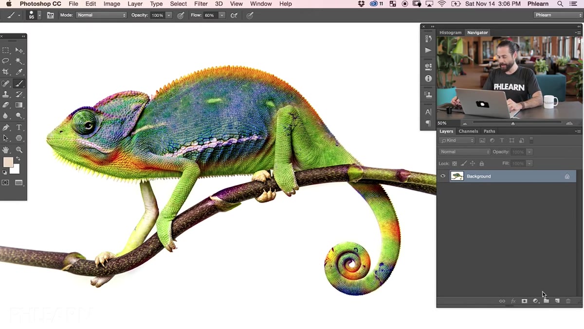
The example image Aaron uses is a chameleon from Adobe Stock, which is honestly a perfect test case. Lots of distinct color ranges, interesting skin tones, and enough complexity to show where targeted adjustments pull ahead of global ones.
Step 1: Skip Image > Adjustments. Use an Adjustment Layer Instead.
 Adjustment layer panel showing Hue/Saturation option
Most people’s first instinct is to go Image > Adjustments > Hue/Saturation from the top menu. It works, technically. The problem is that it bakes the change directly into whatever layer you’re on. You make a decision, click OK, and that decision is now load-bearing. Want to revisit it later? You’re either undoing a stack of work or starting fresh.
Adjustment layer panel showing Hue/Saturation option
Most people’s first instinct is to go Image > Adjustments > Hue/Saturation from the top menu. It works, technically. The problem is that it bakes the change directly into whatever layer you’re on. You make a decision, click OK, and that decision is now load-bearing. Want to revisit it later? You’re either undoing a stack of work or starting fresh.
The better move is to use an Adjustment Layer. Click the half-light, half-dark circle icon at the bottom of the Layers panel and choose Hue/Saturation from the menu. This creates a separate, non-destructive layer that sits above your image and holds all your adjustments. You can double-click it any time and tweak the settings without touching the original pixels. It’s a small habit change with a huge payoff.
Step 2: Get Familiar With the Three Core Sliders
 Hue/Saturation panel with all three sliders visible
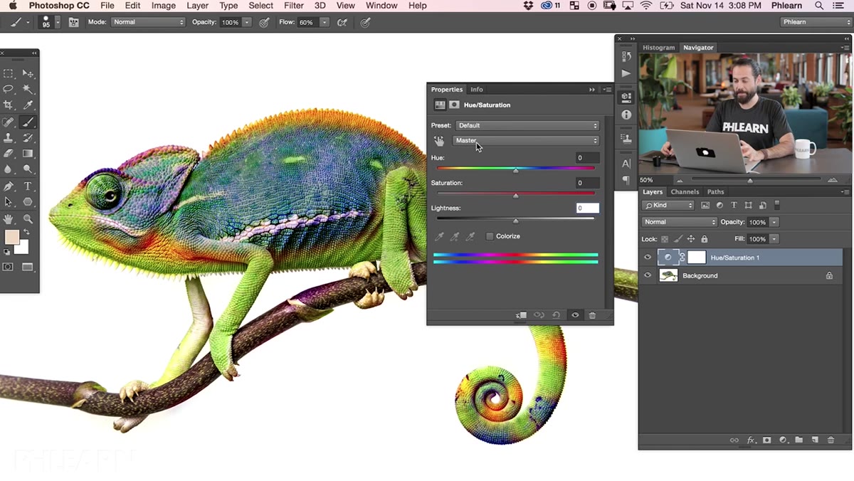
Once your adjustment layer is open, you’re looking at three sliders: Hue, Saturation, and Lightness. Hue shifts the actual color. Drag it left or right and every color in your image cycles through the spectrum. A green chameleon becomes purple, then blue, then something that looks like a bad science fiction movie poster. It’s dramatic, which makes it easy to see exactly what the slider does.
Hue/Saturation panel with all three sliders visible
Once your adjustment layer is open, you’re looking at three sliders: Hue, Saturation, and Lightness. Hue shifts the actual color. Drag it left or right and every color in your image cycles through the spectrum. A green chameleon becomes purple, then blue, then something that looks like a bad science fiction movie poster. It’s dramatic, which makes it easy to see exactly what the slider does.
Saturation controls intensity. Push it up and colors get punchy and vivid. Drag it all the way down and you’ve got a grayscale image. Somewhere in the middle is usually where the interesting stuff lives. Lightness is the one Aaron recommends leaving at zero for most work. It doesn’t behave like exposure or levels. It pushes whites and blacks toward a flat midtone gray in a way that tends to kill contrast rather than help it. Touch it only if you have a specific reason.
Step 3: Switch From “Master” to a Specific Color Channel
 Dropdown menu showing Reds, Yellows, Greens options
By default, the channel selector at the top of the panel says “Master,” which means every color in the image gets adjusted simultaneously. That’s useful sometimes, but the real power is in targeting a single color range. Click that dropdown and you get six options: Reds, Yellows, Greens, Cyans, Blues, and Magentas.
Dropdown menu showing Reds, Yellows, Greens options
By default, the channel selector at the top of the panel says “Master,” which means every color in the image gets adjusted simultaneously. That’s useful sometimes, but the real power is in targeting a single color range. Click that dropdown and you get six options: Reds, Yellows, Greens, Cyans, Blues, and Magentas.
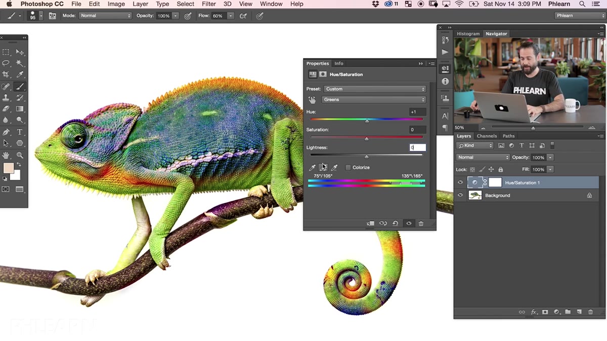
When you pick one, a range indicator appears along the bottom color bar in the panel. That bar shows you which slice of the spectrum you’re actually affecting. Pick Greens, for example, and the hue shift you apply will only move the green tones in your image. Everything else stays put. This is where Hue/Saturation goes from being a blunt instrument to something surgical.
Step 4: Use the Eyedropper to Sample the Exact Color You Want
 Eyedropper tool being used to sample color from image
Here’s where a lot of tutorials skip the most useful part. When Aaron selects Greens from the dropdown and drags the Hue slider, the greens that respond aren’t necessarily the ones he’s trying to change. The color range defined by “Greens” is a fixed starting point, and the color you actually want to target might sit slightly outside it.
Eyedropper tool being used to sample color from image
Here’s where a lot of tutorials skip the most useful part. When Aaron selects Greens from the dropdown and drags the Hue slider, the greens that respond aren’t necessarily the ones he’s trying to change. The color range defined by “Greens” is a fixed starting point, and the color you actually want to target might sit slightly outside it.
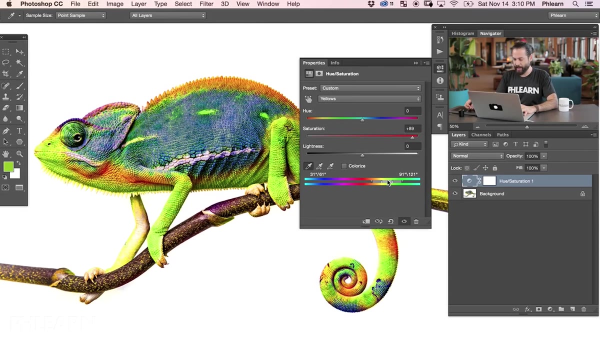
The fix is the eyedropper tool inside the Hue/Saturation panel. Click it, then click directly on the color in your image that you want to affect. Photoshop samples that specific hue and re-centers the range indicator around it. Now when you move the Hue or Saturation slider, it’s working on the color you actually sampled, not a generic approximation of that color family. For anything with subtle or unusual tones, this is the step that makes the difference between a clean result and one that looks slightly off in ways you can’t quite explain.
Step 5: Try the Colorize Option for Monochromatic Looks
 Colorize checkbox active with single hue applied to image
Checking the Colorize box at the bottom right of the panel does something completely different. Instead of shifting existing colors, it strips them out and replaces the entire image with a single hue at the saturation level you set. Think old-school sepia tones, duotone prints, or that stylized look where everything in a photo is bathed in one color.
Colorize checkbox active with single hue applied to image
Checking the Colorize box at the bottom right of the panel does something completely different. Instead of shifting existing colors, it strips them out and replaces the entire image with a single hue at the saturation level you set. Think old-school sepia tones, duotone prints, or that stylized look where everything in a photo is bathed in one color.
The Hue slider picks the color, Saturation controls how intense it is, and Lightness still behaves the same way. For portrait work or graphic design projects where you want a unified color mood rather than realistic color, Colorize is a fast way to get there without a lot of fuss.
What I’d Add From My Own Workflow
Aaron keeps the tutorial tightly focused on the tool itself, which is exactly right for a beginner-level breakdown. But one thing I’d layer on top is using Hue/Saturation in combination with a clipping mask or a selection.
If you paint a rough selection around a specific object before adding your adjustment layer, Photoshop automatically masks the layer to that selection. Your color change only affects what’s inside the selection. That means you can shift the color of someone’s jacket without it bleeding into the background, or change the hue of a single product in a flat lay without touching everything else in the frame. It’s a two-step move, but it turns a global tool into a hyper-targeted one. I use this probably ten times a week.
The single most important thing to take away here is the adjustment layer habit. Everything else in Hue/Saturation is learnable in an afternoon, but if you keep applying color changes directly to your layers, you’re building on sand. Adjustment layers give you the ability to come back, change your mind, and iterate without consequences. That’s not a beginner tip. That’s just how good Photoshop work actually gets made.
Watch the full tutorial on YouTube to see Aaron demonstrate all of this in real time with the full image.
Comments (1)
Just subscribed. If the rest of your content is this good, I'm in.
Leave a Comment