You know that moment. A client sends over a logo or a sign mockup and says “can you just add some text to this?” And you stare at the file trying to figure out which of the 47,000 fonts installed on your system comes close to what’s already there. I’ve burned embarrassing amounts of time on that problem. Cross-referencing WhatTheFont with hand-typed samples, scrolling through font menus squinting at my screen in a coffee shop like some kind of sad typography detective.
Turns out Adobe quietly shipped a solution for exactly this. In this Aaron Nace (PHLEARN) tutorial, he walks through the Match Font feature that landed in Photoshop CC 2015, and it is genuinely one of those tools that makes you annoyed you didn’t know about it sooner. Watch the full tutorial on YouTube - or follow along with my breakdown below.
The workflow is faster than you’d expect. You draw a selection around the mystery font in your image, tell Photoshop to match it, and the software cross-references what it sees against both your local font library and Adobe Typekit. It’s not magic - it’s still making educated guesses - but the guesses are good enough to save you the better part of an afternoon.
Step 1: Set Up Your Working File
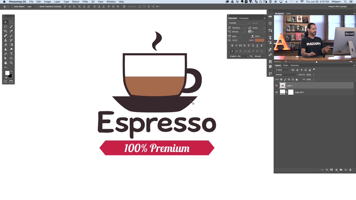 Coffee shop sign image open in Photoshop workspace
Open the image containing the font you want to identify. In Aaron’s example, it’s a stylized coffee shop sign where the client wants new text added that matches the existing lettering. Your situation might be a brand asset from a client, a screenshot of a competitor’s ad, or a flat image you pulled for reference. The key thing here is that the font lives inside the image pixels - you don’t have a live text layer to just click and inspect. That’s exactly the problem Match Font solves.
Step 2: Add Your New Text Layer
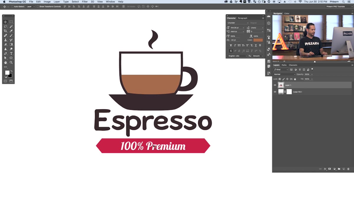 Type tool active, cursor placed at bottom of sign
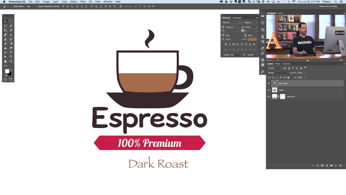
Hit T to grab the Type tool and click where you want to place your new text. Type out whatever your text needs to say. At this point, don’t stress about the font - just pick whatever is loaded as your default. Aaron uses Papyrus as a placeholder, which is Photoshop’s way of quietly testing your taste. You’ll fix the font in a few steps. What you’re doing right now is getting the text layer in place so you have something to apply the matched font to once you identify it.
Step 3: Center and Position Your Text
 Paragraph panel open with center align selected
Before you go font hunting, get your text positioned properly. Open the Paragraph panel (Window - Paragraph) and click center align. Then grab the Marquee tool and draw a selection that covers the full horizontal width of the area where your text should sit. Switch to the Move tool, and use the alignment buttons in the top toolbar to center your text layer to the midpoint of that selection. Hit Ctrl/Cmd+D to deselect. Doing this now means that when you swap fonts and the character widths shift, your text will stay centered automatically rather than drifting to one side.
Step 4: Match the Color First
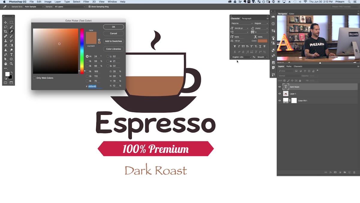 Character panel open with eyedropper sampling text color
While you have your text layer selected, open the Character panel (Window - Character) and click the color swatch. Your cursor will turn into an eyedropper. Click directly on the existing font in the image to sample its color. This is a small step but an important one - matching the color before you match the font means you’re doing a proper apples-to-apples visual comparison when you start previewing font options. Also, if you forget to do it later, you end up with the right font in the wrong color and have to go back anyway.
Step 5: Open Match Font
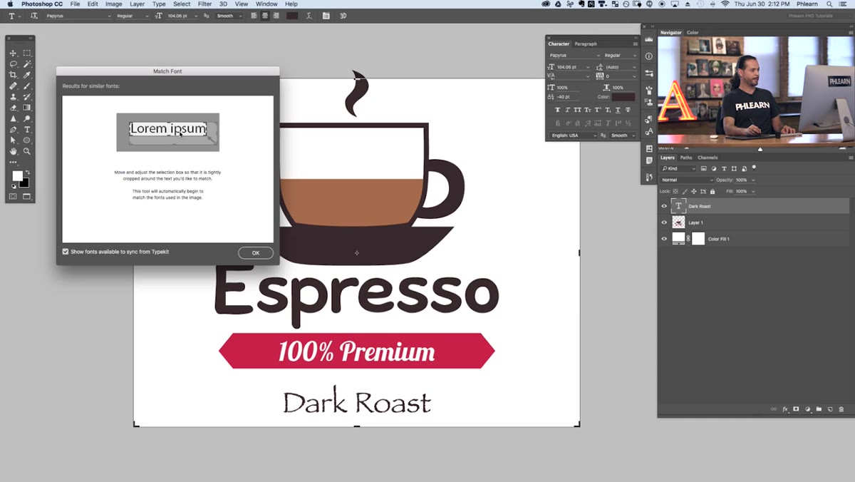 Type menu open with Match Font option highlighted
With your text layer still selected, go to Type in the top menu bar and click Match Font. A dialogue box will appear over your canvas. This is where the actual identification happens. You’ll see a rectangular selection frame with draggable corner handles - this is the crop you’ll use to isolate the font you want to identify. The dialogue also shows a results list that will populate once Photoshop analyzes whatever you crop to. Leave the “Show fonts available from Typekit” checkbox ticked, because that’s what gives you access to the full library, not just what’s already installed on your machine.
Step 6: Draw Your Selection Around the Target Font
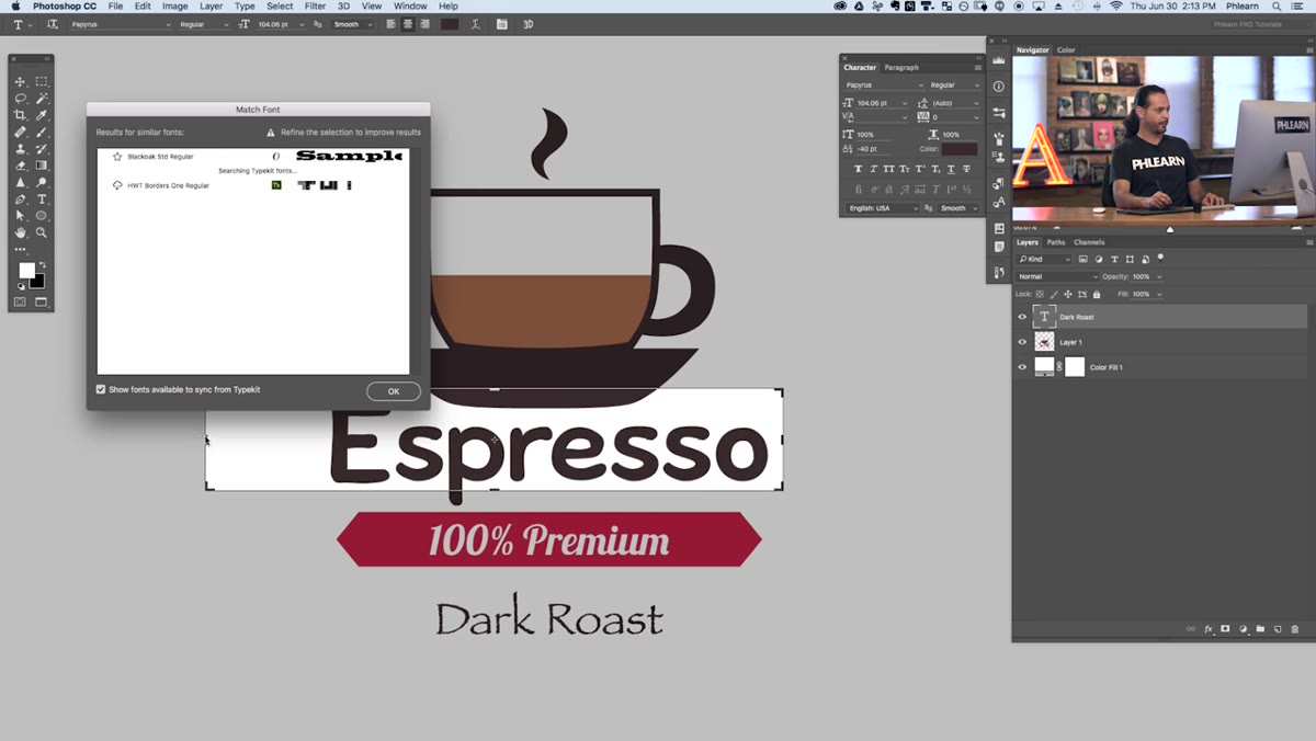 Match Font selection box being dragged around “Espresso” text
Drag the corner handles of the selection box so it fits tightly around the text you’re trying to match - just the letterforms, with minimal extra space above and below. The tighter and cleaner the crop, the better Photoshop’s analysis will be. As you adjust the handles, the font results list on the right will update in real time. You’ll see fonts that are already installed in your library listed at the top, followed by Typekit options below. If the first result doesn’t look right, don’t panic - work your way down the list.
Step 7: Apply the Matched Font
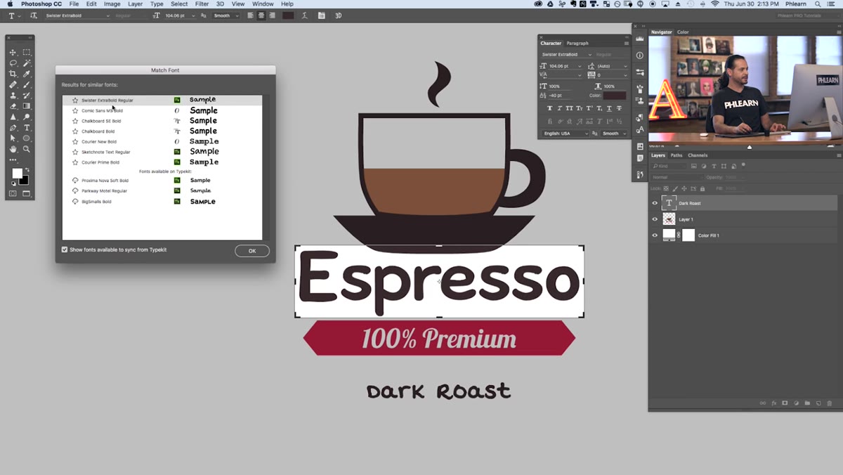 Font results list showing matched options, one being selected
Click any font in the results list and Photoshop will instantly apply it to your selected text layer so you can see a live preview. You’re comparing the new font against the original in the image, which makes it easy to judge whether the match is close enough. If a font needs to be synced from Typekit, there will be a small cloud icon next to it - click it and it’ll download in the background. Once you find the right match, just close the dialogue and you’re done. Your text layer now carries the matched font and you can adjust size, tracking, and weight from there.
One Thing Aaron Doesn’t Mention (That You’ll Probably Need)
Match Font works best with clean, high-contrast lettering. Cursive or heavily stylized scripts will return weird results, and if the font in your image is sitting on a busy background, the algorithm gets confused. My workaround is to do a quick rough selection in the image to isolate just the text area before opening Match Font - sometimes duplicating that section to a new layer and boosting contrast temporarily helps the tool lock in faster. Also, if you’re working from a low-resolution screenshot, forget it. Get a higher-res source if at all possible. The feature is built on visual analysis, so garbage in, garbage out.
Match Font is one of those features that sounds like a minor convenience until the day you actually need it, and then it saves your entire afternoon. The integration with Typekit is what pushes it from a neat trick into a genuinely professional workflow tool - you’re not just identifying fonts, you’re one click away from having them licensed and ready to use.
Watch the full tutorial on YouTube to see Aaron walk through the whole thing in real time - his visual comparisons in the final steps are worth seeing.
Comments (4)
Tried this technique this morning. Game changer for real.
Well explained. I think my audience would really benefit from this — mind if I link to it?
Clear and practical. No fluff. Appreciate that.
Really solid breakdown. This pairs perfectly with the photography work I've been writing about.
Leave a Comment