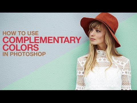
Color theory is one of those things I understood just well enough to be dangerous for years. I knew complementary colors lived on opposite sides of the color wheel. I knew orange and blue looked punchy together. And I knew that whenever I tried to actually apply that knowledge to a real image, I’d spend twenty minutes dragging HSB sliders around, squinting at my screen, and eventually settling on something that was “close enough.” Close enough is not a great professional standard.
This Aaron Nace tutorial from PHLEARN (Watch the full tutorial on YouTube) fixed that problem for me in about four minutes. The premise is simple: instead of eyeballing a complementary color from scratch, you let Photoshop calculate it for you using the built-in Adobe Color Themes panel. The specific example Aaron works through involves changing a background wall color to complement the hat his subject is wearing. But the real win here is the workflow itself, which you can drop onto literally any image where you’re trying to make color choices feel intentional rather than accidental.
What I like about this approach is that it removes the “is this right?” anxiety from the process. You’re not relying on your eye in isolation. You’re anchoring your choices to actual color science, and then using your eye to refine from there. That’s a much better division of labor.
Step 1: Open the Adobe Color Themes Panel
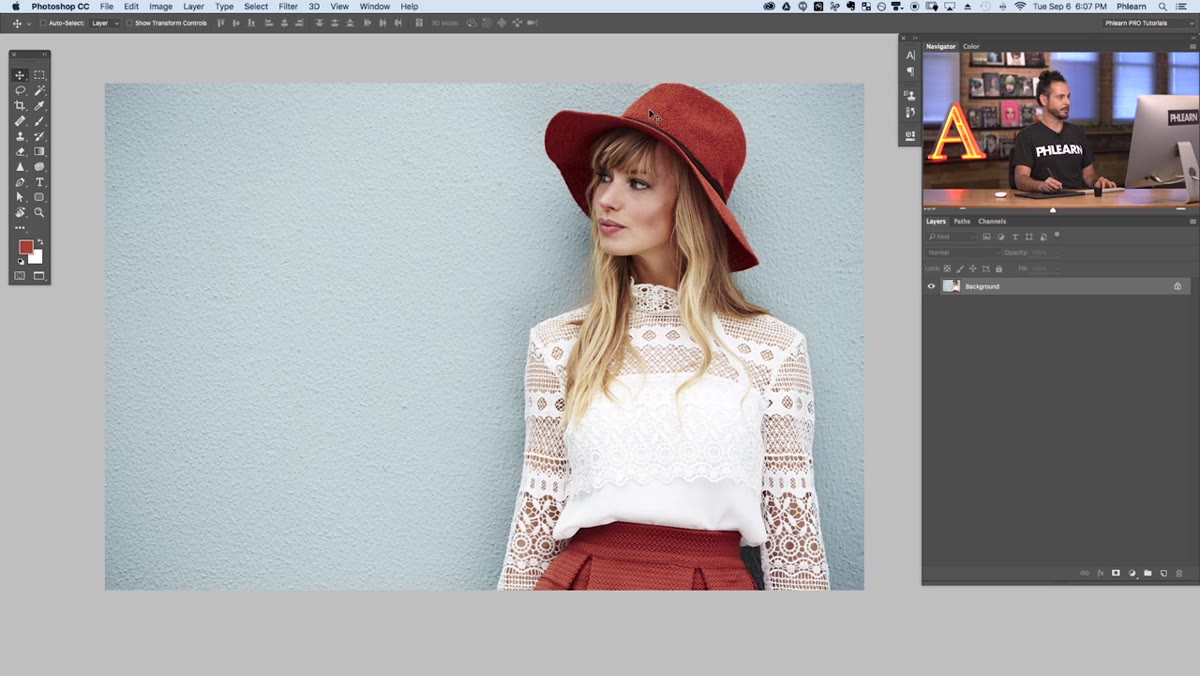 Adobe Color Themes panel opening from Window Extensions menu
Go to Window > Extensions > Adobe Color Themes. If you’ve never opened this panel before, it’s one of those quietly powerful tools that’s been hiding in plain sight. The panel gives you a central color wheel and a row of five color swatches, and it can generate color relationships in several modes: analogous, monochromatic, triad, complementary, compound, shades, and custom. For this technique, you’ll eventually land on Complementary, but leave it wherever it defaults for now.
Adobe Color Themes panel opening from Window Extensions menu
Go to Window > Extensions > Adobe Color Themes. If you’ve never opened this panel before, it’s one of those quietly powerful tools that’s been hiding in plain sight. The panel gives you a central color wheel and a row of five color swatches, and it can generate color relationships in several modes: analogous, monochromatic, triad, complementary, compound, shades, and custom. For this technique, you’ll eventually land on Complementary, but leave it wherever it defaults for now.
Step 2: Sample the Color You Want to Complement
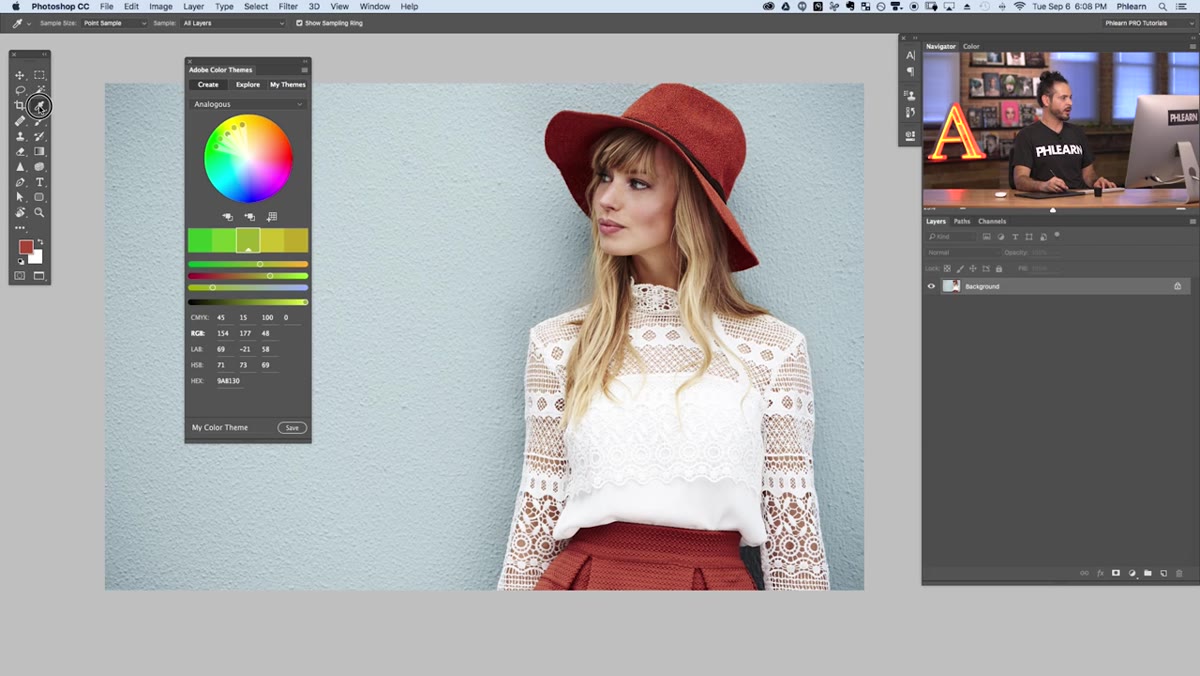 Eyedropper tool selected in the toolbar
Grab the Eyedropper tool (keyboard shortcut: I). Before you click anywhere on your image, go up to the Options Bar and change the Sample Size from “Point Sample” to 31 by 31 Average. Point Sample grabs a single pixel, which is almost never representative of what you’re actually looking at. A 31x31 average pools together the 961 pixels surrounding your click point and gives you the true visual color of that area, not a random highlight speck or shadow pixel hiding in the texture.
Eyedropper tool selected in the toolbar
Grab the Eyedropper tool (keyboard shortcut: I). Before you click anywhere on your image, go up to the Options Bar and change the Sample Size from “Point Sample” to 31 by 31 Average. Point Sample grabs a single pixel, which is almost never representative of what you’re actually looking at. A 31x31 average pools together the 961 pixels surrounding your click point and gives you the true visual color of that area, not a random highlight speck or shadow pixel hiding in the texture.
Click on the part of your image you want to build the palette around. In Aaron’s example, that’s his subject’s hat. Your sampled color now appears as the active foreground color in the toolbar.
Step 3: Load Your Sampled Color into the Color Themes Panel
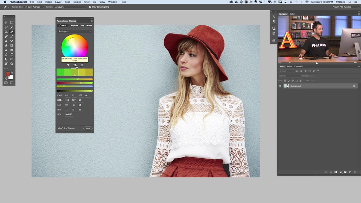 “Set selected color from active color” button highlighted in panel
Look at the bottom of the Adobe Color Themes panel. There are a few small icons there, and the one you want is the middle one: “Set selected color from active color.” Click it. This pushes your sampled foreground color into the central swatch of the panel’s color row. The wheel and surrounding swatches will update instantly to reflect your chosen color as the anchor point.
“Set selected color from active color” button highlighted in panel
Look at the bottom of the Adobe Color Themes panel. There are a few small icons there, and the one you want is the middle one: “Set selected color from active color.” Click it. This pushes your sampled foreground color into the central swatch of the panel’s color row. The wheel and surrounding swatches will update instantly to reflect your chosen color as the anchor point.
This is the step people miss when they first poke around this panel on their own. It’s not obvious that you can inject your own color in there rather than just dragging the panel’s built-in controls. Once you know it exists, it becomes a key part of the workflow.
Step 4: Switch the Mode to Complementary
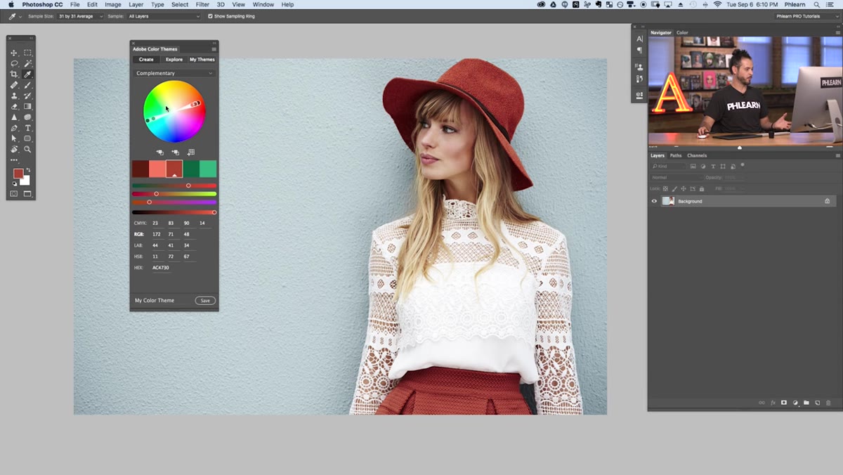 Complementary color mode selected, two color families displayed
Use the dropdown menu at the top of the panel to select Complementary. The panel will now show you a range of swatches split between your original color and its mathematical opposite on the color wheel. These aren’t approximations. They’re exact complements, calculated from your actual sampled color. You can browse the other modes first if you want context: analogous shows you neighbors on the wheel, monochromatic shows you tints and shades of the same hue, and triadic gives you a three-way split. But complementary is where the high-contrast, visually striking pairings live.
Complementary color mode selected, two color families displayed
Use the dropdown menu at the top of the panel to select Complementary. The panel will now show you a range of swatches split between your original color and its mathematical opposite on the color wheel. These aren’t approximations. They’re exact complements, calculated from your actual sampled color. You can browse the other modes first if you want context: analogous shows you neighbors on the wheel, monochromatic shows you tints and shades of the same hue, and triadic gives you a three-way split. But complementary is where the high-contrast, visually striking pairings live.
At this point you’ll have a cluster of shades on one side representing your source color, and a cluster on the other side representing the complement. Those second-cluster colors are your new background, accent, or fill candidates.
Step 5: Use the Complementary Colors to Drive Your Edits
 Color swatches showing hat color and background color options
Now that you have your complementary swatches, click on the one that appeals to you from the second cluster. This loads it as your active foreground color. From here, you apply it however the image calls for. In Aaron’s walkthrough, the goal is recoloring a plain wall behind the subject, which you can do with a Hue/Saturation adjustment layer, a Solid Color fill layer with a blend mode, or a straight paint fill if your selection is clean.
Color swatches showing hat color and background color options
Now that you have your complementary swatches, click on the one that appeals to you from the second cluster. This loads it as your active foreground color. From here, you apply it however the image calls for. In Aaron’s walkthrough, the goal is recoloring a plain wall behind the subject, which you can do with a Hue/Saturation adjustment layer, a Solid Color fill layer with a blend mode, or a straight paint fill if your selection is clean.
The point is that the color choice itself is already done. You’re not second-guessing the hue. You know it’s going to work against your source color because the math backs it up. Now you’re just handling the application and refining the lightness or saturation to taste.
Why I’d Also Use This for Product and Thumbnail Work
Here’s where I’ve started pulling this technique outside of portrait work. Thumbnails, product mockups, social graphics, anything where a background color needs to feel like it was chosen on purpose rather than just “wasn’t distracting.” I work with a lot of brands that send me assets without a defined color language, and dropping this workflow in takes the guesswork out of building something that at least looks considered.
One thing worth knowing: the Adobe Color Themes panel is pulling from the same engine as Adobe Color (color.adobe.com), and you can save themes directly from the panel to your Creative Cloud libraries. So if you nail a pairing for a client, you can stash it and pull it back up months later without having to reverse-engineer what you did. That’s saved me from a painful “what shade was that again?” conversation more than once.
The single biggest shift this technique made for me was moving color selection from a vibes-based guessing game to something reproducible and defensible. You can explain to a client exactly why the background color works. It’s not “it just felt right.” It’s “it’s the mathematical complement to the dominant color in your subject’s wardrobe.” That’s a different conversation entirely.
If you want to see Aaron walk through the full thing with his actual image, go watch it: Watch the full tutorial on YouTube. It’s short, practical, and the kind of thing you’ll actually remember because the concept clicks visually the moment you see the panel update.
Comments
Leave a Comment