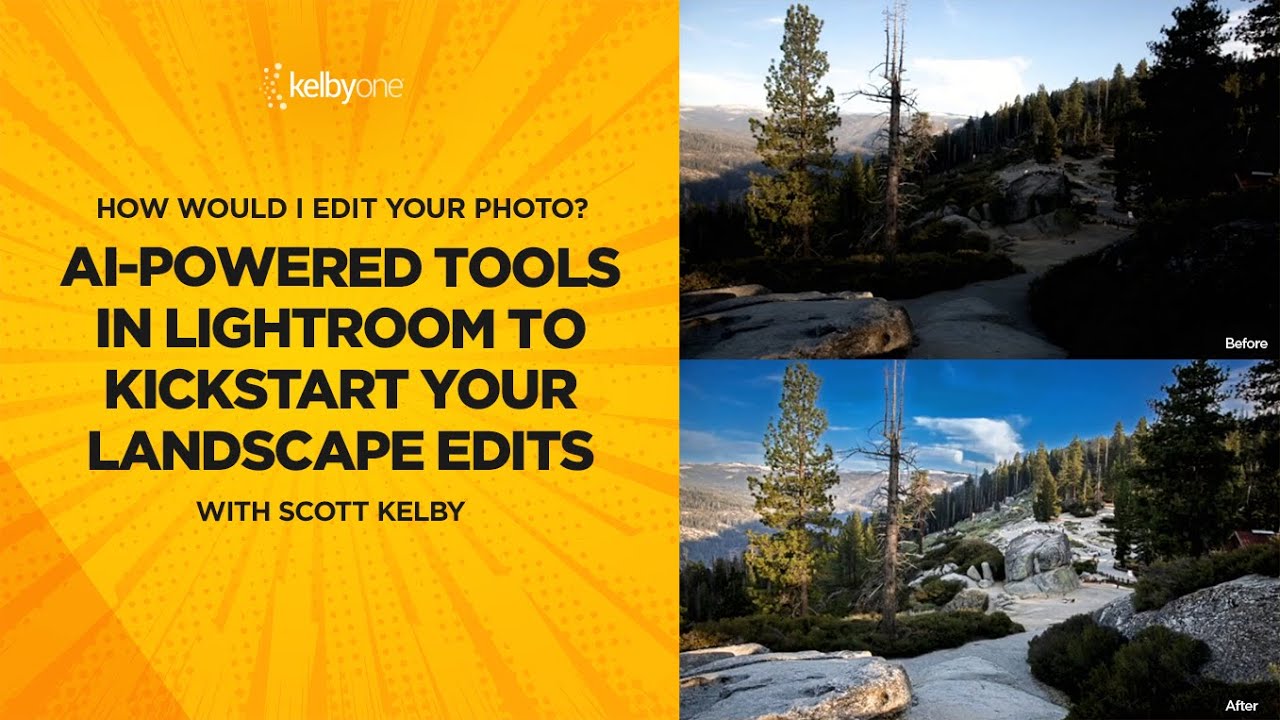
There’s a certain type of editor who loves suffering. They open a raw file, every slider sitting at zero, and they start manually nudging exposure up by 0.35, then shadows up a little, then back down, then highlights, and forty-five minutes later they have something that looks roughly like what the AI would’ve given them in two seconds. I was that editor. I thought manually touching every slider meant I was being a real craftsman. Mostly I was just being slow.
What changed my approach was watching Scott Kelby work through a real reader-submitted raw file in this KelbyOne tutorial. Watch the full tutorial on YouTube – it’s one of those sessions where the actual back-and-forth between editors makes the reasoning visible in a way a polished how-to rarely does. Kelby’s working on a Canon CR2 landscape file, explaining not just what he’s clicking but why he’s choosing between two different AI-powered starting points. That framing – which AI tool, and why – is what makes this worth writing about.
The core problem this solves: landscape photos almost always arrive with a sky that’s blown out or a foreground that’s too dark, or both. Your camera sensor has nowhere near the dynamic range your eyes do. You stood there and saw a gorgeous balanced scene; your sensor picked a lane and exposed for one or the other. The edit is where you fix that, but you have to start somewhere smart before you can fix anything.
Step 1: Open Your Raw File and Resist Touching Anything
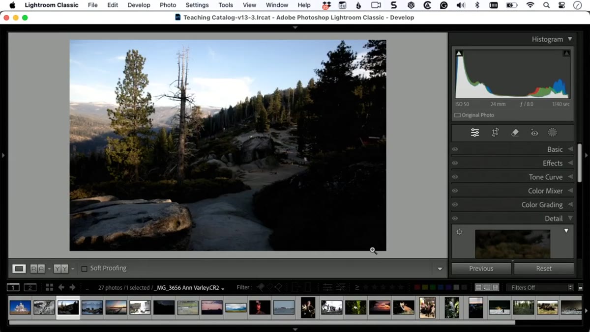 Raw Canon CR2 landscape file open in Lightroom, all sliders at zero
Before you reach for any slider, just look at the image. Kelby’s first move is to ask a simple question out loud: what do I wish were different? That sounds obvious, but most editors skip it and just start dragging things around. For this file, the answer was clear – the sky was too bright and the foreground detail was getting lost. Knowing that before you start means every tool choice has a purpose.
Raw Canon CR2 landscape file open in Lightroom, all sliders at zero
Before you reach for any slider, just look at the image. Kelby’s first move is to ask a simple question out loud: what do I wish were different? That sounds obvious, but most editors skip it and just start dragging things around. For this file, the answer was clear – the sky was too bright and the foreground detail was getting lost. Knowing that before you start means every tool choice has a purpose.
Step 2: Try the Auto Button First (Yes, Really)
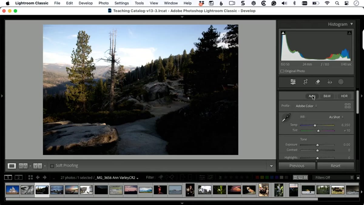 Clicking the Auto button in the Basic panel, sliders adjusting automatically
Click the Auto button in the Basic panel and see where Lightroom lands. Kelby is upfront that this button had a bad reputation for years – it used to just blow your exposure and call it a day. That reputation is stale. The Auto function has been AI-driven for a while now and in most cases produces a reasonable starting point for a landscape. It’s not always perfect, but it’s rarely embarrassing. Click it, look at the result, and then hit Reset to undo it before moving to the next option. You’re not committing to anything yet – you’re comparison shopping.
Clicking the Auto button in the Basic panel, sliders adjusting automatically
Click the Auto button in the Basic panel and see where Lightroom lands. Kelby is upfront that this button had a bad reputation for years – it used to just blow your exposure and call it a day. That reputation is stale. The Auto function has been AI-driven for a while now and in most cases produces a reasonable starting point for a landscape. It’s not always perfect, but it’s rarely embarrassing. Click it, look at the result, and then hit Reset to undo it before moving to the next option. You’re not committing to anything yet – you’re comparison shopping.
Step 3: Understand What Auto Actually Does to Your Sliders
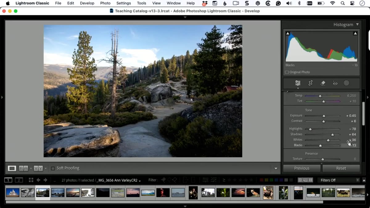 Basic panel sliders moved to new positions after clicking Auto
Here’s the part that’s easy to miss: when you click Auto, watch the sliders. They physically move. Lightroom is analyzing the image and deciding that, say, highlights need to come down, shadows need to lift, and whites need a nudge. That’s useful to see because it shows you where the AI thinks the problems are. Those slider positions are also editable – you can take Auto’s suggestion as a starting point and refine from there. Think of it as the AI handing you a rough draft instead of a blank page.
Basic panel sliders moved to new positions after clicking Auto
Here’s the part that’s easy to miss: when you click Auto, watch the sliders. They physically move. Lightroom is analyzing the image and deciding that, say, highlights need to come down, shadows need to lift, and whites need a nudge. That’s useful to see because it shows you where the AI thinks the problems are. Those slider positions are also editable – you can take Auto’s suggestion as a starting point and refine from there. Think of it as the AI handing you a rough draft instead of a blank page.
Step 4: Try Adaptive Color Instead – and Watch What Doesn’t Happen
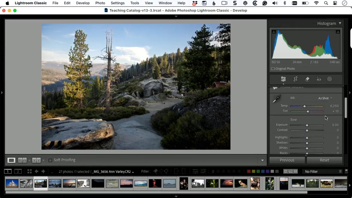 Adaptive Color applied, Basic panel sliders remaining at zero
Reset everything and now go to the Profile section at the top of the Basic panel. Instead of clicking Auto, apply the Adaptive Color profile. Look at the sliders. They haven’t moved. That’s the key difference, and it’s a significant one. Adaptive Color is working at the raw profile level, which means it’s baking in tonal and color corrections before the sliders even enter the picture. When you then start making manual adjustments, you’re working on top of a stronger foundation rather than fighting the raw file from scratch. Kelby describes it as starting on second base, and that’s exactly right.
Adaptive Color applied, Basic panel sliders remaining at zero
Reset everything and now go to the Profile section at the top of the Basic panel. Instead of clicking Auto, apply the Adaptive Color profile. Look at the sliders. They haven’t moved. That’s the key difference, and it’s a significant one. Adaptive Color is working at the raw profile level, which means it’s baking in tonal and color corrections before the sliders even enter the picture. When you then start making manual adjustments, you’re working on top of a stronger foundation rather than fighting the raw file from scratch. Kelby describes it as starting on second base, and that’s exactly right.
Step 5: Use the Amount Slider to Control the Intensity
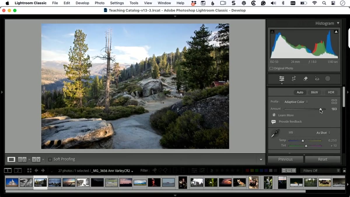 Amount slider under Adaptive Color profile being adjusted
One advantage Adaptive Color has over straight Auto is the Amount slider that appears once the profile is applied. Drag it up and you’re increasing how aggressively the AI profile affects the image. Drag it down and you’re dialing it back toward the original raw appearance. This gives you a degree of control that the Auto button simply doesn’t offer. Auto moves sliders you can individually override; Adaptive Color gives you one master control for the whole profile effect. For landscapes where the light is already complex, that single slider can save you a lot of back-and-forth.
Amount slider under Adaptive Color profile being adjusted
One advantage Adaptive Color has over straight Auto is the Amount slider that appears once the profile is applied. Drag it up and you’re increasing how aggressively the AI profile affects the image. Drag it down and you’re dialing it back toward the original raw appearance. This gives you a degree of control that the Auto button simply doesn’t offer. Auto moves sliders you can individually override; Adaptive Color gives you one master control for the whole profile effect. For landscapes where the light is already complex, that single slider can save you a lot of back-and-forth.
Step 6: Choose One, Never Both
 Adobe warning dialog box choosing between Auto and Adaptive profile
Lightroom will actually warn you about this, but it’s worth being explicit: Auto and Adaptive Color are not stackable. If you apply an Adaptive profile and then click Auto, Lightroom will prompt you to choose. You’re not going to layer these on top of each other and get something twice as good – you’ll just get a mess. Try both approaches on your image, decide which one gets you closer to what you’re after, and then move forward from there. Kelby’s honest that Adaptive Color doesn’t always win – sometimes the plain Auto result looks better. Run the test every time rather than assuming one is universally superior.
Adobe warning dialog box choosing between Auto and Adaptive profile
Lightroom will actually warn you about this, but it’s worth being explicit: Auto and Adaptive Color are not stackable. If you apply an Adaptive profile and then click Auto, Lightroom will prompt you to choose. You’re not going to layer these on top of each other and get something twice as good – you’ll just get a mess. Try both approaches on your image, decide which one gets you closer to what you’re after, and then move forward from there. Kelby’s honest that Adaptive Color doesn’t always win – sometimes the plain Auto result looks better. Run the test every time rather than assuming one is universally superior.
Step 7: Address the Sky After Your Baseline is Set
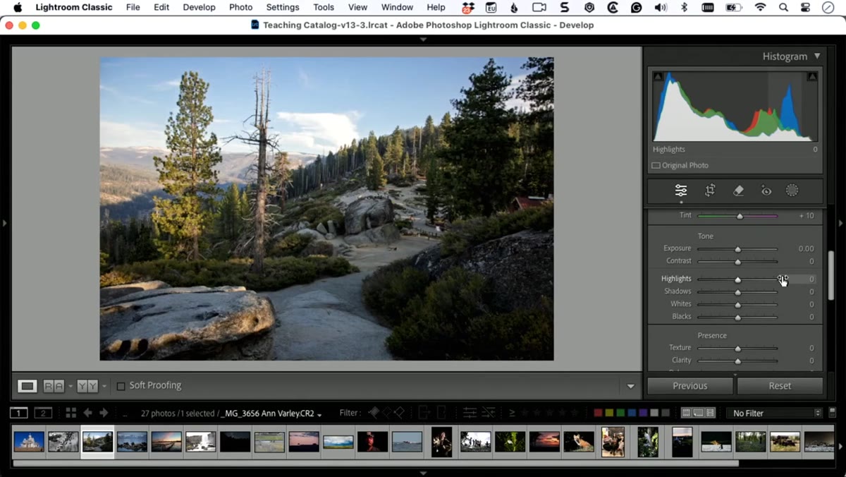 Landscape image with bright sky identified as the next edit target
Once you’ve locked in your starting point – whether that’s Auto or Adaptive Color – the real edit begins. For this image, that meant dealing with the sky. Kelby’s approach is to identify the single biggest problem in the photo and go there first rather than touching everything at once. For most landscape shots, the sky is that problem. The sensor exposed for something and the sky was not it. Now that the AI has given you a solid baseline, you have cleaner headroom to bring those highlights down without crushing the rest of the image.
Landscape image with bright sky identified as the next edit target
Once you’ve locked in your starting point – whether that’s Auto or Adaptive Color – the real edit begins. For this image, that meant dealing with the sky. Kelby’s approach is to identify the single biggest problem in the photo and go there first rather than touching everything at once. For most landscape shots, the sky is that problem. The sensor exposed for something and the sky was not it. Now that the AI has given you a solid baseline, you have cleaner headroom to bring those highlights down without crushing the rest of the image.
A Note on When the AI Gets It Wrong
I’ve run Adaptive Color on probably thirty or forty landscapes since watching this tutorial, and Kelby’s warning holds up: it doesn’t always look better. On images with a lot of warm golden-hour tones, I’ve found Adaptive Color sometimes cools things down in a way that feels clinical rather than inviting. Auto, oddly, tends to be more conservative and leaves more of the original character intact. My current habit is to apply Adaptive Color, check the result, then toggle it off to see Auto’s version, and pick whichever feels closer to the mood the photo actually had. Takes ten seconds and has saved me from chasing the wrong edit more than once.
The single most useful thing in this tutorial is the realization that these two tools are not competing with each other – they’re two different philosophies about where to begin. Auto tells you what sliders to move. Adaptive Color moves the ground itself. Knowing the difference stops you from using them interchangeably and getting confused when the results don’t stack up.
Watch the full tutorial on YouTube – Kelby and his co-host work through the whole file and the sky editing that follows makes the second half just as practical as the first.
Comments
Leave a Comment