I used to think mood in a photo was some vague, mystical thing. Like, either a shot had atmosphere or it didn’t, and if it didn’t, you threw a moody preset at it and hoped for the best. That worked about 30% of the time and made everything look like a 2014 Instagram filter the other 70%. It wasn’t until I started paying attention to what’s actually happening in the shadow areas of an image that things clicked for me.
Watch the full tutorial on YouTube
In this Visual Education tutorial, the instructor zeroes in on a concept called shadow density, which is essentially how much light is present in the shadow regions of a photo. It sounds almost too simple, but once you understand it, you start seeing it everywhere. Airy, optimistic editorial shots? High shadow density. Brooding, heavy cinematic frames? Low shadow density. That oppressive, claustrophobic feeling in a moody portrait? Shadow density is doing the heavy lifting, not the color grade.
What I appreciate about this tutorial is that it skips the usual “drag this slider until it looks cool” advice and actually explains the mechanism. Shadow density and shadow sharpness together are the engine behind emotional tone in an image. Here’s how to work with them deliberately in Photoshop.
Step 1: Identify the Shadow Regions in Your Image
 Shadow density concept introduced with a sample photograph
Before you touch a single slider, take a minute to actually look at where the shadows live in your photo. Not just “the dark parts” broadly, but specifically where the light falls off and detail starts to disappear. Use Photoshop’s histogram to get a read on where your tonal values are clustered. If the left side of the histogram is crammed against the wall, your shadows are clipped. If there’s a gap between the darkest tones and the left edge, you have some latitude to work with. This awareness is what separates intentional editing from random slider dragging.
Shadow density concept introduced with a sample photograph
Before you touch a single slider, take a minute to actually look at where the shadows live in your photo. Not just “the dark parts” broadly, but specifically where the light falls off and detail starts to disappear. Use Photoshop’s histogram to get a read on where your tonal values are clustered. If the left side of the histogram is crammed against the wall, your shadows are clipped. If there’s a gap between the darkest tones and the left edge, you have some latitude to work with. This awareness is what separates intentional editing from random slider dragging.
Step 2: Open a Curves Adjustment Layer
 Instructor explaining light in shadow areas of an image
Curves is the right tool here. Not Brightness/Contrast, not the Shadows slider in Camera Raw, but a proper Curves adjustment layer. Go to Layer, then New Adjustment Layer, then Curves. The reason Curves wins is precision. You can anchor specific tonal ranges so your adjustments only affect the shadows without pulling the midtones or highlights along for the ride. Add a point roughly in the lower quarter of the curve. That’s your shadow region anchor.
Instructor explaining light in shadow areas of an image
Curves is the right tool here. Not Brightness/Contrast, not the Shadows slider in Camera Raw, but a proper Curves adjustment layer. Go to Layer, then New Adjustment Layer, then Curves. The reason Curves wins is precision. You can anchor specific tonal ranges so your adjustments only affect the shadows without pulling the midtones or highlights along for the ride. Add a point roughly in the lower quarter of the curve. That’s your shadow region anchor.
Step 3: Raise the Black Point to Increase Shadow Density
 Tonal range showing shadow areas and how light fills them
This is the core move. On your Curves layer, click and drag the bottom-left point of the curve, the absolute black point, upward along the left edge of the graph. You’re lifting the darkest values so they’re no longer pure black. Even a subtle lift, something like raising the output value from 0 to 20 or 30, introduces a noticeable amount of light into the shadow areas. The image starts to breathe. It feels softer, less heavy, more airy. This is high shadow density, and it’s the signature look of a lot of fashion, lifestyle, and editorial photography.
Tonal range showing shadow areas and how light fills them
This is the core move. On your Curves layer, click and drag the bottom-left point of the curve, the absolute black point, upward along the left edge of the graph. You’re lifting the darkest values so they’re no longer pure black. Even a subtle lift, something like raising the output value from 0 to 20 or 30, introduces a noticeable amount of light into the shadow areas. The image starts to breathe. It feels softer, less heavy, more airy. This is high shadow density, and it’s the signature look of a lot of fashion, lifestyle, and editorial photography.
Step 4: Lower the Black Point to Crush the Shadows
 Oppressive shadow mood example shown with dense dark areas
Now flip it. Instead of lifting that bottom-left anchor point, pull your midtone or shadow region point downward. You’re pushing more tones toward pure black, reducing how much detail and light survive in the shadow areas. The image gets heavier. It starts to feel weighted, serious, even oppressive in the best cinematic sense. This is low shadow density, and it’s the go-to for moody portraiture, dramatic landscapes, and anything with a noir or thriller aesthetic. A small move here goes a long way, so be conservative until you see how far is too far for your specific image.
Oppressive shadow mood example shown with dense dark areas
Now flip it. Instead of lifting that bottom-left anchor point, pull your midtone or shadow region point downward. You’re pushing more tones toward pure black, reducing how much detail and light survive in the shadow areas. The image gets heavier. It starts to feel weighted, serious, even oppressive in the best cinematic sense. This is low shadow density, and it’s the go-to for moody portraiture, dramatic landscapes, and anything with a noir or thriller aesthetic. A small move here goes a long way, so be conservative until you see how far is too far for your specific image.
Step 5: Consider Shadow Sharpness Alongside Density
 Shadow sharpness concept discussed alongside shadow density
Shadow density controls how much light is in the shadows. Shadow sharpness controls how hard or soft the transition is between light and shadow areas. In Photoshop, you can influence sharpness by adjusting the steepness of the curve in the shadow-to-midtone transition zone. A steeper curve in that region creates a more abrupt, high-contrast transition, which reads as harder, sharper shadows. A gentler S-curve in that area softens the falloff. Think of it this way: two photos can have similar overall darkness but feel completely different based on whether the shadows have crisp, defined edges or fade gradually into the lit areas.
Shadow sharpness concept discussed alongside shadow density
Shadow density controls how much light is in the shadows. Shadow sharpness controls how hard or soft the transition is between light and shadow areas. In Photoshop, you can influence sharpness by adjusting the steepness of the curve in the shadow-to-midtone transition zone. A steeper curve in that region creates a more abrupt, high-contrast transition, which reads as harder, sharper shadows. A gentler S-curve in that area softens the falloff. Think of it this way: two photos can have similar overall darkness but feel completely different based on whether the shadows have crisp, defined edges or fade gradually into the lit areas.
Step 6: Use a Luminosity Mask to Protect Your Highlights
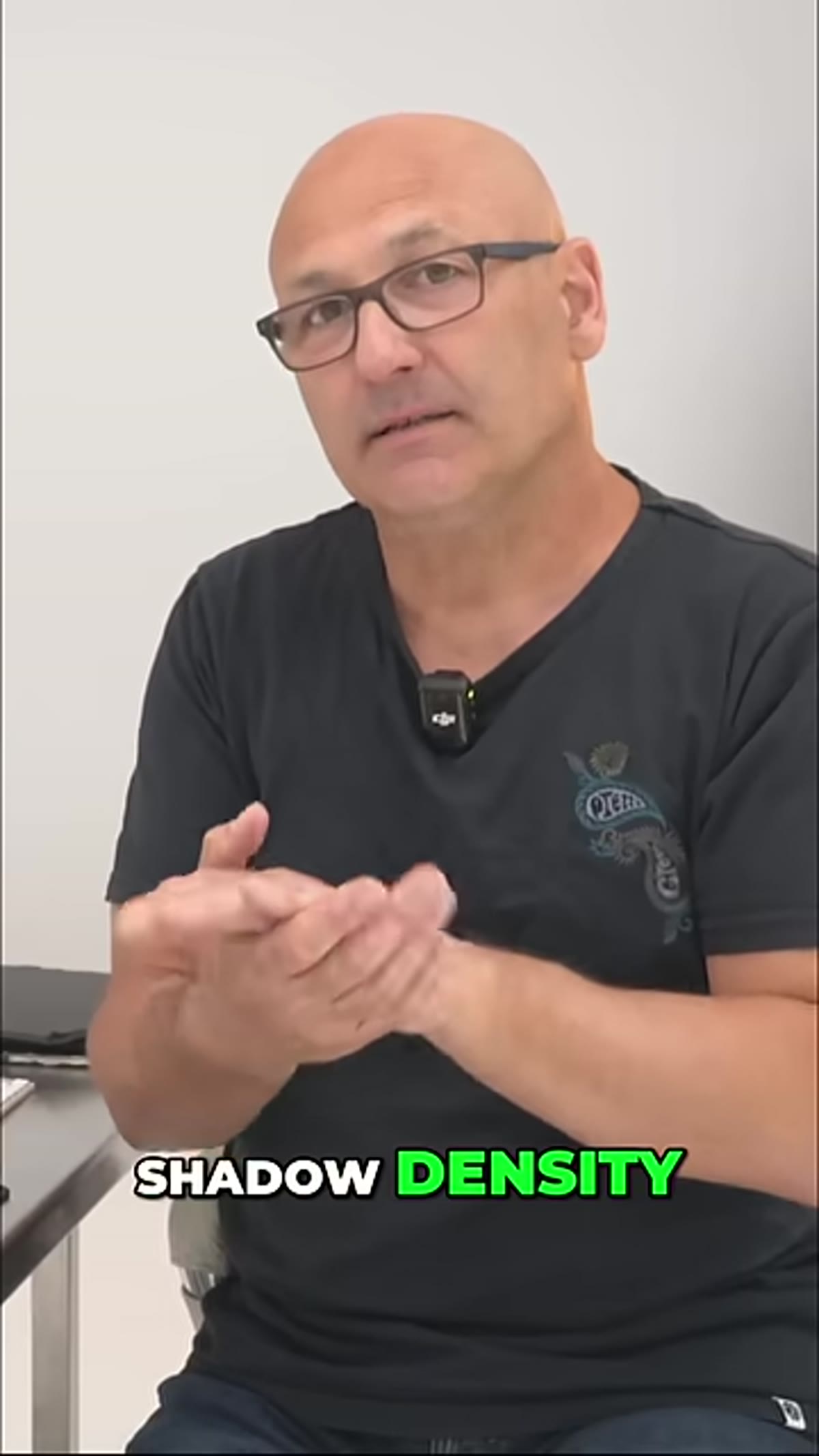 Adjustment layer being applied with tonal control over shadows
One problem you’ll run into: Curves adjustments don’t always stay in their lane. Lifting the black point can affect more of the image than you intended. The fix is to clip your Curves layer with a luminosity mask that targets only the shadow regions. Go to the Channels panel, hold Ctrl or Cmd and click the RGB composite channel to load a luminosity selection, then invert it with Ctrl/Cmd + Shift + I to select the darker tones. Use that selection as a mask on your Curves layer. Now your shadow density adjustment is constrained to where it actually belongs, and your highlights stay clean.
Adjustment layer being applied with tonal control over shadows
One problem you’ll run into: Curves adjustments don’t always stay in their lane. Lifting the black point can affect more of the image than you intended. The fix is to clip your Curves layer with a luminosity mask that targets only the shadow regions. Go to the Channels panel, hold Ctrl or Cmd and click the RGB composite channel to load a luminosity selection, then invert it with Ctrl/Cmd + Shift + I to select the darker tones. Use that selection as a mask on your Curves layer. Now your shadow density adjustment is constrained to where it actually belongs, and your highlights stay clean.
Step 7: Compare Before and After at 100% Zoom
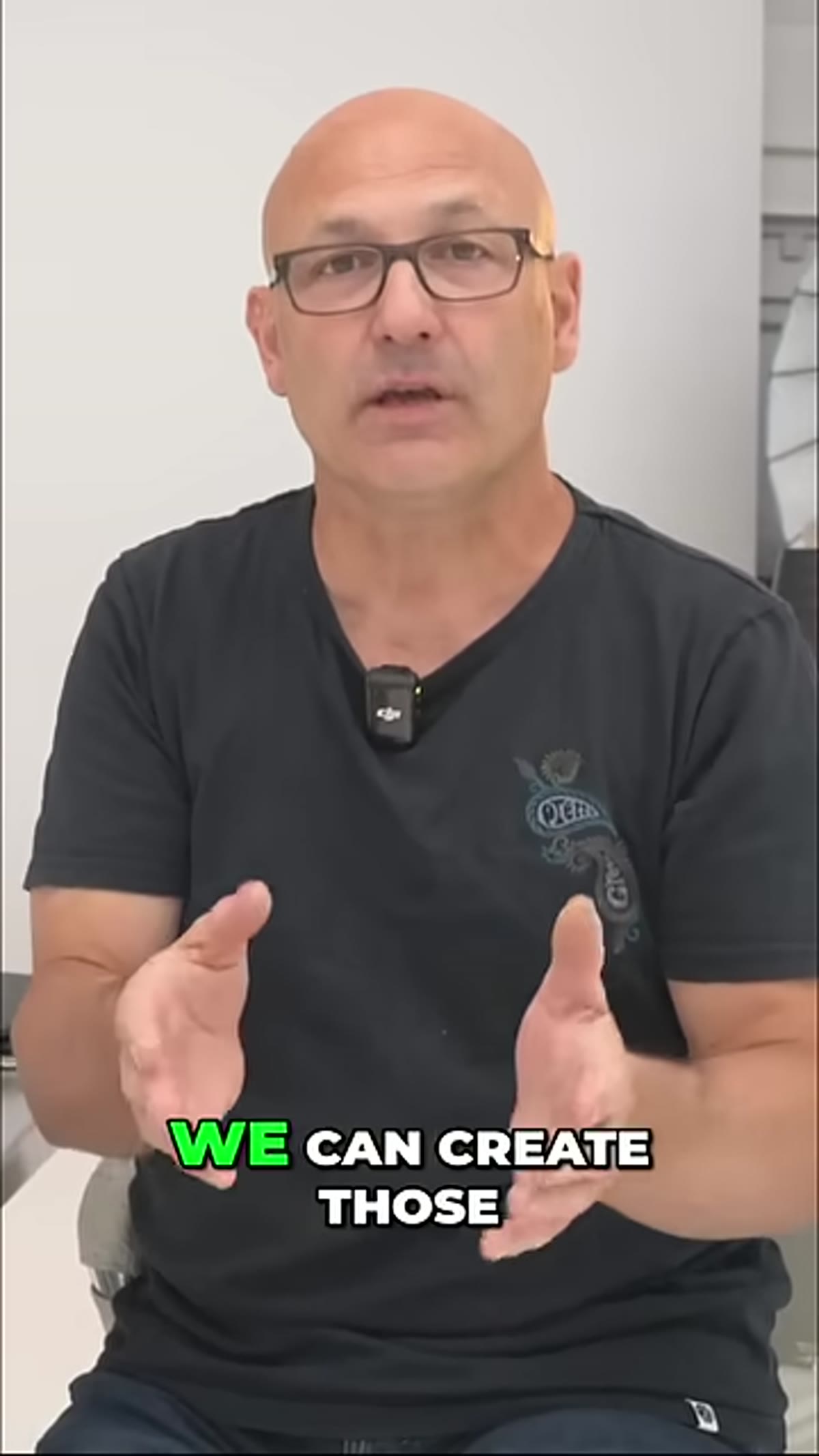 Final mood comparison between high and low shadow density results
Toggle your adjustment layer’s visibility on and off at 100% zoom, not fit to screen. Fit to screen lies to you. At 100%, you can actually see whether the shadow lift has introduced unwanted noise in the dark regions, which is a common side effect. If you spot noise, bring the Curves adjustment back slightly or add a gentle Noise Reduction pass via Filter, then Neural Filters, or through Camera Raw as a Smart Filter. The goal is intentional mood, not accidental grain.
Final mood comparison between high and low shadow density results
Toggle your adjustment layer’s visibility on and off at 100% zoom, not fit to screen. Fit to screen lies to you. At 100%, you can actually see whether the shadow lift has introduced unwanted noise in the dark regions, which is a common side effect. If you spot noise, bring the Curves adjustment back slightly or add a gentle Noise Reduction pass via Filter, then Neural Filters, or through Camera Raw as a Smart Filter. The goal is intentional mood, not accidental grain.
My Experience: Small Numbers, Big Feelings
Here’s something that tripped me up the first few times I worked with shadow density deliberately. I kept thinking I needed to make big moves to see results. In reality, raising the output black point from 0 to just 15 on a Curves layer can completely shift the emotional register of an image. I was spending twenty minutes wrestling with color grades trying to get that soft, editorial feel, and the whole time the answer was a single curve point moved up by a tiny amount. Now I check shadow density before I do anything else in a retouch. It’s genuinely the foundation everything else gets built on.
The single most important idea to take from this: shadow density is a decision, not an accident. Every image you edit has a shadow density setting by default, whether you chose it or not. Choosing it on purpose, even in a small way, immediately separates deliberate editing from guesswork.
Watch the full tutorial on YouTube and pay close attention to how the instructor reads the emotional difference between the examples. That instinct for reading mood in a frame is the actual skill, and this tutorial is a solid way to start building it.
Comments
Leave a Comment