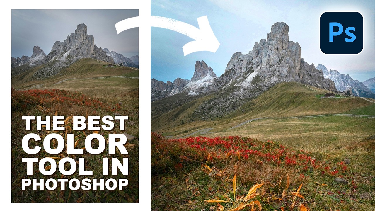
Client work has a way of exposing every gap in your toolkit. I spent an embarrassing chunk of my early freelance career doing color adjustments the hard way — HSL sliders, selective color adjustment layers, hand-painted masks — all to target a single stubborn orange in a landscape or a specific blue in a sky. It worked, sort of. But it was slow, fiddly, and every time the client wanted a tweak, I was rebuilding the whole thing. There had to be a better way.
Turns out there was, and it’s been sitting inside Photoshop the whole time. In this Aaron Nace (PHLEARN) tutorial, Watch the full tutorial on YouTube, Aaron walks through a tool called Point Color, which lives inside Adobe Camera Raw. It’s the kind of feature that makes you say “where has this been my whole life” and then immediately feel annoyed at how many hours you’ve wasted without it.
The short version: Point Color lets you click directly on any color in your image and then manipulate just that color with an almost surgical level of control. Hue, saturation, luminance, and even how much variation exists within that color range. If you’ve ever fought with Photoshop’s standard Hue/Saturation tool and accidentally turned someone’s skin a weird shade of green because the range selection was too broad, this is the fix.
Step 1: Convert Your Layer to a Smart Object
 Converting background layer to smart object via Layer menu
Before you touch Camera Raw, you need to convert your layer to a Smart Object. This is non-negotiable. Right-click your layer in the Layers panel and choose “Convert to Smart Object,” or go to Layer, then Smart Objects, then Convert to Smart Object. You can also get there through Filter and looking for “Convert for Smart Filters” - both routes land in the same place.
Converting background layer to smart object via Layer menu
Before you touch Camera Raw, you need to convert your layer to a Smart Object. This is non-negotiable. Right-click your layer in the Layers panel and choose “Convert to Smart Object,” or go to Layer, then Smart Objects, then Convert to Smart Object. You can also get there through Filter and looking for “Convert for Smart Filters” - both routes land in the same place.
The reason this matters: once Camera Raw is applied as a Smart Filter, you can double-click it at any time to reopen it and adjust your settings. Without the Smart Object conversion, Camera Raw becomes a destructive edit and you’re locked in. I learned the hard way that skipping this step is the kind of shortcut that costs you an hour later.
Step 2: Open the Camera Raw Filter
 Camera Raw filter interface open over a landscape image
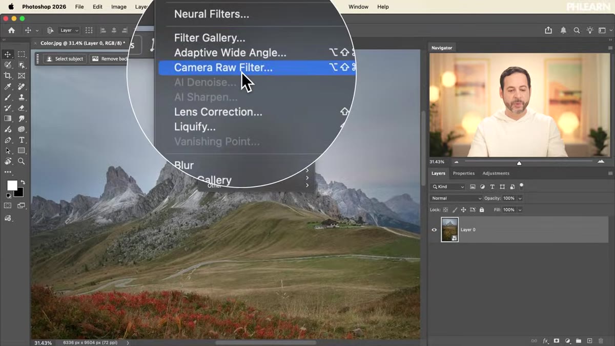
With your Smart Object selected, go to Filter and choose Camera Raw Filter. The interface that opens looks remarkably like Lightroom - because functionally, it is. Adobe essentially built Lightroom’s processing engine into Photoshop, which means everything you know from one transfers directly to the other.
Camera Raw filter interface open over a landscape image
With your Smart Object selected, go to Filter and choose Camera Raw Filter. The interface that opens looks remarkably like Lightroom - because functionally, it is. Adobe essentially built Lightroom’s processing engine into Photoshop, which means everything you know from one transfers directly to the other.
If you’ve never spent time in Camera Raw, take a moment to get your bearings. The panel you’re looking for is called Color Mixer, and it’s found in the right-hand panel. Click on it to expand the Color Mixer section.
Step 3: Switch to Point Color Mode
 Point Color tab selected inside Color Mixer panel
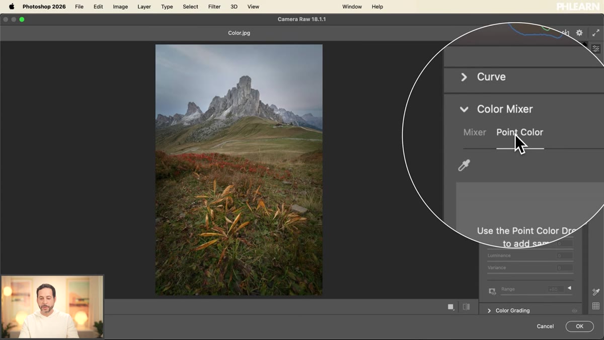
Inside Color Mixer, you’ll see two options at the top: the standard color range sliders (reds, oranges, yellows, and so on) and Point Color. Click on Point Color. This is where things get interesting.
Point Color tab selected inside Color Mixer panel
Inside Color Mixer, you’ll see two options at the top: the standard color range sliders (reds, oranges, yellows, and so on) and Point Color. Click on Point Color. This is where things get interesting.
The standard Color Mixer approach works by targeting predefined color ranges - it’s useful, but you’re always fighting the edges of those ranges. Point Color flips the approach. Instead of asking you to fit your adjustment into a preset category, it asks you to just click on the specific color you want to change. The tool figures out the range for you.
Step 4: Sample Your Target Color with the Eyedropper
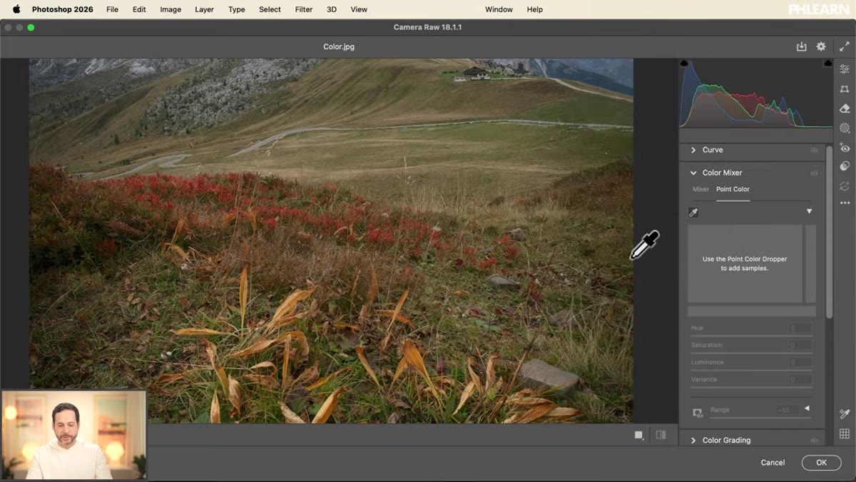 Eyedropper tool hovering over orange tones in landscape image
Grab the eyedropper tool inside the Point Color panel and hover it over your image. As you move around, you’ll notice a highlight on the color spectrum showing exactly which hues your cursor is sitting over. This live preview is genuinely useful for understanding how colors in your image relate to each other before you commit to a selection.
Eyedropper tool hovering over orange tones in landscape image
Grab the eyedropper tool inside the Point Color panel and hover it over your image. As you move around, you’ll notice a highlight on the color spectrum showing exactly which hues your cursor is sitting over. This live preview is genuinely useful for understanding how colors in your image relate to each other before you commit to a selection.
Click on the color you want to adjust. Aaron demonstrates this by clicking an orange tone in his landscape shot, and the panel immediately locks onto that specific orange and displays it on the color wheel. You’re not working with a label like “orange” anymore - you’re working with the exact color value you sampled.
Step 5: Adjust Hue, Saturation, and Luminance
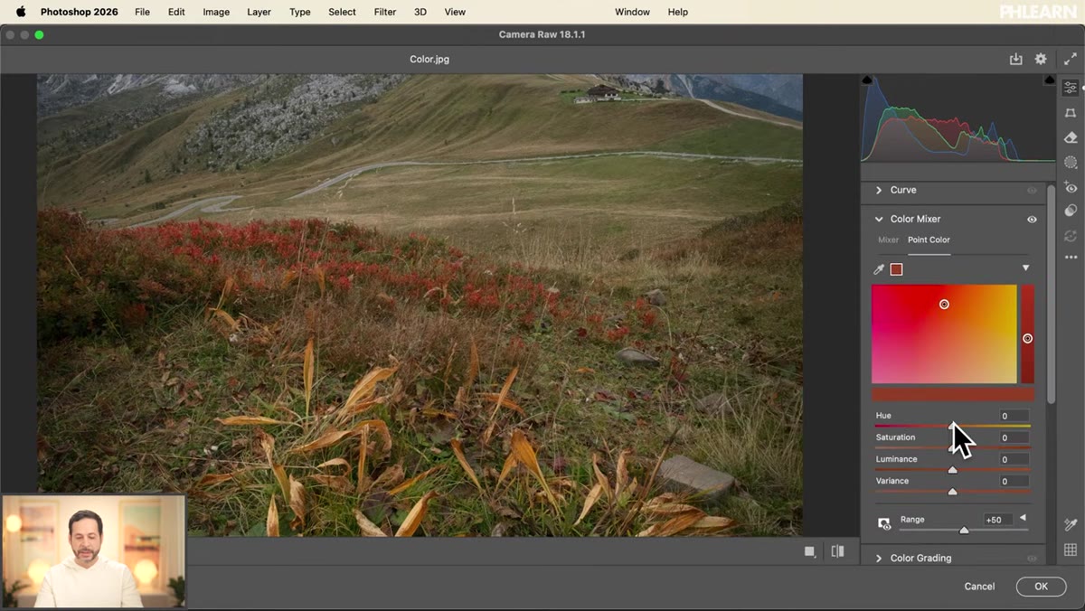 Hue, saturation, and luminance sliders being adjusted for sampled color
Now the fun part. With your color sampled, you get sliders for Hue, Saturation, and Luminance. Drag Hue left or right to shift the color toward neighboring tones. Drag Saturation up to make it pop or down to mute it. Luminance controls how bright or dark that specific color reads in the image.
Hue, saturation, and luminance sliders being adjusted for sampled color
Now the fun part. With your color sampled, you get sliders for Hue, Saturation, and Luminance. Drag Hue left or right to shift the color toward neighboring tones. Drag Saturation up to make it pop or down to mute it. Luminance controls how bright or dark that specific color reads in the image.
One practical tip Aaron mentions that I’ve found holds up in real work: when you push Saturation up, bump Luminance up a little too. Heavily saturated colors that stay at the same luminance can look dense and unnatural. Lifting the luminance slightly as you saturate keeps things from looking like a cartoon.
Step 6: Use Variance and Range to Fine-Tune
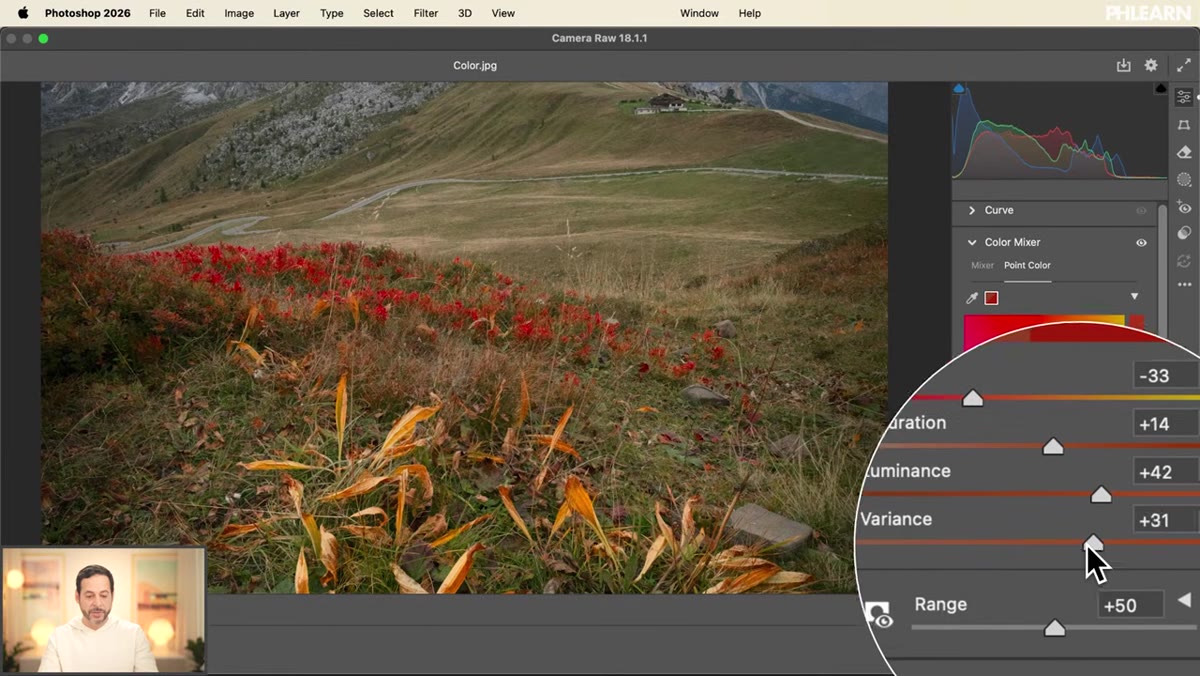 Variance and range sliders being adjusted in Point Color panel
Below the standard sliders are two controls that separate Point Color from anything else in Photoshop’s color toolkit: Variance and Range.
Variance and range sliders being adjusted in Point Color panel
Below the standard sliders are two controls that separate Point Color from anything else in Photoshop’s color toolkit: Variance and Range.
Variance controls how much natural color variation is introduced across your selected hue. Pulling it left pushes everything toward one uniform tone, which tends to look flat and artificial. Pushing it right lets the adjustment breathe a little - nearby hues get a slightly different treatment, which mimics how color actually behaves in real photographs. Range controls how broad the color selection is - how far from your sampled point the adjustment reaches before it fades out. Narrowing the range makes your edit hyper-specific. Widening it creates a smoother, broader effect. Together, these two sliders give you control that would take multiple layers and masks to replicate any other way.
When Point Color Doesn’t Do Everything You Need
Point Color is excellent, but it’s worth knowing its limits. It’s a global adjustment - it affects every instance of that color in the frame. If you need to change the orange in a jacket without touching the orange in the background sky, you’ll still need a mask. My usual workflow is to apply the Point Color adjustment in Camera Raw first to get the color dialed in, then add a mask to the Smart Filter in Photoshop to paint out any areas where the effect is spilling somewhere I don’t want it.
Also, if you’re working with colors that are very desaturated or very close to neutral grays, Point Color has a harder time isolating them cleanly. It thrives on distinct, saturated hues - which is exactly where most color grading work happens, so in practice this limitation rarely gets in the way.
The single most important thing I took from Aaron’s tutorial is this: stop treating Camera Raw as a tool just for RAW files. As a Smart Filter in Photoshop, it’s a full color grading suite that sits non-destructively on any layer, any file type. Point Color is the headline feature, but the whole environment is worth exploring.
Watch the full tutorial on YouTube to see Aaron work through the tool on a real landscape image - seeing the before and after in motion makes the impact of Point Color land in a way that screenshots alone can’t quite capture.
Comments (2)
Wow, I had no idea you could do this. Mind blown.
Shared this with my photography group. Everyone loved it.
Leave a Comment