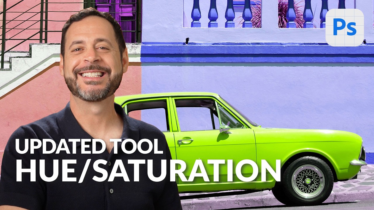
Color correction used to be the part of my workflow where I’d lose twenty minutes clicking through dropdown menus, second-guessing which color range I was actually editing, and ultimately just cranking global saturation like an amateur. Not my finest professional chapter. So when I caught Aaron Nace’s PHLEARN tutorial on the updated Hue/Saturation interface in Photoshop Beta, I was genuinely relieved. Not because it reinvents the wheel, but because it fixes the exact friction points that made the old version annoying to use quickly.
Watch the full tutorial on YouTube
The core functionality hasn’t changed dramatically – you’re still adjusting hue, saturation, and lightness. What’s changed is how you navigate between color ranges, and honestly it’s the kind of UI improvement that makes you wonder why it took this long. The color picker layout alone has cut my adjustment layer fiddling down significantly. Here’s exactly how it works.
Step 1: Add a Hue/Saturation Adjustment Layer
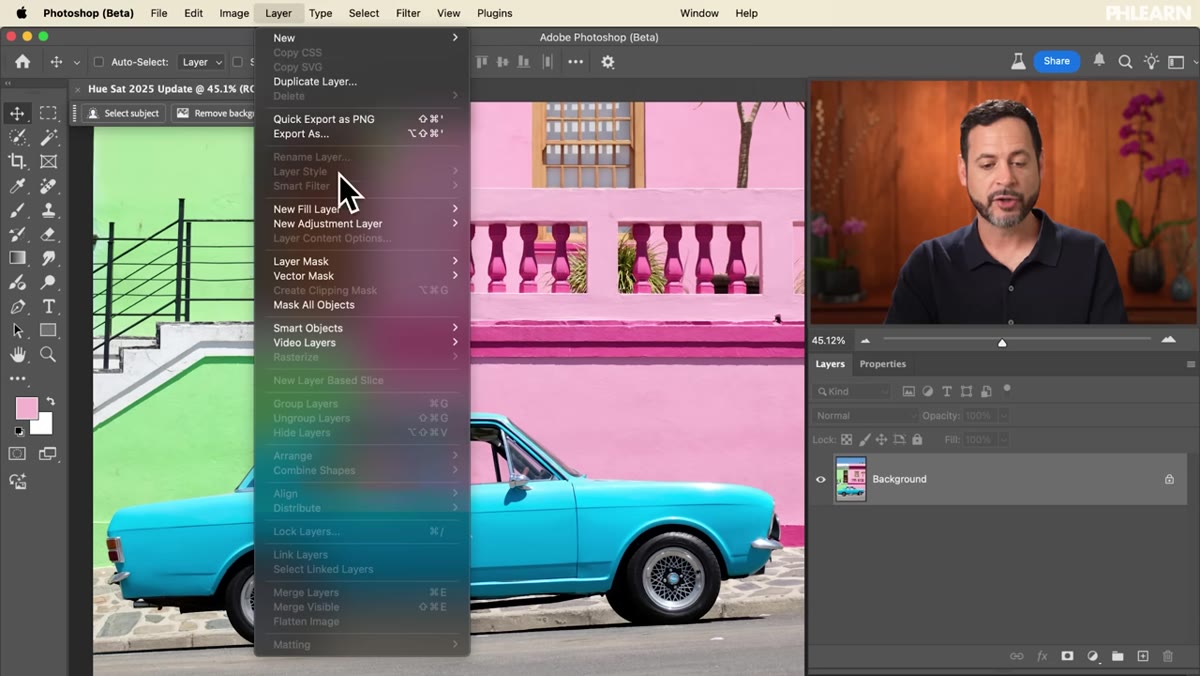 Adding a new Hue/Saturation adjustment layer via Layer menu
Start by going to Layer, then New Adjustment Layer, then Hue/Saturation. Click OK and you’ll see it appear above your background in the Layers panel. To open the controls, double-click the adjustment layer icon and your Properties panel will open. This is where all the action happens. Working non-destructively through an adjustment layer is always the move – you can revisit and tweak it any time without touching your original image data.
Adding a new Hue/Saturation adjustment layer via Layer menu
Start by going to Layer, then New Adjustment Layer, then Hue/Saturation. Click OK and you’ll see it appear above your background in the Layers panel. To open the controls, double-click the adjustment layer icon and your Properties panel will open. This is where all the action happens. Working non-destructively through an adjustment layer is always the move – you can revisit and tweak it any time without touching your original image data.
Step 2: Get Familiar With the New Color Selector Layout
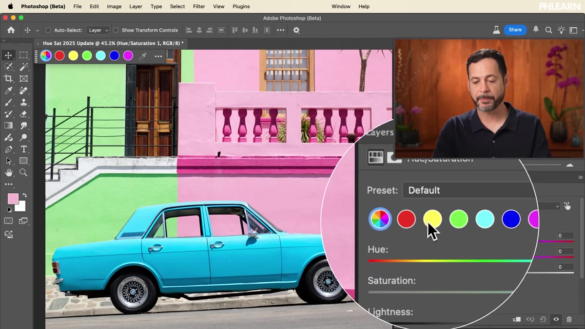
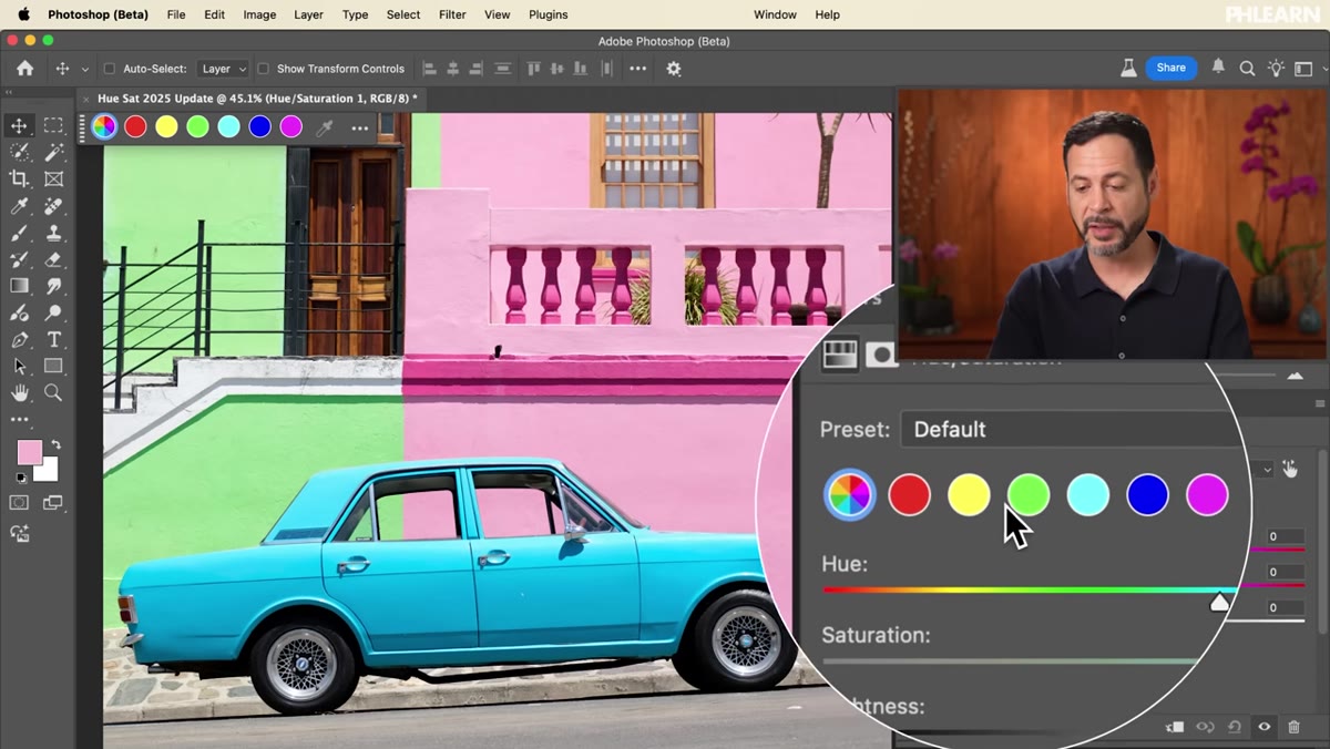 Properties panel showing the new visual color selector row
This is the part that’s actually new. Instead of a dropdown menu where you had to choose “Reds” or “Yellows” from a list, you now get a visual row of color swatches sitting right at the top of the Properties panel. You can click any one of them directly to isolate that color range. It sounds minor but in practice it’s significantly faster – especially when you’re working on an image with several distinct color regions and you need to jump between them quickly. No more hunting through a dropdown mid-flow.
Properties panel showing the new visual color selector row
This is the part that’s actually new. Instead of a dropdown menu where you had to choose “Reds” or “Yellows” from a list, you now get a visual row of color swatches sitting right at the top of the Properties panel. You can click any one of them directly to isolate that color range. It sounds minor but in practice it’s significantly faster – especially when you’re working on an image with several distinct color regions and you need to jump between them quickly. No more hunting through a dropdown mid-flow.
There’s also a contextual taskbar option, which means the controls are surfaced and accessible without you having to dig into the Properties panel manually. Useful if you’re the kind of person who keeps panels collapsed to save screen real estate.
Step 3: Explore the Presets to Understand the Tool’s Range
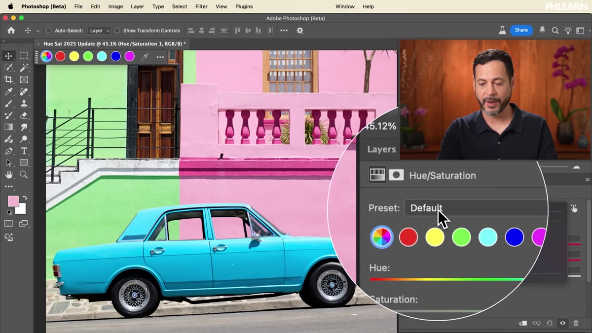 Presets dropdown showing options like Sepia Tone and Cyanotype
Before you start dialing things in manually, it’s worth clicking through the presets for about 30 seconds. Options like Sepia Tone, Cyanotype, and Increase Saturation give you an instant visual sense of what the tool is capable of and how far the sliders can push the image. Think of it as a quick orientation rather than something you’d actually deliver to a client. Once you’ve had a look, use the reset icon at the bottom of the panel to bring everything back to zero before you start working for real.
Presets dropdown showing options like Sepia Tone and Cyanotype
Before you start dialing things in manually, it’s worth clicking through the presets for about 30 seconds. Options like Sepia Tone, Cyanotype, and Increase Saturation give you an instant visual sense of what the tool is capable of and how far the sliders can push the image. Think of it as a quick orientation rather than something you’d actually deliver to a client. Once you’ve had a look, use the reset icon at the bottom of the panel to bring everything back to zero before you start working for real.
Step 4: Adjust All Colors Globally With the Master Setting
 Hue slider being dragged with all image colors shifting simultaneously
With the default “all colors” option selected – meaning none of the individual color swatches are active – any slider movement affects every color in the image simultaneously. Drag the Hue slider left or right and you’ll watch the entire photo shift through the spectrum. It’s visually wild and occasionally useful for stylized looks, but most of the time this is too blunt an instrument for real work. Know it exists, but don’t lean on it unless you specifically want that global shift.
Hue slider being dragged with all image colors shifting simultaneously
With the default “all colors” option selected – meaning none of the individual color swatches are active – any slider movement affects every color in the image simultaneously. Drag the Hue slider left or right and you’ll watch the entire photo shift through the spectrum. It’s visually wild and occasionally useful for stylized looks, but most of the time this is too blunt an instrument for real work. Know it exists, but don’t lean on it unless you specifically want that global shift.
Step 5: Target a Specific Color Range by Clicking a Swatch
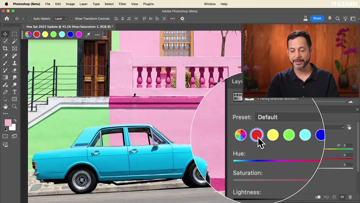 Reds swatch selected, saturation slider being dragged to the right
Here’s where the new interface earns its keep. Click one of the color swatches – say, Reds – and now your adjustments only affect pixels that fall within that hue range. Drag the Saturation slider to the right and you’ll see only the red-adjacent tones respond: think warm pinks, brick tones, reddish shadows. Everything else stays put. This is the core workflow for targeted color work, and being able to click a visual swatch instead of navigating a dropdown makes it feel much more intuitive, especially when you’re working fast on a deadline.
Reds swatch selected, saturation slider being dragged to the right
Here’s where the new interface earns its keep. Click one of the color swatches – say, Reds – and now your adjustments only affect pixels that fall within that hue range. Drag the Saturation slider to the right and you’ll see only the red-adjacent tones respond: think warm pinks, brick tones, reddish shadows. Everything else stays put. This is the core workflow for targeted color work, and being able to click a visual swatch instead of navigating a dropdown makes it feel much more intuitive, especially when you’re working fast on a deadline.
Step 6: Use the Slider Shortcuts to Move With Precision
 Cursor hovering over the Saturation label with arrow indicators visible
This is the step most people skip in tutorials and then feel slightly stupid about later. When your cursor is over any of the slider labels – Hue, Saturation, or Lightness – you’ll see small left and right arrows appear. You can click and drag directly on the label to move the slider. Hold Shift while dragging to move it faster. Hold Alt (or Option on Mac) to slow it way down for fine-tuned adjustments. This is the kind of keyboard shortcut integration that I genuinely wish existed in more panels. For precise color grading work, the slow-drag mode is a game changer.
Cursor hovering over the Saturation label with arrow indicators visible
This is the step most people skip in tutorials and then feel slightly stupid about later. When your cursor is over any of the slider labels – Hue, Saturation, or Lightness – you’ll see small left and right arrows appear. You can click and drag directly on the label to move the slider. Hold Shift while dragging to move it faster. Hold Alt (or Option on Mac) to slow it way down for fine-tuned adjustments. This is the kind of keyboard shortcut integration that I genuinely wish existed in more panels. For precise color grading work, the slow-drag mode is a game changer.
You can also double-click the label itself to snap the slider back to zero, or double-click the slider handle to do the same. And of course you can type a value directly into the number field if you already know where you want to land.
One Thing I’d Add: Stack Multiple Color Adjustments
Something Aaron doesn’t get into in this particular tutorial – and this is worth knowing from practical experience – is that you’re not limited to one Hue/Saturation adjustment layer. When I’m working on something with several competing color problems, I’ll often add two or three separate adjustment layers, each targeting a different color range. It keeps the adjustments readable and editable, and it means if a client asks you to “make the sky less blue” without touching anything else, you’re not untangling a single layer that’s doing six things at once. Clean, stacked adjustment layers are one of those habits that looks like overkill until the revision requests start coming in.
The single biggest takeaway here is that the visual color swatch selector replaces the old dropdown in a way that actually speeds up real work. It’s not flashy, it’s just better. If you’re still on the full release version of Photoshop and haven’t poked around the Beta, this is a solid reason to open it up and spend an afternoon getting comfortable with the updated interface before it rolls out everywhere.
Watch the full tutorial on YouTube and see Aaron walk through the whole thing with a great sample image that really shows the color targeting in action.
Comments
Leave a Comment