If you shoot and edit photos for a living, or even just as a serious hobby, you’ve probably felt the creeping anxiety of Adobe adding new tools to Photoshop and wondering if you’ve been doing everything wrong. New button appears, gets some buzz, and suddenly you’re questioning your entire workflow before you’ve even clicked on the thing. That’s exactly where I found myself when Photoshop’s contextual taskbar started showing a button called “Adjust Colors,” and people in every Facebook group and Reddit thread started treating it like some kind of revelation.
In this Matt Kloskowski tutorial, Watch the full tutorial on YouTube, Matt cuts through the noise pretty quickly. The headline argument: Adjust Colors is not a new tool. It’s a dressed-up interface sitting on top of the same old Hue/Saturation adjustment layer you already know. And for photographers specifically, it’s probably not the workflow upgrade you were hoping for. Here’s what the tutorial actually covers, and what I took away from it after watching.
Step 1: Find the Adjust Colors Button in the Contextual Taskbar
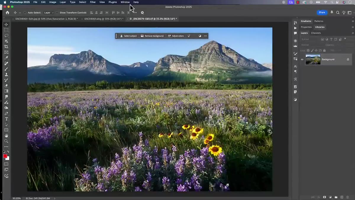 Contextual taskbar visible at bottom of Photoshop workspace
The Adjust Colors feature lives in Photoshop’s contextual taskbar, that little floating strip of options that shows up near the bottom of your workspace. If you don’t see it, head to the Window menu and toggle on “Contextual Task Bar.” Once you have a photo open, the button will appear in that bar ready to go. It’s easy to miss if you’ve dismissed the taskbar at some point, which, honestly, I had done because it kept getting in the way of my canvas.
Contextual taskbar visible at bottom of Photoshop workspace
The Adjust Colors feature lives in Photoshop’s contextual taskbar, that little floating strip of options that shows up near the bottom of your workspace. If you don’t see it, head to the Window menu and toggle on “Contextual Task Bar.” Once you have a photo open, the button will appear in that bar ready to go. It’s easy to miss if you’ve dismissed the taskbar at some point, which, honestly, I had done because it kept getting in the way of my canvas.
Step 2: Click Adjust Colors and See What It Actually Creates
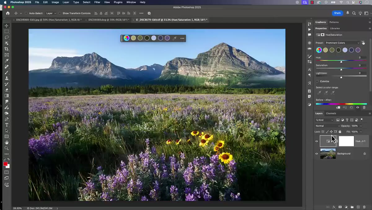 Hue Saturation adjustment layer added to Layers panel
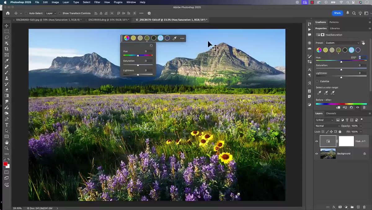
When you click Adjust Colors, Photoshop analyzes your image, identifies the dominant colors, and then opens a color wheel-style interface that gives you quick access to those specific color ranges. It feels modern and intuitive. Here’s the thing though: look at your Layers panel. What Photoshop has actually done is add a standard Hue/Saturation adjustment layer. The preset it applies is called “prominent colors,” which is the genuinely new part of this feature. The wheel is a friendlier front end for something that has existed in Photoshop for years.
Hue Saturation adjustment layer added to Layers panel
When you click Adjust Colors, Photoshop analyzes your image, identifies the dominant colors, and then opens a color wheel-style interface that gives you quick access to those specific color ranges. It feels modern and intuitive. Here’s the thing though: look at your Layers panel. What Photoshop has actually done is add a standard Hue/Saturation adjustment layer. The preset it applies is called “prominent colors,” which is the genuinely new part of this feature. The wheel is a friendlier front end for something that has existed in Photoshop for years.
Step 3: Try Boosting a Color Range and Watch It Fall Apart
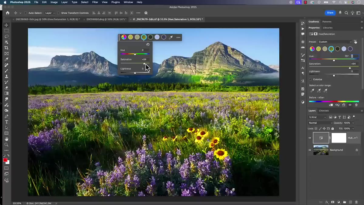 Over-saturated greens showing unnatural color shift in landscape photo
This is where the tutorial gets honest in a way I appreciated. Pick a color in the wheel, say the greens in a landscape shot, and start pushing the saturation slider. It doesn’t take much before the result looks, in Matt’s words, “radioactive.” The greens go neon, they bleed into areas you didn’t intend, and the image starts looking like it was edited by someone who just discovered the saturation slider exists. The tool is heavy-handed by nature. Because it’s targeting broad color ranges across the whole image, there’s very little surgical precision happening here.
Over-saturated greens showing unnatural color shift in landscape photo
This is where the tutorial gets honest in a way I appreciated. Pick a color in the wheel, say the greens in a landscape shot, and start pushing the saturation slider. It doesn’t take much before the result looks, in Matt’s words, “radioactive.” The greens go neon, they bleed into areas you didn’t intend, and the image starts looking like it was edited by someone who just discovered the saturation slider exists. The tool is heavy-handed by nature. Because it’s targeting broad color ranges across the whole image, there’s very little surgical precision happening here.
Step 4: Test the Blues to Confirm the Pattern
 Sky blues over-saturated, appearing unnatural and blown out
Switch from greens to blues, which in a landscape photo is going to be your sky. Same story. Pushing that slider makes the sky look more like a cartoon than a photograph. The tool isn’t subtle. Now, you do have masks and other refinement options available once the adjustment layer is created, but at that point you’re adding significant extra work on top of a result that started off rough. That’s the wrong direction to be traveling in a workflow.
Sky blues over-saturated, appearing unnatural and blown out
Switch from greens to blues, which in a landscape photo is going to be your sky. Same story. Pushing that slider makes the sky look more like a cartoon than a photograph. The tool isn’t subtle. Now, you do have masks and other refinement options available once the adjustment layer is created, but at that point you’re adding significant extra work on top of a result that started off rough. That’s the wrong direction to be traveling in a workflow.
Step 5: Understand Who This Tool Is Actually For
 Matt speaking to camera, contextual framing of target user
Matt makes a point here that I think is the real value of this video. Adjust Colors isn’t designed for photographers who are already comfortable in Lightroom or Camera Raw. It’s designed for a different kind of user, probably someone doing graphic design, social content, or working with images in a more general sense, who needs a fast way to shift colors without digging into the Layers panel at all. For that person, a big color wheel with prominent colors pre-selected is genuinely useful. For someone editing RAW files with specific tonal goals in mind, it’s a shortcut to a mess.
Matt speaking to camera, contextual framing of target user
Matt makes a point here that I think is the real value of this video. Adjust Colors isn’t designed for photographers who are already comfortable in Lightroom or Camera Raw. It’s designed for a different kind of user, probably someone doing graphic design, social content, or working with images in a more general sense, who needs a fast way to shift colors without digging into the Layers panel at all. For that person, a big color wheel with prominent colors pre-selected is genuinely useful. For someone editing RAW files with specific tonal goals in mind, it’s a shortcut to a mess.
Step 6: Recognize That Lightroom and Camera Raw Already Do This Better
 Reference to Lightroom’s Point Color panel and masking tools
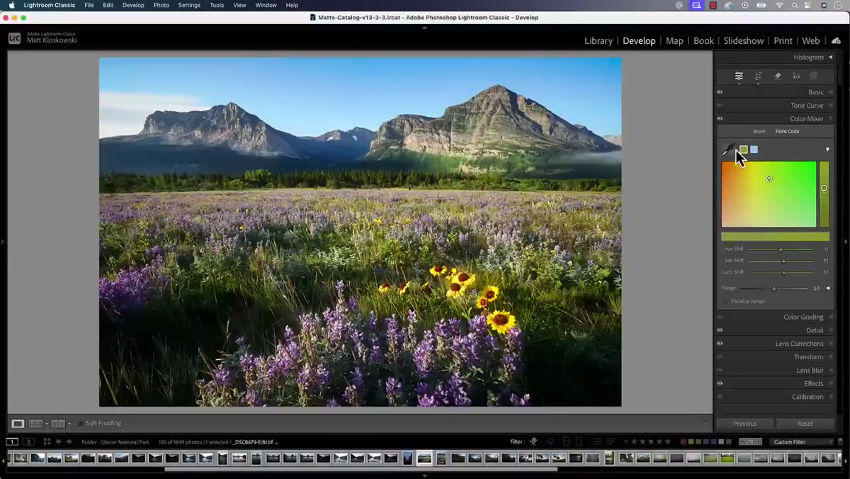
The comparison Matt draws is important. Lightroom’s Point Color panel, which has been refined significantly over the last few years, lets you target specific colors with a lot more control. Layer that with Lightroom’s masking tools, including the ability to create a mask based on a specific color range, and you have a system that’s more precise and more forgiving than anything the Adjust Colors button is offering. Camera Raw inside Photoshop gives you access to the same engine. If you’re already living in that ecosystem, Adjust Colors is a step sideways, not forward.
Reference to Lightroom’s Point Color panel and masking tools
The comparison Matt draws is important. Lightroom’s Point Color panel, which has been refined significantly over the last few years, lets you target specific colors with a lot more control. Layer that with Lightroom’s masking tools, including the ability to create a mask based on a specific color range, and you have a system that’s more precise and more forgiving than anything the Adjust Colors button is offering. Camera Raw inside Photoshop gives you access to the same engine. If you’re already living in that ecosystem, Adjust Colors is a step sideways, not forward.
My Take: The Real Confusion Is About Workflow, Not Tools
The feature itself isn’t the problem. It’s actually a decent addition for the right user. The problem is that Adobe keeps expanding both Lightroom and Photoshop in ways that make the line between them feel blurry, and photographers who are trying to optimize their workflow end up chasing every new feature to figure out if it changes the answer to the question “where should I edit this?”
My short answer, based on my own experience juggling freelance work across a lot of different image types: color work on photographs stays in Lightroom or Camera Raw. Photoshop is where I go for compositing, retouching, and anything structural. The Adjust Colors button does not change that. If anything, testing it out the way Matt does in this tutorial confirmed it. I spent about ten minutes poking at it on a landscape shot I was working on at my usual coffee shop table, and by the end I had an adjustment layer I immediately deleted and a renewed appreciation for the HSL panel in Lightroom.
If you’re a graphic designer who needs to quickly shift a product photo’s color palette for a client deck and doesn’t want to touch a Layers panel, Adjust Colors might actually save you some time. But if you’re a photographer with a raw file you care about, this isn’t your tool. It’s a UI shortcut that points to an older feature, and it doesn’t outperform the dedicated color tools you probably already have open in another window.
The single most important thing this tutorial drives home is this: a new interface is not a new capability. Always look at what’s actually happening in the Layers panel before you decide a feature deserves a place in your workflow.
Watch the full tutorial on YouTube to see Matt walk through all of this live, including the side-by-side comparisons that make the limitations very clear very fast.
Comments
Leave a Comment