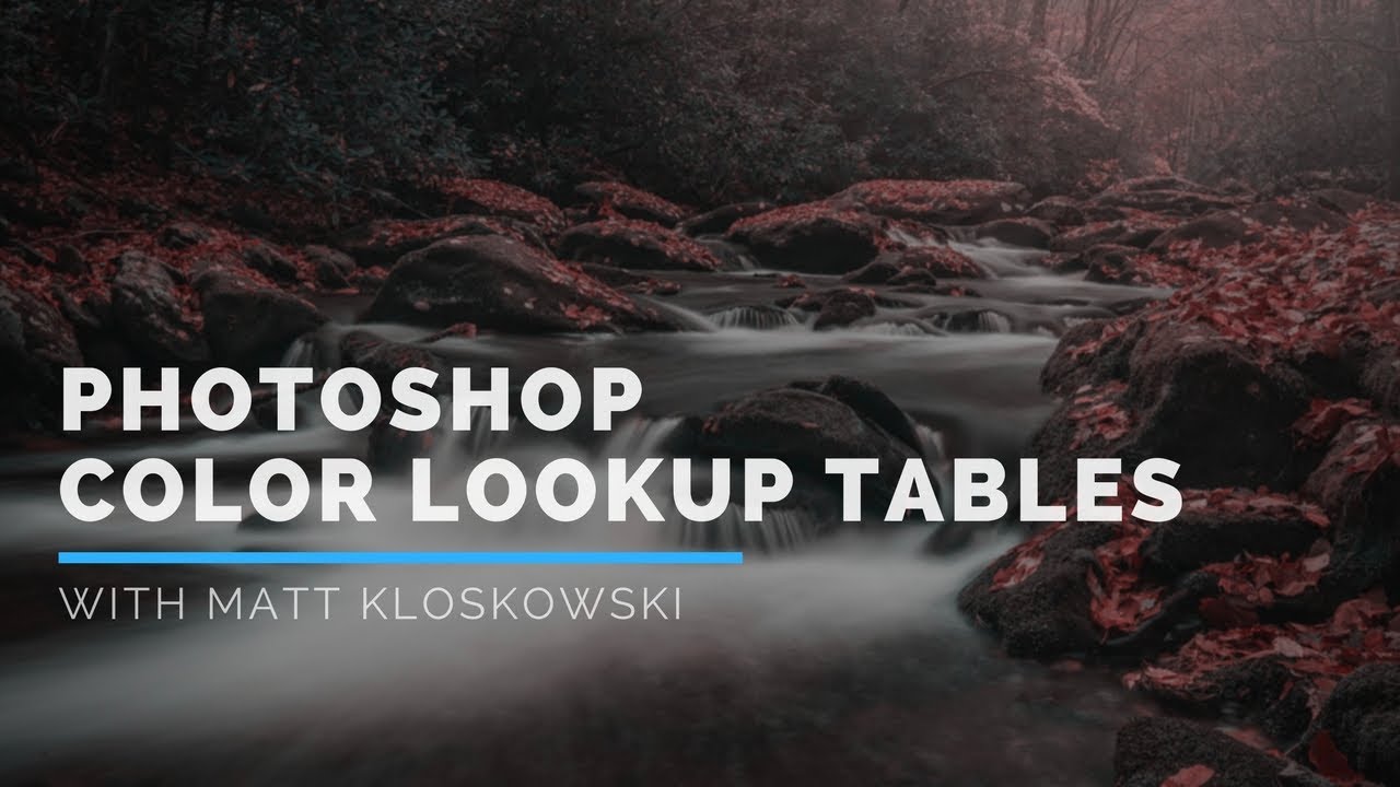
I have spent embarrassing amounts of time manually dragging Curves, nudging Hue/Saturation sliders, and stacking three or four adjustment layers just to get a color grade that feels intentional. Then a client asks for a revision and I get to do it all over again. The whole process is fine, but it’s slow, and it compounds every time you’re working with a batch of images that need a consistent look.
Color Lookup Tables, or CLUTs, solve a specific version of that problem – and they’ve been sitting inside Photoshop the whole time, largely ignored. I stumbled across Watch the full tutorial on YouTube from Matt Kloskowski, who has a gift for explaining things that have technically been documented but never actually explained. His breakdown of CLUTs is one of those tutorials that takes something that sounds intimidating (3D LUTs, color space mapping) and makes it immediately usable. Here’s the full walkthrough.
Step 1: Open Your Adjustments Panel
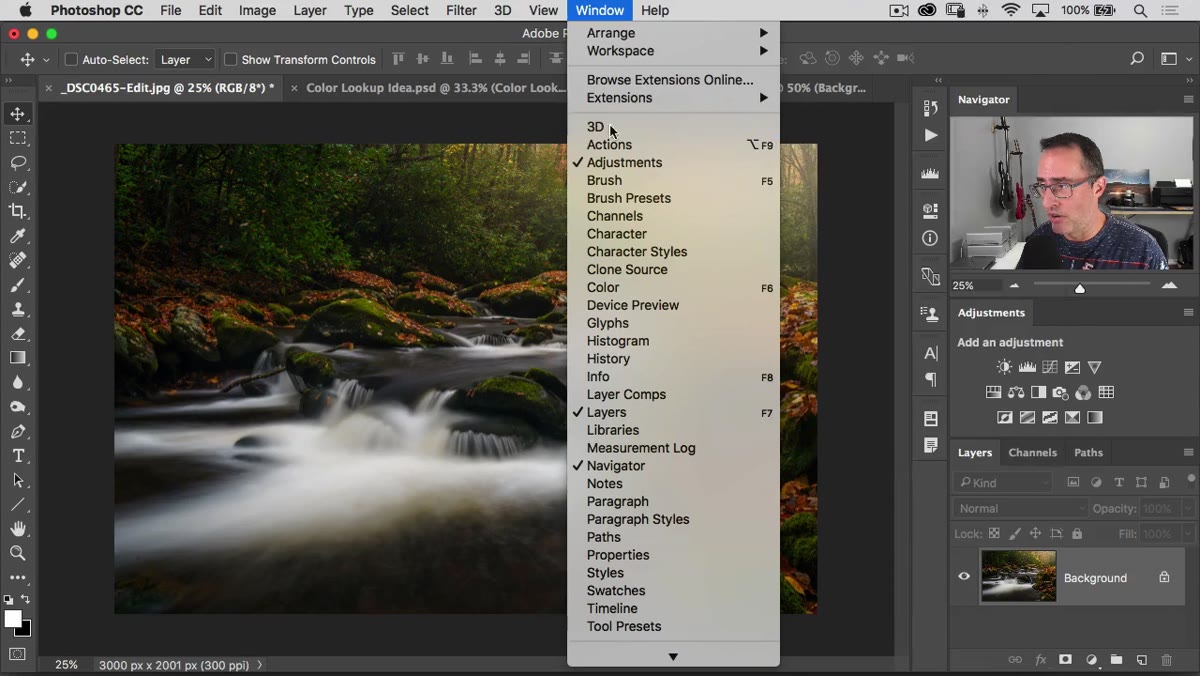 Adjustments panel visible on right side of workspace
If your Adjustments panel isn’t already docked on the right side of your workspace, go to Window and select Adjustments. It’ll appear as a panel full of small icons, each one representing a different type of adjustment layer. You’re looking for an icon that resembles a small grid – like a tic-tac-toe board drawn inside a box. That’s your Color Lookup Table adjustment. Click it.
Adjustments panel visible on right side of workspace
If your Adjustments panel isn’t already docked on the right side of your workspace, go to Window and select Adjustments. It’ll appear as a panel full of small icons, each one representing a different type of adjustment layer. You’re looking for an icon that resembles a small grid – like a tic-tac-toe board drawn inside a box. That’s your Color Lookup Table adjustment. Click it.
Once you click it, a new Color Lookup adjustment layer gets created and the Properties panel opens up automatically. This is where all the action happens. You’ll see three sections: 3DLUT, Abstract, and Device Link. Ignore the bottom two for now. Everything interesting lives in 3DLUT.
Step 2: Understand What a Color Lookup Table Actually Does
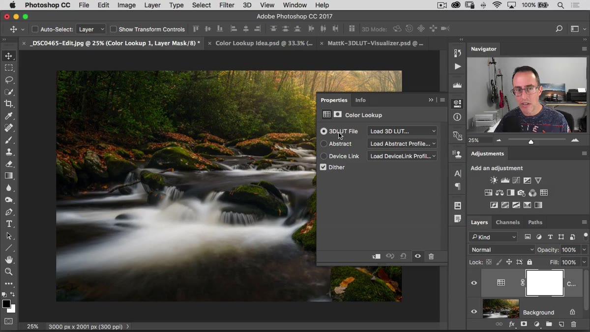 Properties panel showing 3DLUT dropdown menu
Before you start clicking through presets like a kid at a vending machine, it helps to understand what’s actually happening. A color lookup table is essentially a map. You’re telling Photoshop: take this specific color value and replace it with this other specific color value. Every pixel in your image gets remapped according to that table.
Properties panel showing 3DLUT dropdown menu
Before you start clicking through presets like a kid at a vending machine, it helps to understand what’s actually happening. A color lookup table is essentially a map. You’re telling Photoshop: take this specific color value and replace it with this other specific color value. Every pixel in your image gets remapped according to that table.
The “3D” in 3DLUT doesn’t mean anything spatial or three-dimensional in the way you’d think. It refers to the RGB color space being treated as a three-axis system (red, green, blue), which is how Photoshop calculates the remapping. Nothing in your image is being converted to 3D geometry. It’s just math with a confusing name.
Step 3: Load a Preset from the 3DLUT Dropdown
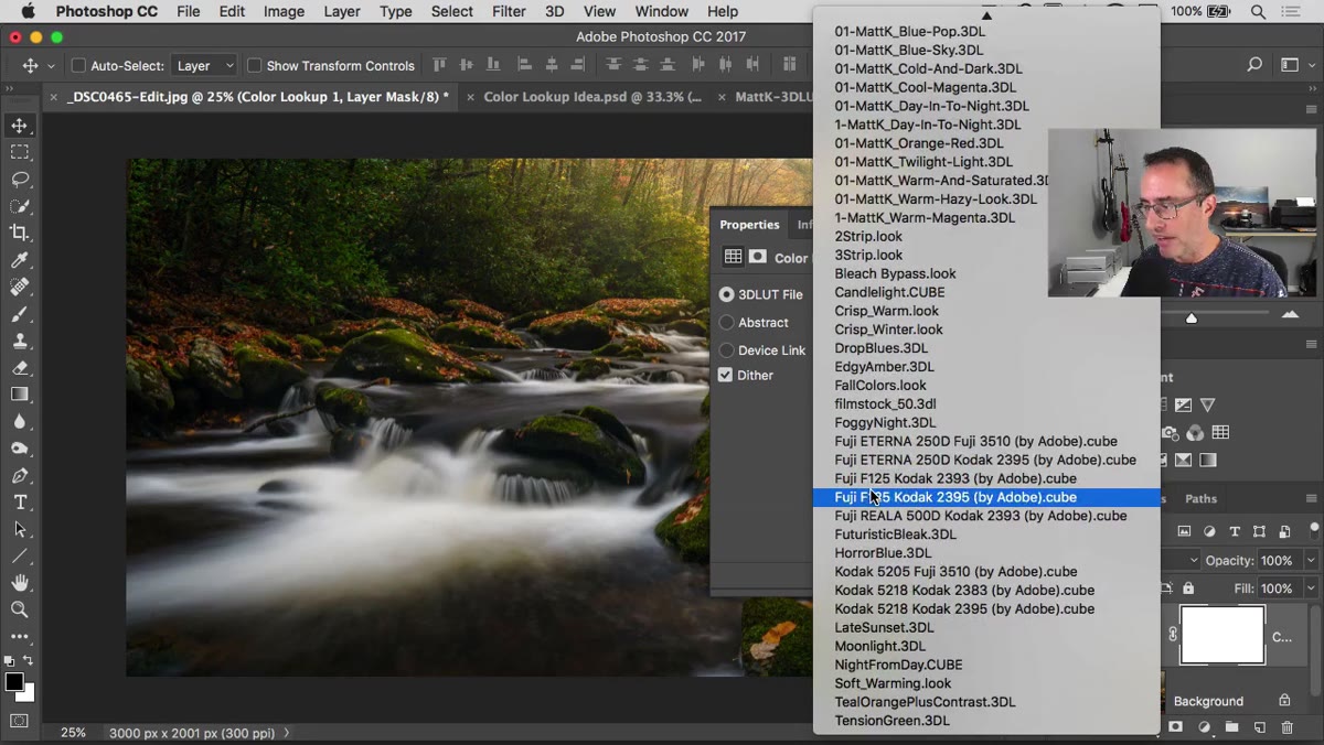 Dropdown showing built-in LUT presets like Two Strip, Edgy Amber
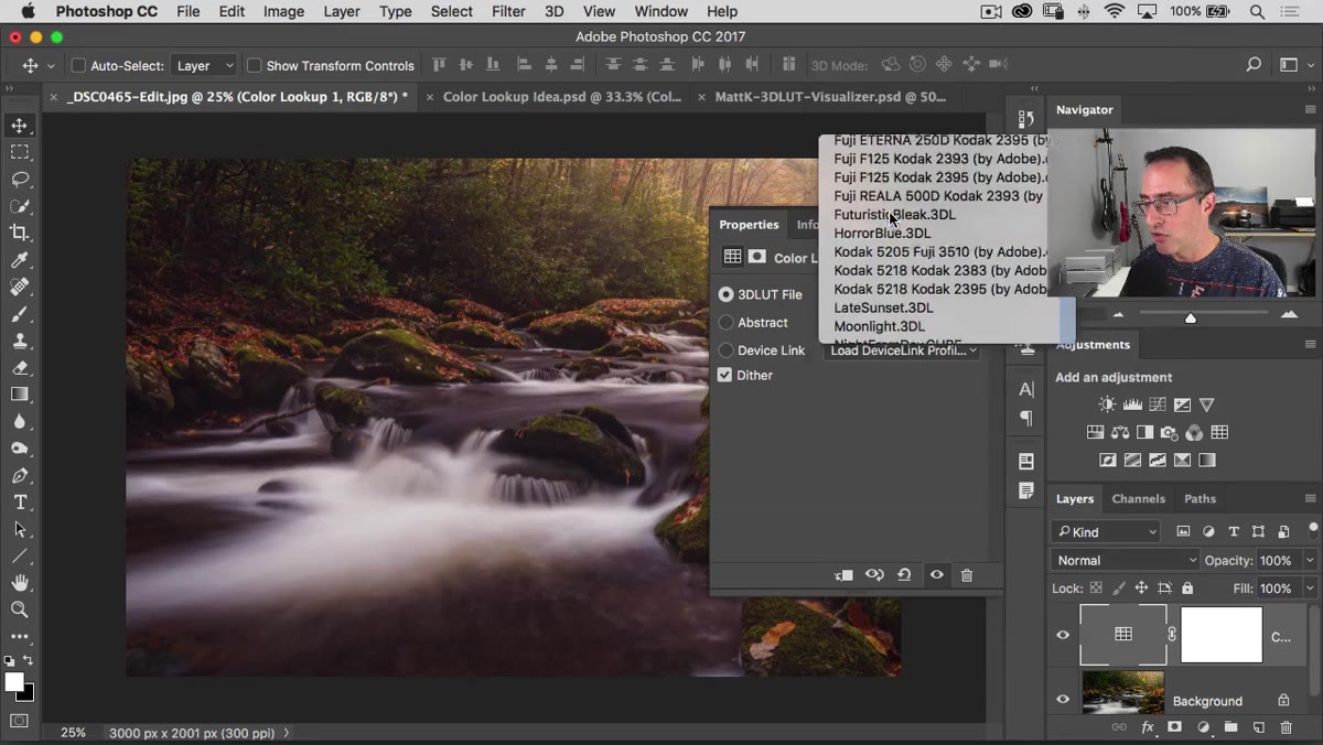
Click the 3DLUT dropdown and you’ll see Photoshop’s built-in presets. If you haven’t added any custom ones, yours will start with options like Two Strip, Three Strip, Edgy Amber, Late Sunset, Soft Warming, and a handful of Kodak-branded looks. Pick one and click it. The effect applies instantly as a non-destructive adjustment layer.
Dropdown showing built-in LUT presets like Two Strip, Edgy Amber
Click the 3DLUT dropdown and you’ll see Photoshop’s built-in presets. If you haven’t added any custom ones, yours will start with options like Two Strip, Three Strip, Edgy Amber, Late Sunset, Soft Warming, and a handful of Kodak-branded looks. Pick one and click it. The effect applies instantly as a non-destructive adjustment layer.
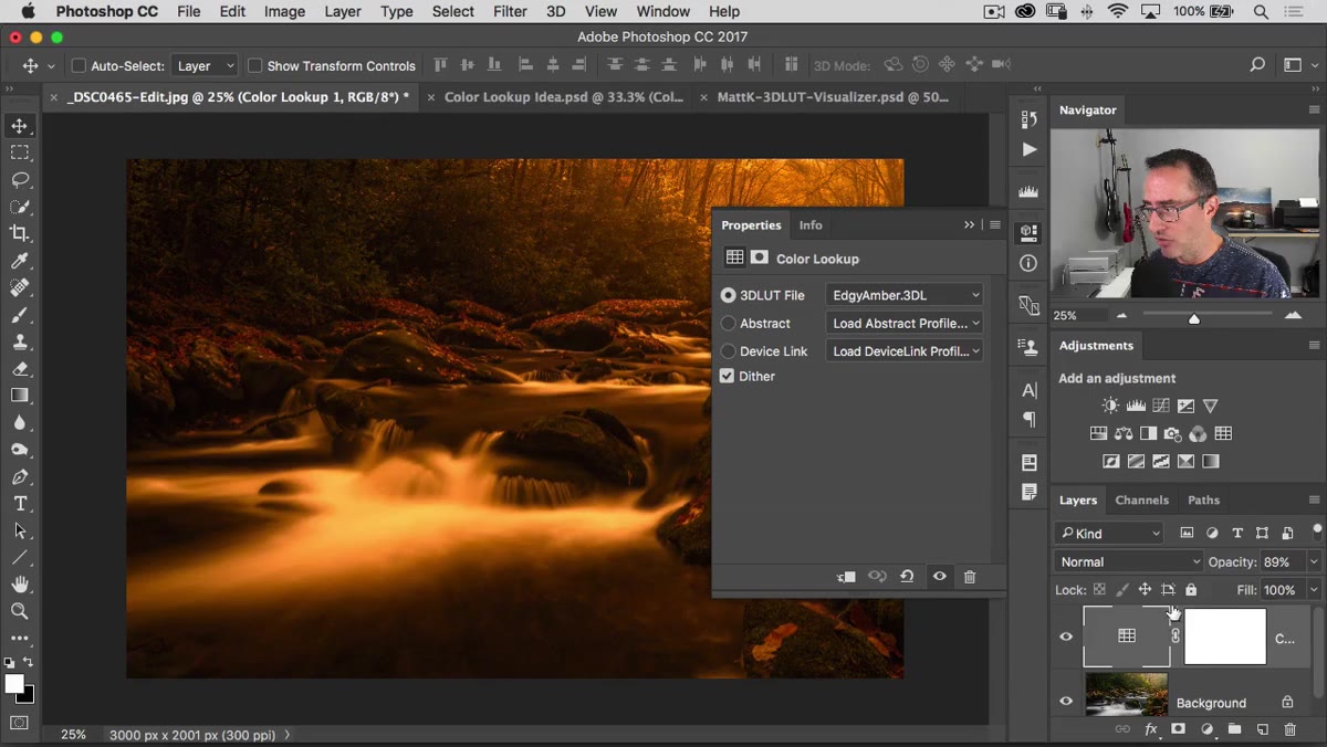
Some of these are strong out of the box – Edgy Amber hits pretty hard on most photos. That’s not necessarily a problem, and it’s not a reason to skip past a preset. The opacity control is right there in your Layers panel, and dialing it back to 40 or 50 percent can take something that felt like a Instagram filter from 2012 and turn it into a subtle, professional color grade. Don’t judge a LUT at 100 percent opacity.
Step 4: Use the Eyeball Icon in the Properties Panel to Toggle Before/After
 Properties panel with eyeball icon toggling before and after view
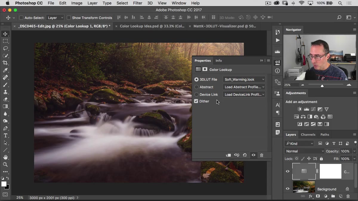
This is a small thing that saves real time. Inside the Properties panel, while your Color Lookup layer is selected, there’s a little eyeball icon. Clicking it toggles the adjustment on and off so you can see the before and after directly in your canvas. It’s faster than clicking the layer visibility toggle in the Layers panel, and it keeps your focus in one place.
Properties panel with eyeball icon toggling before and after view
This is a small thing that saves real time. Inside the Properties panel, while your Color Lookup layer is selected, there’s a little eyeball icon. Clicking it toggles the adjustment on and off so you can see the before and after directly in your canvas. It’s faster than clicking the layer visibility toggle in the Layers panel, and it keeps your focus in one place.
Use this constantly as you’re cycling through presets. The difference between a subtle look and an obvious one is sometimes invisible until you compare it directly against the original. The toggle makes that comparison effortless.
Step 5: Adjust Opacity and Blend Modes to Fine-Tune the Effect
 Layers panel showing Color Lookup adjustment layer with opacity slider
Because CLUTs are adjustment layers, they play by the same rules as every other adjustment layer in Photoshop. You can lower the opacity to blend the effect with the original image, which is probably the most useful control you have. Most of the built-in presets are designed to be noticeable, so starting around 50-70 percent and working up from there is a reasonable approach.
Layers panel showing Color Lookup adjustment layer with opacity slider
Because CLUTs are adjustment layers, they play by the same rules as every other adjustment layer in Photoshop. You can lower the opacity to blend the effect with the original image, which is probably the most useful control you have. Most of the built-in presets are designed to be noticeable, so starting around 50-70 percent and working up from there is a reasonable approach.
You can also experiment with blend modes. Switching a Color Lookup layer to Luminosity, for example, applies the tonal changes from the LUT without affecting the hue – useful when you like the contrast shift a LUT creates but don’t want the color cast. Color mode does the opposite. These aren’t always dramatic changes, but they give you more surgical control than the opacity slider alone.
Step 6: Cycle Through the Kodak Presets for Film-Style Grades
 Kodak LUT applied showing muted blacks and flat contrast
The Kodak presets in the dropdown deserve their own step because they behave differently from the others. Where something like Edgy Amber pushes saturation and contrast aggressively, the Kodak options tend to do something more interesting – they compress the tonal range. The blacks don’t go fully black. The image gets slightly flatter, which mimics the look of film stock in a way that feels less like a filter and more like a different medium.
Kodak LUT applied showing muted blacks and flat contrast
The Kodak presets in the dropdown deserve their own step because they behave differently from the others. Where something like Edgy Amber pushes saturation and contrast aggressively, the Kodak options tend to do something more interesting – they compress the tonal range. The blacks don’t go fully black. The image gets slightly flatter, which mimics the look of film stock in a way that feels less like a filter and more like a different medium.
If you’re working on portrait work, lifestyle photography, or anything where you want a warm, editorial feel without it looking processed, the Kodak presets are worth spending time with. Try them at full opacity first just to see what they’re doing, then pull the opacity back to taste.
My Actual Use Case: Batch Consistency Without Losing My Mind
Here’s the thing nobody mentions about CLUTs in the workflow context: they’re excellent for establishing a consistent look across a set of images fast. When I’m working on a project with 15-20 photos that need to feel like they belong together, I don’t want to manually match color grades across every single one. I’ll find a LUT that gets me 70 percent of the way there, apply it as an adjustment layer, and then do minor individual tweaks on top. The LUT becomes the foundation, not the final answer.
I’ve also started saving my own combination looks – a specific LUT at a specific opacity with a Curves layer stacked on top – as Layer Comps or just flattened into a custom action. That way the look is reproducible in about ten seconds on the next project. CLUTs aren’t magic, but they’re a legitimate shortcut when used as a starting point rather than a one-click finish.
The single biggest takeaway from Matt’s tutorial is this: don’t dismiss a LUT because it looks too strong at first glance. The opacity slider turns a blunt instrument into a precision tool. Everything you’d want to do with a color grade manually – warm the tones, crush the blacks, push the midtones toward a specific hue – these presets are already doing it. You just have to learn how much of it you actually want.
Watch the full tutorial on YouTube to see Matt walk through each preset live and grab the download he mentions in the description for easier LUT management.
Comments
Leave a Comment