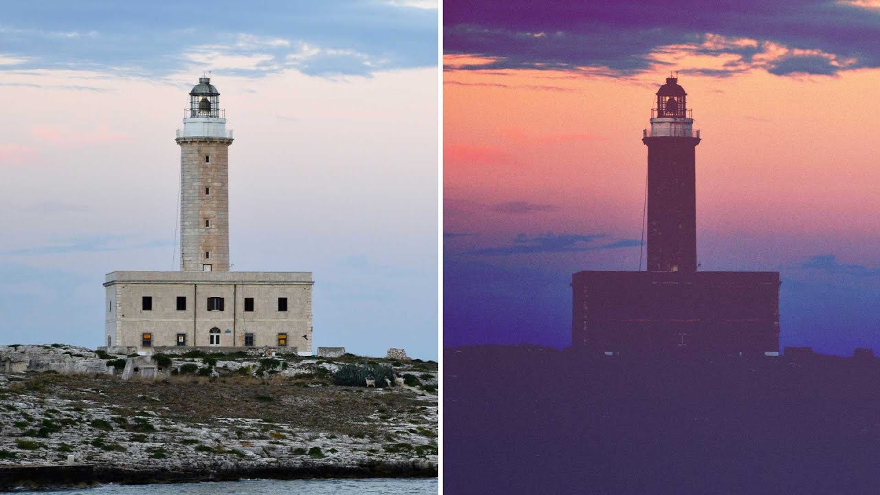
Client work has a way of forcing you to learn things fast. I spent an embarrassing amount of time trying to fake that moody, washed-out film look by just dragging the exposure slider down and hoping for the best. The result was always the same: muddy, flat, and nothing like the cinematic shadow work I was going for. The problem wasn’t my eye. It was that I was using the wrong tool for the job.
That changed when I watched this Aaron Nace tutorial from PHLEARN on creating a dark film look in Photoshop. Watch the full tutorial on YouTube. The technique is surprisingly compact, maybe ten minutes of actual work, but it hinges on a part of the Levels panel that most people scroll right past: the output slider. Once that clicked for me, I started seeing this approach everywhere, in editorial photography, music video stills, moody landscape work. It’s one of those techniques that’s simple enough to use on deadline but flexible enough to build a whole aesthetic around.
Aaron works through this on a lighthouse-at-sunset photo, which is a smart choice because it already has strong dark areas and a bit of warm light to play with. The technique transfers cleanly to portraits, street photography, pretty much anything with contrast and shadow detail worth manipulating.
Step 1: Open Your Levels Adjustment Layer
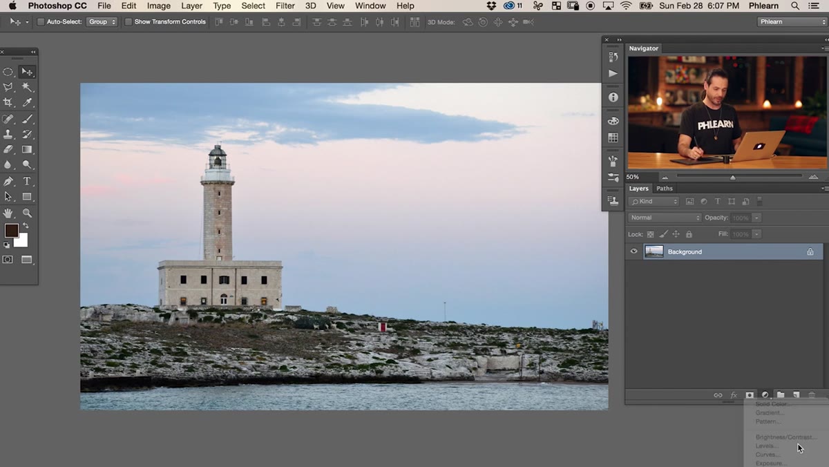 Levels adjustment layer being added in the Layers panel
Add a Levels adjustment layer from the Adjustments panel or via Layer > New Adjustment Layer > Levels. Don’t touch the image layer directly. You want this non-destructive so you can go back and tweak values later without any quality loss. If you’re not already working this way on every project, now’s the time to start.
Levels adjustment layer being added in the Layers panel
Add a Levels adjustment layer from the Adjustments panel or via Layer > New Adjustment Layer > Levels. Don’t touch the image layer directly. You want this non-destructive so you can go back and tweak values later without any quality loss. If you’re not already working this way on every project, now’s the time to start.
Step 2: Understand the Difference Between Input and Output Sliders
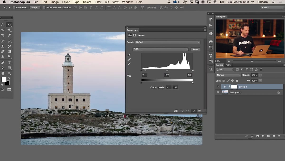 Levels panel showing both the input and output sliders
Here’s where most people’s Levels knowledge stops at the input sliders, the triangles along the top histogram. Drag the black input point right and your shadows go dark fast. Drag the white input point left and your highlights blow out. That’s the stuff everyone uses.
Levels panel showing both the input and output sliders
Here’s where most people’s Levels knowledge stops at the input sliders, the triangles along the top histogram. Drag the black input point right and your shadows go dark fast. Drag the white input point left and your highlights blow out. That’s the stuff everyone uses.
The output sliders sit below the histogram, and they control something different: not what counts as black or white in your image, but what the actual output value of those darkest and lightest points will be. Drag the black output slider to the right and your pure blacks lift to a mid-gray. Nothing in the image can go darker than whatever value you’ve set. That’s the mechanic the entire dark film look is built on.
Step 3: Crush the Blacks with the Input Slider
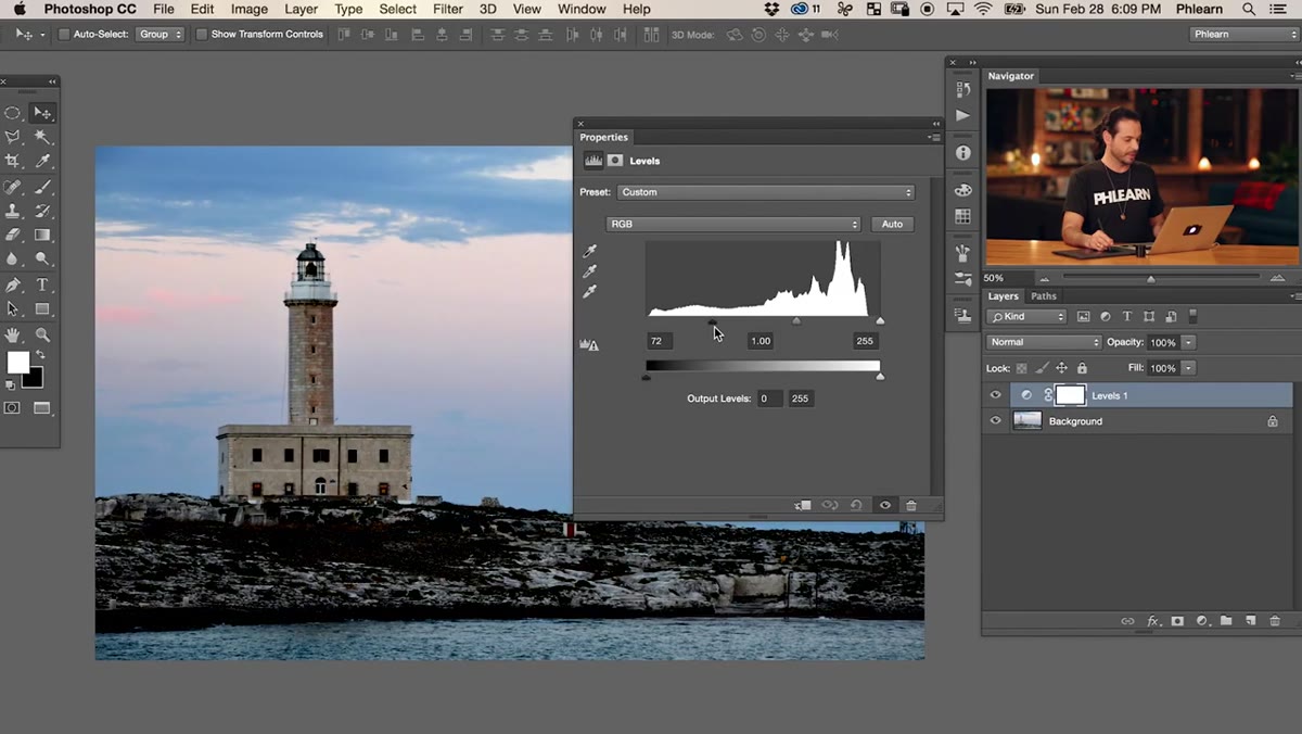 Input black point slider being dragged to the right
With the RGB channel selected, drag the black input slider to the right. You’re pushing a significant portion of your shadow detail into pure black, collapsing the tonal range in the darks. The image will look almost too dark at this stage, like someone turned off half the lights. That’s intentional. You’re setting up contrast before you pull it back.
Input black point slider being dragged to the right
With the RGB channel selected, drag the black input slider to the right. You’re pushing a significant portion of your shadow detail into pure black, collapsing the tonal range in the darks. The image will look almost too dark at this stage, like someone turned off half the lights. That’s intentional. You’re setting up contrast before you pull it back.
Aaron lands on a point where the silhouette shapes read clearly but a lot of the texture in the darker areas is gone. Think of it less as making your image dark and more as simplifying the darks into a flatter, more graphic shape.
Step 4: Lift the Shadows with the Output Slider
 Output black point slider being dragged to the right
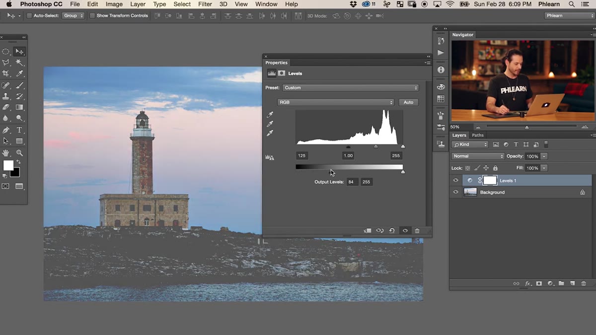
Now drag the black output slider to the right. This lifts your shadows from pure black up into a lighter gray, which immediately gives the image that faded, film-negative quality. The combination of crushing with the input and then lifting with the output is what separates this from just desaturating or lowering exposure. You’re compressing the tonal range from both ends at once, which creates a kind of milky haze in the shadows that reads as distinctly analog.
Output black point slider being dragged to the right
Now drag the black output slider to the right. This lifts your shadows from pure black up into a lighter gray, which immediately gives the image that faded, film-negative quality. The combination of crushing with the input and then lifting with the output is what separates this from just desaturating or lowering exposure. You’re compressing the tonal range from both ends at once, which creates a kind of milky haze in the shadows that reads as distinctly analog.
Find a value that keeps the image feeling dark and intentional without looking like you just dropped a gray layer on top of everything. Somewhere in the range of 50-90 on the output black point is a reasonable starting zone, but trust your eye over any specific number.
Step 5: Add a Second Levels Layer for Color in the Shadows
 Second Levels adjustment layer added above the first
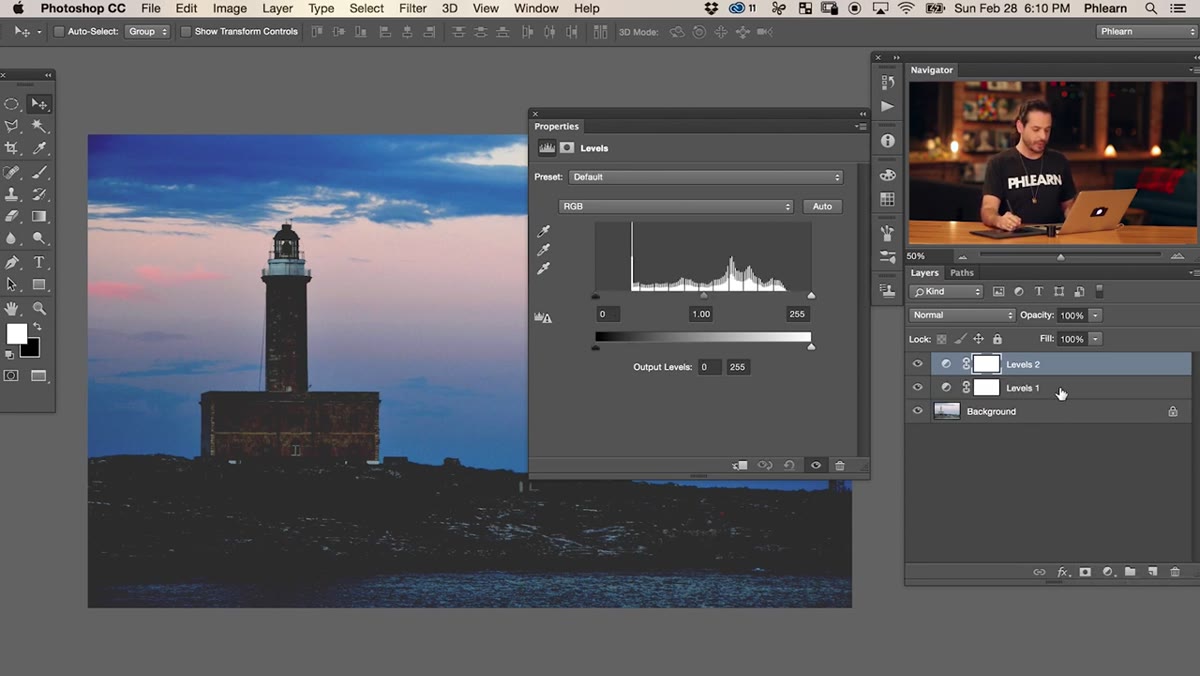
Add a second Levels adjustment layer above the first. Aaron keeps these separate rather than combining them in one layer, and I’d recommend doing the same. Isolating the tonal work from the color work means you can adjust either one without second-guessing what’s affecting what. It’s a small organizational habit that saves real time when a client asks you to “make it a little less purple” at 11pm.
Second Levels adjustment layer added above the first
Add a second Levels adjustment layer above the first. Aaron keeps these separate rather than combining them in one layer, and I’d recommend doing the same. Isolating the tonal work from the color work means you can adjust either one without second-guessing what’s affecting what. It’s a small organizational habit that saves real time when a client asks you to “make it a little less purple” at 11pm.
Step 6: Push Color into the Shadows Using Individual Channels
 Red channel selected in the Levels panel with output slider being moved
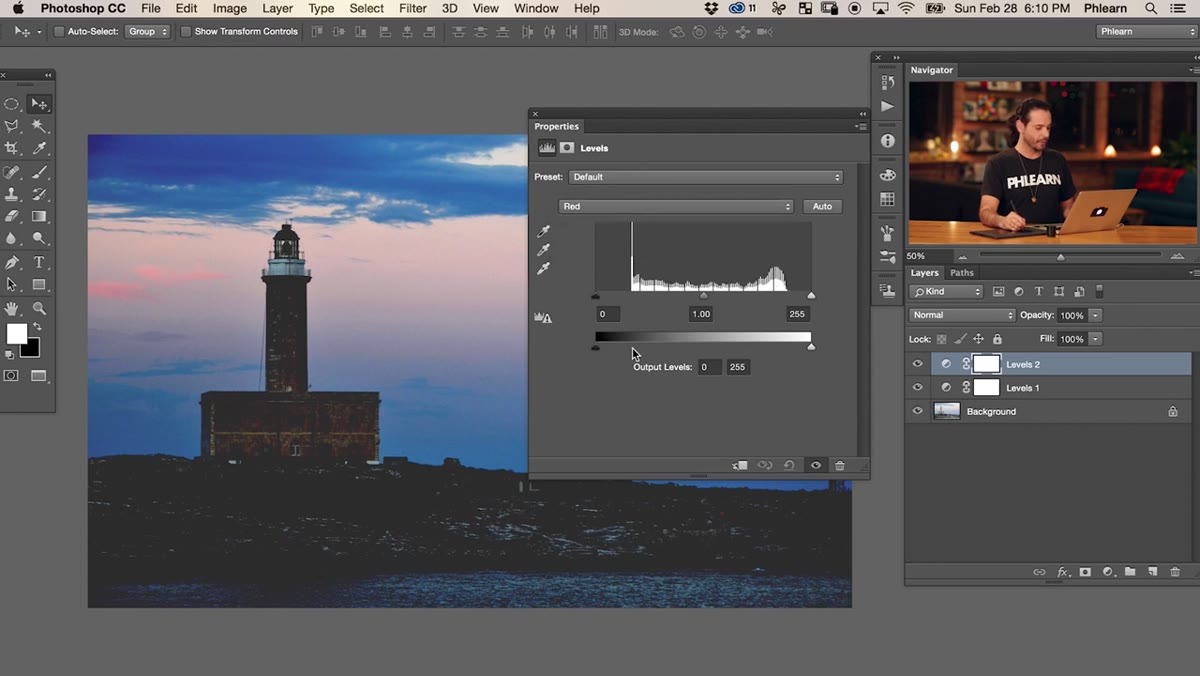
In this second Levels layer, switch from RGB to the Red channel. Now use only the output slider at the bottom of the panel. Dragging the black output slider to the right adds red to your shadows. Dragging it to the left pulls red out, pushing the shadows toward cyan. Switch to the Green channel and do the same thing, pulling the green output slider down pushes shadows toward magenta. The Blue channel lets you add or remove blue from the darks.
Red channel selected in the Levels panel with output slider being moved
In this second Levels layer, switch from RGB to the Red channel. Now use only the output slider at the bottom of the panel. Dragging the black output slider to the right adds red to your shadows. Dragging it to the left pulls red out, pushing the shadows toward cyan. Switch to the Green channel and do the same thing, pulling the green output slider down pushes shadows toward magenta. The Blue channel lets you add or remove blue from the darks.
The dark film look Aaron builds here uses a subtle combination of these channels to introduce warmth or cool tones into the crushed shadows, giving the image a color grade that feels like a specific film stock rather than a generic dark filter. There’s no single right answer here. Experiment slowly, small moves in multiple channels compound quickly.
One Thing I’d Add: Clip a Curves Layer on Top
After going through Aaron’s technique on a few of my own images, I started adding a Curves adjustment layer clipped to nothing specific, just sitting at the top of the stack, to do one more pass on the midtones. The Levels work handles the shadow structure really well, but if your image has a strong subject in the midtones, like a face or a focal point you don’t want swallowed by the effect, a subtle S-curve can bring back just enough contrast in the middle of the range without undoing the shadow lift you worked for. Think of it as a recovery tool rather than part of the effect itself.
One more thing worth testing: try applying this entire adjustment stack as a Smart Object group, so the whole effect is toggleable and editable on any image you want to try it on. It takes about two extra minutes to set up and saves a lot of repetitive work if you’re batch-processing a shoot for a consistent look.
The real takeaway from Aaron’s tutorial is that the Levels output slider is one of the most underused tools in Photoshop for anyone doing stylized photo work. Understanding that you can set a floor on how dark your darks actually get, independently of the tonal compression you apply above it, opens up a whole category of looks that you cannot easily replicate with Curves or Exposure adjustments alone. It’s the kind of thing that seems minor until the first time you use it and suddenly understand why certain photos look the way they do.
Watch the full tutorial on YouTube to see Aaron walk through the whole process and show the before and after in real time.
Comments
Leave a Comment